Let’s take it outside
Interiors are increasingly influencing outdoor public spaces in unexpected ways, according to Joanna Merwood-Salisbury and Vanessa Coxhead.
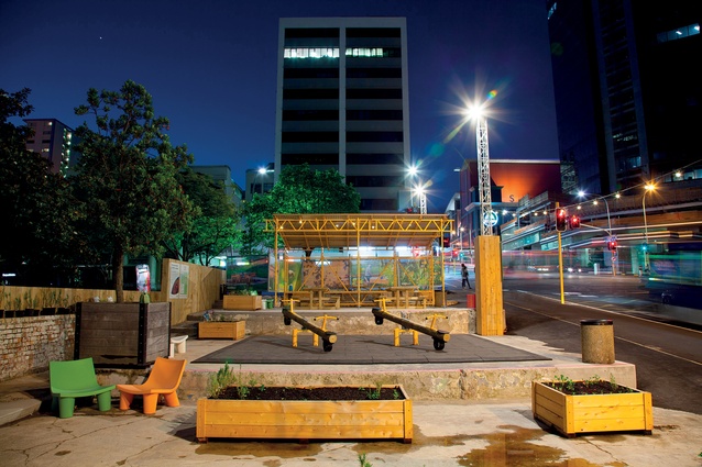
As more and more Aucklanders live downtown, the city is adjusting its thinking about public space. Increasingly, exterior spaces are being thought of in terms of interior design. Installed last November on the corner of Albert and Wellesley streets, Griffiths Gardens is part pop-up park and part urban living room.

Inspired by the Auckland Design Office’s (ADO) agenda to ‘Activate Auckland’, it aims to stimulate an otherwise empty part of the city, in this case land cleared to make way for the Aotea Station of the City Rail Link. While facilitating and funding the project, the ADO sees its role as an enabler, making use of the temporary spaces as an opportunity to test new ideas and learn through low-stakes making.
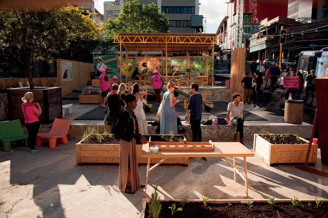
Standing in contrast to the monumental Bledisloe House behind it, Griffiths Gardens is a kind of inner city backyard for those who live and work in the city centre. The form is ad hoc, rough and ready and distinctly domestic. The concrete building pad left behind by a recently demolished building defines the perimeter of the yard and a shelter of bright yellow scaffolding provides rudimentary cover. On the pad, fixed elements mix whimsy with utility.
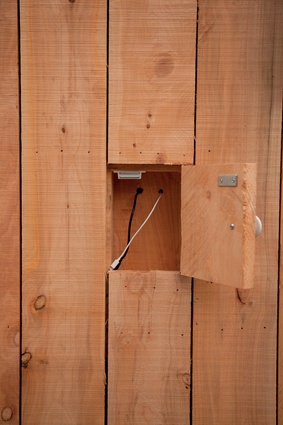
During office hours, city workers can be seen eating lunch or having a meeting at one of the picnic tables. The less self-conscious play on see-saws while charging their phones at purpose-built wooden charging stations by Angus Muir Design. Moveable planters, a key component to Sarah Smuts-Kennedy’s ongoing social sculpture For the Love of Bees, promise future greenery.
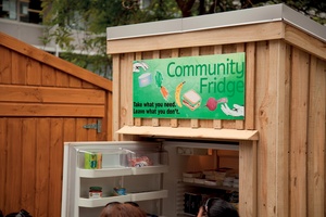
Two rough-sawn timber sheds sit at the rear of the site – one houses gardening equipment, and soon a garden teaching space, and the other a community fridge facilitated by Love Food Hate Waste. A free bike-repair station sits alongside. Musicians perform, organised or spontaneous. Apartment dwellers have been spotted eating their evening meals at the site, and as night falls the rough sleepers of Auckland settle in, using the built structure as shelter, washing line, charging point and safe place for the night. As ADO’s Barbara Holloway puts it: “Finally, a tiny house in the city centre!”
Created through the collaborative efforts of designers, artists, psychologists and human geographers, Griffiths Gardens brings an interiorist approach to urban design. The focus is not on aesthetic form, but on creating opportunities for human interaction.
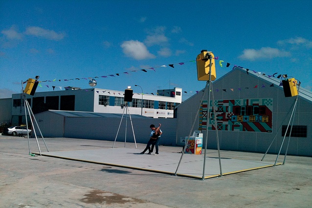
Like other examples from around the country (the ongoing Alt Group-led POP projects; Dance-O-Mat and other Gap Filler projects in Christchurch; Bond and Leeds Street in Wellington), it draws its strategy of rapid activation from the tactical urbanism movement. Conceived with the time frame, budget, scale and sensibility of interior design, tactical urbanism is temporary and intimate, not permanent and monumental.

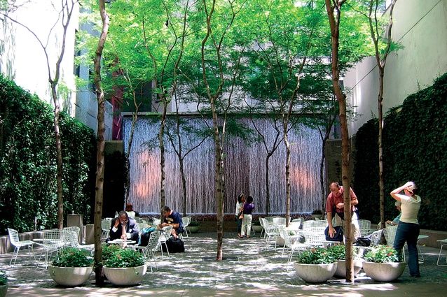
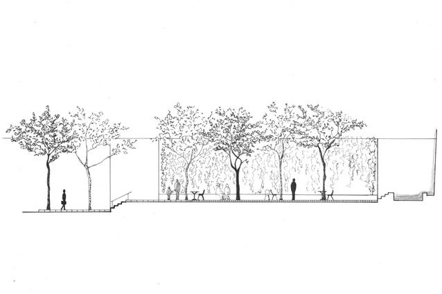
The history of thinking about exterior spaces as ‘rooms’ dates at least as far back as the mid-1960s, with Zion and Breen’s Paley Park in New York City being the iconic example. Designed as a counter to the vast, empty and unused exterior plazas of modernist architecture and planning, Paley Park offered protective enclosure in the form of ivy-clad walls and a waterfall, along with moveable seating to encourage intimate sociability.
But the projects associated with tactical urbanism are not so polished, so aesthetically pure. With domestic scale mix-and-match pieces that can be quickly and easily combined and recombined, they are useful as catalysts for further urban development.
The introduction of the interior scale to the urban landscape opens up another possibility: the application to exterior contexts of pliable, soft materials traditionally associated with interior spaces, such as curtains, wallpaper and carpets, which may incorporate vivid colour, texture, and decorative effects.

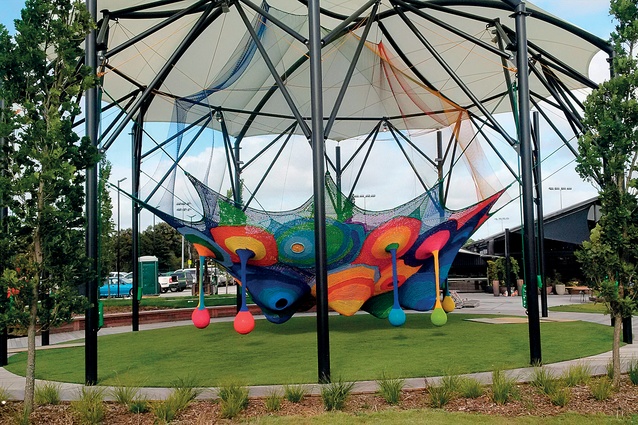
Referencing traditional feminine crafts, the artist Toshiko Horiuchi MacAdam’s colourful knitted play structures explore the potential of textiles to become dynamic and three-dimensional, extending their scale and scope beyond the tactile to the tectonic. MacAdam has recently installed a crochet net for Woah! Studios’ urban playground in Henderson.
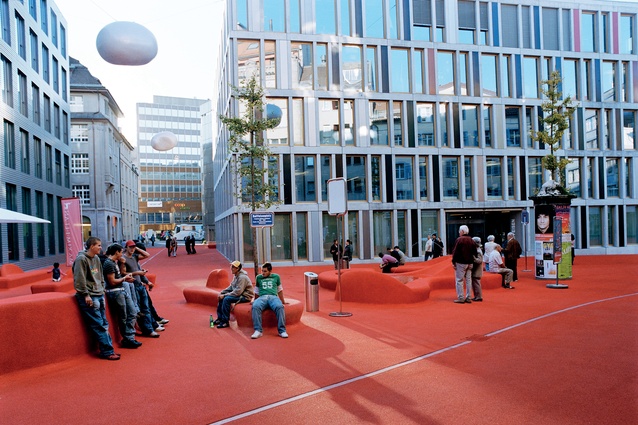
Further afield, Stadtlounge in St. Gallen, Switzerland, designed by Carlos Martinez Architekten in collaboration with artist Pipilotti Rist, is an evocative expression of a similar idea. The designers reactivate a previously underused space into a ‘city lounge,’ as the name implies, by literally rolling out the red carpet.
The application of a continuous surface of red granulated rubber across pedestrian, recreation and rest areas brings cohesion to an area of irregular and unconnected voids, slowing down movement and tempting pedestrians to slow down, stop and touch their surroundings. Exploiting the semiotic associations of carpet, in contrast with typical plaza surfaces of asphalt or stone, the soft texture provides comfort. It has the capacity to receive impressions so the wear and tear of habitual use is made evident on its surface.

Taken together, these projects challenge our understanding of public space in the contemporary city, and the possibilities for its design. To be public has traditionally meant to be expansive and exposed, open and transparent, to allow for the kind of massed crowds associated with pre-modern squares and market places. As these projects demonstrate, the deployment of interior concepts of temporality, scale, form and materials greatly enlarges what is possible within the urban realm.
A longer version of this essay will appear in: Interiors Beyond Architecture (Eds. Deborah Schneiderman and Amy Campos, Routledge, 2017). Joanna Merwood-Salisbury is Professor of Architecture at Victoria University of Wellington. Vanessa Coxhead is a postgraduate student at the School of Architecture, Victoria University of Wellington.

