Light in spades: Garden House
This architect and designer duo transformed their dark box of a Queenslander into a garden-centric, light-filled house where views abound.
My tour of this ingeniously renovated Queenslander cottage began with a magical moment of stepping through a large window frame onto a rooftop garden. References to Alice’s Adventures in Wonderland and The Chronicles of Narnia abound. Here, beyond a main bedroom perch, at eye level for those reclining on the bed, is a green and mesmerizing haze of vegetation sprouting vigorously from a grid of planter boxes.
The roof garden system, like other technical elements of the project, has been painstakingly researched by owner-builder, designer and architectural graduate Bruce Carrick. “It’s a German system developed in Singapore,” says Bruce, explaining how the interlocking planter boxes have reservoirs beneath that pipe water into a collection tank for recycling.
Bruce and his architect wife Caroline Stalker, a director of Architectus in Brisbane, had bought the somewhat decrepit cottage in inner-city New Farm in the late 1990s. Following a well-trodden course, they had prettified and made functional the kitchen and bathrooms, and generally carved out spaces for themselves and their two sons within what Caroline describes as “confined spaces with tricky connections.” Two earlier renovations had added space within the dark confines, but seventeen years on, this third project was firmly to gain amenity.
The home had cut itself off from a lovely long finger of land that stretched north into a private garden realm, and the new configuration was about “folding the garden into the plan” while gaining light. “We knew the importance of both ‘north-ness’ and ‘garden-ness,’” says Caroline. “They both bring amazing joy.”
Designing and building for oneself brings with it constraints and freedoms. On the one hand, ideas are limitless and research time is unbilled, and on the other, day jobs must prevail. “It is such a challenge in commercial practice to allow for that absolute luxury of taking your time for multiple design investigations,” says Caroline. “Here we allowed ourselves that luxury.”
“It took me three weeks to talk Caroline out of going into a ‘proper’ building contract,” recalls Bruce. While Caroline was the lead designer for the project, Bruce took on the mammoth task of project documentation, supervision and building the house on a cost-plus basis, simultaneously running his industrial and furniture design company Lookout Design.
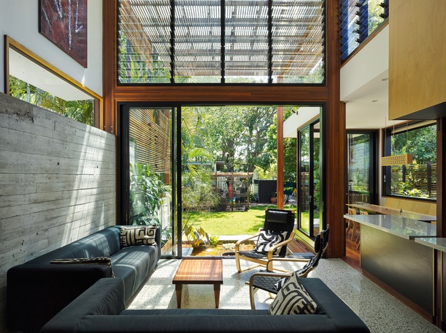
But with Caroline burrowing into every rabbit hole of possibility, and many schemes discussed and developed with Bruce, who also added clever ideas of implementation, the plan eventually emerged. A major decision was the conversion of the existing backyard pool into a capped water tank that pumps warm or cool water into pipes embedded in the waffle concrete podium. The podium serves as a living room floor, raised 600 millimetres above ground and thereby mitigating overland flood issues.
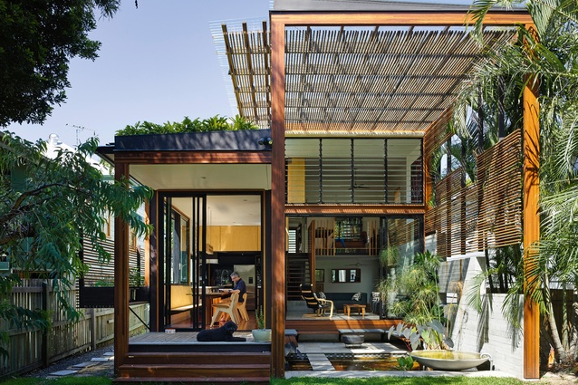
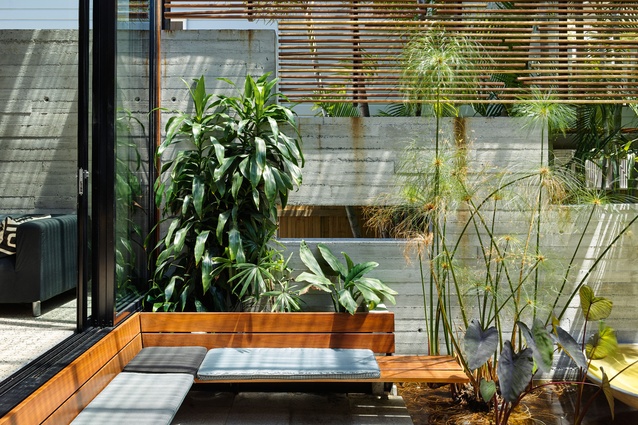
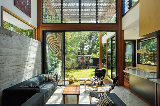
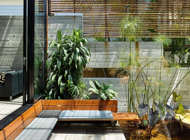
Instead of the pool, which the couple’s sons had outgrown, a tranquil lounge-side fishpond was installed. The concrete slab steps down into this internal garden room one side and on a private internal sunken lounge on the other. Walls peel away to reveal the garden room and pond on two sides. The back garden is now framed by a giant timber screen portal reaching to six metres above the pond, providing privacy from neighbours while creating a splendid moment of opening and embrace.
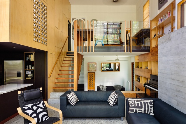
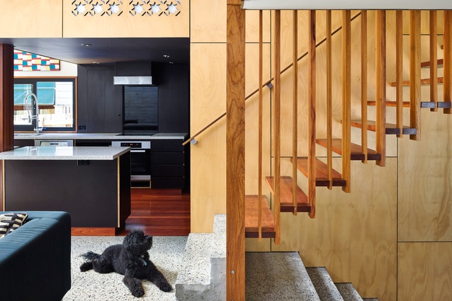
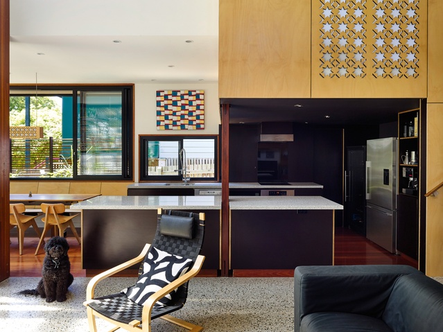
While the old part of the house remained intact, the new plan dedicated the upper level to the parents and the lower level to the boys. The hub of the home, or the “gel” as Caroline refers to it, is the large void created in the centre. Here the double-height volume embraces a study and a feature wall of favourite objects housed on shelves of recycled crow’s ash. Opposite, a double-height wall is pierced with starburst motifs derived from Bruce’s earlier furniture designs. The decorative elements serve a functional purpose of cleaning up the mishmash of elements and joins that had developed over time. In the same quest for functionality, the temptation to re-do the bathrooms was dismissed as “being about consumption” and ideas were focused instead on the principle of the borrowed landscape. “It was all about how to make a 400-square-metre block work,” says Caroline.
A new, elevated dining room projects into the garden on the edge of the pond lounge. Above, it is fringed and shaded by the rooftop garden. On its eastern side, a series of planter boxes for herbs and vegetables and a recycled timber trellis are fast establishing an edible windowsill garden as well as privacy from close neighbours.
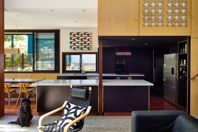
Bruce made the rosewood dining table from timber bought from an old shopfitter in the neighbourhood, and the chairs around it are also a Lookout Design special. The kitchen, a compressed space adjacent the dining room, is decked out in blackened plywood, while above, by contrast, the main bedroom is a light-filled box lined with honey-coloured ply.
Having dealt with the whims of the house so accreted with layers of change over time, Bruce and Caroline adopted the mantra “imperfection is OK,” and achieved a new and beautiful layering for the next phase of their family’s life.

