Precise and proud: Light Saw House
A turn-of-the-century weatherboard cottage along Melbourne’s Merri Creek has been transformed by Zen Architects into a light-filled space for a family to come together.
The clients of Zen Architects’ Light Saw House bought the original turn-of-the-century weatherboard cottage in Melbourne’s Fitzroy North in the late 1990s. “It was beautiful, the garden was lovely and we could almost afford it,” says owner Craig Stephens. It was intended to be a home where the couple could raise a family, but life took a different direction.
They spent more than two decades away as expatriates living in London and Sydney and their cottage fell into a state of disrepair, with cracks in its walls, a “crazily overgrown garden” and squatters commandeering the property.
Situated on the west side of Merri Creek, where the ground is “notoriously horrendous for building footings,” according to architect Luke Rhodes, the house needed to be re-stumped. As the clients were planning on returning from England, the re-stumping became the catalyst for a rear extension project. The cottage had a lean-to addition of sorts, which was orientated to the garden but fully south facing. “There wasn’t a lot of light in here,” says Luke. “That was the first thing that struck us.”
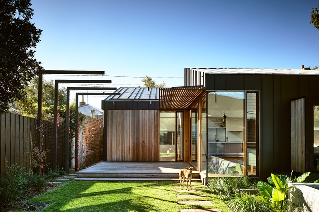
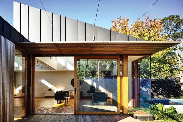
The project was designed and constructed while the clients were still living overseas. Zen Architects removed the lean-to and in its place created a family-oriented living area that maintains a connection with the garden and is capped with two north-facing sawtooth highlight windows that funnel light into the space.
Sawtooth roofs are historically used in industrial buildings as a way of directing daylight from above into the large-spanning internal spaces below. Here, the roof form has been used to scoop light into the space, over the top of the large mass of the existing house to the north.
The angle of the sawtooths echoes the angle of the hip roof of the original house. However, as Luke explains, this was a happy medium found in reaching the solution that would allow them to get as much sun into the interior as possible without overshadowing the rear garden.
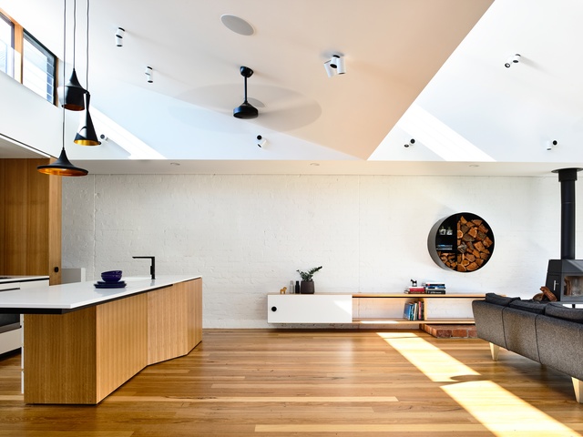
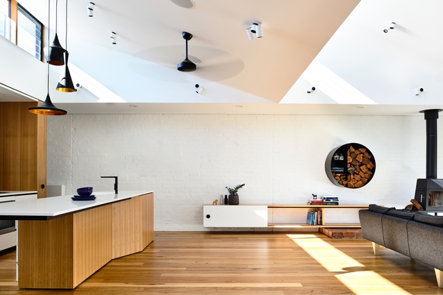
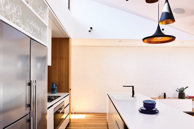
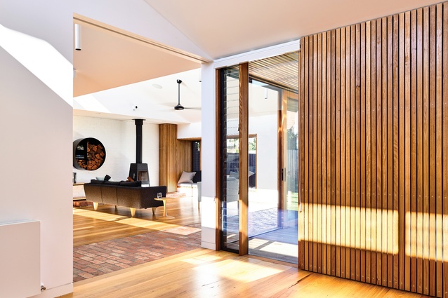
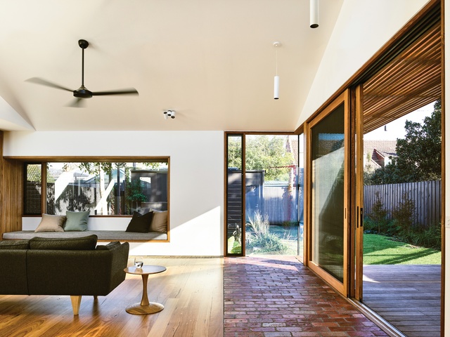
Having two sawtooths allows natural light to penetrate deeper into the space. Despite the fact that it faces south, the new space is much more light-filled than the north-facing original front of the house. Internally, the windows cast two linear bands of light across the floor of the open-plan living and kitchen space below, like a theatrical spotlight that moves with the angle of the sun. The sawtooths form sharp lines on the ceiling where it meets the lower part of the room against the boundary. The result is reminiscent of a piece of precisely folded paper art.
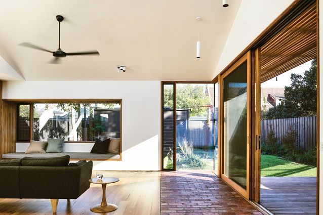
A painted brick wall along the boundary allowed the architects to create a gallery-like wall for the client’s art collection, with a hanging system recessed into the ceiling. To the south, a window seat pokes itself out from the envelope of the building and peers over the pool below.
The central living area is supplemented with an adjacent, smaller multipurpose space. “We wanted to create quite a small footprint for quite a large house and keep as much of the garden as possible. So it’s a second living room, it’s also a spare bedroom. It’s a super flexible space,” Luke says.
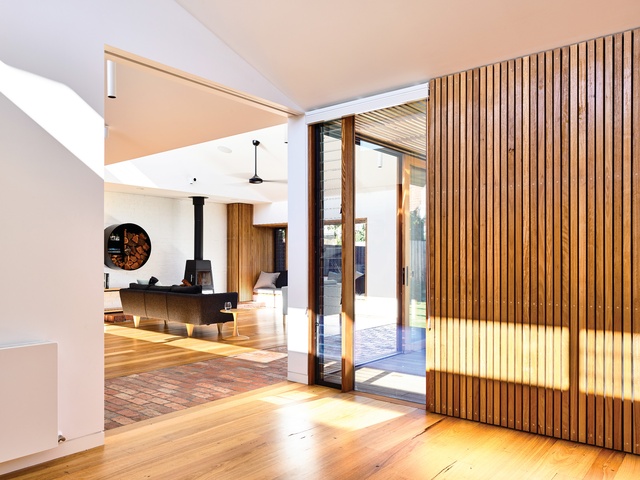
“Having two separate living rooms in the design … has allowed the main living area to become the family gathering space. It’s a testament to the clients that there’s still no TV in this room. It’s a space where things could be devoid of technology and the family could really come together.”
Now reunited with their original home, the clients say this arrangement has “made a big difference” to their family life. The two living areas form an L shape that hugs an external deck leading to the garden, designed by Eckersley Garden Architecture. A sunken, vegetated trough adjacent to the wall of the pool allows the pool to sit fence-free in the garden.
The architects worked hard to ensure the extension had a minimal footprint and that each of the new spaces had a connection to garden. Even the narrow but efficiently planned study behind the secondary living area has views to the outdoors via both a perimeter window and one that borrows views from the room in front.
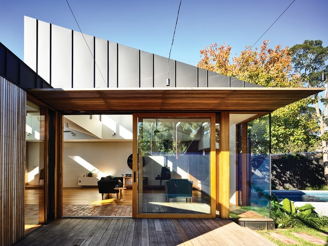
The extension is made predominantly of recycled materials in an effort to create a sustainable building, a key consideration in the design. The original brick garden beds were recycled and reinterpreted as a brick path internally leading to the garden. Only a few hundred bricks used in the project did not originate from the site.
The brick path and boundary wall allow the lightweight timber building to achieve a level of thermal stability while also integrating and stabilizing the original front part of the house. The dwelling, as a whole, has gained a 6.2-star NatHERS sustainability rating, “which is really hard to achieve on a south-facing building with such a massive volume of the original building retained,” says Luke.
Three bedrooms occupy the front rooms in the original house, while a main bedroom and walk-in robe have been inserted into the original dining room, affectionately referred to by the clients as the “ballroom” due to its size.
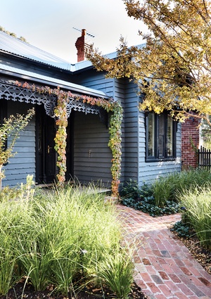
The front facade was repainted in a dark grey palette to provide a backdrop to the “super lush and super green” garden. The cottage stands proud among its neighbours.
This article was first published on ArchitectureAU.com

