Living pavilion: Recrafted Art House
An Arts & Crafts home in Auckland’s Remuera receives a sympathetic renovation that looks to both history and the future.
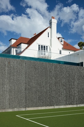
Mimicking the proportions and stylistic cues of this Arts & Crafts home that spans a corner block in Auckland’s Remuera was the architectural approach in this project by Crosson Architects.
But it was not a legally required one. That’s surprising because the home, designed in the 1910s, has presence and poise, and is an exquisite exemplar of the period.
The original architects, Bamford and Pierce, have become known for buildings in the English tradition: those like Neligan House (the diocesan office for the Anglican Church) and the Tea Kiosk in The Domain, which is a perennial backdrop for families enjoying tea and ice cream in the gardens overlooking the duck pond.
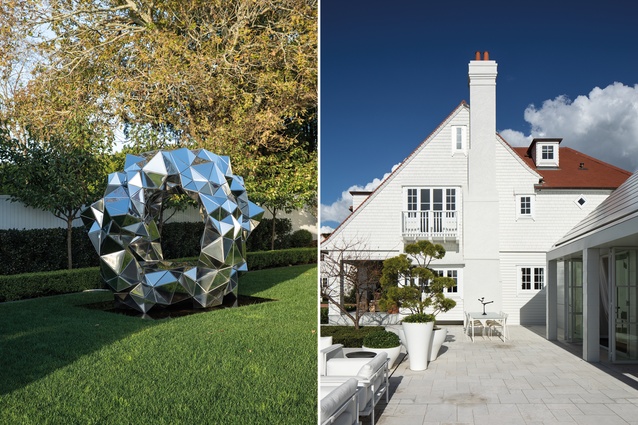
Although the home was not a listed building, the owners, who had three children, asked for a considered restoration of the property, which would not only turn back the clock to that initial vision but look forward, too. They tasked Ken Crosson and his team with creating a living pavilion – a building that would straddle time and connect with the pool and the landscape.
But first, in consultation with Heritage New Zealand, the re-imagining began. “The challenge, when working with homes that are clearly of an era, is to be respectful of that but to craft something with its own story. In effect, we are making a new history,” says Crosson.
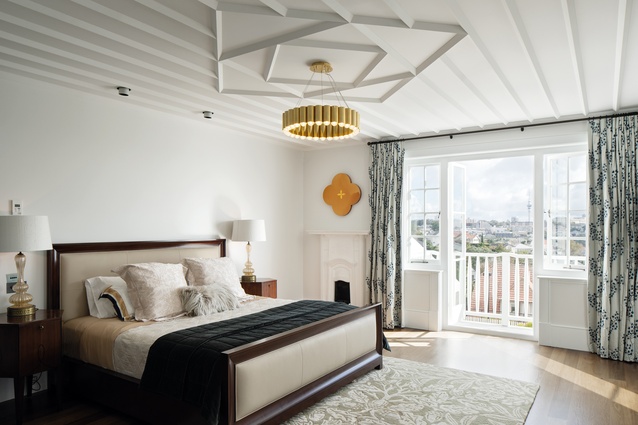
Within the fabric of the existing home, there was work to be done. The ’80s had not been kind to the old girl; many beautiful details had been covered over or boxed in. Setting these architectural accomplishments free was first on the list. Three verandahs that had been built in were reinstated and a trio of fireplaces was coaxed back to life.
“We tried to keep these as authentic as possible and brought in fireboxes of the period from England.” The chimney stacks, too, received some TLC; they were structurally reinforced and capped with terracotta chimney pots of the era.
Arts & Crafts design lauded the handmade and was a reaction to Victorian mass production where filigree, fretwork, balusters and other decorative details were created by machine, initially in England and then in the colonies. It was also insular. Rooms became a series of cells that celebrated intimacy and intricacy but left the natural world at the threshold.

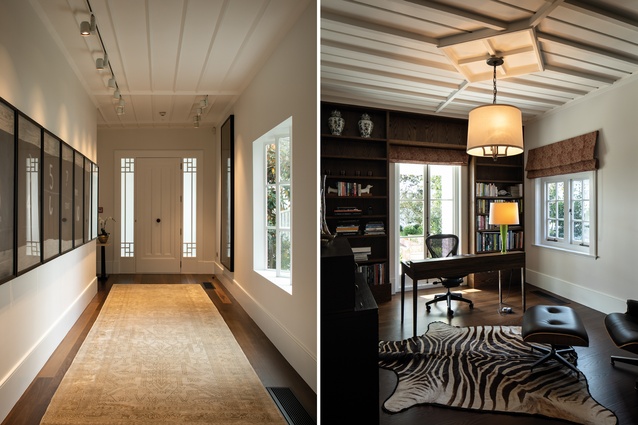
Sympathetic changes to the plan included repositioning the front door, which now opens to a formal gallery (the owners are enthusiastic collectors of New Zealand art) lending a sense of arrival and giving the works room to breathe.
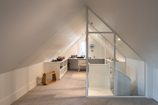
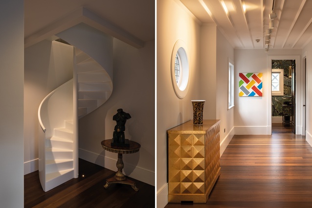
The main stair was repositioned and the upstairs bedrooms replanned. From here, an open-plan play zone created within the roof volume is accessed via a steel spiral – a playful white extrusion that twists upwards.
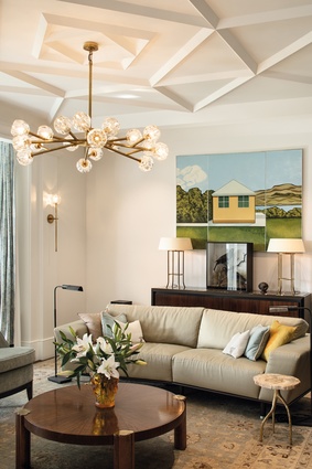
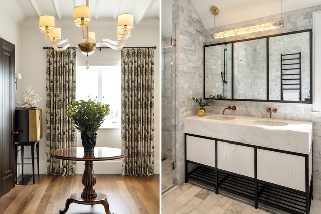
While ever mindful of their home’s history (ceiling detail reinstated, brass handles polished to a shine), the owners wanted to live more broadly. The site has north-facing views across the harbour to the city – but that aspect was all but wasted.

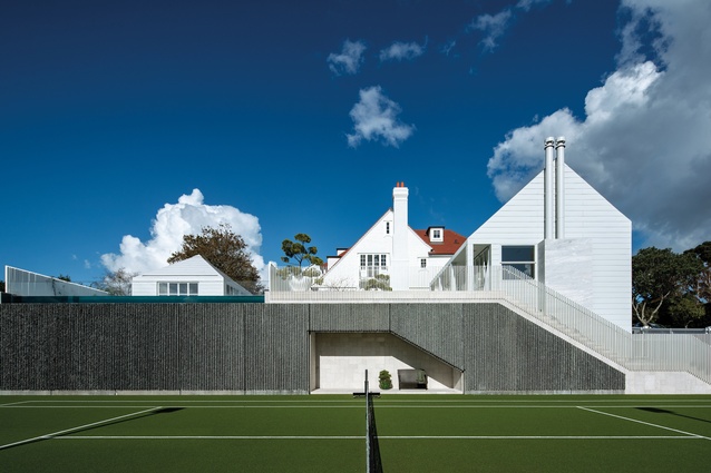
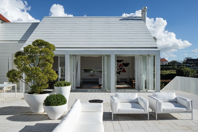
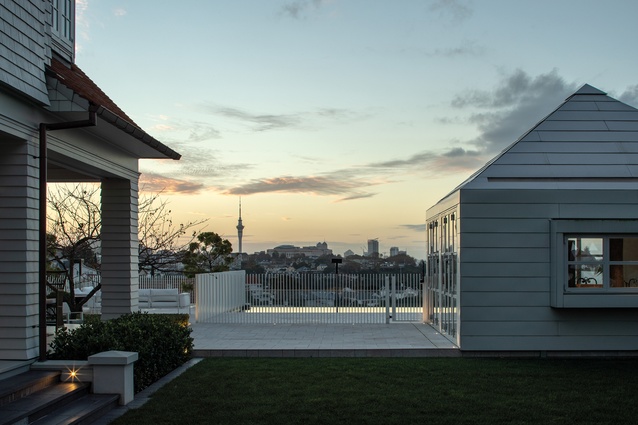
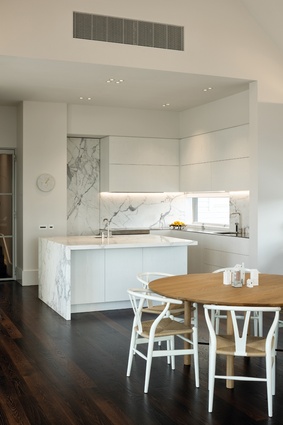
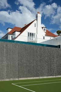
The opportunity to be more expansive was embraced by the new kitchen/dining/family wing which, at right angles to the face of the main home, forms a sheltered L-shaped embrace around the outdoor aspects – the terraces and a pool. A level below, an upgraded tennis court is bounded by a concrete wall, the face of which is pre-cast in a grooved pattern that harks back to the 1970s.
The new building has a familial resemblance to its big brother that is immediately noticeable: the asymmetrical gable, the way the verandah tucks in under the main roof, those paired chimney stacks. But, like any younger sibling, it plays its own tune. The metal roof profile wraps down to become the exterior cladding. “It’s crisply crafted in folded metal and follows the horizontal line of the weatherboards on the original home to which it connects,” says Crosson.

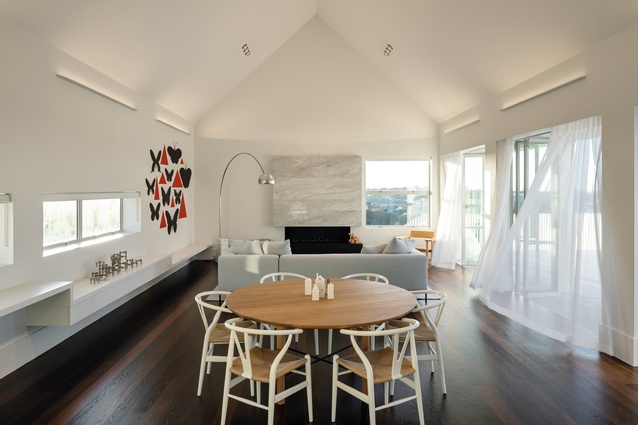
Inside, it’s all clean-lined, purposeful strokes – a move which pays the cathedral ceilings due homage. In the day, the high apex softens the light which floods in from a bank of glazing on the terrace side; at night, the ceilings are uplit for a dash of drama.
A simple white ledge that moves through various levels the length of one wall can be a bookshelf, a place to display art, a seat or a desk. The marble fireplace is a material connection between Arts & Crafts and the here and now. “We repeated the marble as a window in the scullery area, which links the old house to the new,” explains Crosson. “The slab is so fine that, when the lights are on, it glows with translucency.”
Crosson, who cut his teeth on altering old houses and lives in a villa, may not be known for his heritage work – but that’s not to say he doesn’t love the challenge. “As I get older, I start to have more appreciation for the trajectory that architecture is on. I have more respect for the order, scale and rhythms of historical styles,” he says.
And while it is gratifying for the team (James Young, Justine Goode and Corbett Madden) that the project earned a heritage award in the 2019 Auckland Architecture Awards, it is more rewarding, still, that their clients now invite them for games of tennis or evening drinks around the pool. “Not only are we able to experience what a nice connection the home now has to its surroundings but, over the four years, we and the home-owners have become great friends.”
There’s surely no better measure of success.
This article first appeared in Urbis magazine.


