Long live the Queen: Queen’s Rise
The aesthetic inside Middleton, one of the Queen’s Rise eateries, is timeless and features tan-leather seating, Nero Marquina marble from Spain, edged in thick brass, and Travertine wall tiling.

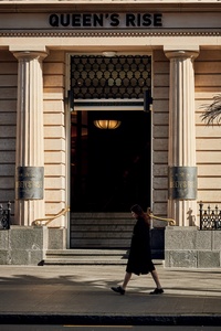
The stately Tasmanian sandstone façade of the Queen’s Rise building.
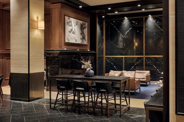
The lobby of the renamed QBE Centre hints at what’s to come but doesn’t give the game away.
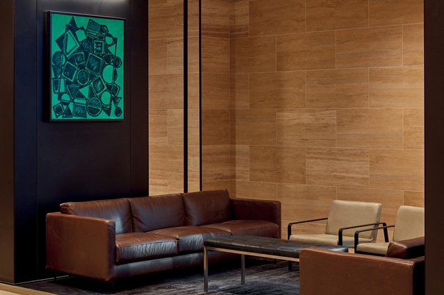
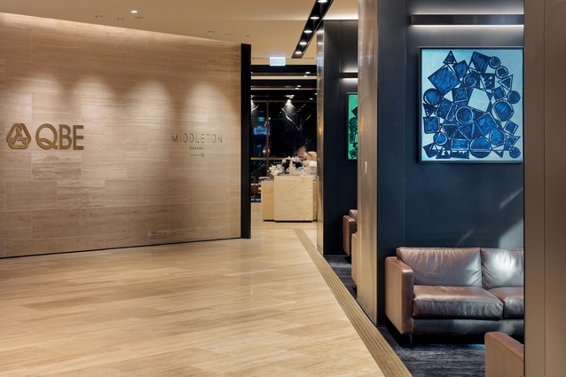
Bespoke lounges are by Thonet and the floor rug is from Designer Rugs. Artwork is The Others by Simon Ingram, sourced from Gow Langsford Gallery.
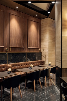
Wall and floor tiles are Pedre Dark Travertine. Columns are clad in dark bronze anodised aluminium. Furniture is sourced from Thonet and Stylecraft.

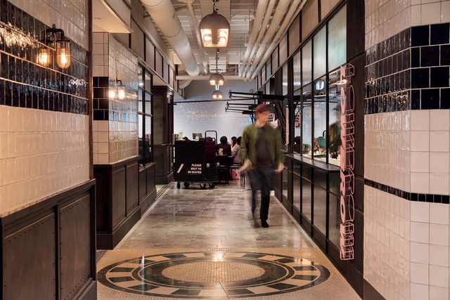
There are more than 50 different types of tile used throughout Queen’s Rise, including this radial floor design and the subway-tiled walls.
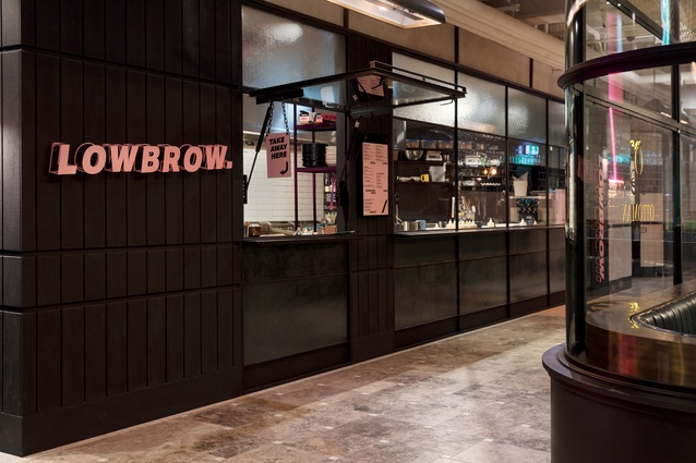
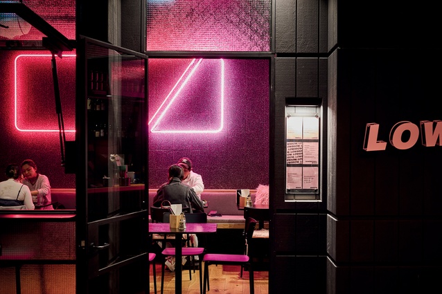
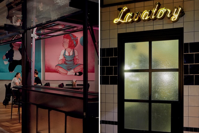
Lowbrow’s shop front uses black steel and Squarelite glazing.
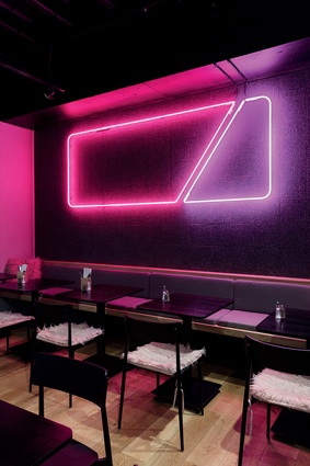
Lowbrow’s neon wall lighting was designed by Walker Mitchell, who created the entire design for Lowbrow, and fabricated by Pro Sign Services.
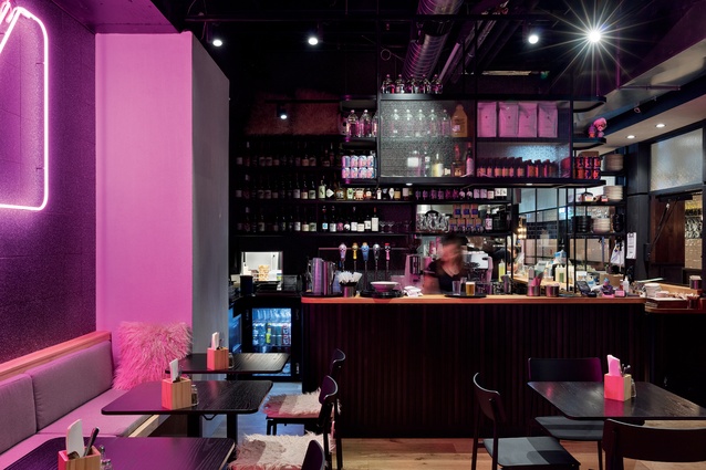
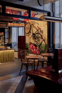
Lowbrow, from the minds behind Culprit, features a low-interventionist approach to food and natural wine.
Designer Charlene Chong says the overall interior approach “was based around the experience you would have in a European laneway”.
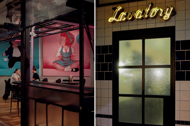
Artwork is by Haser; many of the fittings received pre-applied ageing processes to give the space a more authentic feel.

Each of the 11 tenancies has its own identity but also a neighbourliness drawn from a shared aesthetic.
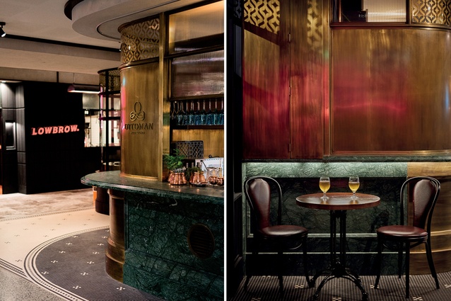
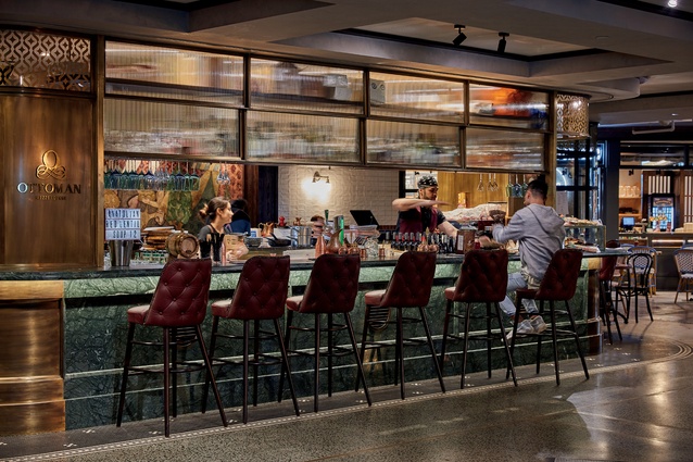
Ottoman Mezze Lounge makes use of a Turkish-inspired colour palette of warm metallics, deep browns and green marble.
“We set up snapshots of the tenancies by working with the acute and obtuse angles and corners set up by the unusual footprint,” notes Chong.
This underutilised, 1860s’ Auckland building, in a prime Queen Street location, has been brought back to life. Its resulting public spaces make use of clever design and well-curated hospitality to revitalise its core.
Although there’s no suggestion of smoke and mirrors with the substantial overhaul of the 28-floor building at 125 Queen Street, a first glimpse could be deceiving. A life-sized image projected on New Zealand’s largest LED screen alongside it continues the heritage façade seamlessly to the corner, in a digital trompe l’oeil that makes passers-by do a double take.
It’s not the only surprise in store for the uninitiated. Beyond the property’s Tasmanian sandstone face – all imposing columns, stately symmetry and mercantile brass – is a food emporium that could be equally at home in a Parisian side street or a Melbourne laneway.
When Winton Partners, the developers of the property, bought the building almost five years ago, it was long-unoccupied and in a less-than-ideal state. The original home of Bank of New Zealand, it was designed by Melbourne architect Leonard Terry and the grand, carved wooden doors opened to the well-to-do citizens of Auckland in 1867.
More than a century later, in the mid-’80s, a high-rise office was added.“I remember, as a young child, taking a school trip to the observation deck,” says development manager Kerry Woods.
Keeping true to this history while delivering a project worthy of such a high-profile address was one aim; ensuring amenity of the same quality for tenants and the local community was another.
The base build complete, Winton turned to Sydney-based Alexander &CO. to provide the finishing design for the common areas and the first-floor dining precinct as well as a lobby, café and bar on the Swanson Street side of the property.
Associate director Charlene Cong says of the brief: “They wanted the project to be one of a kind and have a rock-star aesthetic”. According to her, the design freedom was brilliant while, simultaneously, terrifying. “When you can take it wherever you want to, you need to create your own ‘story’ for each area to inform the design process,” says Cong.
The resulting narrative, particularly in the public zones, is evocative and unexpected. The lobby of the renamed QBE Centre hints at what’s to come but doesn’t give the game away. “It’s been called brutalist and postmodern but we didn’t want to reference any particular era or style, as we wanted to create a truly timeless aesthetic,” says Cong.
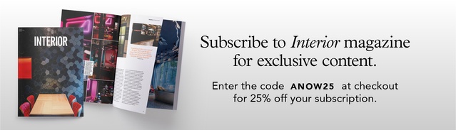
This textural journey passes a rough-hewn slab of black marble at the concierge desk and is taken up by columns clad in sheets of smooth, anodised aluminium that funnel into the Middleton café and bar – a secreted-away venue that feels Manhattan in mood.
With no visual access to the street but a six-metre stud, this could be an exclusive members’ club. Tan-leather banquettes, walls tiled in cream Travertine and Nero Marquina marble, sourced from Spain, lend gravitas while a striking fireplace and an open kitchen and bar bring comfort. It would be easy to settle in for a coffee, lunch or an evening drink… forever.
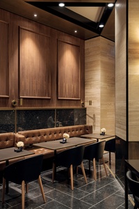
The smart speakeasy setting was achieved by hard graft – tilers book-matched the white veins in the black marble, joiners flawlessly continued the profile of the marble in timber and metalworkers finished the brass to just the right level of age.
“Pre-applied ageing processes add a richness and sense of authenticity to materials. We did not want the brass work to appear as a bright-yellow finish so the patina effect allowed it to appear more bronzed and weathered. The bespoke process was reliant on how long the ageing solution was left in place and on it being applied with straight-armed strokes,” says Cong.
It was advantageous for the craftspeople to cut their teeth at Middleton in preparation for Queen’s Rise; the open-early-to-late eating emporium, which is a discovery on the first floor of the building, was a true test of their skills.
“It was about creating a venue that takes you to a different world,” explains Cong who, for two years, travelled back and forth every fortnight between Sydney and Auckland to steer the project to its conclusion.
The first step was to create a master plan within the trapezoidal footprint around the building’s hexagonal core – not easy geometry to navigate. The result is a central loop of public circulation intersecting with nooks and pockets that were naturally created from the odd shape. A cluster of smaller food outlets and kiosks is found in the back corner, medium-sized ones are at the entrance, and a hero tenant in the centre anchors the scheme together.
Alexander &CO. worked in tandem with an Australian food and beverage consultant, Future Food, to try to ensure the right mix of tenants for the development. For the hungry office-worker looking for lunch, or for theatregoers wanting an after-show bite, the experience sought to be one of enticement in terms of both aesthetics and food offerings.
A feast of detail is on the menu: a collection of vignettes, each of which could be anywhere in Europe and yet all of which still speak the same language. The designers mapped out every elevation in fine detail – walls, floor and ceiling. “We focused on creating vignettes throughout the space. No matter where you turn, there’s something new to look at.”
One of the project’s highlights has to be its complex tiling. Using reference photographs of subway stations and decorative columns in the grand halls of Italy, the designers pushed the boundaries with more than 50 different tiles, many flown in from Australia, to play with movement and pattern. The designs were mapped by hand then translated into a computer in order to communicate the vision to the manufacturers.
Some designs, such as the floral floor patterns, were meticulously laid by hand. Others, such as a radial form in the lift lobby, were waterjet cut and pre-glued at the makers in China then flown out and laid in one disk. They were all aged to give that weathered, lived-in look of old Europe.
“The entire project was built on custom fabrication and all credit to Winton for understanding that, to create something unique, you can’t rely on known processes and products,” says Cong.
All the finishes received the same meticulous treatment. A 3D-printed model of the elements of the brass handrails was sent to the manufacturer to ensure that there was no room for error; structural columns clad in mesh were minutely managed. “The sampling process was a tremendous feat; we had mock-ups of mesh sizes, the gaps in between, the rivet sizes and steel angles to see how each detail interacted with the next.”
Once the building services were installed in a considered hierarchy – “no disorganised cables or pipework, everything ran parallel to each other with priority given to mechanical services” – the designers began working closely with the owners of the boutique eateries set to populate Queen’s Rise lest the scheme stumble at the last hurdle.
It didn’t. Each of the 11 tenancies has its own identity but also a neighbourliness drawn from a shared aesthetic. Order from Ottoman Mezze Lounge with its Turkish cocktails and taramasalata or Lowbrow with its low-interventionist approach to food and its natural wine, or pop into the Poké Bar where you’re encouraged to eat the rainbow, then share a table anywhere. It’s sophisticated and casual all at the same time. International style has made it to Queen Street, if only you know where to find it.
Designer Brief

Charlene Cong – Associate Director, Alexander &CO., Sydney
Charlene Cong has spent the past two years flying back and forth between Sydney and Auckland, to develop, design, detail and then direct the fit-out of the common areas, lobby, café and dining precinct at 125 Queen Street. Working out a logical flow for the public spaces within a trapezoidal footprint was one challenge for Alexander &CO.; conveying the detail of the design across the Tasman was another but being given complete freedom to create something unique was, Cong says, the most daunting aspect of all.
What was the overall vision for the Queen’s Rise dining precinct?
Charlene Cong (CC): The design was based around the experience you would have in a European laneway. Auckland already has many boutique eateries sprinkled around the city and in Ponsonby, which is close by. Beyond that, there is destination food. Queen’s Rise brings all these options into one venue and we worked closely with a food and beverage consultant to map out the type of cuisine that was the best fit and decide how to achieve the right variety. It was a very informed process. Beyond the razzle dazzle, there’s a clever planning strategy.
Aesthetically, it’s a very rich space. How did you achieve this?
CC: The design started to form around the moments that were created by the nooks and hidden spaces. Regardless of where you entered the space, there was always a ‘frame’ that directed your vision. Turn left and you’d see a little vignette, look the other way and there would be a different one, but they were all part of a collection that spoke the same language. We set up snapshots of the tenancies by working with the acute and obtuse angles and corners set up by the unusual footprint.
Also, it comes down to the detail. We wanted the materials to feel and look authentic, and for everything to appear aged – not crystal clean. For example, we rubbed a little bit of ink onto the crackle tiles so they looked a bit more weathered and pre-applied patina to the steelwork and brass. Timber finishes were specified with rough-sawn textures.
What solutions did you come up with to bypass the downside of working remotely?
CC: I used an iPad Pro on site so that I could sketch details for the builders during on-site meetings, then email them when I got back home. We also screen-shared all our meetings using Google Hangouts where we’d actually sit around a table and go through drawings, turning the pages together. It also allowed me to guide the team through our design intent for the venue using our 3D model. Beyond that, the contractors would text me photos from the site; I’d mark them up and text them back.
Having said that, our practice works with very traditional methods; we don’t believe in designing on computer. CAD is the finishing aspect of the journey that starts with a pen and paper. I have a folder of more than 30 sketches for just one wall of Queen’s Rise.
What’s one thing people who visit Queen’s Rise might not realise?
CC: Organising the building services was a tremendous challenge as the services are exposed within the venue. We were working with a base build with a low ceiling height and each tenancy required large volumes of mechanical extraction. To bring all the subcontractors together and ask them to coordinate each of their services is a significant task. We spent close to a year modelling the way we could map out each service.
A hierarchy was established: the ductwork was completed first, then the electrician had to run his cable trays underneath the ductwork; fire contractors then had to fit their pipework around these, and AV and security were last on the list. The entire ceiling, including all building services, was sprayed light grey. For such an enormous amount of equipment, it is quite impressive how neat it all looks.
Now that the project is over, what are your reflections on it?
CC: It has been an amazing experience. Winton gave us so much freedom to explore our creativity and we did not hold back. We would not have been able to achieve the level of detail and rigour for the project without the client’s support. They would say: “Don’t let the budget limit you – we’ll cross that bridge when we reach it.”
They truly trusted us with what we were tasked to achieve and that gave us the confidence to push ourselves to a new level of creativity and resolution. And people responded; they came together. Designer, client, contractor and consultants all had a common goal to realise something that had never been achieved before. That was the great motivator on the long journey.
This article first appeared in Interior magazine