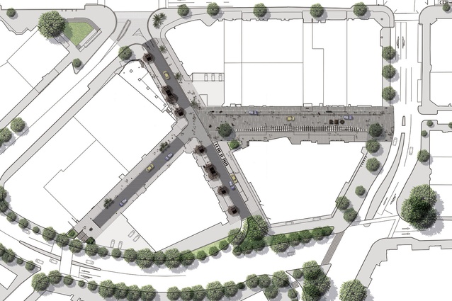
Lorne Street by Architectus
A pedestrian-favouring gathering space that frees the Auckland Public Library from its narrow confines.
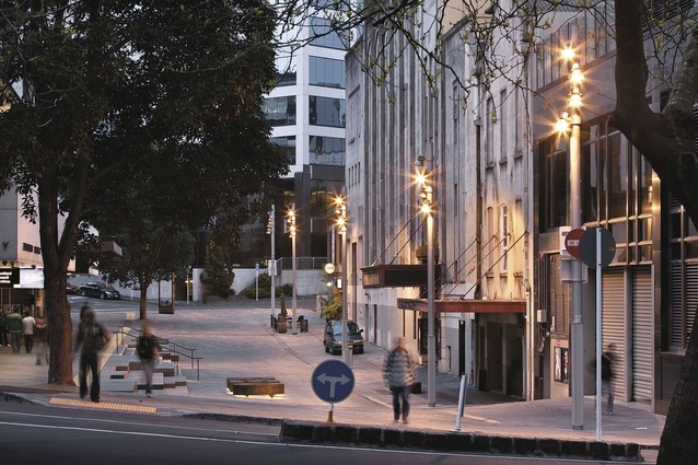
It may be on the fringe of Auckland’s ‘learning quarter’, as described by Auckland Council to sum up the parcels of land that incorporate the university, AUT, Art Gallery et al, but there was something about the Auckland Public Library on Lorne Street that tended to try one’s mental faculties. For one, it was difficult to decipher the front door, hidden, as it was, out of sight behind a dingy one-way street, a row of parked cars, a wall, and a footpath on a terrace under a canopy. It was, as they say, complicated. The library, designed in 1970 (by Auckland City Council Architects’ Euan Wainscott, according to Errol Haarhoff’s Guide to the Architecture of Central Auckland), was hiding its light under a bushel. Athfield Architects and GHD made some improvements in 2005 – a small extension added to the “mute” corner of the building, as reported in Architecture NZ back in 2006. In that issue, editor John Walsh, said that the new “transparent wedge enlivens what had been a dead corner at the end of a moribund street.” He also said, “One of Auckland Library’s problems is that its main approach and entrance has been so unceremonious. Its public front door looks out on the old grey backside of the St James Theatre. At this, its nether end, Lorne Street isn’t so much a road as a service alley.”
Enter stage right Ludo Campbell-Reid, main protagonist of the shared space scheme. The time had come for Lorne Street to get an upgrade of the pedestrian-favouring typology. Five such zones have been rolled out around the inner city, including Boffa Miskell’s Elliot and Darby Streets, now complete, and Fort Street nearly so. Lorne Street, an Architectus job, is also now done. Looking at the developments on this eastern side of Queen Street, urban designer Henry Crothers, who led the Lorne Street project, says you can now see a sequence of “events” along the progression of an alternative route through the city. He describes it neatly as “the Old Town route”, running parallel to Queen Street, from AUT to Britomart. Upper Lorne now bookends this route. Previously, this part of Lorne Street was just a sneaky place to park, and it was a view of parked car roofs that defined the library as one peered over the awkward balustrade that delineated building from street. “If you look at most cities around the world, libraries are generally located next to public space,” says Crothers. “The classic example is the New York Library, which has a beautiful set of stairs in front of it. People sit there; there are performances and busking, singing and gathering. There’s a social aspect. One of the ideas behind this project was to make it a space that connected to the library – and actually made it a library rather than a forgotten-about space around the back of Queen Street. This should be a destination.”
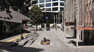
A key to the project’s success was to remove the separation between library and street. The shared space treatment devised by council and its consultants allows for a more streamlined connection, with paved ground extending the width of the space, connecting and unifying the upper terrace of the library with the base of the St James. With that organised, Crothers says the ambition was “to make the best set of stairs in Auckland.”
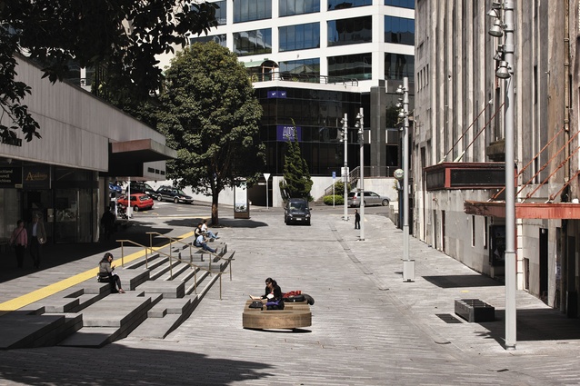
“You’ve got to give credit to the project managers at Auckland Council,” he says. “There were a number of options for the stairs, from the standard tiling stair through to this option, made out of massive, solid stones. These steps all vary in the depth – and we set up a module that worked around how heavy these slabs are, because there was a weight limit based on what piece of equipment would be able to lift them into place. Then we got the scale right, and pushed and pulled at it until we got some interesting shapes that also related to the geometric shapes of the library building.”
Architectus has already made a monumental set of steps – down at the waterfront’s Karanga Plaza. Those aggregate tidal steps wade confidently nto the Viaduct Harbour. The library frontage steps are equally confident, but on a different scale – these slabs of heavy basalt are muscular, like the stone-faced building itself, and confident. The varied heights convey the dual intention of bridging the change in elevation and providing a swathe of public seating. A site-specific poem by Robert Sullivan, elected by the library for the honour, and applied to the stair risers, is a lighter touch. This word-based art ties visually with Mary Louise Brown’s Byword series of inscribed public furniture, elements of which are positioned on the section of Lorne Street hemmed by Wellesley and Victoria Streets.
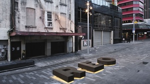
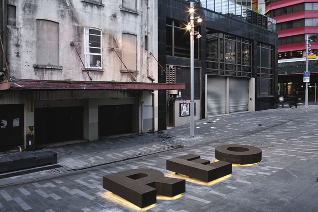
The urban designers also looked to the library for other design cues: sculptural bronze details from the building were replicated in the stair handrails and on the other feature-seating element – Reo. Comprised of three impressive bronze letters, Reo has the Maori language translation of Sullivan’s poem embossed upon it. “We thought we should carry on the idea of words and language in the furniture. The poem is site specific – a little story of the history of this part of town and its meaning,” says Crothers. “This part of town, the connection to Albert Park from here, the valley, the water below, and the vegetation are historically significant. We wanted to recognise this in a way that was understated, but permanent and grounded.”
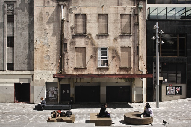
These key features, and those yet-to-be-installed lightboxes, give a presence to this part of town. Casual observation suggests that they draw people from the building to the street, enhancing a social aspect of the building. In this respect, Lorne Street differs from the other shared spaces. It’s not a typical streetscape – there are no shops and cafes, although there’s one bar; instead, there’s a big drop in level, a public building and a decrepit theatre. Activating the space at night requires the library to stay open later, which it now does. Eventually, if the St James reopens, then this space will be a valuable congregation area, which is perhaps one reason why it is not cluttered with greenery. Crothers anticipates criticism from some quarters about the lack of trees, but counters that the St James’s façade is “one of the most amazing things about this space.” “Its not beautiful and perfect, and there’s no doubt it needs a tidy up, but the fact is that it’s cool – raw and urban. We debated whether to put more trees in and, in fairness, there are probably people who feel that we missed an opportunity to green the space. But we felt that if you look back down Lorne Street it’s very green, and when the next phase is finished [Rutland Street end], then that will be very green as well.”
This space, says Crothers, can counter that greenery; it can be urban and the building can be a feature.
“That, of course, will make more sense when the building is actually being used – when, hopefully, there’s an amazing, working theatre here rather than just an abandoned old building.”

