Making waves: Moving House
An apparently faceless building by Architects EAT reveals itself as a layered and sculptural home that playfully controls light and shadow throughout the day.
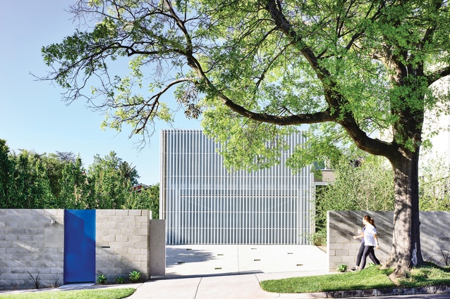
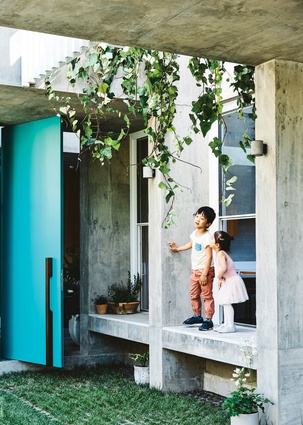
Just like those bus stop movie posters that change images as you walk by, this extraord inary new house by Melbourne’s Architects EAT is a shapeshifter. Situated on a leafy street in Kew, it presents a serenely geometrical composition to the public – in the foreground, the fence is a soft-grey horizontal stripe of concrete blocks and flat sheeting punctuated by a brilliant blue gate, and behind that, off-centre, is a white, square building clad in metal grille and translucent sheeting.
The house appears faceless, but because it is positioned back from the street and takes up only a little more than half the width of the block, the effect is intriguing rather than imposing. How would the passer-by extrapolate anything more than a simple rectangular structure from this view?
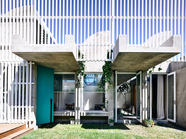
Walking through the blue gate still doesn’t reveal much. We see a concrete driveway ramping up to the front of the house – down one side is a generous strip of lawn perfect for a kick of the footy in winter, and waiting for a cricket pitch to be mown into it on Christmas morning; beyond that is a raised timber deck for watching the action on the grass and turning sausages on the barbie. Above, the white facade wraps around the side wall, broken only by some ground-floor windows and an entry door.
A few steps more and parts of the interior come into view. There’s an open-plan living area and a kitchen, and above – what’s that? Blue sky is clearly visible through the upper half of the facade. With every step further into the property, a wave-like concrete roof profile becomes clearer to the eye.
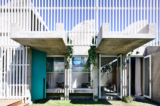
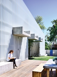
Viewed on an angle, the white metal bars of the facade form an opaque barrier, but from the side, with no translucent sheeting behind them, there’s much more gap than grille. We’ve been had! All of a sudden, this house that appeared to be relatively simple in form, and encased in a homogenous white shell, shows itself to be much more nuanced.
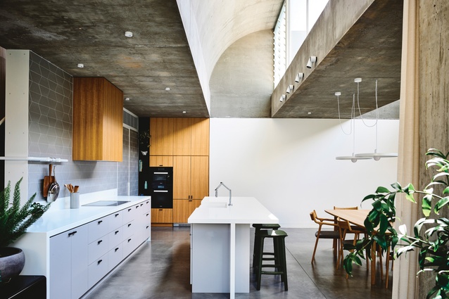
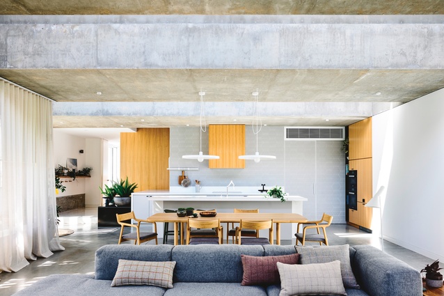
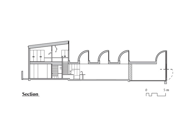
The roof form is quite beautiful. A series of parallel roof windows runs the full width of the ground floor, rising up like extruded ship funnels to bring northern sunlight into the open-plan living volume. Looking up from the kitchen at the southern end of the space, we see stripes of blue sky or cloud or whatever the day has to offer.
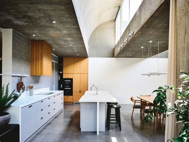
As the seasons roll by, the impact of direct sunlight on the interior changes; light from the low winter sun brings warmth and a bright radiance to the space, while in summer, the diffuse glow from the “funnels” brings gentle light yet no radiant heat.
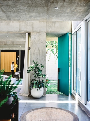
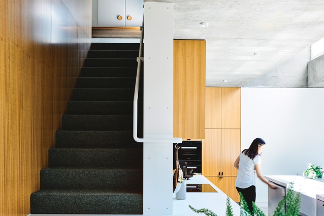
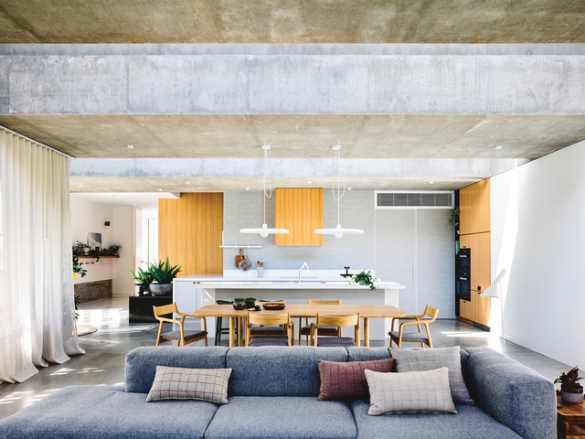
If the white metal grille defines the visual character of the house from the outside, inside it is the tone and texture of concrete that captures the imagination. On the ceiling, the concrete has been left raw and unpolished, inviting the eye to explore its variations in pattern and colour; on the floor, it is polished and sealed.
The effect of so much concrete is anything but heavy or oppressive – the way it has been shaped into such delicate, nonlinear, almost playful shapes; the way the light from the roof windows brings both strong contrast and ambient illumination; the way the ground-floor exterior wall, a combination of concrete and concrete block, is regularly punctuated with large windows – it all adds up to a structure that appears sculptural and light.
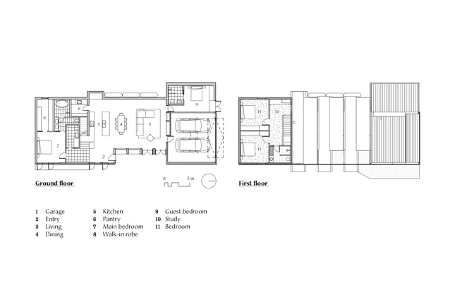
The living zone beneath the concrete waves is undoubtedly the heart of the home, around which other spaces are arranged. Behind the kitchen is the main bedroom and ensuite; at the other end of the ground floor is a guest bedroom and ensuite, and (thanks to the translucent sheeting on the northern facade) one of the brightest, most inviting garages you’ll ever see.
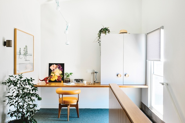
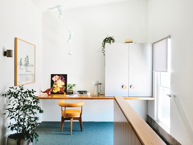
On a small upper floor over the main bedroom are additional sleeping quarters and a study zone for the kids; and then, through the windows onto the deck and lawn, is a garden that is more an extension of the living space than a separate area. The large windows here slide up and away, transforming the concrete window ledges into perfect places for reading, playing with toy cars, chatting to people inside or out, and shifting occasionally as the sun and shadows move across the house.
As Architects EAT co-director Albert Mo observes, an obvious move would have been to run the house across the full width of the block, with a garden behind the front fence, to maximize access to northern light. But this would have meant that the driveway to the garage ran through the main outdoor area rather than keeping the spaces separate.
Besides, the brief didn’t call for a “big house,” just one that could happily accommodate a family and guests, and that provided privacy. Some architects might have achieved this by presenting the street with a blank wall and a house focused in on itself; here, remarkably, it’s done with a very open house – just one that wears a disguise.
This article was first published on ArchitectureAU.com.

