Material Focus: Ahi Restaurant
Architect Jack McKinney was the lead designer for Ahi at Commercial Bay. In this collaboration with Warwick Fabrics, he discusses some of the material and fabric choices for this eatery.

In your hospitality work, you have often tried to maintain a fairly minimal palette. How do you ensure there is vibrancy and tension within that?
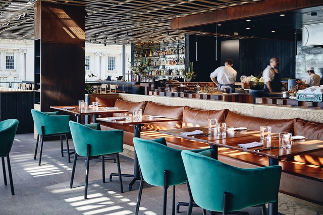
Jack McKinney (JM): I tend to work with a limited colour palette, with variety in the material expression. So, at Ahi, there is a predominance of timber but of many species, and of many textures. We see timber ‘raw’ (in the weathered and sawn slats woven across the ceiling), ‘cooked’ (literally burnt: the larch on the walls and the backs of the banquettes) and ‘cut’ where the clean, dressed timber is expressed (on the countertops and the inside faces of the banquettes). To avoid monotony, we chose to introduce quite a hard acid green in the form of the chair fabrics – this is the dynamic antidote to the hot tones of the fit-out.
Part of the consideration here would have been to select materials that did not detract from the views. Did your interior also seek a dialogue with that exterior?
JM: There are two exteriors to the space. The first is the ‘interior’ exterior, which is the food court beyond. We engaged with that directly by introducing windows that create views into the entry, across the working part of the kitchen and to the view beyond, and into the cool store. We then wanted a mental ‘palette cleanser’ for guests arriving so the entry is very blank: just dark, shadowy and black. This creates a sense of distance once they arrive. Then, there are the harbour and cityscape beyond, which are quite dramatic. We have planned the space to maximise transparency towards the outside from all parts of the interior – there is almost nowhere in the space without an outlook. This includes a lot of the service areas; it’s nice to give the staff a beautiful outlook as well.

Tell us more about your choice of fabrics for the dining chairs. Why did you select them and how does that match/work with the rest of the concept/materiality?
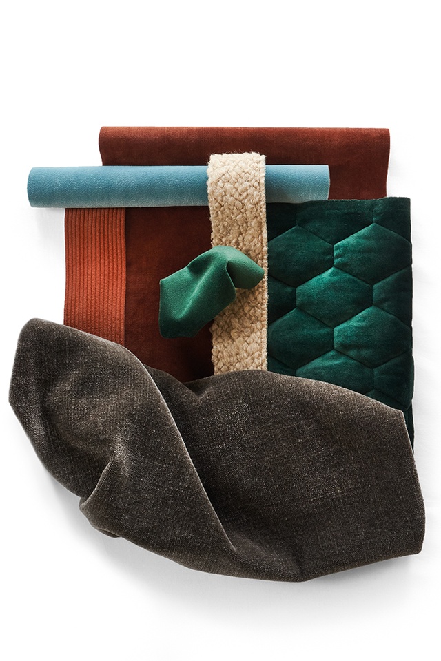
The predominant fabric is Warwick Fabrics’ ‘Plush Forest’. We needed a green tone that would balance all the red-browns of the rest of the space. This allows the chairs to stand out visually. The plush texture of the fabric seems an unlikely choice for a restaurant as it feels very domestic but it is durable and we liked this homely connotation. The velvet fabric texture responds to the dynamic daylight within the space so is actually quite active. The colour appears hard to photograph accurately for this reason.
Part of the brief for this restaurant was for it to represent New Zealand. How does the fabric fit within this?
JM: The chairs are designed locally by Simon James. The green completes the story of native timbers expressed in the space as a link to the foliage of growing trees. The colour is close to the greeny-black that is particular to our bush. We will introduce more planting to the interior, which will further underscore this relationship.
See more in the Material Focus series, including inspiration from the New York Grill, Naumi Hotel, Fabric Bistro and more, here.
ArchitectureNow and Architecture NZ work with a range of partners in the A&D supply sector to create appropriate content for the site. This article has been supported by Warwick Fabrics.
If your brand or clients are interested in similar creative content email mark.lipman@agm.co.nz to enquire.


