Material Focus: Seven
Partner Content: Spatial design studio SemiCreative was responsible for the interior fit-out of sophisticated new Christchurch restaurant Seven. We talk to creative director James Irvine about the project – winner of this year’s Hospitality Award at the Interior Awards.
What was your client’s brief for the design of this interior?
James Irvine (JI): It was to respect the building while creating a dialled-back space that entices you to sit down, open a bottle of wine amongst friends and stay for the evening. The offering was to be an à la carte-style menu with creative dishes designed for sharing and pairing with a range of local and international beverages. The space needed both to complement and to highlight the offering while adding layers of warmth and softness to the desired ambience.
How did the history of the building influence the overall concept?
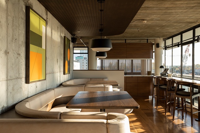
JI: It was significant in both determining the initial design language and then creating an anchor to build upon. The restaurant is on the seventh floor of the Canterbury Terminating Building Society’s former offices – the last remaining large-scale commercial building by local architect Peter Beaven. The architectural style, form and finishes had all been preserved in much the original state, which is rare for a building of its age. The seventh floor sits recessed below an overhanging concrete roof slab, which appears to float above a complete surrounding of glass and steel joinery. We set about finding a balance between highlighting these features while giving the restaurant a style of its own, sympathetic to the era.
What inspired the curved banquette seating?
JI: Because of the long, narrow nature of the space, it was important to create a feeling of connectedness from one end to the other. The 25 lineal metres of continuous seating allowed us to achieve this, whilst also creating pockets of cosy, intimate seating. Curves weren’t abundant but certainly had their place in a mid-century setting, particularly in furniture applications where comfortable seating was required. The sinuous nature of the design helped create a layer of softness against the heavily textured structural concrete it wraps around.

Tell us about your Warwick Fabrics’ material selection, in terms of colourways and fabrics.
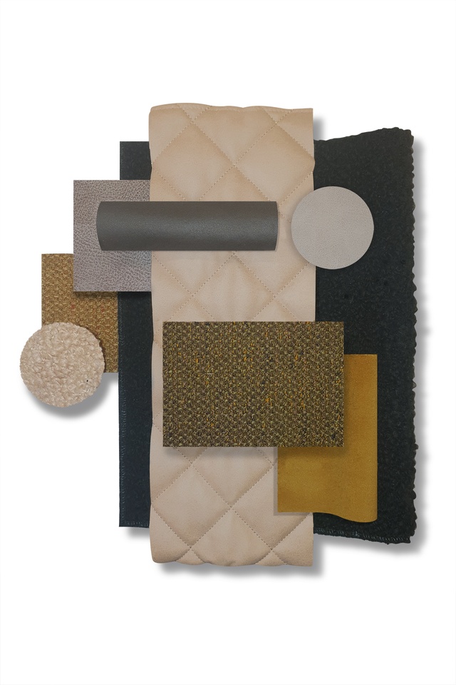
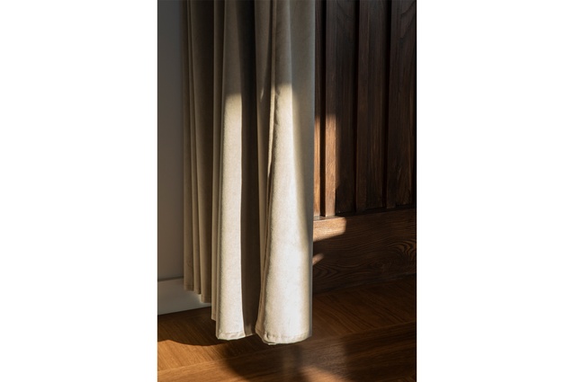
JI: There were two key products that were chosen for aesthetics and function, in equal parts. The banquette seating, made by Harrows, uses Pelle in the warm, creamy colourway Bone. Pelle not only looks and feels like a soft, well-worn fabric (perfect for creating a cosy, intimate setting) but it also holds a heavy commercial rating and Warwick’s Halo easy-clean characteristics: ideal for the odd glass of spilt wine. The drapery throughout the space uses Mystic in the colourway Putty. Mystic is a soft velvet which was used at both the main entry and the entry to the private dining. Its crushed-velvet properties add a sense of elegance and sophistication to the space while also achieving a heavy commercial rating as well as the appropriate fire rating required.
See more in the Material Focus series, including inspiration from the New York Grill, Naumi Hotel (Auckland), Fabric Bistro and more, here.
ArchitectureNow and Architecture NZ work with a range of partners in the A&D supply sector to create appropriate content for the site. This article has been supported by Warwick Fabrics.
If your brand or clients are interested in similar creative content email mark.lipman@agm.co.nz to enquire.


