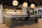
Material Focus: Spark Headquarters
The communal kitchen and breakout area features sliding doors that connect to the outdoor terrace.
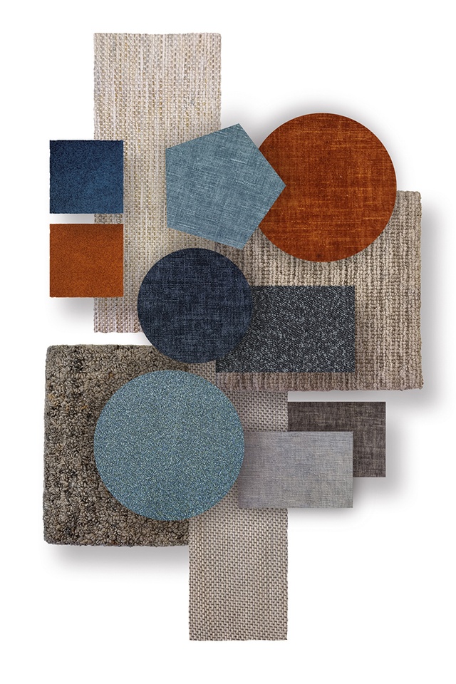
Ottomans feature Warwick Fabrics’ Copeland Hazel.
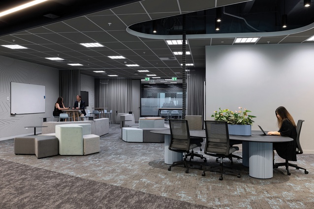
Modular ottomans feature Warwick Fabrics’ Corey Sky, Felix Thunder and Keylargo Sky.
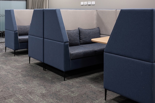
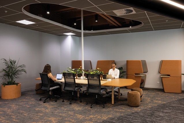
Meeting booths feature Warwick Fabrics’ Akito Ocean.
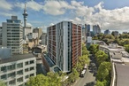
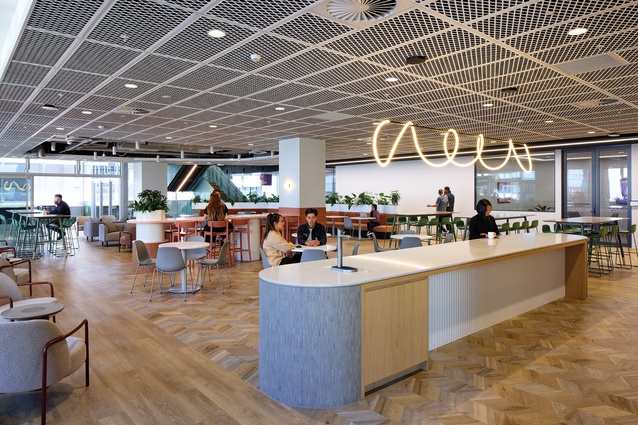
Cachet Group was tasked with uniting the Spark team under one roof at 50 Albert Street in Auckland. Lead designer Saila Wang talks us through the 12,000m2 project.
What was Spark looking to achieve with its new workspace?
Saila Wang (SW): Spark wanted to bring everyone together into one space, having previously worked within four different buildings. A lot of thought went into making the areas more functional across the six levels, offering a range of meeting rooms with tech upgrades for plug and play, as well as quiet rooms and gathering spaces. We collaborated with Athena Blue Global and Whare Timu on the workplace fitout strategy and cultural narrative, respectively.
Tell us about the cultural narrative and how Cachet translated it within the design.
SW: Spark is all about connecting people, not only as a telco but also with regard to its employees, teams and ‘neighbourhoods’. The te ao Māori concept of the three kete or baskets worked beautifully to bind everyone together — on the lower levels is te kete tuatea (the basket of encounter), in the middle is te kete aronui (the basket of humanities) and at the top is te kete tuauri (the basket of sacred knowledge).

How did you differentiate one floor from another?
SW: The six floors were split into the three baskets and a specific pattern was created based on each of the floors. Levels one and two featured the kaitaka pattern in the arrival spaces and meeting rooms, levels three and four featured the niho taniwha pattern throughout the meeting spaces and feature staircase and, lastly, the takarangi appeared on levels five and six. In addition to the patterns, each floor also had a coloured theme which assisted in visual wayfinding for the employees. We used colourways for wayfinding through the zones, as we transition from terrestrial to celestial. We started with neutrals, then moved to earthy red tones representing the earth’s core and lava, to blue rivers and oceans, terracotta sunrise and dawn, green forests and finally light blue and grey sky, clouds and space.

Tell us about your choice of fabrics.
SW: We selected a variety of Warwick Fabrics, including Maclaren, Copeland, Balmain and Brooklyn. Not only are the textures beautiful but, also, they offer a large selection of colours. This worked perfectly for us because we wanted to keep the same fabric throughout the project but we needed six colourways of that fabric to tie in with the colour transitions, moving up through the levels from earth to sky. Warwick had the right colours and tones, together with the right commercial durability, which made these fabrics the perfect choice
See more in the Material Focus series, including inspiring interiors: The Helier by Peddlethorp, Waka Kotahi NZTA by Designgroup Stapleton Elliott, Picnicka by CTRL Space, Arvida by Stack Interiors, Gulf Rise by Urban Lounge, and more, here.
ArchitectureNow and Architecture NZ work with a range of partners in the A&D supply sector to create appropriate content for the site. This article has been supported by Warwick Fabrics.
If your brand or clients are interested in similar creative content email mark.lipman@agm.co.nz to enquire.