Material Focus: Young + Richards
Harriet Pilkington – director of architecture firm Young + Richards – chats about texture and fabric selections for its recent project at Richards Partners office.

Interior: Tell us about the fabric choices you made for Richards Partners.
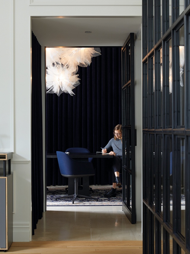
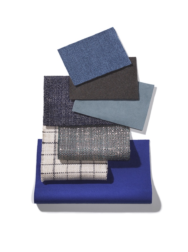
Harriet Pilkington (HP): In the boardroom we selected Warwick acoustic curtain fabric. We used it because it is soft and lightweight in a wide width and has noise-reducing capabilities, thanks to its weave. It is amazing that it will give an approximate 55 per cent reduction of noise in a room.
Interior: Were these influenced in any way by the new location or the building’s history as Auckland Magistrate’s Court?
HP: The client’s brief was for a quiet, luxurious space with pockets of privacy. The acoustic fabric was suggested by consultant Nigel Rye. It was a fabulous result that fitted the brief perfectly and worked in with the heritage nature of the space and our desire to provide a classic contemporary response to this.
Interior: Why did you think these materials would work so effectively in the context of a branding firm?
HP: The space required the feeling of an atelier with pockets of calm, quiet space. The fabric helped soften the hard flooring surfaces.
Interior: How would you suggest beginning an interior project that will fully redefine a brand or company?
HP: Richards Partners is my father Brian Richards’ long-established brand-development company. I have grown up immersed in his practice and been involved in the spatial consideration of how a ‘workshop for ideas’ can be created, striving again to create a canvas for each client’s brand innovation in this new Magistrate’s space.
Interior: Is there a formula, via material palette or otherwise, to ensure one maintains a client’s legacy?
HP: Our approach to design is never formulaic. We take time to listen and tailor our response and solution to the client’s needs.
Interior: What were some of the challenges in designing for a heritage building?
HP: In terms of designing for a space with heritage, we took the approach of a contemporary classic response to the space, using both modern and natural finishes. We were impressed with this fabric’s innovation – it’s an example of modern production possibilities used as a traditional drapery element.
The main challenge with this heritage space was that some of the heritage elements had been lost and altered during previous renovations, so we had to decide where to add and enhance and where to subtract. We modelled up the existing space in detail and worked from there. The original curved windows are stunning and are a main feature of the space.

Click here to hear from Walker Mitchell’s Kirsty Mitchell on the Material Focus for Hobsonville Point’s Fabric Bistro. And click here to see the Material Focus for Naumi hotel by Material Creative.
ArchitectureNow works with a range of partners in the A&D supply sector to source appropriate content for the site. This article has been supported by Warwick Fabrics.


