Meadowbank Kitchen by Godward Guthrie Architecture
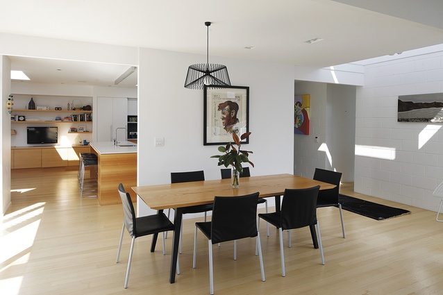
Nestled in a mid-century cul-de-sac in Auckland’s east was a 1960s house with a core in serious need of renovation. The client brief was simple: open up the centre of the house – the kitchen – for better family living. Both the physical and ideological heart of this home, the kitchen was previously shut off from dining and sitting areas. It was also an inconvenient thoroughfare to the main bathroom – a high-foot-traffic area for the young family that inhabits the house.
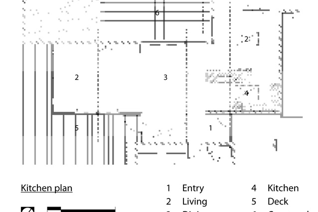
Working with the existing footprint, architect Julian Guthrie of Godward Guthrie Architecture relocated the bathroom to allow a more spacious kitchen. This also gave better flow to the morning courtyard.
Extending the kitchen to 2.8m by 4.8m, the renovation needed to be practical, informal and fluid.
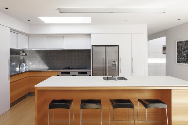
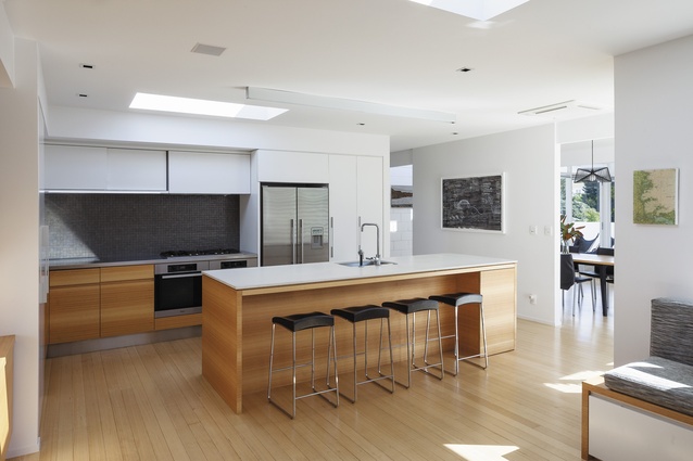
A Victorian ash veneer forms the floor, a material continued throughout the joinery. The central island features a 20mm honed-finish quartz top, and a long tubular light follows the island instead of a pendant, to keep the area open. Opposite the workspace is complementing barstool seating for four, adjacent to a built-in seating/toy storage area.
Materials were chosen for their “appropriateness to the style of the house,” says Guthrie, noting the timber’s warmth and white-painted joinery. “This works with the house’s modernist bones.” For the back benchtops, stainless steel was installed for durability and tie-in to appliances. Stainless kick steps take the knocks from the owners’ children, and the cupboard doors are handle free to prevent head injuries to running little ones.
A floating stainless-steel shelf also allows for clutter-free cooking, laid upon the feature porcelain mosaic tiles. A skylight was installed to remedy the kitchen’s windowless centrality, which “lets so much light in you can almost defrost meat on the back bench,” the owners say. The slide-out drawers are deep to fit the owners’ copious appliances.
They feature stainless steel (in sides and trim) as well, to complete the robust metal theme.


