Meeting under chevron hoods
Jeremy Smith contemplates the intricate origami planes of Studio Pacific Architecture’s Nelson Airport Terminal and ascends to the Cab of its playfully splayed trapezoid Control Tower.
The thing about being surrounded by National Parks is that you become quite hard to get to. We Nelsonians can’t go anywhere quickly by road. Rail is long gone and boats seem to be all about fishing. Planes, though, are a different story and more and more people are choosing to live out here in apparent isolation and commute through the air. Flying to Wellington takes little more time than going up and down, and Auckland is reached while many traverse the Southern motorway and find somewhere to park.
Apparently, more than 3000 people pass through Nelson’s airport every day, which, per capita of the local population, is second only to Queenstown: astonishing, given Nelson has no international flights.
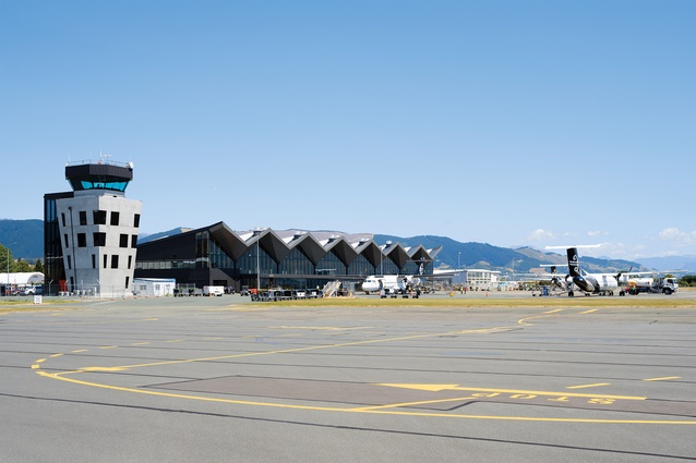
Yet, airports are also places where you spend time. There’s waiting involved. You can, as I have done, sit and write an article before boarding a plane, and find it is the waiting that opens opportunities for architecture. So, what’s under all these chevron hoods at Nelson’s new Airport Terminal by Studio Pacific Architecture? There’s plenty to take in and more than an understanding of our regional comings and goings.
Nelson was established as one of New Zealand’s first five cities but, as Ben Schrader records in The Big Smoke, Nelson didn’t grow. Auckland, Wellington, Christchurch and Dunedin all grew rapidly while Nelson flatlined, largely because of “a poor port and small [area of farmable] hinterland”.1 However, it really is growing now and what I like about the new terminal is that Studio Pacific hasn’t suggested that, as their city expands, Nelsonians need to abandon any regionalist pride or have something the same as anyone else has.
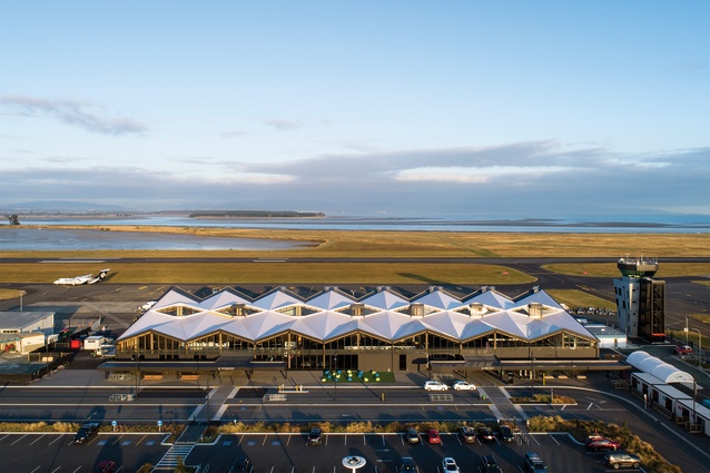
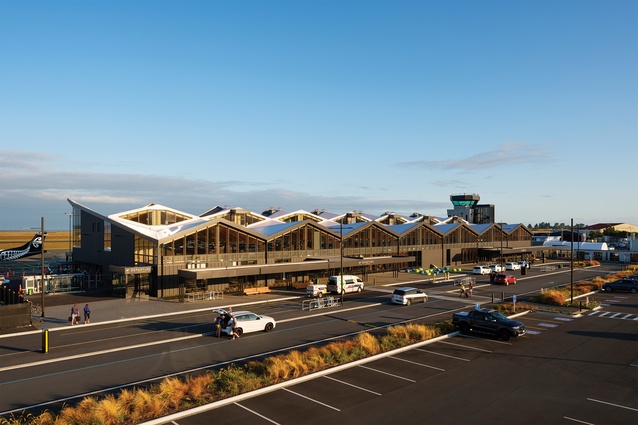
The building hints at this from afar with its faceted chevrons shaping over what might otherwise be a fairly predictable rectilinear perimeter. But this roof is not another supersized wing that airports the world over seem to be fashioning. It is more a collection of inter-parking little planes. Studio Pacific director Evžen Novák says the form developed from the shape of mountains, Rhino computer modelling and origami paper-folding sessions. However, it quickly became about what it meant to be in the building. This, he says, is “where you say hello and goodbye to your place”.
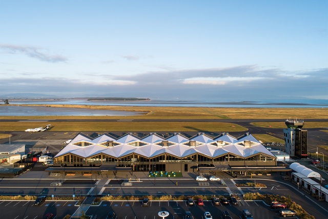
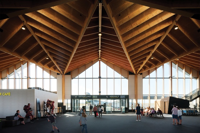
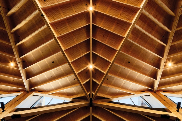
He’s right; the folding and intersecting timber roof planes unmistakeably draw in the terrain but the sense of regionalism extends further. Novák points out that the timber is locally grown – the structural laminated veneer lumber (LVL) is from Nelson Pine Industries up the road – and prefabricated into modules in one of the old hangars nearby. Building with what is local is not just regionally sensible, for timber also provides a net carbon sink.
In their published paper on the building, Novák and team suggest around 300 tonnes of CO2 equivalent is embodied in the building, and that a steel-framed building might expend similar levels of CO2 again.2 In this nice prompt to the ongoing need for measurement in cyphering all things sustainable, they are quick to note these as very approximate calculations, with the full impact not yet independently reviewed. Architects can’t do all the maths, of course, but understanding the impacts of the ways in which buildings are designed is increasingly important. The sustainable impact of Studio Pacific Architecture’s approach and timber use is not to be taken lightly and neither is the technical know-how in undertaking this type of expressed structural work.
Making this look easy isn’t easy but engineer Alistair Cattanach and the team at Dunning Thornton in Wellington have made some extraordinary moves. The structure has shear planes in the roof, and uses the criss-crossing LVL beams and rafters combined with plywood to provide diaphragm action and create structural depth. It then integrates steel diffusers – Tectonus resilient slip friction joints (RSFJs) – into the timber columns to provide friction damping to withstand seismic activity and dissipate seismic energy.
There is plenty to get your head around in the slotted plates and high-strength bolts and disc springs in these RSFJs placed in view, up high in the columns. The dry structural explanation is that: “when the applied joint force overcomes the frictional resistance between the sloped bearing surfaces, the centre slotted plates start to slide and energy will be dissipated through friction during cycles of sliding.”3 The outcome doesn’t require such heavy thinking. By capturing and dispelling earthquake loads, this innovative engineering drastically improves the performance of the building in a seismic event. The idea is to provide resilience so that the building is operational immediately after a quake: more resilience, less post-quake maintenance.
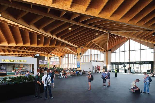
All these wonderful games are expertly guided and expressed by Studio Pacific to make a repeatable 15m free-span module that is legible and extendable. There’s no trickery and no need for a suspended giant eagle artwork or games played with ceilings. The roof is lean and folds both sides – you can imagine the origami sessions.
But there is also bravery. Novák and his team have done more than talk to the importance of sustainable design – they’ve gone out of their way to demonstrate it by ventilating the terminal concourse naturally. Aeroplanes are noisy and heavy on fuel and carbon, which immediately complicates opening things up. But what better place to do this than in Nelson, which prides itself on being a smart city and for its environment and climate?
We forget that all buildings used to be ventilated naturally but, also, that leadership is required in finding our way back to more sustainable buildings. For ‘smart’ doesn’t need to denote any kind of digital reliance; it can mean just simple, albeit, in this case, with quite a lot of kit on the roof. While planes might ultimately become electric, like cars, efforts like Studio Pacific’s here can’t be taken lightly, for this forwards the now. Ultimately, many of the answers to climate change are likely to be found in spaces that move air without plant, like this. We might all need to return to wearing or not wearing jumpers occasionally, even at airports; but isn’t that the point?
Novák points to the shape of the roof rising westwards towards the runway so that it can open on the east away from the aeroplanes and draw in air low before funnelling it upwards and out east again through steps in the roof. The chevrons then shape an eave to reduce the load from the western sun and heat to dispel air through cowls at the peak. There is still plenty of western glass facing the infamous Nelson sun, but the hustle and bustle and extra hot air involved with ticketing and dropping off bags are held out of the direct light and cleverly shielded from the sun by the secret world of where bags are loaded onto planes. There are offices and support spaces up top which receive some air conditioning but, with convection air rising, the concourse is the best place to be.
So, as I sit waiting for my plane, life underneath this wonderful roof feels pretty good. Timber helps de-institutionalise buildings through warmth but also a sense of craft. The combination here of dark metals and wood is one that we often see in houses and running window seats to the perimeter plays out this homely feel further. Yet, as I look, those on the window seats are framed in the view. I look to where I am sitting, in the main seating area in the middle of the concourse; there’s a question here and it’s all in the waiting.
Being anonymous is hard in a place like Nelson and my writing is being continually interrupted by hellos and goodbyes from people I know. Underneath the scissoring roof is a strict rectangle, which counters the meandering of the former terminal by local architect Alex Bowman. If the new terminal folds to create space in section, Bowman’s folded in plan to a myriad of corners. Here is where Nelsonians sat waiting for a plane, out of the way with their backs to a wall, watching from behind a newspaper or just writing stories.
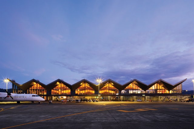
No such hiding now: despite all this space and the placement of retail boxes inside the terminal, corners remain difficult to find. But, after some 170 years of slow progress, Nelson is just now entering its teenage growth spurt. You have to expect some oversized clothes and new adventures. There’s no point adolescently looking at your feet. You can’t under this roof; it makes you look up. Sometimes it takes a big cousin to come in from the city to change things up.
Perhaps this is Studio Pacific’s real contribution. This new terminal isn’t about being an individual; it’s a meeting place, a place to see people and chat, to be uplifted. It makes time for the moments between the greetings and the goodbyes.
And, when you think of how, increasingly, people travel to and from Nelson, then this terminal really is the gateway to Nelson. Terry Stringer’s recent sculpture out on the northern road entry into Nelson can’t compete, no matter how fine. This is arrival and here’s your sculpture: it’s in the shape of your mountains, it’s about your timber, your climate and your people, and it comes under a roof. Keep talking; Nelson’s a fine place to be.
Popcorn box vistas
Towers just aren’t that common any more. The Rapunzel approach of making a single space way up top doesn’t seem to fit well in modern life. Just as well, too, but I also imagine that letting down your hair isn’t something that comes as standard at Air Traffic Controller School. Yet, neither do I quite picture a never-ending supply of coffee and cigarettes that the movies depict on cold snowy nights when the power goes out during unbelievably big storms with planes full of snakes desperate to land. So, I’m quite excited at the prospect of climbing up and meeting the princesses and princes who spend their days up there doing a job that just has to go right.

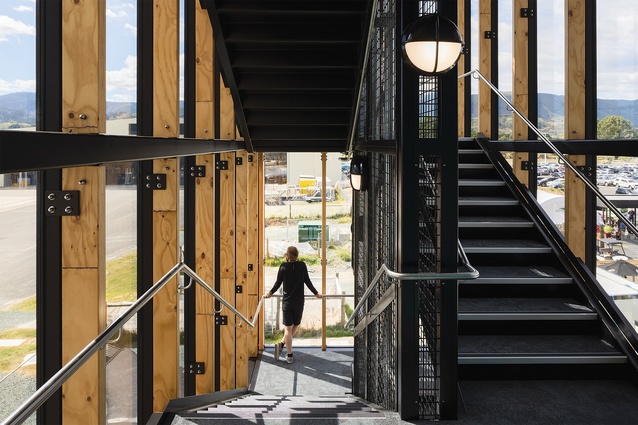
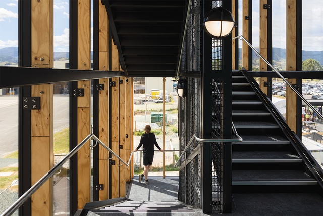
Interestingly, entering still requires calling upwards. But, as if to dispel the fairy tale, Studio Pacific has provided a glazed stair for me to climb. We need just to be let in. Perhaps, medievally winding up a spiral stair for 17 plus metres might cause giddiness, which presumably isn’t in the handbook for how to start a controlling day. I have much to learn. The real reason, I’m told by Novák, that Air Traffic Control towers don’t have lifts is the controllers need to be able to physically work outside on the deck in emergencies.
Stairs take a lot of space and, therefore, by separating them, the tower becomes free to be used for office and technical support spaces without the lighthouse-planning approach where every space is visited on the way to the top. Yet it also works to connect the controllers downwards. It’s a long way down to collect the milk but the glass stairwell provides a second window, one that you actually might be seen in. Those Rapunzels up in the tower are part of a larger airport team, after all. They don’t need to be rescued; they are doing the rescuing. Seeing a stair makes everything a little friendlier: less Tower of London, less Dark Lord Sauron’s Barad-dûr.
This is important and clever. The tower won a 2019 NZIA Nelson Marlborough Award for Public Architecture but, of course, it is no more public than is a bank vault. You can’t just pop up for a look when you’ve run out of things to do while waiting for a plane. As if to remove any secrecy, Studio Pacific hasn’t just glazed the stairwell, it has also expressed the services, even making the fire risers shiny between black metal grates and adding some warming timber.
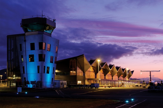
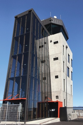
But, if the stair is the support act and made less troublesome than a good plait, the tower’s something quite different and unexpected. Comfortable rooms stem off at each landing, yet it is all slightly topsy-turvy, with each floor increasing in size in an inverted, outwards-splaying taper as we ascend the five-and-a-half storeys. Well, perhaps it is closer to six but there is a bit of strange on the way up – a staffroom, offices and, ultimately, three-quarter-height tech rooms. I’m not sure what that says about the technical world but it feels a little Being John Malkovich. Then we arrive at the view, what they call the ‘Cab’, where it’s fair to say the eye can see everything.
As architects, we often think planning rules are stringent in our cities. Airports are in another league. Novák takes me through some of the runway setbacks, movement paths, height planes, view lines, canting. There’s a mathematical reason for having five-and-three-quarter storeys and, clearly, plenty of architectural conducting to match the conducting of planes for, remarkably, there’s not a video-camera screen in sight. There’s radar and a continual intercom filled with Foxtrots and Alpha Bravoes. This is a place of audio and visual procedural control.
Clearly, it works, for, from up here, I see planes on the runway and in the air, multiple landing strips, and a world of airport baggage movers, trucks and workers. Nelson airport isn’t JFK but it’s busy with leaving and arriving also requiring taking off and landing – all of this makes for a noticeably higher degree of difficulty in the workplace than for, say, timetabling a bus station.

It’s also kind of surgical observing what’s happening up here in the tower – impressive, assured and beautifully calm. It turns out that hair doesn’t need to be tightly cropped or even held in a bun. It’s not so Rapunzel-wild that they might do away with the stair and revert to a plait, but life up here isn’t as heavy as are the manual and maths that come with the brief. There is simply an important job to do.
This is why the play in the tower is so nice. It is a building needing some height and a really big window yet Studio Pacific do well more than that in giving the tower some life in an attempt to provide just what the building can’t have: a public life. It’s not blown sideways like Wellington’s Control Tower, just a little skewed in what might be some kind of regional commentary. The tower is heavy and robust but its windows are scattered rather than medievally placed. There’s pragmatism, too; the walls are angled outwards but strategically so – helping to lower the sun load – and each floor braces a structure that sits on a seismic base. The tower isn’t there just to hold the bubble atop the top but it does look slightly Dr Seuss, its two distinct parts somewhat salt and pepper shaker-like.
It’s a nice gesture and this is a nice place to work. As air traffic controlling becomes less procedural and more digital, and, dare I say, cloud-based, a tower like this could well be surpassed by a squash court-type room somewhere out the back or even far-faraway.
So, credit to Studio Pacific for letting down its hair a little. It’s a pity, perhaps, that all the groundworks and security fences are necessary and that the simple lock at the bottom wasn’t enough so that those who ascend the tower each day aren’t as visible as they deserve to be. But, perhaps, that’s just all part of not living in a fairy tale. I’m sure I’m not procedurally cut out for air traffic controlling but the team from Studio Pacific Architecture might well give it a go; clearly, they understand the manual and more.
1 Ben Schrader, The Big Smoke, New Zealand Cities 1840–1920, Bridget Williams Books Limited, Wellington, 2016
2 Evžen Novák, Samantha Zondag, Sarah Berry and Simon Hardy, ‘Nelson Airport’s new terminal – overview of the design of a large-span engineered timber specialist building’, NZ Journal of Forestry, November 2018, Vol. 63, No. 3, p. 14.
3 Ibid p. 15.

