Melrose Bathroom
Many of us are attracted to the charm inherent in period architecture; but charm can quickly lose its lustre when modern living is compromised. A fine line, therefore, needs to be trod between respecting the past and servicing the present. Located within such a property, this new bathroom seeks to do just that.

One of the first challenges facing architects Cecile Bonnifait and William Giesen – and one implicit in many period homes – was a lack of space. At a nudge over 100 square metres, floor area was at a premium.
“Luckily, there was a small area of flat land behind the original bathroom that we were able to incorporate into the new design,” says Giesen. “This allowed us to square off the rear of the house, with the result being an extra 6-8 square metres added to the floor area.”
The added space, along with a reconfiguring of the existing layout, has resulted in a larger bathroom and second bedroom. Next on the agenda was tackling the lack of natural light in the south-facing space, while ensuring privacy was also maintained.
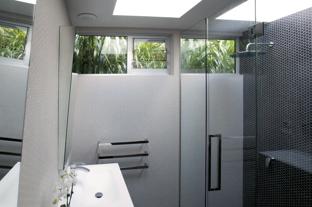
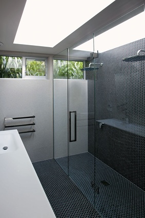
“Standard windows were not an option, so we incorporated three large skylights into the design – two in the bathroom and one in the separate toilet, which is located behind the wall of the shower,” says Bonnifait.
Clerestory windows along the southern wall also help to lighten the interior, while the louvred panel aids in natural ventilation. Functionally relevant to the space the windows also serve an aesthetic purpose, highlighting a swathe of verdant green to offset the otherwise achromatic colour scheme.
“The interior of the house has a very neutral base palette with the owner’s artworks providing splashes of colour,” says Bonnifait. “When devising the colour and material palettes for the bathroom we wanted to bring that simplicity into the new space.
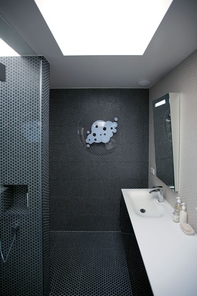
“Classic French mosaics were specified, but in a warmer, more contemporary variant – charcoal and cream – of the equally time-honoured black and white scheme. Similarly, rather than a traditional chequerboard or rosette pattern, we have blocked the colours to impart a sharp, modern feel.”
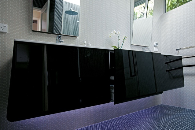
The high-gloss, twin-sink vanity with recessed LED lighting completes the modern-classic look.
“Essentially, we wanted to create a space with a sense of elegance; one that evoked the hand-crafted quality that lies at the heart of the property. The challenge was to retain the modesty of the structure while combining with that, the modern feel the owner has injected throughout the home.
“The resulting simplicity of style belies the consideration paid to every aspect of the project.”


