Sydney house by MCK Architects
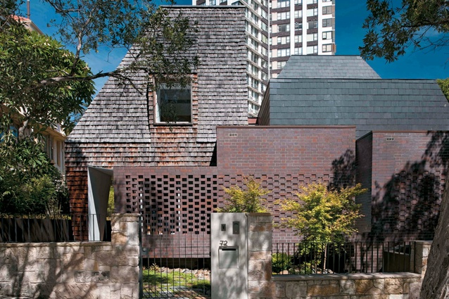
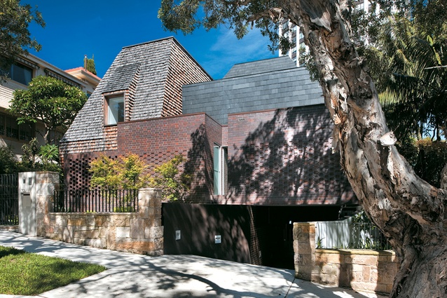
From the street this house by MCK Architects almost gives a nod to a Parisian maisonette. Its modest and layered frontage with a hit-and-miss brick screen give glimpses of the home beyond while being faithful to the heritage of the surrounding buildings and neighbourhood. After passing through the front gate you become aware of the folding nature of the architecture, which at some points rises high above the ground, and sometimes threads back into it.
Mark Cashman, of MCK Architects, describes the “memory game” this new design plays with the house that was demolished to make way for it. It is the same scale and reuses brick for areas of the floor and walls. The design also draws reference from the timber shake and slate roofs of the nearby St Marks Church in Darling Point and its chapel beside.
The clients are a Japanese wife and Malaysian/Chinese husband and their two daughters. After moving from New York to Sydney they wanted the Australian dream of a home by the sea that also considered their international background. One starting point was a collection of doorknobs from around the world (which were used throughout the house), and another was an oriental screen. This Japanese aesthetic is ever-present in the house but especially in the tatami room, which holds the family’s most treasured objects and is a place of reflection.
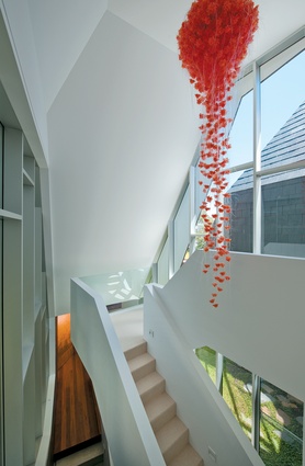
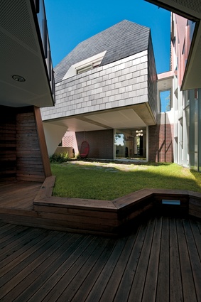
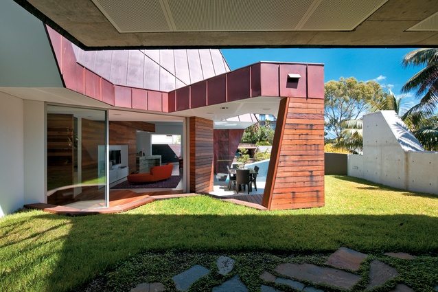
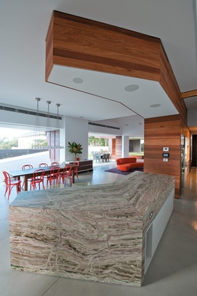
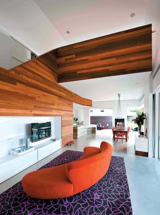
Inside, the spaces pleat together over three floors. While timber shingles, copper and brick command the exterior of the building, the inside is sometimes cool white, with plaited insertions of marble, then later the outside blurs with the interior with walls of brick and concrete that flow organically from inside to out. Rising up through the dwelling the architecture moves and twists: a patterned geometry dancing together, each step mirroring and pivoting, creating a complexity to tickle the fancy of M.C. Escher. Some areas have a cathedral-like feel, with the ceiling sweeping above and then folding to the floor like a fine origami box. The house appears to be a part of the landscape, with the ground continuing onto the landscaped garage roof, spreading the usable area of the garden onto the house itself, an architectural idea which was integral to the design.
Neighbours had mixed opinions of the project, which is not unexpected in a strict heritage area when faced with a modern building. Over the period of construction one neighbour would often comment to the builders: “How’s the power station going?” The design is a result of a whirlpool of constraints, a building mass honed by council conditions and carved to consider views of the harbour from surrounding properties. The architects chose to use this tug of war to critically analyse and enhance their design.
At the rear of the property is a finely crafted garden where the architecture becomes less constrained. A swimming pool is strongly grounded into the sloped site, appearing to wind out of view beneath the house, the end of the ribbon of architecture tucked tidily away.

