2013 Milan day three
Penny Craswell visits Milan’s courtyard gardens of Spazio Rossana Orlandi and 10 Corso Como, and the design district of Brera.
While the fair itself has a lot of design that is very inspiring, it is only one aspect of design week in Milan. Usually it is the very large brands who display at the fairgrounds, not the smaller, more avant-garde designers, and the setting – a series of vast, industrial halls – can be a bit dry, or overwhelming.
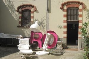
Thankfully, a lot of design week happens in and around Milan city, and this juxtaposition of contemporary design with the city’s historic fabric and gardens makes for some of Milan’s most rewarding moments. On day three we visited two such locations – the courtyard garden design destinations of Spazio Rossana Orlandi and 10 Corso Como, and the exhibitions and showrooms of the Brera district.
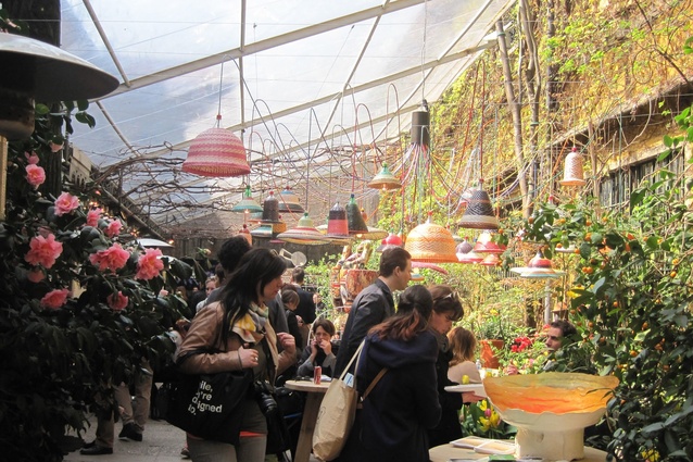
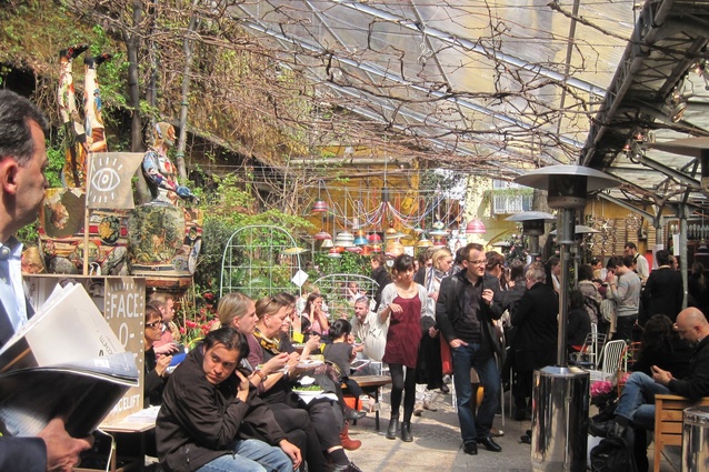
First, the gardens. Rossana Orlandi, at seventy years old, is one of the most iconic figures in Italian design. In 2002 she transformed an ancient building and former factory into a series of galleries and a shop called the Spazio Rossana Orlandi. Each year during the Milan fair she shows a collection of exhibitions, featuring everything from student designs and other quirky pieces to the work of the latest hot designers, all within her courtyard garden, where traditional Italian food is served by genuine Italian nonnas.
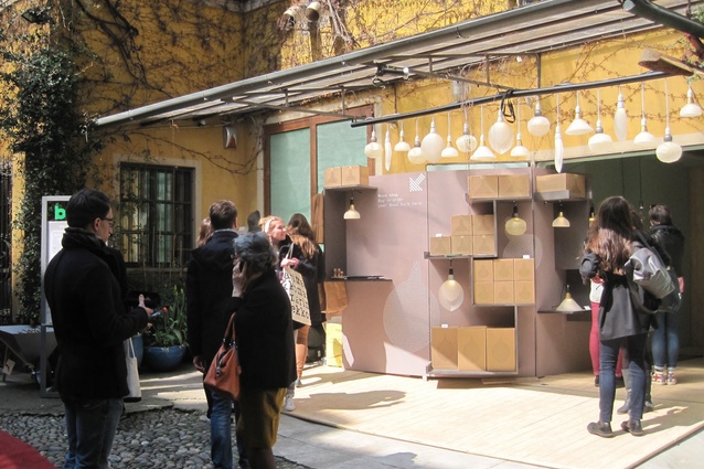
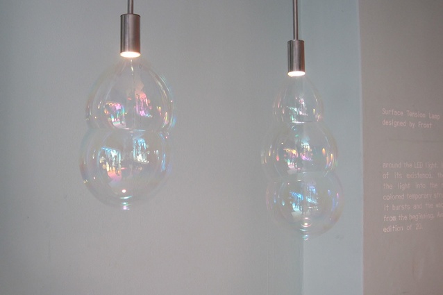
This year there were a few standout pieces, including the sustainable LED bulbs by lighting company Booo, which combine the bulb and the shade. Most striking is the Surface Tension Lamp by the Swedish design studio Front; its shade is created by bubbles that continuously form and burst on the light-emitting part of the LED.

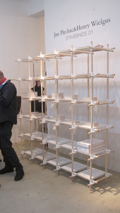
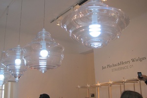
Nearby, the work of Czech designers Jan Plechác and Henry Wielgus from Jan and Henry stood out for its simplicity and impact. Stavebnice 01 – existing as either a desk, shelving or hanging system – joins blonde timber and white connections as a series of perfectly symmetrical, balanced rods, while a series of glass pendant lights called Neverending Glory are a study in fragile perfection.
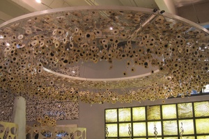
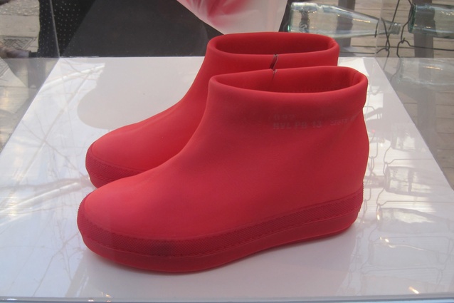
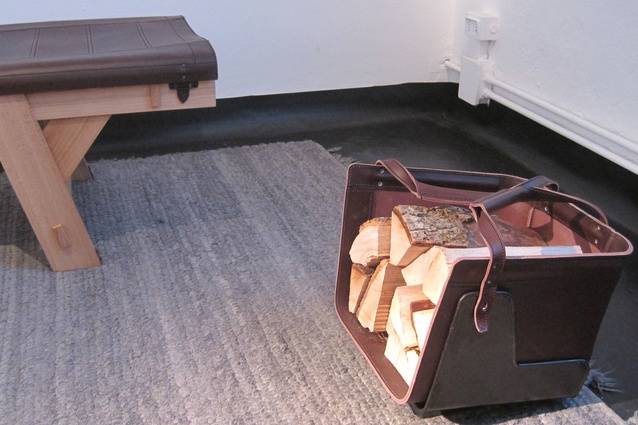
Also simple yet effective, the Poke stool is the first foray into furniture for Korean-born Swedish typographic designer Kyuhyung Cho. A series of circles in the seat of the stool allow the legs of other stools to be poked through to create a stackable and playful piece. Other highlights included Dutch designer Thomas Eyck’s new range of furniture incorporating leather, which includes a beautiful firewood carrier in brown, and Pure, Jean Nouvel’s range of gumboot-like shoes in bright hues.
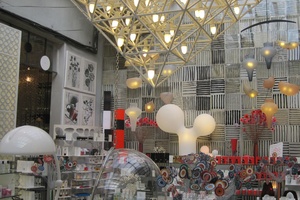
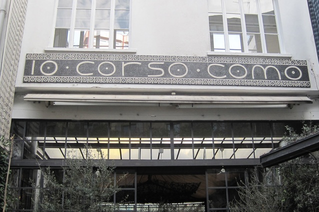
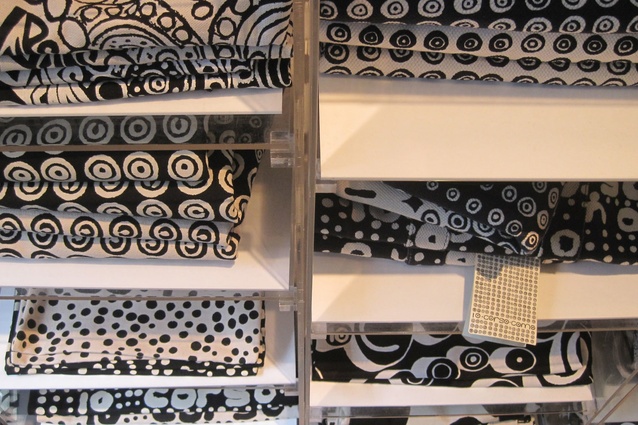
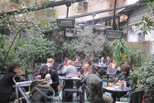
Next stop was 10 Corso Como – a combination of courtyard cafe, store and hotel that opened in 1990. The complex is known for its fantastic graphics – a black-and-white circle motif that can be found everywhere from signage, to a paper chandelier, to accessories, souvenirs and wrapping paper.
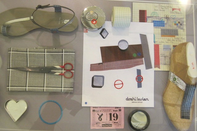
This was a chance to relax with a glass of prosecco, but there was also time to stroll through the curated fashion and design collections in the shop, including the new range of Camper shoes by Doshi Levien.
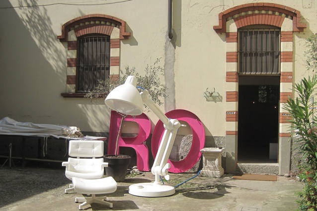
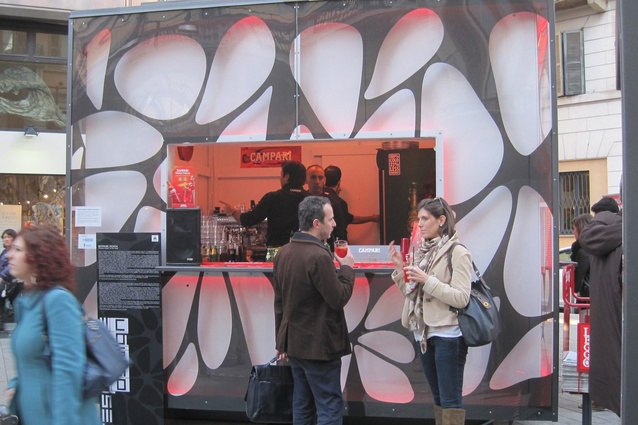
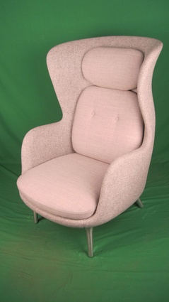
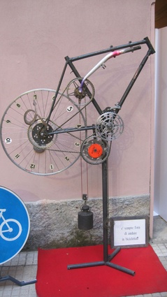
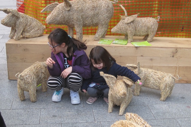
Finally, an evening stroll through the Brera design district provided a chance to visit the showrooms of Fritz Hansen, where the new Ro chair by Jaime Hayon was launched, as well as turning up some interesting exhibits including a clock made of bicycle parts, a pop-up Campari bar and some animal sculptures made of straw that had some nearby kids entranced.

