Mildred & Co
A “gritty urban setting” is how Jose Gutierrez describes the neighbourhood that surrounds one of his latest projects. He’s not wrong. This small showroom and bridal-party wedding list business, which can also level up as an events space, sits in the heart of Newton, a neighbourhood of blocks adjacent K’ Road that were sawn off by the North Western Motorway as it clove through town in the ’50s.
The rough charm of the neighbourhood, however, has been polished in recent years, as newer businesses begin to coexist with or replace those with more of a light industrial bent. Within a stone’s throw of Mildred & Co, for instance, a business that occupies what was once a rundown mechanic’s workshop, you’ll find the ad agency Consortium, whose yellow roller doors set in a bunker-like concrete-block building have long been a Gundry Street landmark. Next door sits Art + Object, an auction house that abuts two of the boundaries of Mildred & Co’s tight site; and, almost directly over the road, you’ll find the Auckland Old Folks Coronation Hall (which, faded and yellow, is not exactly a great shop window for the prospects of the aged; that it sits boldly emblazoned with ‘Auckland Old Folks’ Ass.’ proves perhaps that losing your marbles and retaining some levity are not mutually exclusive.)
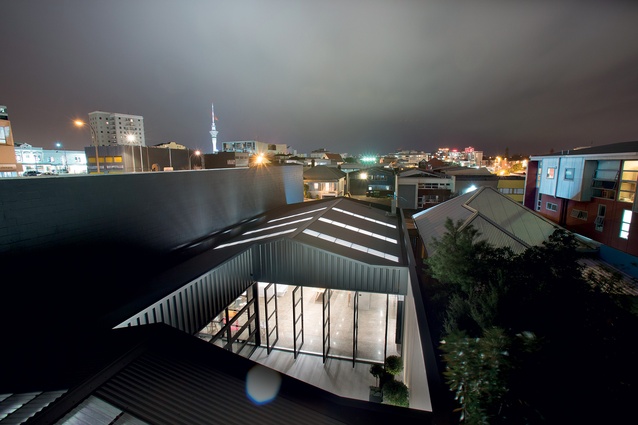
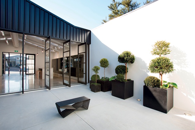
Back to the matter at hand: on his allocated site, Gutierrez has mostly designed in the footprint of what was already there, albeit with some new sections of building containing storage, at the rear, framing up a neat courtyard. The brief, he says, was to create a neutral and flexible space, something that could be leased out for events but also bold enough to define a brand. The solution focused around a “study on scale and proportion, as well as controlling light, reflections and acoustics”. The form of the original building was retained and new sections of building were added around the perimeter of the site to create a courtyard, which, says Gutierrez, “gives a sense of release and openness within the surrounding dense urban fabric”.
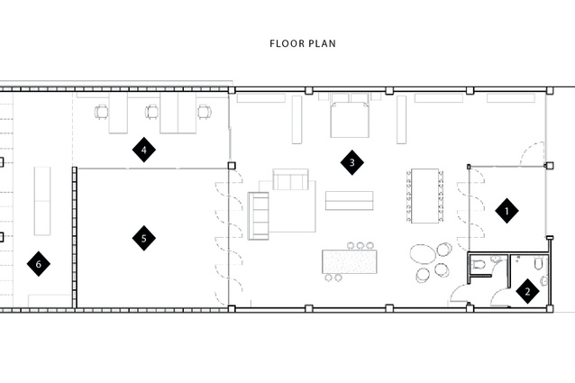
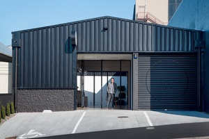
Viewing from the front of the building, which is freshly reclad in black steel, you might describe this project as the ultimate lock and leave. It may be a showroom but, should circumstances change, it’s not hard to imagine it being adapted into a great city pad. The black steel, says Gutierrez, was “selected to turn the façade into a shadow, giving the sense of a void, a negative space”. The great joy of this is that makes the journey one from dark to light, with the interior’s whiteness highlighted via contrast. Inside, the plan is remarkably simple. There’s a main showroom space, with small bathroom and shower tucked away to the side of the entrance foyer; the small courtyard and the narrow office area runs down one side; and, finally, a neatly organised storage room wraps across the back of the outdoor space.
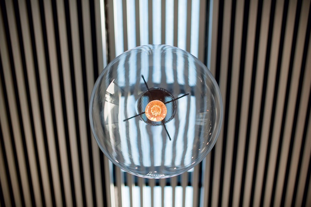
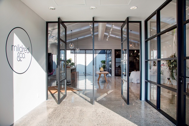
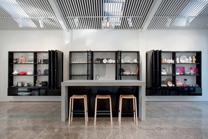
Once the threshold is crossed, via the entrance lobby’s high pivot doors, you will find a pristine interior with buffed concrete floors and a white timber-battened ceiling. The battens, in place to hold up the acoustic insulation, give the space both a rhythm and a human scale; they also filter natural light, and the shadows cast at certain times of day can be intriguingly abstract. Gutierrez says that in their form, the battens “mimic the negative and positive undulations in the old corrugated iron roof”.
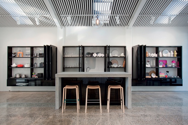
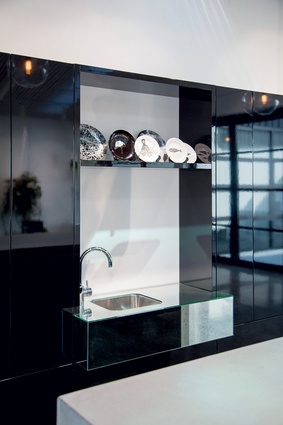
The other key architectural moves in the main space are the highly reflective, wall-mounted, black cabinets, which allow the showroom’s wares to be safely stored when it is being used for events, and the concrete island, with kitchen amenities cleverly stowed away within. With the exception of the island’s waterfall concrete top, which is more matte, the surface finishes were carefully selected to create reflections and enhance the movement in the space, high-gloss black lacquer cabinets, hyper-polished concrete floors, glass pendants all contribute to this, says Gutierrez.
Overall, the spaces are defined by variations in volume and scale. The idea is that it is not just one stagnant space – every aspect of the design has been rigorously considered to create a dynamic space that can be experienced in various configurations.
“The physical transition into each of these spaces is a defined experience,” he says. “Stepping through to the courtyard becomes an architectural experience; the threshold remains defined but still allows for movement through the space.”
To enhance that experience, the high, pivoting doors and the cabinetry were conceived of as sculptural pieces in their own right, says the Gutierrez. “These are designed to create a dialogue with the architecture in both their open and closed states. Their configurations transform the dynamic, mood and architecture of the space.”

