Hospitality at home: Millswood House

Click to enlarge
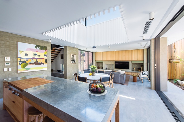
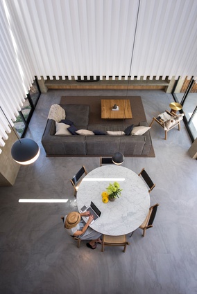
A void above the living areas lets plenty of light in, which is perfect for the owners, who spend a lot of time entertaining in the kitchen. Artwork: Michael Muir.

A void above the living areas lets plenty of light in, which is perfect for the owners, who spend a lot of time entertaining in the kitchen. Artwork: Michael Muir. Image: David Sievers

1 of 11
At once robust and sophisticated, the kitchen’s material palette includes burnished concrete and Tasmanian oak.

At once robust and sophisticated, the kitchen’s material palette includes burnished concrete and Tasmanian oak. Image: David Sievers

2 of 11
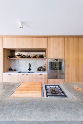
The custom off-form concrete island bench features bespoke elements, including a timber chopping board that covers the cooktop.

The custom off-form concrete island bench features bespoke elements, including a timber chopping board that covers the cooktop. Image: David Sievers

3 of 11
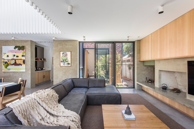
The architects have used timber, bagged brick and burnished concrete to create the perfect setting for the clients’ furniture and art collection.

The architects have used timber, bagged brick and burnished concrete to create the perfect setting for the clients’ furniture and art collection. Image: David Sievers

4 of 11
The architects have used timber, bagged brick and burnished concrete to create the perfect setting for the clients’ furniture and art collection.

The architects have used timber, bagged brick and burnished concrete to create the perfect setting for the clients’ furniture and art collection. Image: David Sievers

5 of 11
A void above the living areas lets plenty of light in, which is perfect for the owners, who spend a lot of time entertaining in the kitchen.

A void above the living areas lets plenty of light in, which is perfect for the owners, who spend a lot of time entertaining in the kitchen. Image: David Sievers

6 of 11
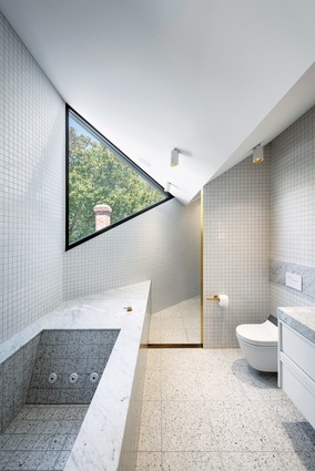
The ensuite makes a bold statement, with its triangular window and custom spa.

The ensuite makes a bold statement, with its triangular window and custom spa. Image: David Sievers

7 of 11
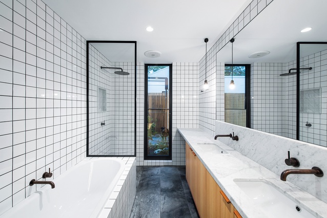
The main bathroom’s understated design is sympathetic to the character of the original cottage.

The main bathroom’s understated design is sympathetic to the character of the original cottage. Image: David Sievers

8 of 11
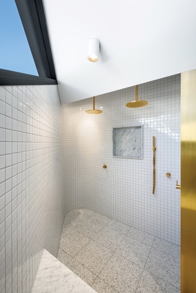
A striking mix of sharp angles and patterned surfaces, the ensuite has been integrated into the home’s existing roof form.

A striking mix of sharp angles and patterned surfaces, the ensuite has been integrated into the home’s existing roof form. Image: David Sievers

9 of 11
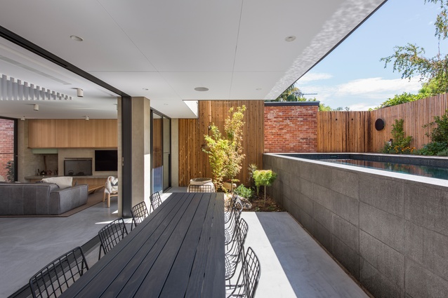
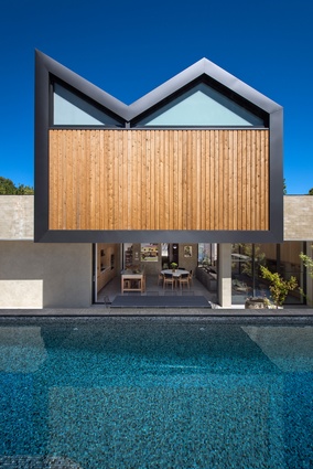
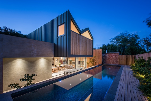
The project is a new blackened steel- and timber-clad extension to a double fronted cottage.

The project is a new blackened steel- and timber-clad extension to a double fronted cottage. Image: David Sievers

10 of 11
The project is a new blackened steel- and timber-clad extension to a double fronted cottage.

The project is a new blackened steel- and timber-clad extension to a double fronted cottage. Image: David Sievers

11 of 11
The project is a new blackened steel- and timber-clad extension to a double fronted cottage. Image:  David Sievers

This renovation of a turn-of-the-century cottage by Studio-Gram in collaboration with architect Kate Russo, has all the dynamism of the Adelaide practice’s popular hospitality work. Nestled in the inner-Adelaide suburb of Millswood, the double-fronted cottage’s new blackened steel- and timber-clad extension, distinct for the “cat’s ears” profile of its roof, was a three-year labour of love for the architects.

No mere gimmick, the inverted roofline provided the necessary width on the floor plate to accommodate the second level’s main bedroom and robe, as well as an ensuite that’s integrated into the existing roof form.

While the home’s main bathroom is sympathetic to the cottage’s original understated character, its ensuite is all sharp angles, patterned surfaces and strong lines. It’s a bold statement with something of a 1980s flavour to it, due in no small part to the triangle-shaped window and the custom-designed spa that could seat four people. A restrained palette of black, grey and white tempers the scheme’s audacious forms and the outcome is an unexpectedly tranquil sanctuary that’s completely immersive.

The large void in the centre of the extension likewise imbues the home with a Zen-like quality, while ensuring the open-plan living areas on the ground level receive plenty of natural light. There, the architects have used timber, bagged brick and burnished concrete to create the perfect setting for the clients’ furniture and art collection. However, it is the kitchen that best reflects the clients’ passions.
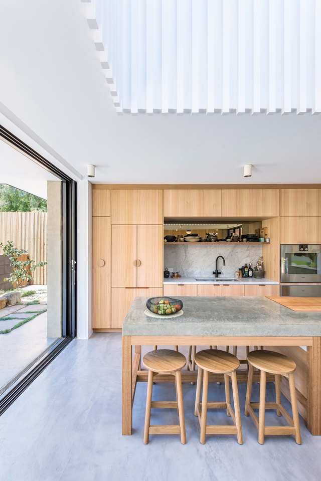
At once robust and sophisticated, the kitchen’s material palette includes burnished concrete and Tasmanian oak. Image:  David Sievers

“The clients are in the hospitality industry and they wanted a kitchen made for entertaining, that was robust enough to be used as it should be used,” explains Dave Bickmore, who, together with Graham Charbonneau, founded Studio-Gram in 2014. “All the dirty stuff tends to be hidden these days because of the rise in popularity of the butler’s pantry, but the clients really wanted to celebrate preparing food and cooking it in front of family and friends, so they could still interact with them while doing so.”

Despite its straightforward appearance, the kitchen presented the architects with their biggest challenge. Customizing an island – with a bespoke, timber chopping board to cover the cooktop and a timber lid for the scrap bin – was no small feat. The off-form concrete for the bench was poured in situ and they only had one shot at getting it right. This meant that integrating the cooktop into the island bench was difficult, too, as was incorporating the downdraft vent, which avoided the need for overhead exhaust. Ultimately, the architects’ attention to detail has paid off: they have delivered a finely tuned study in craftsmanship.

This article first appeared on architectureau.com.


More projects