Miramar Roxy Cinema renovation
Miramar, arguably the heart of New Zealand’s film industry, gets its own cinema back — an art deco makeover with a contemporary twist expressed, most notably, by its science fiction-style frescoes.
A neon sign and rows of lights above the doors of the Roxy Cinema in Miramar entice us in, then the magic of movie-going wraps around us. The décor is 1930s art deco style with a contemporary feel, so we may or may not be going to one of the early movies featured on posters around the walls of Coco, the ground floor cafe/restaurant. Perhaps Fred Astaire and Ginger Rogers in The Gay Divorcee, John Wayne as the screen’s first singing cowboy in Riders of Destiny or a terrifying performance of Dracula with real screams. In the 1930s cinema began to talk and soundtracks brought atmosphere to the moving image; now 3D is the latest technology so Avatar and Rio are screening.
Miramar is arguably the hub of New Zealand’s film industry, however, it lacked a place where the public could watch movies. Jamie Selkirk, Tania Rodger and others decided to resurrect the old Capitol Theatre. Built in 1928 and used as a cinema until 1964, the Capitol became a shopping court then became more or less derelict. Locals were attached to the façade so as part of the project the owners gave it a makeover and brought a state of the art two-cinema facility to the suburb.

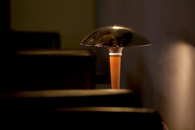
Selkirk, the Oscar award-winning film editor for Lord of the Rings had a vision of what he wanted and oversaw the design. He harnessed the conceptual and practical skills of people at Weta SPFX Workshop and the colour/design expertise of Anita Fijn, who had worked on the Embassy cinema. Selkirk approached the design task somewhat as he would a movie-making project — “organically”, trying things out, discarding, adding, changing and tweaking along the way. “Film making is always a work in progress — you keep playing around with it when you’re editing. You cut the scene first then put it away and do something else, do another scene, then come back to the other one… so you gradually get it to work all together,” Selkirk says. The team researched using books and the internet, and Selkirk bought many of the cinema’s art deco lights when browsing in antique shops overseas. He “searched high and low” for interesting lights to suit the period. Three lights in the café came from a 1930s diner in Chicago; the sidelights took four weeks to make in China. Other cinemas in the US (Los Angeles, New York, Santa Barbara) provided inspiration, as did cinemas in movies such as King Kong and Inglourious Basterds, which gave the dusky, pinky-brown colour for the café walls.
Fijn says she “struggled for a long time” with the brief to create a warm, inviting art deco space that was also contemporary. “At first I was thinking [art deco] pastelly, bright colours, but when they said make it more contemporary I went dirtier with the colours, softened them. Toning everything down is like our version of art deco.” Using Sketch Up and Photoshop Selkirk, Fijn and other people at Weta Workshop created, coloured and “walked through” the two-storied space. “It looks great in a 3D programme but you’re never quite sure how a space will feel,” Selkirk says. “[Empty] it looked huge. Now with everything in it’s come down to a nice cosy space.”
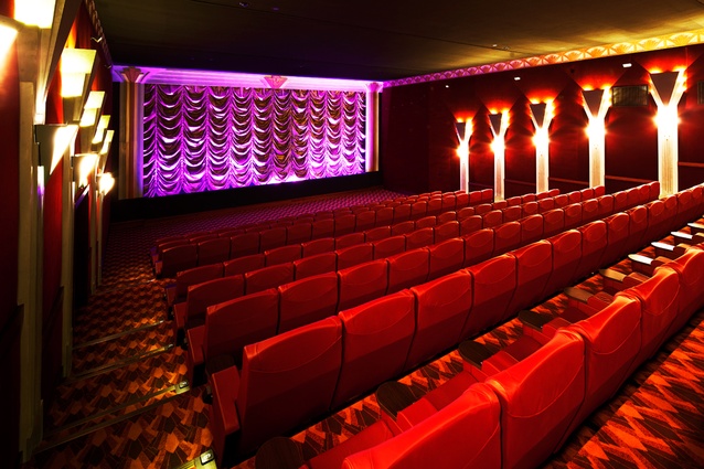
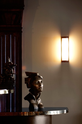
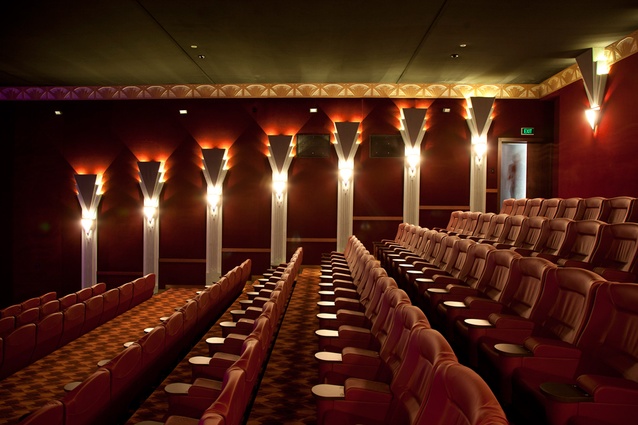
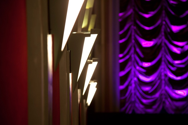
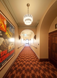
To balance the warm, dusky pink of the walls Fijn introduced contrasting green and gold inspired by Egyptian and art deco sources. The green and gold provide continuity throughout. Washed green/blue, neon-lit ceiling soffits in the café are edged with gold; the coffee machine by chance echoes the colour. Wall columns with hidden speakers in both cinemas are a more intense version of the same colour against a deep, dark red fabric background. Selkirk preferred walls covered with fabric to the more usual curtains. Corridors are nude, soft brown, decorated with half archways that are end-stopped by dark brown/gold sculpted heads; the walls of the foyer/bar upstairs are soft, peacock green. Light green, Chinoiserie-patterned wallpaper adds another stroke of art deco glamour in the bathrooms as do the white tiles, hand basins, lights and mirrors, which Fijn designed in the deco stepped style, repeated elsewhere in the interior. Wood rather than the usual partitions gives a solid, more permanent feeling.
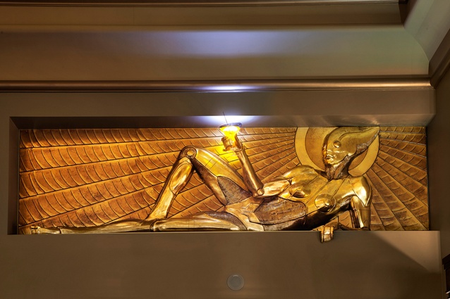
Every space has its own identity “so you get a surprise as you go into each new area,” Fijn says. “The greens and gold were a linking element.” And a few surprises for her popped up along the way (as happens during organic works in progress) such as the bronze fish door handles, two figures with blue globes and red fish on the stairs (Miramar, from the Spanish, “mer a mar” means view of the sea) and two reclining, gold robots sipping cocktails in alcoves upstairs — also courtesy of Weta. Fun and a laid-back approach characterised the job which she says didn’t take itself too seriously.
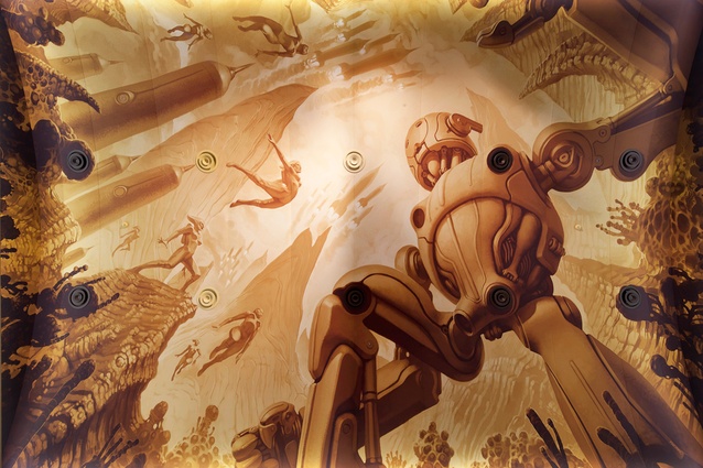
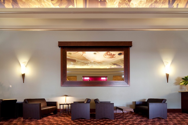
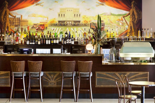
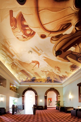
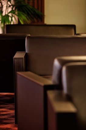
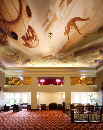
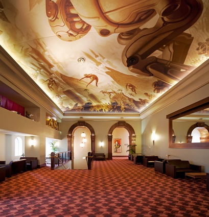
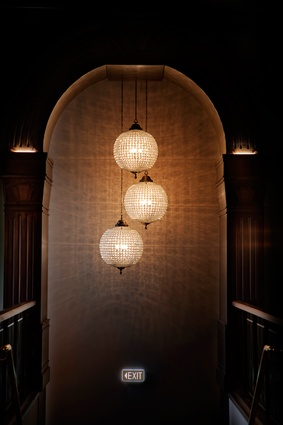
Artist Greg Broadmore created a sepia-toned, ceiling mural for the upstair’s foyer, themed from 1920s and 30s retro-futurism, and his comic/graphic novel/collectibles work Dr Grordbort. The ceiling draws the eyes up and out to life on another planet, Metropolis perhaps, or to New York and ceilings in the Rockefeller building, which inspired Broadmore. This ceiling was printed in strips from Photoshop on fire retardant material to comply with fire regulations. In the café another digitally produced mural by Chris Guise depicts historic features of the area with the old Capitol Theatre centre stage. Historic features include the gas works, trams, old cars, soldiers and a water slide from the Wonderland Amusement Park that occupied the site of Weta SPFX Workshop in the early 1900s. The mural can be changed for themed evenings. Chandeliers add glamour, of note three glitzy globes suspended in the archway upstairs. Downstairs the replica of a sunburst chandelier from another art deco cinema reflects the circular pattern on the floor; a sunburst design also features in the bar panels. The chandelier and bar panels were made at Weta Workshop. Carpet picks up the art deco fan motif on the street façade and the warm interior colours. Red furniture fabric in the café makes “a plush, opulent art deco look that is fanciful and fun”. As we settle into comfortable, red leather chairs in Cinema One the scalloped folds of a waterfall curtain rise on a new experience of movie-going in the capital.

