Mirror, mirror
Camille Khouri visits the new offices of Warren and Mahoney Auckland, a gold box that reflects the beauty of its home inside an old shipping warehouse.
They may have only moved around the corner, but Warren and Mahoney have come a long way from its previous dark and enclosed office on Victoria Street to arrive at these glitzy new digs in Wynyard Quarter.

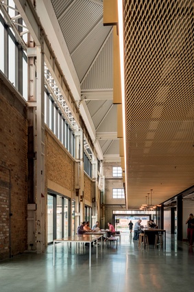
The offices are encased inside the Mason Bros building, an old shipping warehouse that most recently housed America’s Cup mast-makers Southern Spars. The design makes sure to reference the history of the building, while still presenting a bold new storefront for the architecture firm.
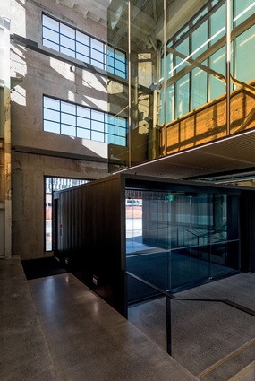
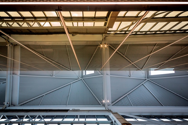
A reflective gold glass box envelops the working spaces on the upper floor and appears to hang above the lower floor, to evoke the idea of a ship in a bottle. The soft light quality through the saw-tooth roof was a key driver for the design, explains architect Blair Johnston.
“There was a clear ambition to create an object that sits within the existing fabric of the building and sets off all the walls in a respectful way. We were hoping to create a strong contrast between old and new but also amplify the existing, so the gold mirror glass enclosure is really enhancing the light quality, reflecting all of the existing brickwork and creating this sense of special ambiguity. When you walk in, it’s hard to tell where the new insertion starts and finishes due to this reflective glass, so there’s an interesting tension there.”

The shell of the building was retained in its original form, and the gantry system, which was used to shift heavy machinery around the warehouse, is still visible around the ceiling. The foundations were strengthened and the land beneath the building was decontaminated, but whatever was taken from the original building, was replaced. The only new elements on the façade are the windows and lintels.
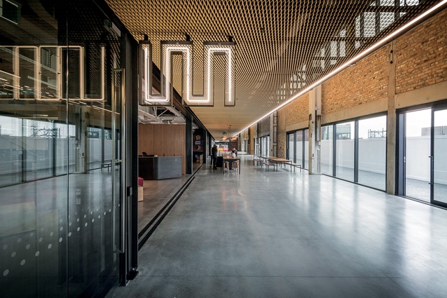
Warren and Mahoney take up the ground and first floors of the southern elevation. Above will be consultancy firm Mott McDonald, and GridAKL will inhabit the northern end, along with a café on the ground floor. The east-facing length of the building is taken up by a public laneway, providing access between Pakenham and Madden Streets.
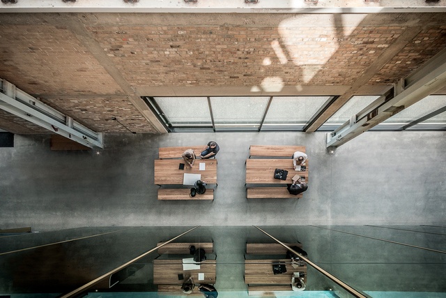
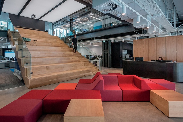
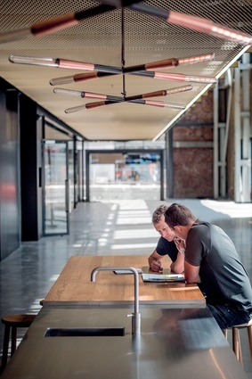
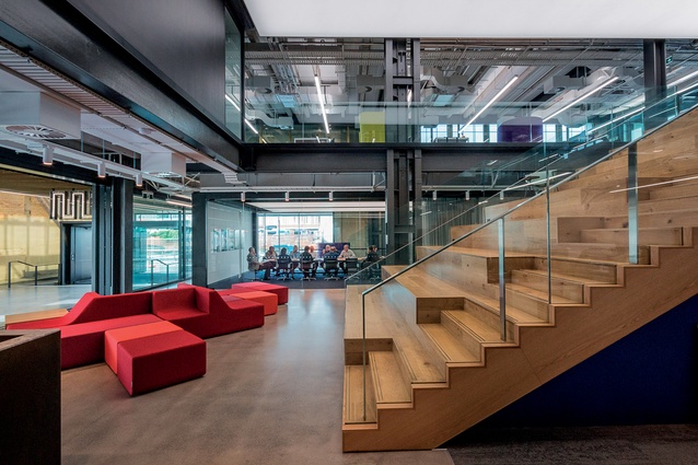
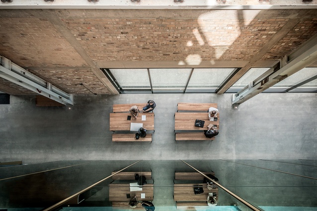
Warren and Mahoney’s offices spill out into this laneway, with tables and chairs set up outside their staff kitchen on the ground level. The reception area is an open space, inviting views up the atrium stairs. The transparent nature of the new offices means a higher level of communication with the public, bringing the company’s work out of the dark figuratively as well as literally, explains WaM’s Principal Scott Compton.
“We’ll get a lot of transient visitors, people who aren’t necessary working with us, engaging with Warren and Mahoney on a simple, referential scale,” he says. “This was one of the objectives of the project: to get away from the dark, mysterious place we were in before. With its formal reception, it was difficult to see what went on behind the scenes.”
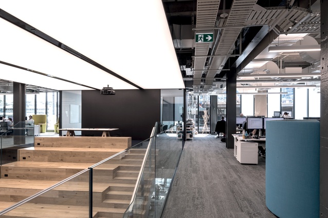
The atrium serves as a space to host events. Up to 60 people can be seated on the bleacher seats, while around 40 more can stand around the upper level to view a projector screen on the upper wall, for large-scale presentations.

“We wanted to integrate ways in which we can get closer to the market we are in, to speak with our peers and have the ability to host them,” says Compton. “This is a simple device that allows companies or agencies such as Panuku Development to come and talk about what they’re doing.”

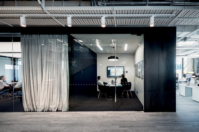
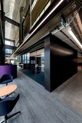
Materials are kept simple, with blackened steel – a reference to the roots of the building – used on the reception desk and the cladding of the ground floor meeting room, which is visible from the laneway. The concrete floor was poured and ground, and a concrete tone carpet was chosen for the work areas beyond. Warmth is brought in through pops of colour in the furniture and also through the extensive use of timber. Furniture is all by local designers and manufacturers, such as Fletcher Systems, Simon James Design, Goldsworthy and IMO.
An interesting feature of the workspaces upstairs is a purpose-built virtual reality space, where clients can experience 3D-modelled environments from within. Compton says this is a whole new way of working with a client in an architectural design space, which leaves less to chance.
“Using the paddles, we can pick stuff up and move it, throw it. Depending on what the client is looking for, we can prototype things. We can build examples in virtual reality, and you can get the scale and walk around them and look at the detail up close. Equally we can create massive spaces and get a sense for the volume.”
It appears the Mason Bros building has been reborn as a hub for design and innovation, a fact that will be further evident when GridAKL moves in around the middle of 2017.

