Modernist evolution: McLeod House
Perched high on a rocky outcrop, this expressive home by Ian Moore Architects reveals a strong connection with the experimental architecture of mid-century modernism.
Some houses are designed, built and inhabited within months and this is generally seen as the best outcome for designer and client. There are, however, many instances where the completion of a house is an ongoing project, spanning a timeframe that stretches out to years. While this can be a challenge for all parties, it can also be an opportunity for refinement and reflection. This is the case with the McLeod House by Ian Moore Architects.
Ian Moore’s involvement in the McLeod House began back in 1997, when the client approached him to design a new house for the site. The client had seen Ian’s Price O’Reilly House (completed in 1995 with Tina Engelen), a seminal work of late-twentieth-century Australian residential architecture, and felt an affinity with its absolute design clarity.
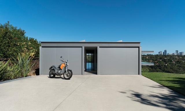
Perched high on a rocky outcrop in Sydney’s Castle Cove, the client’s existing 1970s house had “reached its use-by date,” like many of the buildings in the neighbourhood, and the idea was to demolish and start afresh. However, restrictive council planning codes meant that 30 per cent of the existing house had to be kept for the rebuild to go ahead. Ian had to work with the bones of the old house as a basis for the reconstruction.
The McLeod House can be seen as an artefact of Ian’s architectural evolution over twenty-five years of practice. Ideas, themes and motifs have been tested here, revisited and reworked. It is also an expression of Ian’s strong connection with the experimental and expressive architecture of mid-century modernism.
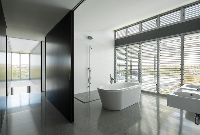
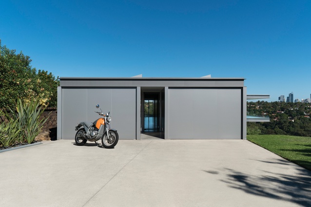
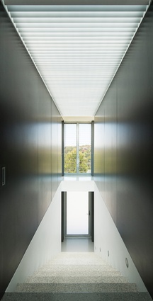
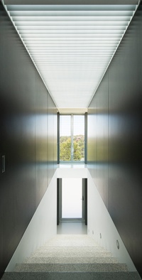
The McLeod House draws on two classic American houses of the late 1950s for its spatial and experiential configuration. The first is the Hunt House (1957) by Craig Ellwood. Ian attributes to this Malibu house the way the McLeod House’s double garages are used to form a solid facade to the street, separated by a central circulation spine that cuts through the dwelling. Ian sees this as a “non-disclosure of what happens within,” carefully staging the presentation of spectacular views.
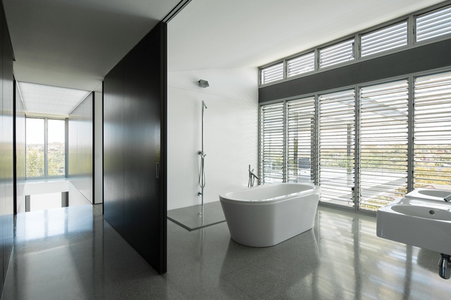
This tactic, along with the existing footprint, creates a house in three parts: the solid garages, the screened sleeping quarters and the open living spaces. The sleeping quarters are separated from the circulation spine by large sliding panels. This allows the rooms – and the entire home – to open up from side to side. Ian believes in “not creating cellular rooms,” which he sees as inappropriate for the Australian climate and contemporary living.
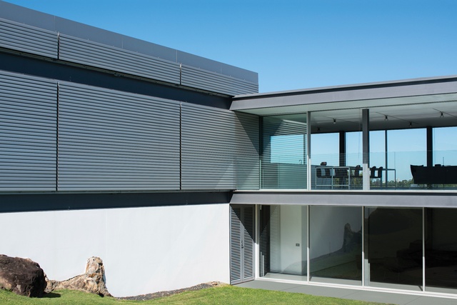
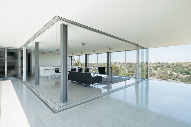
The second modernist house that Ian cites is the 1959 Stahl House by Pierre Koenig. Sited like its Sydney counterpart, it sits high in the Hollywood Hills, with expansive views. Ian has evoked Koenig’s horizontal steel-framed box for the living spaces of the McLeod House. Glass walls slide back behind grey-painted steel columns, allowing the floating pavilion to open up to the surrounding landscape. The experience of being in this room is exhilarating because of its openness and the vastness of its vistas. As Ian says, “you can stay in the living room all day and not need to go anywhere.”
As in the rest of the house, an overt expression of materiality is suppressed in favour of spatial clarity. Ian sees this as an integral component of his design approach, looking for materials “that don’t scream ‘look at me!’” – in this case, grey terrazzo floors, white walls and ceiling, stainless steel and aluminium. Space triumphs over materiality.
That is not to say that Ian is not concerned with materials. He notes that over the time period that he has been working on the McLeod House, his attitudes towards materials have changed. In particular, he has developed a great concern for durability, now considering it to be of “key importance” to specify materials that will last and will need very little maintenance.
Ian’s material and structural rationalism has been tempered in this project by the client’s extensive collection of Philippe Starck items. The unlikely combination of Starck’s flamboyance and Ian’s restraint works particularly well in this case. The house acts as a foil for the colourful Starck furnishings and fixtures dotted throughout the interior.
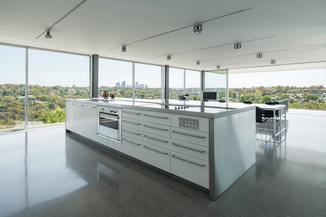
Ian sees the McLeod House as embodying the mid period of his development. It clearly speaks of Ian’s “structural” background in the explicit expression of structural elements within the design, his fascination with sliding walls in place of boxy rooms and the transition and sequencing within the interior from “private spaces to open communal ones.” Despite the extended time period Ian still sees the design ideas explored in the house – and the practical outcomes – as valid and true to this day, as does the client, who has been delighted to call Ian back every few years to complete another part of the project.

