Monastic modesty: Surry Hills House
This refurbishment of a narrow terrace house by Benn and Penna Architecture presents the client with a light-filled, monastic and disciplined setting for life to unfold.
Very small-scale work – the modest refurbishment of narrow terraces in dense, city-fringe areas – is the grounding for many architects in their earliest days of practice. These sorts of projects are then eschewed for grander (at least physically wider) work as the firm develops.
But the very restricted scope and palette of these constrained projects, and the volume of mediocre solutions, mean that this genre remains a litmus test for a clever architect and an enthused client. The prevailing real estate conditions mean that clients are now, more than ever, willing to invest time and money in precise solutions for the property they have increased equity in but now don’t wish to leave.
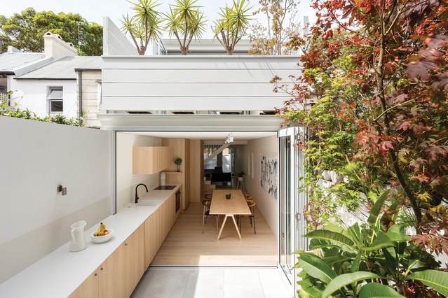
The Surry Hills House by Benn and Penna Architecture is an example of such a project. The existing terrace is narrow, with rear spaces facing south toward the dishevelled back walls of adjacent galleries and warehouses. At best, the “views” are glimpses over pocket-sized adjacent courtyards. Yet the determination of both the client and the architects has resulted in a surprising solution.
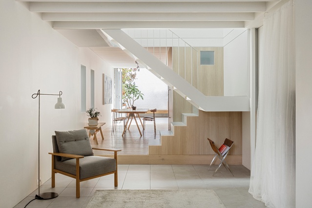
The layout and premise of the project are simple – the old house remains, with two open rooms made into one volume downstairs and a study/bedroom and bathroom upstairs. The front facade is adjusted, but its previously adapted form is too useful to be restored to match the group of neighbouring terraces. The soffit of the downstairs room is painted rafters, some original, some replaced in the battle against the once-resident termites. This timber ceiling treatment is repeated in the new parts of the house.
The ground-floor space is reimagined as one long volume from the front to the back boundary. The middle of the house defines the shifting point, in which the previously discreet hand of the architect becomes firmer. A fine white-painted steel stair stringer crosses the long space, and one step up onto a new Tasmanian oak floor marks the start of the new part of the house. The tall volume of the stair void bifurcates the sequence of downstairs rooms and daylight streams down into this midpoint of the home.
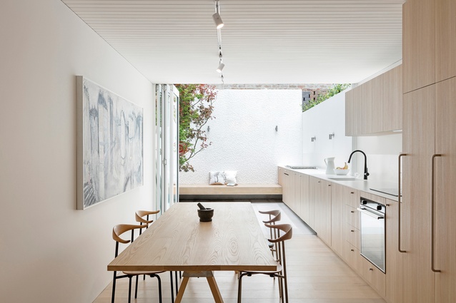
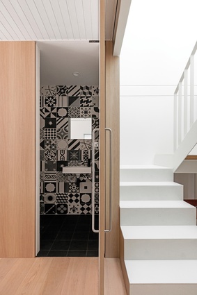
The stair, running perpendicular to the long space, is the widest of the new interventions on the ground floor. The veneer used beside the stair clads a small guest bathroom, and the same material covers a range of ever-diminishing volumes that form the kitchen. The all-weather benchtop (also used for some stair treads) extends out through the rear doors to the end of the short courtyard. The kitchen bifold doors tuck into a concealed slot in the cabinetry when closed.
The courtyard is simple and includes a timber bench seat below a faceted white-tiled rear courtyard wall. This rear wall faces west, and sunlight touching the mosaics brilliantly refracts and distributes light into the kitchen.
Upstairs, the old part of the house has a new bathroom and laundry, and a volume in the roof space has been added for storage. This is daylit and ventilated through glass panels at the top of the stairwell. The new rear bedroom is almost monastic in character, and opens to an enclosed upper terrace as large as the bedroom. From this generous outdoor space, one can look onto the surprisingly private brick walls of the neighbouring buildings, or down onto the lower courtyard. Again, big bifold doors make the transition between inside and outside negligible.
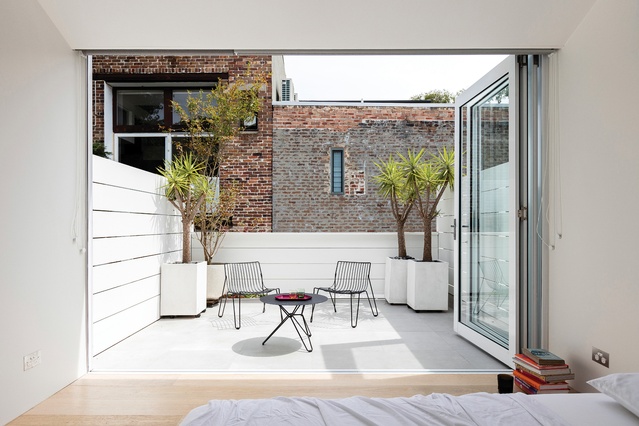
The refurbishment shows the disciplined hand of the architect, and this is evident in the photos. Except for the finesse of the rear courtyard tiles, and the rich black-and-white encaustic tiles in the downstairs bathroom, the palette of materials is very restrained and calm. But the effusive enthusiasm of the client’s possessions add a layer (in real life) that makes sense of the monastic architectural response.
The client, Tunisian by birth, collects objects that are unified by a delicacy of texture and a richness of colour. He loves plant life and the house is, in reality, quite full of objects, which he continues to rotate and change as he enjoys life in the space. It is as if the architects have handed him a stage set, to which he has added props and costumes.
This is a surprisingly light-filled house given the limited resources and orientation of the original building. It is an example of how an architect and client with a common enthusiasm can have quite different tastes. It is proof that one can find architectural hope and promise in the most modest of situations. This project is a reminder that constrained sites magnify the skill, or otherwise, of an architect.

