Motion Sickness: Beyond the trends


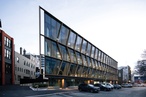
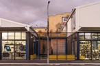
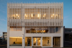
A once-industrial building has undergone a bold transformation to become the third home of Motion Sickness — a creative advertising powerhouse known for its heavy-hitting campaigns and rebellious spirit. Wonder, the team behind the redesign worked in close collaboration with the agency to craft a space that surpasses trends, opting instead for something iconic.
Motion Sickness wanted more than just a workspace; they sought a cultural headquarters that could contain and reflect their boundary-pushing ideas. To achieve this, Wonder steered clear of hot-desk work area and selected finishes and materials divergent from corporate minimalism, instead creating a tactile, atmospheric environment.
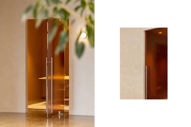
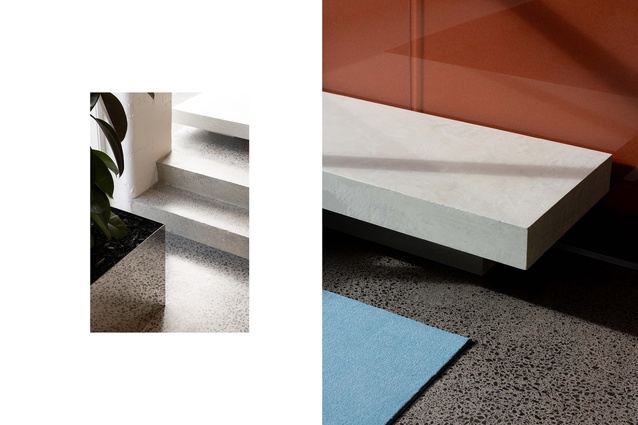
The design team took cues from the power and flair of 60s–70s ‘Mad Men’-era advertising — rose-tinted glass and baby-blue carpet meet brushed aluminum and tan leather, harsh and heavy concrete plinths are eased by the large windows and warm light fixtures. The result is a project that balances bold character with unexpected softness.
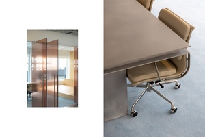
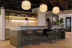
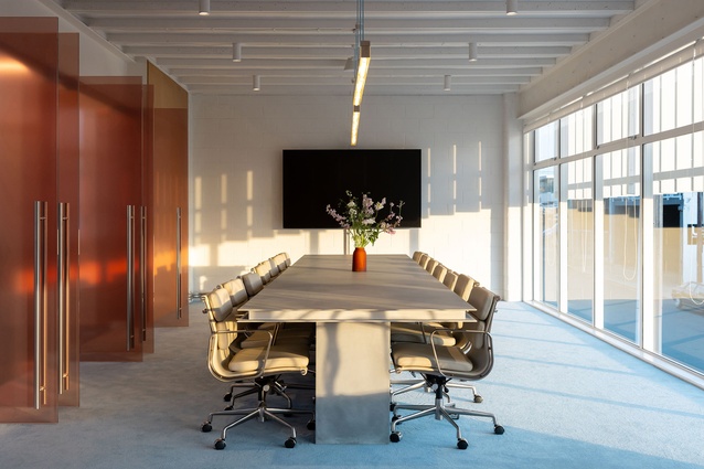
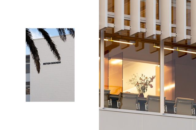
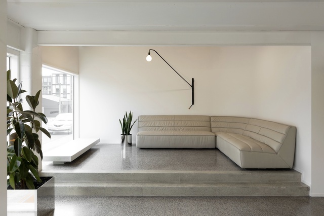
The boardroom is where eyes are drawn; it is not only a place for meetings but a stage for strategy, negotiation and long-form collaboration. Meeting rooms are often a private area with few visual distractions and neutral colours, strictly business — Wonder went for something different. The agency often gather for long meetings, sometimes running hours or even days, the space needed to feel open, fresh and connected to the outside office. Rose-tinted blurred-glass doors line the walls, and baby blue carpet brightens the room further. With sweeping views across the surrounding industrial district, the room offered extra space for movement, expansion and impromptu gathering of teams of up to 40 members. A heavy, sculptural concrete table anchors the room — both symbolically and literally — built to carry the weight of big ideas.
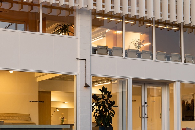
Outside the boardroom, the studio becomes a glowing beacon at night, casting warm, curated light onto the industrial streetscape below. It’s a visual juxtaposition, one that immediately distinguishes the agency from its surroundings and lets the studio’s interior identity soak into the public eyes. Through the rose-tinted glass and into the office space, the blue carpet and glass is a visual motif carried into smaller seating areas, showing how ideas move throughout the studio.

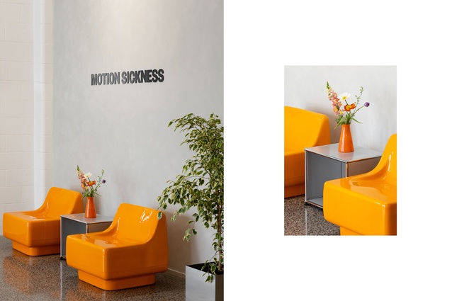
The lobby showcases some of the boldest and playful colour, with vibrant orange furniture and artwork in waiting spaces. A shelving section displays Motion Sickness’ many creative awards, while a sculptural bin below holds those that didn’t fit — tongue-in-cheek. It’s part celebration, part commentary and fully in line with the agency’s playful identity.
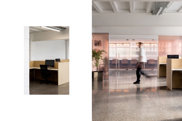
Throughout the studio, desks are arranged not to follow trends of open planned hot desks, but to foster creativity. Referring to the move away from hot desks, Buster Caldwell, creative director of Wonder, stated “The potency of ideas can be generated when small teams are put into little microcosms”. Constructed from strand board, the desks reflect the practical needs of small, agile teams who require a personally organised desk to achieve the work Motion Sickness is known for. These clusters of work spaces act as nests for the next big idea. Large comfy couches offer space for informal work, taken up mostly by the younger members of staff. It’s unstructured, purposeful chaos.
While their previous studios exuded an ironic student-flat aesthetic — vintage, second-hand, a bit unruly — this latest evolution signals maturity without losing their edge. The youthful energy remains, but the aesthetic has sharpened. Furnishings were individually selected collaboratively between Wonder and the agency, not strictly planned or made bespoke — each item earning its place for how it contributes to the agency’s culture rather than how it satisfies design orthodoxy. Yet, the items never detract from the inspiration of the project, maintaining a taste of the 60-70s. The space resists trend and embraces texture: powder blues, vintage pinks, brushed steel, and playful finishes layered over structural rawness.
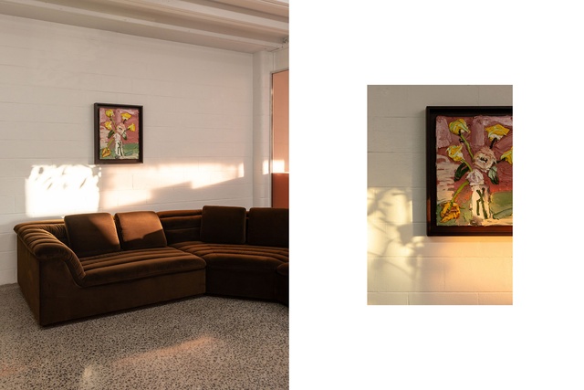
Past campaign imagery is elevated through gallery-style curation, forming a creative heraldry that documents the agency’s journey and output. Downstairs, a couch — again claimed by the youth — faces a concrete plinth in front of a large street-facing window. This frame becomes a site for rotating local art installations, bridging the space between studio and community. A unique method to interact with the community while showcasing the work the agency is known for, is a peep-hole instillation by previous art director, Anna Maxwell. Affectionately known as New Zealand’s smallest billboard, it features a view just inches wide, inviting passersby to engage with the unexpected.
With its central location and focus on sustainable commuting, the agency had little need for excessive parking. Instead, Wonder reclaimed a few spaces and transformed them into a social deck, lovingly dubbed “Family Bar.” It’s a nod to local culture, in-jokes, and the importance of shared downtime. It’s here that exemplifies how Wonder explored and met Motion Sickness’ unique nature — cheeky, relaxed yet deeply intentional — to create a space never conforming to expectations of a workplace.
Motion Sickness’ new headquarters is a place where their creative past and present collide in an environment built for what’s next. It doesn’t ask for attention — it demands it. Just like the ideas born within.
Wonder was the Worplace up to 1000m2 winner in the 2025 Interior Awards.
See the live presentation from Buster Caldwell here.