Garden room: Mount Stuart Greenhouse
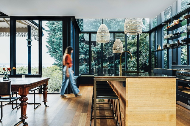
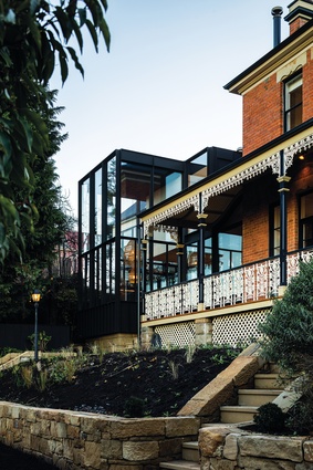
This addition to a grand early-20th-century home in Hobart reads as a generous garden room, housing a new dining and kitchen space that captures the scale and movement of the nearby cypress tree.
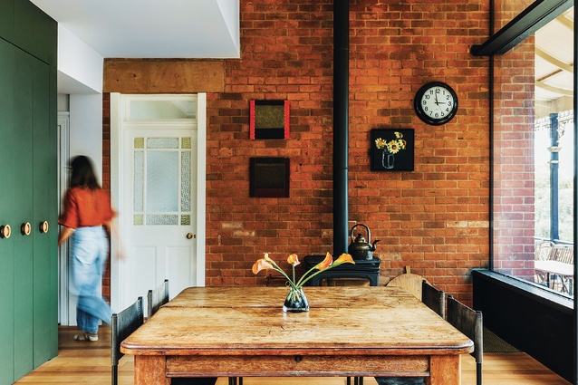
The brief for a residential project can come in many forms. But at its richest, it maps out a way of living throughout the year, highlighting the moments of daily life that the owners feel will bring pleasure. The clients for this alteration and addition had a series of clear ideas about the elements they needed: a bathing room for quiet contemplation, a kitchen you could cartwheel in, a room to view a giant cypress, dining tables for summer and winter, and as much sun as possible. Importantly, they wanted an extension that felt lived in from day one, as a suitable match for their grand, early twentieth-century Hobart home. Architecture Practice Bence Mulcahy took on this lively brief and entered into a collaborative process with the clients.
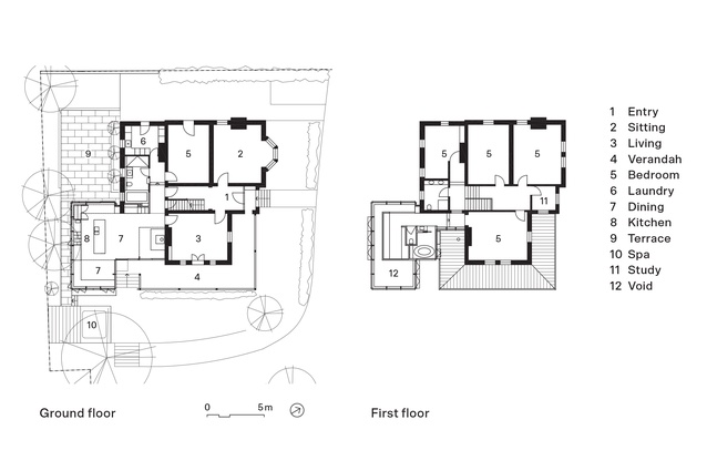
While the overarching conceptual brief was for a garden room, the programmatic brief asked for a new kitchen, dining room and sitting space on the ground floor and an ensuite and dressing room above, with some refurbishment of the existing guest bathroom and the laundry along the way. The new work was developed to replace a conservatory extension, built several decades ago, that was difficult to heat and too small for this family of six, which includes one large dog.
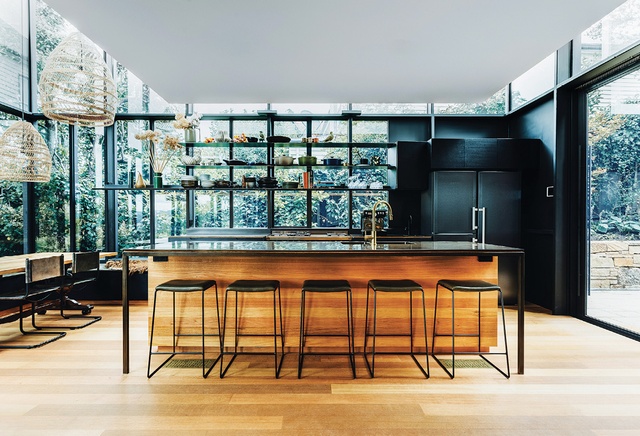
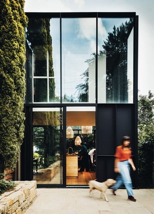
Exploring many ideas through cardboard architectural models, Bence Mulcahy landed on a box within an articulated box as the structural and spatial concept for the new work. The steel structure, with custom steel casement windows, creates a stiff external skin and roof from which the smaller box, containing the first-floor program, is hung. This move allows the full volume of the double height to be enjoyed on the outer edges of the extension.
The pattern of steel mullions and transoms across the face of the new work picks up on the detail of the main house – busier at the base, in line with the iron balustrade of the existing verandah, and cleaner and more open at the top, matching the proportions and fenestration of the upper floor. The entire new building slides in under the eve of the upper floor, keeping the profile of the extension to a minimum without feeling diminutive.
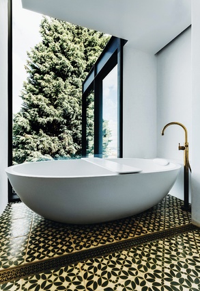
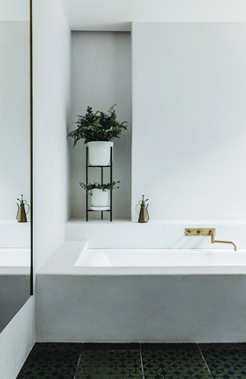
Beyond the larger architectural moves, it is the attention to detail and craftsmanship that define this project, with the clients as engaged in the process as the architects. The family wanted authentic materials wherever possible – solid timber, brass, ceramic, steel. They had imported lush, hand-painted Austrian tiles for each of the bathrooms and also wanted to explore techniques like tadelakt, a Moroccan method for hand-polishing hard plaster.
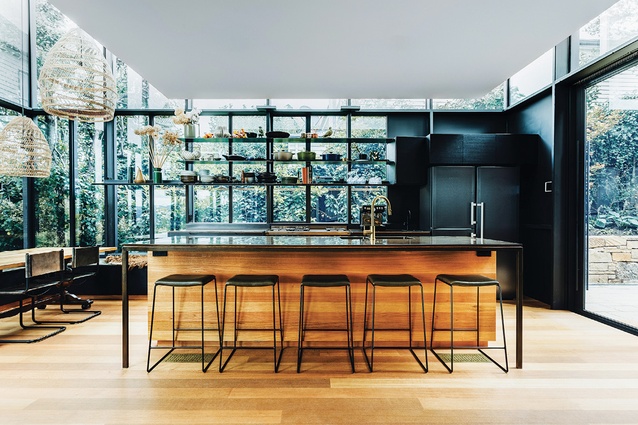
The kitchen benchtop is a central feature of the new room, with its surface and sink wrapped in burnished brass that improves with use as its fine mesh of scratches builds a patina. All other plumbing fittings throughout the extension are brass. The patterning of the Austrian tiles has been used as a motif for custom, laser-cut brass grilles that conceal all the workings of the ducted heating system while offering a nod to the handiwork often seen in houses of this era.
Deep greens in the paintwork key in to the tones of the cypress tree and flush timber joinery, stained black or left natural, is deliberately recessive, allowing the jewel-like brass surfaces to come to the fore. In the upper-floor ensuite, the tadelakt technique gives the bone-coloured surfaces the texture of honed stone.

The clients’ insistence on a lived-in feel has been translated by Bence Mulcahy to an environment that, while highly considered, has a surprising sense of ease; the usual mess of family life beds down the design rather than obstructing its reading. One of the clients describes the new work as being like a nineteenth-century still life painting. The passion for texture and material has come from the architects and the clients, with the architecture and carefully selected furnishings combining lavishly against the deeply coloured backgrounds and brought to life by light.
The brief has been met – the clients easily describe the moments that they cherish within the new work. Always an early riser, one of the couple describes drawing a bath prior to dawn and watching the sunrise from the tub. The moment when the beam of light lands on the water is like her own little piece of James Turrell, she jokes.
In summer, they love to sit in the large window seat, where the box is double height, caught within the leaves of the pear tree under the mesmeric movement of the cypress. There is an unexpected delight in the reflections of this glazed room, with little pieces of Derwent River visible in the glass, the trees “printed” across the lustre of the brass benchtop and the large woven lights seemingly repeated throughout the space
This article first appeared on architectureau.com.

