Mt Eden addition: Garden room
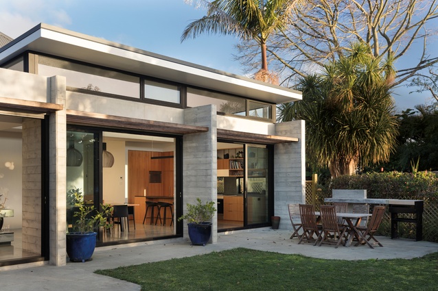
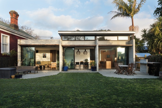
This cleverly conceived villa addition by McCoy + Heine Architects offers a strong connection to its outdoor living space, stepping across the site and framing the back garden.
Sarah Lindberg remembers an unusable kitchen housed in a lean-to at the back of her and Nick Fitzpatrick’s Mount Eden villa. “We spent all our time in it and it was the smallest part of the house,” she says.
When the couple was briefing architects McCoy + Heine, their key desires were a new kitchen, more functional spaces and an extension that would leave them with ample green space for their growing family.
“Food was a big part of the brief, too,” explains architect Miles Heine. “We have people round quite a bit,” adds Lindberg. “We wanted the kitchen to be an anchor in the scheme, with good connections to the other spaces,” says architect Natasha McCoy, “and with that strong connection to outdoor dining,” adds Heine.
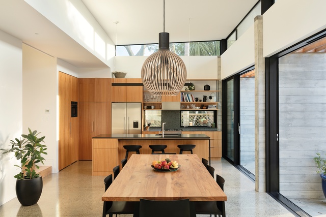
A robust connection with the outdoor eating and cooking space was one way to achieve a more quirky desire of the project – as both Lindberg and Fitzpatrick had spent considerable time in South America, they wanted to ensure the project had a distinct feel of that part of the world.
Regarding the initial ideas, Heine explains: “It was very much about maintaining the fabric of Mount Eden from the front and then, also, opening up to the rear”. It took a while to achieve the right balance between the new building and green space at the rear of the existing villa but Lindberg was determined that they could have more usable space and a house that felt bigger, without the footprint necessarily growing too much larger.
Materiality was thoughtfully considered. “Having a completely different language, but one that is referencing the villa through the concrete shuttering is, for us, a better response than just continuing the materiality of the villa,” says McCoy.
The result is what feels like a garden room. Four concrete fin walls provide the aesthetic and structural base for the extension, which is mostly out of sight from the road side and runs the width of the plot. When the architects were looking at the initial form, they looked at extending through along the southern boundary, “but then the idea came to us to step across the site and frame that backyard,” Heine explains. “This also helps to provide privacy.”
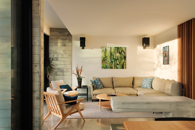
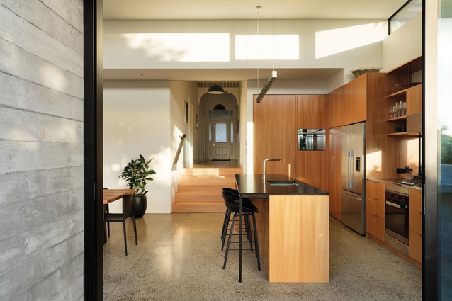
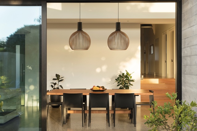
The new rectangular space is down a few stairs at the end of the existing villa’s hallway. “We were really keen to connect to the garden and having that drop down allows the extension to be a bit more unobtrusive from the road; high ceiling spaces could be accommodated without competing with or dominating the villa, visually,” explains McCoy.
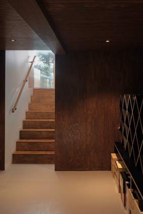
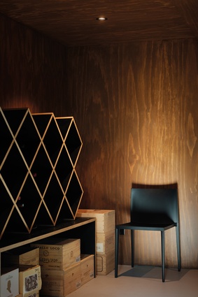
The new floor space provides for kitchen, dining, living, laundry and storage at ground floor and a well-stocked cellar at basement level. The cellar, with its discreet, playful access (which could easily be overlooked as another kitchen cabinet), is a surprise and is purposefully connected to the kitchen. “This was important as it’s all part of that social entertainment space,” says Heine. “It’s quite fun when people come around for the first time,” adds Lindberg.
“We drew a lot of this concept from South American architecture and Sarah and Nick were quite happy with the idea of working with more solid materials because they had experienced those there,” says McCoy. The concrete walls were cast on site and, in a lovely gesture, the shuttering was created using timber from the existing villa.
As Heine recalls, “it was a delightful moment, as the concrete walls are built first and everything else fits around them.” Well-insulated windows line the western façade, facing the garden, and clerestory windows are made possible by the roof popping up over the kitchen and dining room. These windows are perfectly positioned to “catch high-level snippets of the gardens of the neighbouring sections while still maintaining privacy,” explains McCoy.

The family loves the new space they call home and, pointing to the cosy new living area, Lindberg says that, on a winter’s afternoon, this is the best place to be in the sun. For the architects, “being able to create a garden room is always a joy and enabling that connection was a real success for us.”
Explaining possibly the biggest success of any building project, Sarah shares, “we felt privileged to have this house that was more than 100 years old and we wanted to improve it not just for us but beyond our lives… It was about repurposing the house for another 100 years.” Surely, this kind of stewardship is the real meaning of the Latin American phrase ‘mi casa es tu casa’, describing the warmth and hospitality of a home and translating to ‘my house is your house’.
***

Material Palette
Miles Heine and Natasha McCoy discuss some of the materials used in the Mount Eden House.
Tell us more about the use of concrete.
The thing we really like about the shuttered concrete is the fact that it is cast in situ and it is a craft. The finish is very bespoke and has a real connection to the site as it has to be laid on site. There is opportunity for chance when you do things in situ – it’s not a perfect finish and there’s something quite delightful in that.
Is there a continuity between the external and internal material palette?

We wanted there to be that continuity between inside and out to help with that feeling that it is a garden room. So, having concrete on the floor inside and outside helped. We have also used some of the same lighting inside and out and the same materials in the kitchen and the outside cooking and dining area. We wanted to have warmth as well, which is why we went for the wood (Anegre Timber Veneer in the kitchen) to try to soften all of that.
Tell us about the cellar cabinetry palette.
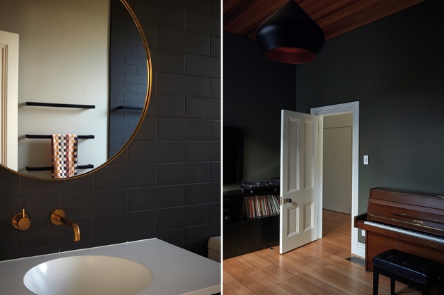
The palette for the cellar was initially thought of as a cigar box – that whole chocolate, warm aesthetic with the black joinery (plywood with melamine). That was custom cut and the builder fabricated it on site, so it was a bit of a design challenge.
This article first appeared in Houses magazine.


