MTG Hawke’s Bay
Napier, these days, is synonymous with its art deco architecture, although that wasn’t the case when I lived in Hawke’s Bay as a kid – the local burghers had little interest in architecture or art. Back then, Napier Museum had declined from its heyday, under Leo Bestall, as one of the country’s finest provincial museums – its main function seemed to be as a kind of metaphysical mausoleum, memorialising the 1931 earthquake that killed 250 people. Virtually the entire city centre either collapsed or went up in flames but the catastrophe also raised the surrounding landscape by a couple of metres, draining the great inland sea of Ahuriri and turning Scinde Island into Napier Hill. This fundamental reconfiguration of the city means Napier has always seemed uncomfortable to me.
Marine Parade dates from before the ’quake, in a previous attempt to create a seaside strand out of a treacherous shingle coastline, but the sea here (described by a visiting Mark Twain as “bred among the icefields of the Antarctic”) still gnaws at the land. Our unstable isles have always lurched, both physically and economically, from one extreme to the other but this now-pretty little tourist town has an even more discomforting history than does the rest of the country. Given this shifting landscape, it’s hard to believe the Napier Museum has sat on the same site for over 150 years.
This history is visible architecturally, in what is not so much one building but a series of structures on the site. The extensive upgrade by architect Richard Daniels of Opus Architecture and MTG director Douglas Lloyd Jenkins has focused not just on adding space but on making sense of the institution’s history and reorganising the complex. This is now visible in the name itself, an acronym of Museum, Theatre and Gallery. The 1936 Louis Hay building at the north end of the complex has been beautifully restored inside and out and its Louis Sullivan/Frank Lloyd Wright-influenced design is a welcome antidote to Napier’s surfeit of buildings reliant on decorative façades. One original gallery has been retained with the others occupied by archives, a library and a reading room.
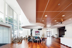
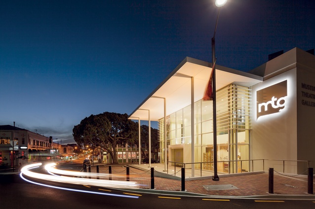
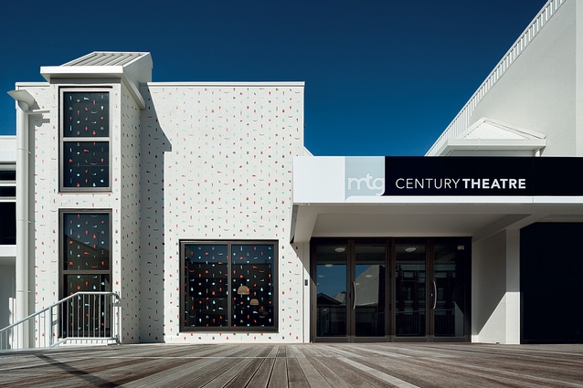
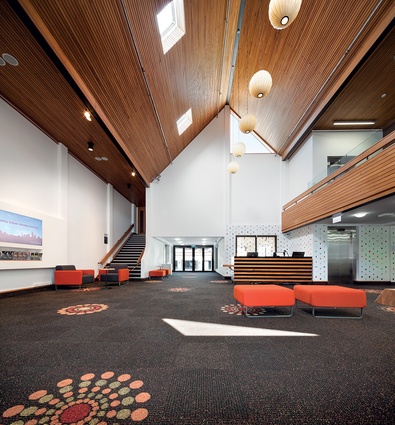
Guy Natusch’s 1970s theatre and foyer have been spiffed up and are even more ’70s than I remember them being at the time, with many of the fittings and decorative commissions having gone to young designers, craftspeople and artists. The Marine Parade entrance that was the main entry to the complex for decades was always too recessive but remains as a subsidiary one to the theatre. Standing on the street, Natusch’s crowd of air-handling funnels – a composition we high-school kids thought pretty modern and high-tech at the time – remains as well but has been painted white. This actually improves the appearance of the funnels as sculptural objects but will also mean they do not to detract from a vast and characteristically colourful splash by artist Sara Hughes, which will soon adorn the Marine Parade frontage. Of course, the MTG’s new white livery also serves to tie together the disparate building styles but it’s the new addition at the east end of the site that now gives the complex a new front and a new identity for a new century.
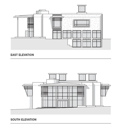
Napier probably rivals Oamaru in having the greatest collection of heritage buildings in the country. It’s not all deco either, as the city also retains a collection of more neoclassical and modernist buildings. Norman Foster’s Carré d’Art, situated opposite the Roman temple in Nîmes, France, has been an influence on the building and it’s a thoroughly apt one. The new front of the MTG is a simple and elegant structure that doesn’t fight it out stylistically with its neighbours but complements them in scale and proportion while continuing to have the openness and neutrality that we associate with the modern museological institution.
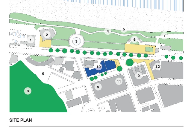
But, rather uniquely for Napier, this new building starts to shape up some civic space as well. The experience of Napier is generally one of a grid of streets wallpapered with art-deco façades, a fascination with surface that occupies the peripatetic, but there is little in the way of urban place-making. The portico of the MTG reflects, in a more contemporary style, the colonnade of Marine Parade’s Veronica Sunbay Memorial across the road and, with the loggia of the neighbouring Masonic Hotel, forms two sides of a square. This creates a welcome sense of place off the long main drag of Marine Parade and signals one’s arrival at the city centre behind.
A small cylindrical turret that rises up through the building (originally intended to house a relocated camera obscura) also works as a counterpoint to the dome of the landmark T&G Building opposite.
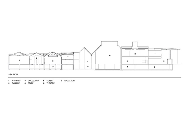
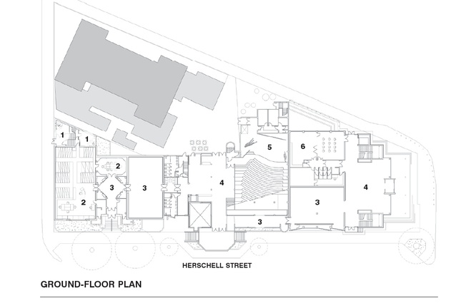
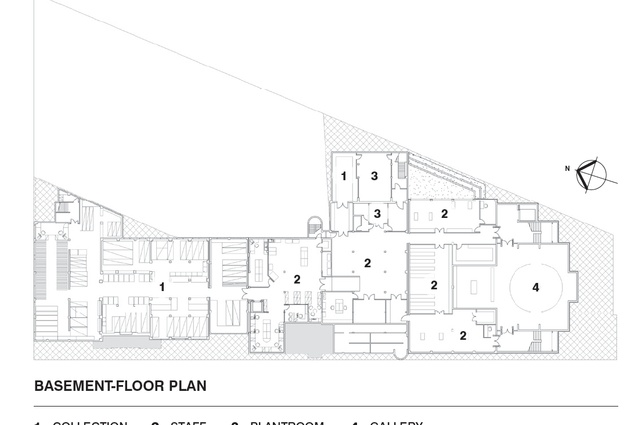
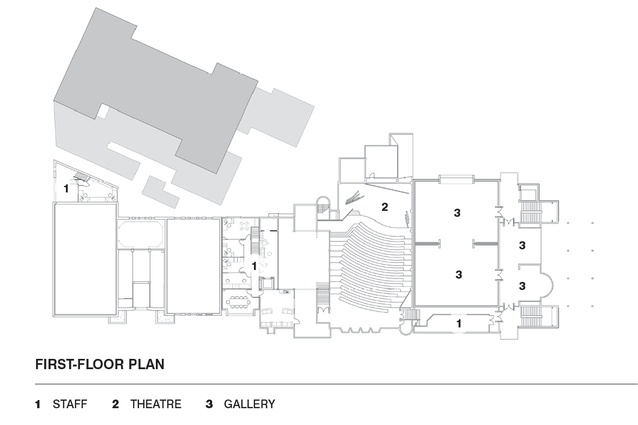
Beyond the new entry and foyer, the site plan has been rationalised by the provision of a long axis on the ground floor that ties the complex together. Downstairs, the earthquake still haunts the foundations in a permanent exhibition set in an appropriately dark and subterranean space that feels wound back in time. But there is also a great deal more in the way of back-room facilities housing staff, workshops and storage. Upstairs are the new galleries. In all, this redevelopment has given the MTG 65 per cent more gallery space and 15 display areas in total.

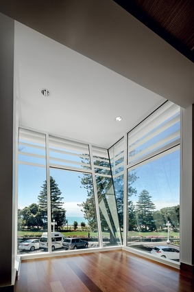
Lloyd Jenkins asked for rooms rather than space and the four galleries upstairs have doors enabling them to be configured in various arrangements, as well as having the potential to be day-lit from above or, in the case of one, to be opened up to the beach view through a great long window. This focus on a series of rooms also means the whole complex can be experienced in a variety of ways – patrons are able to meander around the galleries in the way they choose rather than follow a prescribed path. Two viewing areas jut out on either side of the building, like the wings of a ship’s bridge. After one has been engrossed in close inspection of gallery contents under artificial light, these lookouts open up views like postcard panoramas – a vista of the sweeping bend of the Bay on one side and, on the other, the great shrug of hillside beyond the pretty façades of the town centre.
The MTG has skilfully avoided the pitfalls of being inserted into a heritage context that could well have seen it end up as a pastiche of its art-deco neighbours. It has reorganised its site and allowed a series of buildings from different eras to shine, as well as created an excellent series of internal spaces. Not many institutional buildings in this country live up to the vision statements of their organisations but it can be honestly said here, that the structure adds an architectural dimension to the aim for MTG to be “a place where people, objects and ideas meet”.

