Mystique to suit: Whitlam Place
Set within a brazen, nonconformist building of 11 bespoke apartments, this abode fittingly offers an artisanal-yet-elegant edge to Melbourne’s bohemian suburb.
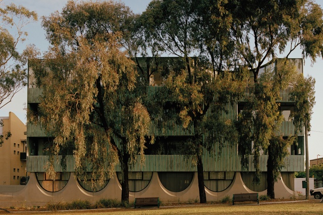
Whitlam Place is an example of that rarity of new multi-residential buildings that eschews the cookie-cutter appearance of many developments in favour of genuinely inspired design. The four-levelled structure is defined by a solid form that rests atop a lightweight podium, articulated by a series of inverted concrete arches.
It is situated within the ‘golden triangle’ of Smith, Gertrude and Brunswick Streets, in Melbourne’s vibrant Fitzroy, and the architects, Freadman White in collaboration with Anon Studio, took their cue from the area’s civic buildings, as well as from the architectural legacy of Australian modernist Robyn Boyd.
“The project aspires to the early nonconformist spirit of modernism, which explores new ways of living, and experimental forms of construction that are blended with artisanal crafts and elegant details,” says practice director Michael White. “And the outcome is expressed through high-quality building techniques, durable materials and energy-efficient solutions that directly respond to the challenges of everyday life.”

Two penthouse apartments with views of the Melbourne skyline are the jewels in the brutalist development’s crown; the one occupied by owner-developer and the project’s collaborating architect Marcello Donati of Anon Studio is perhaps the most covetable.
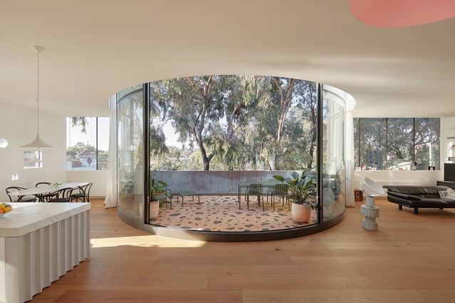
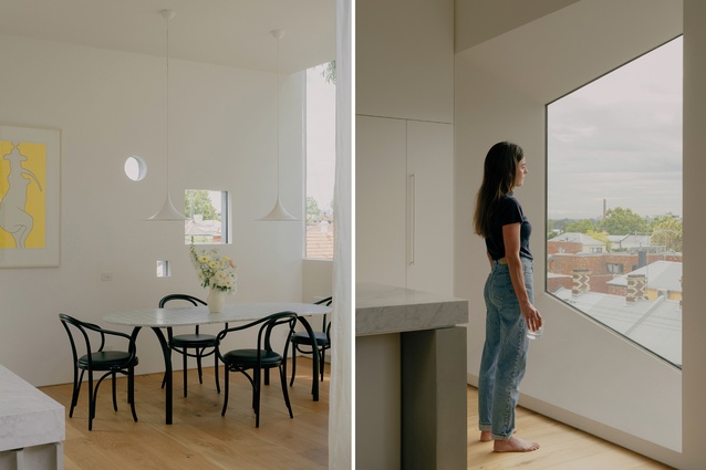
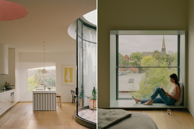
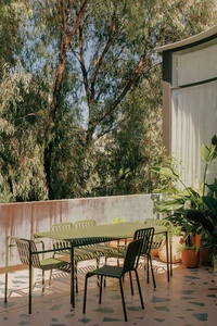
Characterised by glazing that wraps around a private, curved, south-facing rooftop courtyard, the compact 145m2 abode is a sophisticated study in spatial efficiency and relaxed functionality. This courtyard, which cuts into the apartment’s otherwise rectangular arrangement, defines the zoning of the open-plan living areas. And, when the sliding doors are open, the interior spaces extend outwards, making them appear larger than they actually are.
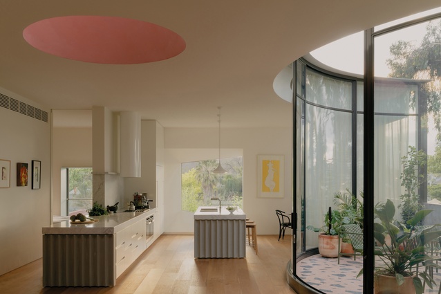
The kitchen, dining room and lounge form the hub of the home and the architects ensured they take precedence, deliberately minimising the two bedrooms and bathrooms so these private areas are more modest in size.
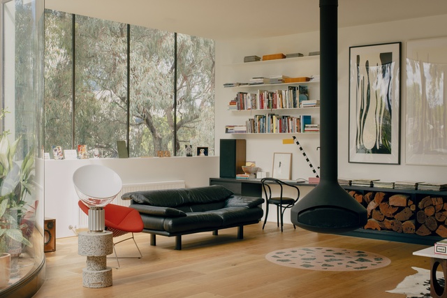
White and Donati were mindful, also, to include a number of generously proportioned windows to let the outside in even further. Together with the courtyard, they make certain the apartment doesn’t suffer from a lack of natural light or ventilation. White walls and oak flooring add to the bright and airy appeal of the home and create a neutral backdrop for the design’s artistic interventions and handcrafted elements.
As White explains, “Each of the 11 apartments has a different personality to suit the needs of the various owner-occupiers. But what we tried to do throughout the building was celebrate moments of curiosity that would make people ask, ‘Why do that?’”
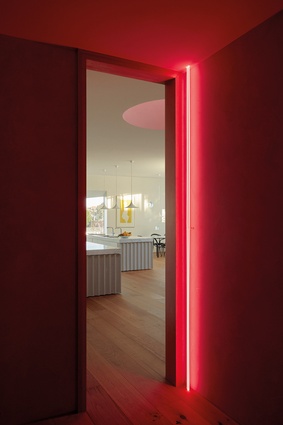
In Donati’s penthouse, an oculus skylight above the living area is finished in pink polished plaster. It glows a range of colours, from apricot to aubergine, depending on the time of day, and presents as a site-specific James Turrell-style light installation. This resonates with the neon-lined lobby, which services both penthouses and evokes the work of another American light artist, the late Dan Flavin, whose minimalist sculptures are as rigorous as they are striking.
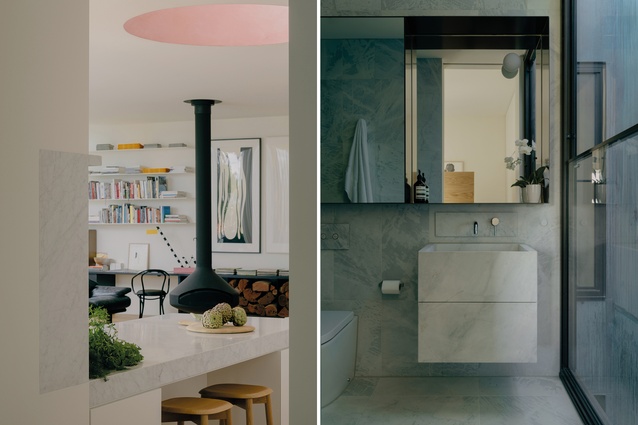
But the apartment’s most compelling artisanal feature is the courtyard’s bespoke pink and green terrazzo, developed by the tiling contractor with Freadman White. This chunky patterned flooring is used in the courtyard to great effect, adding colour and flourish, and then inset into the interior’s oak floor in a circular motif beneath the suspended wood heater.
There are other instances of unexpected delight that similarly punctuate the home, including the kitchen’s marble splashback that wraps around the wall leading to the bedroom and the ridged ends of the counters. These details all work in well with Donati’s furniture and art collections: an eclectic mix of Memphis-flavoured objects, classic modernist forms and abstract prints and paintings. Rather cleverly, the views of the adjacent park, which is full of eucalyptus trees, adds another level of visual interest to the overall scheme, so it appears lively and full without seeming cluttered. This is stylish-yet-comfortable inner-city living that very much feels like home.
This article first appeared in Urbis magazine.


