Double feature: Naremburn Twin Peaks
Simple yet impactful alterations and additions to an interwar bungalow by Benn and Penna on Sydney’s North Shore elevate once-dark period interiors to bright contemporary living spaces.
In order for architecture to transform people’s lives, it doesn’t have to be big or brash – it just has to be good. Tucked away in a quiet street on Sydney’s lower North Shore, a dark bungalow was deftly transformed by architects Benn and Penna into a family home suitable for twenty-first-century living. The project is modest in size and budget, but delivers on a big scale through a new first-storey addition at the rear that maintains the streetscape while providing the space and light the family required.
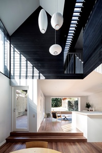
The clients purchased the house in Naremburn because they were determined to raise their family near the city. This meant they had to forgo a large house and garden in suburbia, instead settling on a compact interwar bungalow some six kilometres north of Sydney’s CBD. While the location worked in terms of their desire for city-side living, the size and configuration of the house did not.
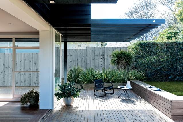
As is so typical of this type of house, it was dark and poky with poor connections to the outside. The clients were familiar with the work of Benn and Penna through the Balmain Houses and knew that the firm had experience with delivering projects that address contemporary modes of living. The tight budget and restricted site meant that the project was driven by three key parameters: getting as much natural light as possible into the centre of the house, creating a new sleeping zone for parents and children, and connecting the interior spaces to the garden and the sky.
The first move saw the architects clear away a service area on the ground floor that blocked the northern sun from entering the living spaces. This not only opened up the living areas, but also allowed the rooms at the front of the house to have a visual connection to the garden at the rear.
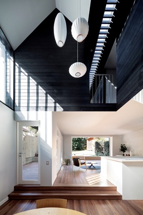
Andrew Benn, director at Benn and Penna, says, “We often think about the garden before the house,” meaning that the way the interior spaces link with the garden, either visually or physically, is of utmost importance. The newly created living space was extruded up through the first floor and provided with a large north-facing clerestory window.
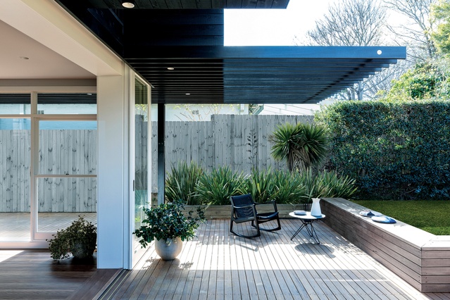
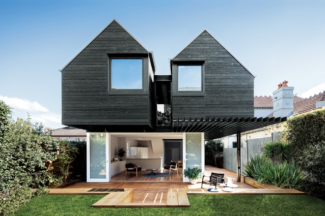
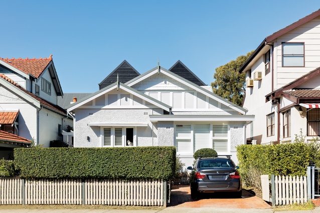
The second move was the addition of the “twin peaked” pavilions on the first floor. From the street, very little is given away as to what lies behind the gable of the existing house. When compared to the overbearing additions of the neighbouring properties, the two black peaks that pop out the top work in well with the surrounding roofscape.
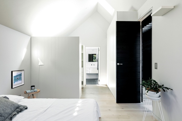
The tactic here was to “push up and slide out over the garden.” What the architects have done is to create two separate pavilions connected by a walkway. The pavilions are offset from each other, minimizing the bulk of the overhang from the garden. One pavilion is for the children, the other for the parents. This was a conscious move to demarcate and separate the two zones from each other, futureproofing the living arrangements for when the small children become teenagers who will need their own space.
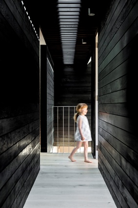
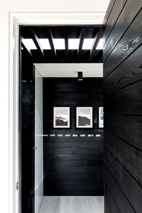
The twin pavilions are clad inside and out in a rough-sawn black-stained cedar. Andrew says that the use of black “helps recess the exterior elements” while “softening the play of light on the inside.” While the clients were initially somewhat hesitant about the choice of black, it seems that the finished result has won them over.
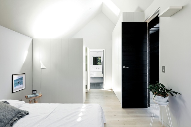
The corridor that connects the two pavilions looks out toward the green of the garden at one end and the double-height void over the living area at the other. This corridor is roofed with a nine-metre-long skylight, diffused by black battens. The doors opening off it are set flush in the walls with no architraves, giving very crisp distinctions between the pavilions, whose interior follows the exterior gabled form.
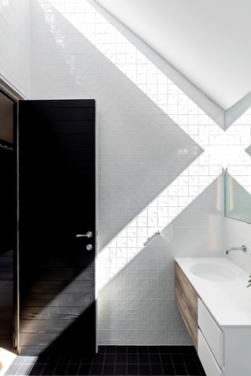
While the pavilions are not wide, their steep-pitched ceilings ensure that the spaces are lofty and abundant skylights and windows give every room a sky view and/or a garden view. The architects wanted the ceiling planes to be read as large, uncluttered surfaces, so only uplighting has been used in the bedrooms. The bathrooms have a north-facing skylight at the apex of the ridge, which allows direct sunlight to enter and hit the textured wall tiles, accenting the relief design on the surface.
In this small project packed with big design ideas, Benn and Penna has demonstrated how a few simple, well-considered moves can have a big impact on how a family lives in a space. This project displays an understanding of how spaces are occupied without sacrificing any of the delights of architectural form.
This article first appeared on architectureau.com.

