Natural order
Overlooking a sacred pā site, this Dunedin home by Mason and Wales Architects responds to its sweeping views and the needs of a growing family with considered planning and humble forms.
This home is a testament to the fact that when thoughtful, design-focused clients and passionate architects collide under the right conditions – namely, a stunning site overlooking one of New Zealand’s most unspoilt coastlines – something magical is born.
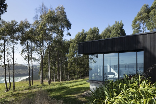
The story of this home, perched on top of a cliff about 20 minutes outside of Dunedin, is as much about the site as it is about the building. Francis Whitaker of Mason and Wales Architects has a special affinity for these particular South Island shores, having lived most of his life in one of the bays that this site overlooks; so, he was keen to take on the project when the clients approached the firm.

The 17.5-hectare piece of land has been in the owner’s family for many decades and the couple both grew up nearby. The home takes up a small portion of the plot, which houses paddocks for several horses to roam and is dotted with gum trees and native grasses. Though the couple who now own the site work in creative fields themselves, when they wanted to build a home for their young family, they enlisted Mason and Wales to give them “what they didn’t know they wanted”.
The initial brief was fairly simple, with the clients’ main stipulation being that they wanted a separation between the master suite and the children’s rooms. Beyond that, the geometry of the house’s plan was dictated purely by the views. Rather than create a large, glass box, the architects gently nudged the owners towards a design that reveals the various ocean views slowly and methodically.
Design architect Whitaker explains: “There’s no way you could contrive the form. It was a house generated totally from the physical reality of the site.” Indeed, the geometry of the plan is where the brilliance of this home lies.

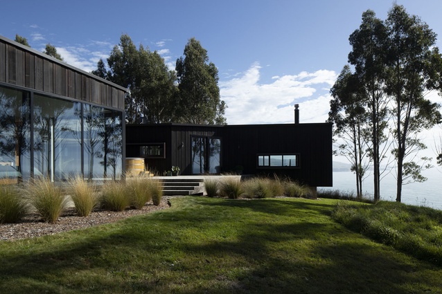
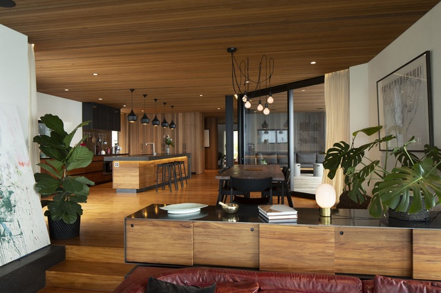
The plan reads like a kinked T-shape, with three main areas – the living room, the master bedroom and en suite, and the children’s bedrooms – plus outdoor decking, capturing scenes over the Purakanui Inlet, the ocean and Blueskin Bay. Most of the circulation space doubles as usable areas, keeping the overall footprint small. The top part of the T houses the kitchen and dining spaces and the area just off the children’s rooms is a second lounge or media room.
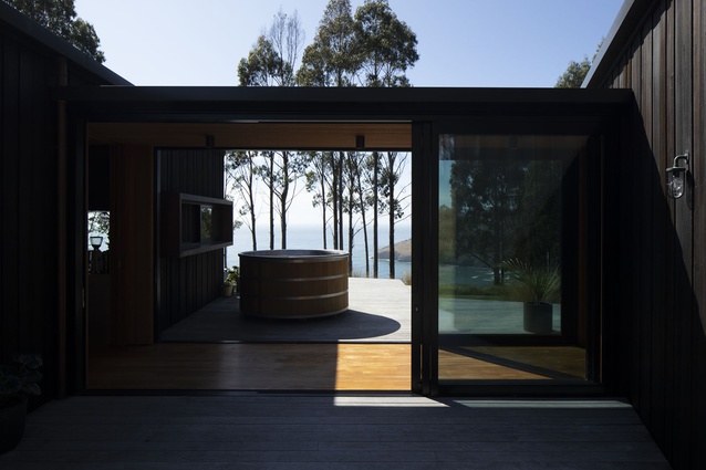
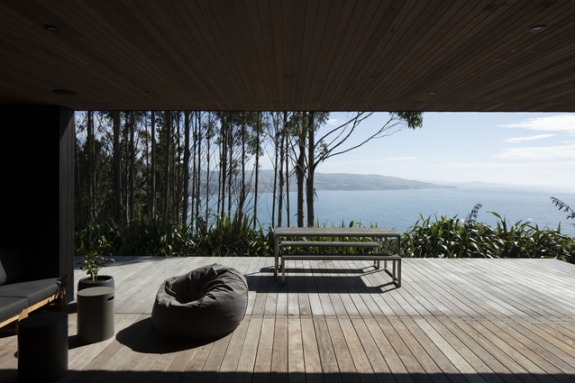
With the site being so exposed, wind posed a major challenge to the design. In response, the architects utilised the negative spaces that carve into the floor plate as three outdoor decks, each of which enjoys sunlight at different points of the day and also gives the option for a sheltered outdoor space no matter which direction the winds are coming from.
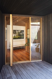
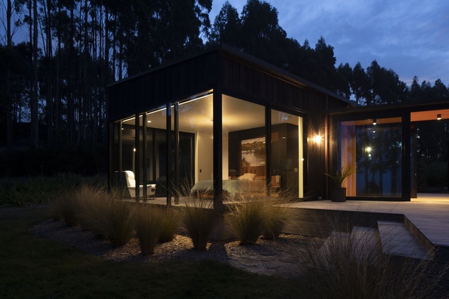
As you approach the home, you are treated to views of the ocean through a glazed corridor that separates the main house from the master suite, which sits as a glass box to one side, forming the bottom part of the T. This glazing provides a lightness to the home and offers a sneak peek of the vistas that lie waiting for visitors once the interior threshold is crossed.
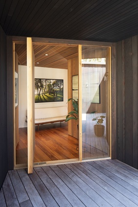
Upon entering the house, dark-stained cedar gives way to the warm, honeyed glow of natural timber enveloping most of the interior surfaces. Variable-width cedar clads the walls and ceiling inside the main living areas and recycled heart rimu is used for the floorboards. The owners note: “We were very aware that a new house can feel a bit soulless. That was one thing we worked hard to combat with the rawness of the materials.”
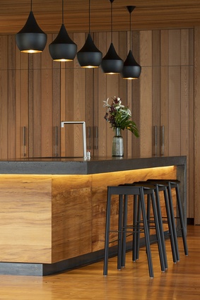
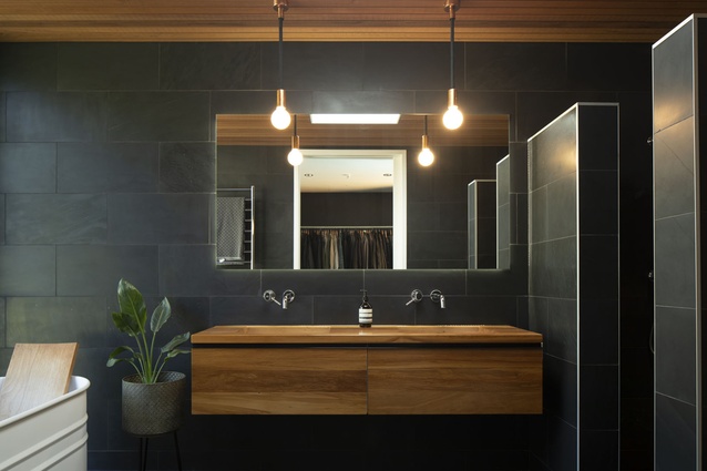
The natural variation in hues seen in the timber is punctuated by black accents throughout, including a black-oxide concrete bench that forms the focal point of the kitchen, black steel joinery and coal-coloured stone tiles in the master bathroom.
Interior furnishings were carefully considered by the owners, with a view towards timelessness. The owners joke that they are “still moving in” almost five years after the build was complete because they wanted each piece to be perfect. “We wanted to do everything as well as we possibly could, which meant some things didn’t happen straight away. We felt a lot of responsibility to the site, to do it justice.”

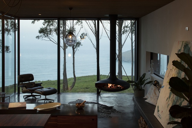
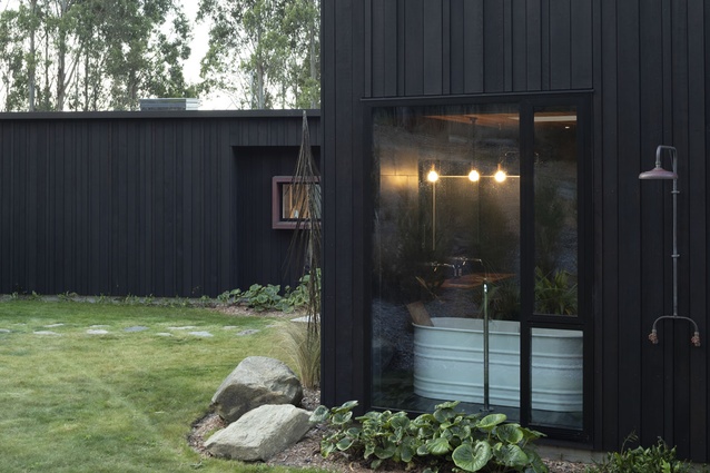
The white Agape bath is one such piece that the couple searched for diligently. When they saw it, they knew it was the one: “This is what the house deserves.” Another expression of this simple-yet-strong aesthetic is the black Gyrofocus fire, which is suspended from the ceiling. It makes its presence known while complimenting the immense views beyond it perfectly.
This house is both gentle and compelling at once, with its agrarian, barn-like forms set to weather into the cliff over time. Together, the architects and home-owners have taken a simple, economical and robust design and created a space that can continue to grow and serve the family’s changing needs for generations to come.

Material palette
Architect Francis Whitaker talks about the site’s historical rocks and the use of black concrete in the living and kitchen spaces.
Is there some story behind the exterior stone walls?
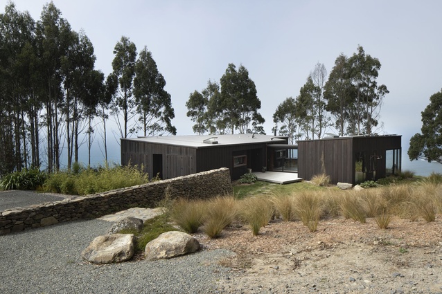
Francis Whitaker (FW): The old stone walls that cover Otago’s coastal hills and farmland leave behind a physical record and pattern of European settlement in New Zealand. To create farmland, the settlers had to clear dense bush, remove roots and dig up the rocks used to build these magnificent stone walls. Building on the historical context of their farmland, the owners collected still more rocks and constructed another dry stone wall, which defines the entrance to their dwelling. The agrarian character of the house has also been created in the use of simple barn forms, hewn in rough timber weatherboarding.
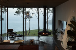
Why did you choose a concrete floor for the sunken living room?
FW: The home-owners were keen on concrete for the lower living area for a number of reasons. The Gyrofocus fire requires a fireproof surface directly beneath it, so, rather than place a different material under only the fire, we extended this material throughout the entire space. This room enjoys a large amount of sun throughout the day and the dark concrete minimises reflection and glare. The home-owners had wanted a limited material palette throughout the house and the burnished black oxide concrete was also used in the island bench and floating bench seat in the lower lounge.

