Nature mirrored: Mercury
Sustainability, staff comfort and a few wow moments are at the core of Mercury’s new headquarters in Newmarket.
The new Mercury headquarters building is an example of the ways in which architectural intervention can create a productive work environment by highlighting employee comfort as an integral part of its design. The new HQ exemplifies a successful workplace environment and illustrates how to employ sustainable building practices in an office building. Architectural firm Warren and Mahoney aimed to provide a home for innovation and collaboration, which is fostered by a sense of both community and care in the workplace.
Since its establishment in 1994, Mercury has pioneered the renewable energy movement in New Zealand. Following a branding rethink in 2016, Mercury’s leadership considered it to be crucial to build a new HQ that epitomised its core values of ‘innovation, collaboration and community’, not only to increase staff morale and productivity but to stand as a physical embodiment of Mercury’s sustainability values.
Before the Newmarket project, Mercury’s employees were divided between two Auckland offices: Greenlane and Albert Street, accommodating 450 and 100 people respectively. This arrangement proved problematic for employees as there was a lack of cohesion over the offices and a number of staff members had to travel across town during the day for meetings.
The idea was to amalgamate the workforce in one central location. The design moniker, according to head designer Holly Campbell, was ‘Nature Mirrored’. “That provided a sustainable home with well-being at its heart.”
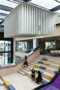
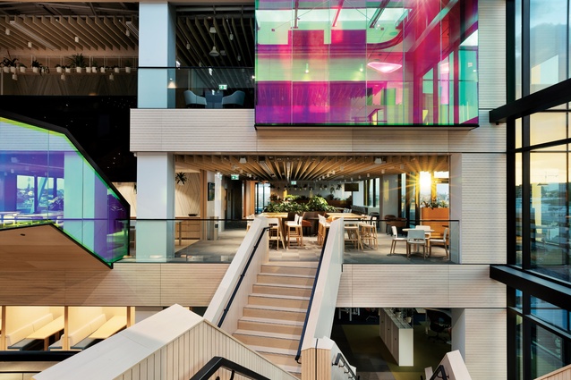
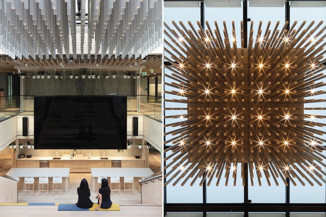
An immense atrium connects all five levels to provide visual connectivity for employees. “Our primary challenge was to find ways to connect all Mercury’s people together across all floors, separated by a large central atrium,” says Campbell.
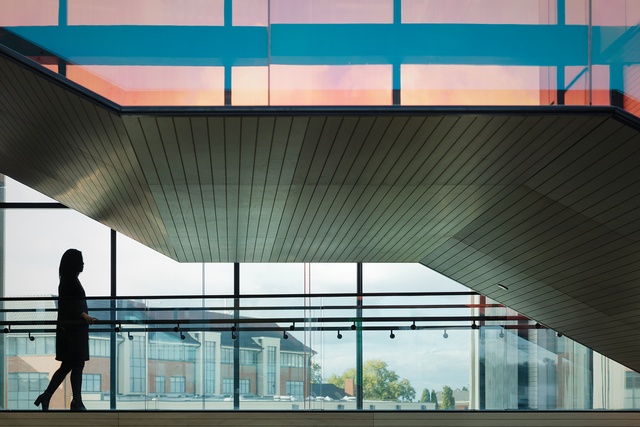
The continuous glass façade filters natural light through the atrium to all levels. The positioning of the openings throughout the atrium provides natural ventilating qualities that exceed the minimum New Zealand Green Building Council requirements by 50 per cent, ensuring a higher level of fresh-air exchange throughout the premises.
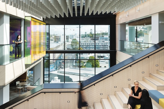
Generous stairwells connect the floor plates for circulation and encourage incidental meetings with colleagues. The grandstand stair at the heart of the atrium provides a central location for all staff meetings. “The staircase sought to bring everyone together by creating a large, AV-enabled, versatile and open space to allow all Mercury people to connect across their national network,” Campbell explains.
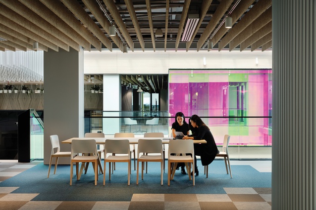
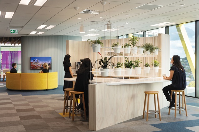
The open floor plan allows for a natural sense of collaboration across the whole company. The modern and innovative way of working, ‘hot-desking’, was incorporated in the new building; it’s an aspect that was not employed in the previous offices. Pods of desks on each floor and personal lockers replace traditional private offices.
All team members, including managers and team leaders, are encouraged to explore this sense of mobility in the hope that it will strengthen the brand DNA of ‘sharing and connecting’ whilst diminishing hierarchy.
The three main business units – corporate, contact centre and field workers – have different working styles. While members of staff commonly gather in their departments, no individual is confined to one area, creating space efficiency and allowing for a constant movement of ideas. The open-plan design illustrates the Mercury business model of ‘cross-functional ways of working’, where a collaboration of ideas from different people over various job roles is encouraged.
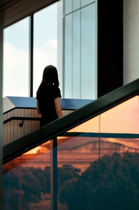
The spaciousness of the floor plan is further emphasised when observing the careful interaction between the use of light and the use of materials. The glass façade creates a constant connection with the outdoors, which augments the relaxed atmosphere and aids employee well-being.
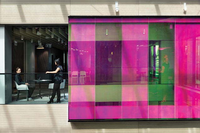
Inside the atrium, light bounces off dichroic glass cladding on the grandstand stair and boardroom walls. This combination of metal and translucent glass creates kaleidoscopic effects of colour and light, capturing the changing light from the sun-filled atrium and distributing it to all parts of the floor plates.
Senior designer and technician at Warren and Mahoney, Arron O’Hagan, states that “the glass is at its brightest in the middle of the day and more subdued towards the evening. This mimics the natural ebb and flow of human energy throughout the working day.”
According to Campbell, the glazing adds a sense of movement and life to the building. “The dichroic glass is a physical representation of energy: constantly changing colour throughout the day while mirroring nature within and the surrounding cityscape of Newmarket.”
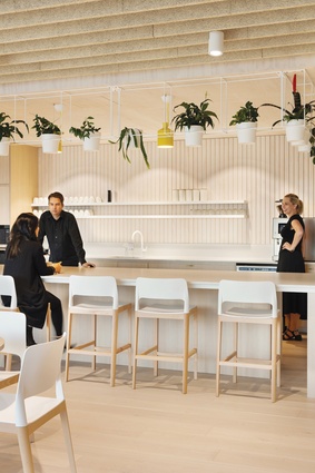
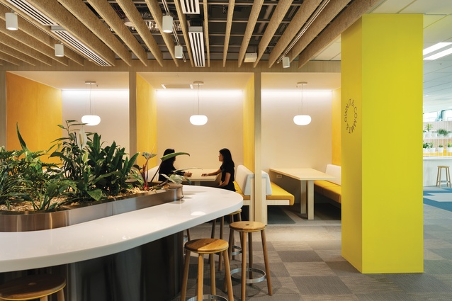
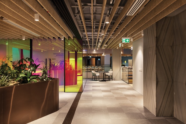
Providing a connection to natural products was an important aspect to the design team, which further emphasised the idea of a ‘Nature Mirrored’ office. “Sustainability was a key driver in the material choices throughout,” says O’Hagan. The woven vinyl flooring has a significant amount of recycled content and can be recycled at the end of its life. The wood-wool ceilings in the social areas create a sense of warmth, and the ceiling tiles in the meeting rooms have a neutral biological footprint.
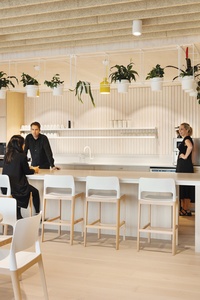
To create an even more nature-filled space, planting and greenery was added heavily throughout the building. This aspect of greenery not only provides the inhabitants with a visual connection to nature and a calming atmosphere, but contributes to the purification and cooling of the air. Air conditioning units do feature throughout the building for occupancy comfort; however, the use of sustainable techniques, such as planting and swirl diffusers in open-plan areas, means the HQ exceeds NZGBC’s 5 Green Star rating benchmark.
Acoustic solutions and materials have been successfully incorporated for overall comfort: an important consideration because of the number of people in the building. Noisier areas, such as the staff kitchen and eatery, sit closer to the atrium, whilst private meeting pods are further away.
The workstations include custom, fabric-wrapped screens that are attached to the sit-to-stand desktops, enabling each user a degree of visual and audial privacy at the working height of their choice. The atrium ceiling features acoustically designed suspended panels that absorb any reverberation from the surrounding floors.
The inventive use of contemporary and sustainable materials and methods co-aligns with the innovation and creativity Mercury seeks to foster in its company. The new HQ demonstrates an office building that places employee and occupant satisfaction at the centre of the design. It stands as a physical embodiment of Mercury’s sustainability values, emphasising the importance of Mercury in the New Zealand community.
This article first appeared in Interior magazine.


