New York state of mind
In a bid to build the largest apartment building in New York City in the late 1920s’, real estate mogul Henry Mandel acquired an entire city block on the west side of Manhattan. He hired the architectural firm of Farrar & Watmough to design a residential complex that was statuesque in both scale and character.
Not surprisingly, over the years, London Terrace Gardens has managed to retain its charm and popularity among the most discerning New Yorkers, including a number of notable celebrity residents. “It’s a grand pre-war building with a beautiful brownstone aesthetic,” explains the tenant of this one-bedroom rental apartment, a creative director currently based in Manhattan. “The first time I laid eyes on this apartment, I knew it would be a perfect fit for my needs. I don’t think the internal layout could be improved in any way.” The home boasts good architectural bones and ample natural light.
The Swiss-born creative director quickly realised that he wouldn’t need to make any fundamental – and therefore potentially costly – amendments in order to fashion an enviable space that would reflect his global career, personal tastes and lifestyle.
However, having lived and worked in numerous cities, the creative had amassed a significant collection of furniture and artefacts, the size of which would not be accommodated in the 80m2 apartment. “I felt that I needed help curating my collection and bringing the chosen pieces together within a strong colour scheme.”
He enlisted the help of NYC based design firm Studio Mellone. “Andre [Mellone, the studio director] and his team asked all the right questions from the beginning,” he continues. “They took a deep dive into every aspect of my lifestyle and envisioned the solution that I was struggling to put into words.”
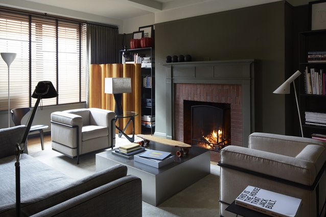
Recognising that the client was more prone to ordering takeaways than cooking, and more likely to arrange casual soirees than formal get-togethers, the team focused their efforts on the living room. As a result, the fundamental aspects of the apartment – the small galley kitchen and bathroom – were left relatively unscathed.
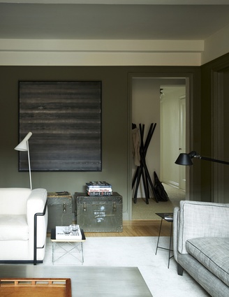
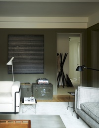
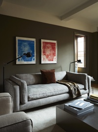
The colour palette – namely a selection of greys, khakis, olive greens and beige – was inspired by Number 8, the client’s favourite artwork by abstract expressionist painter Jackson Pollock. The parquet floor, somewhere on the red and orange spectrum, jarred with the chosen tonal range and was sanded back, exposing its original blonde colour. The living room and kitchen were painted military green and the bedroom was painted a light beige, setting up a strong visual contrast between the two spaces.
“Another important aspect of the brief was to create the illusion of more space,” the client adds. “Despite the apartment’s size, it feels much larger.” This is primarily due to Studio Mellone’s canny use of colour and texture, but also their restrained and strategic layering of furniture, accessories and sculptural lighting throughout.
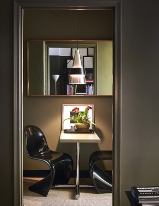
The layered wooden venetian blinds and linen curtains in the living room for example, extend further than the actual window length – creating an increased sense of space. The shrewd placement of the client’s Alvar Aalto pinewood screen in the far corner gives the impression that something exists beyond. An additional small table and wooden chair on the perimeter of the room amplify the effect, without the sense that any of these decisions were forced or over-thought.
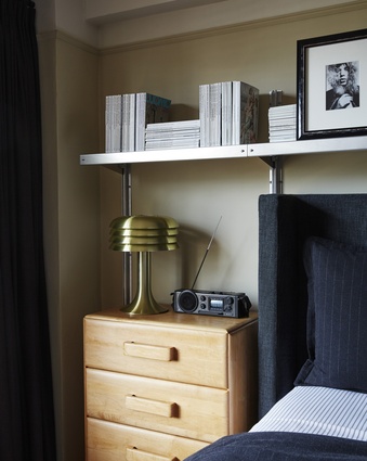
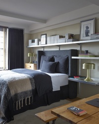
Studio Mellone’s approach extends into the client’s bedroom where a carefully edited selection of pieces bring both a sense of tranquility and masculine luxury to the space. Compromising on a queen-sized bed, the client was afforded a comparatively generous allocation of space for the surrounding elements – sizeable bedside tables, and Swedish lamps by Hans Agne Jakobsson, perfectly juxtaposed against an upholstered Restoration Hardware headboard.
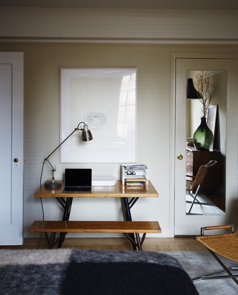
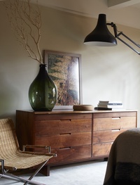
An industrial, made-to-measure E-Z Shelving System, heaving under the weight of the ex-editor’s magazine collection, maximises otherwise wasted wall space while an American black walnut George Nakashima dresser across from the bed, the client’s favourite piece, sits adjacent to a utilitarian Ilmari Tapiovaara bench-and-desk table which functions as a mini-office. A Ward Bennett Sled lounge chair finishes off the eclectic, yet remarkably cohesive, aesthetic. Each item is somewhat over-scaled, an unexpected design decision given the size of the room, but the gamble works a treat.
“This apartment is really a story about striking the balance between luxury and low budget,” the client adds. “In making careful decisions throughout, we were able to create a really unified space that feels like it was made to measure. That’s what really successful interior design means to me.”

