Newtown Park Apartments
On the site of a former major tram depot in Wellington’s city-fringe suburb of Newtown, Studio Pacific Architecture has transformed a rundown collection of towers for social housing. Newtown Park Apartments is Wellington City Council (WCC)’s latest and largest complex in its $220-million, 20-year-long social housing upgrade plan, which includes Central Park Apartments, Te Ara Hou Apartments and Regent Park Apartments.
While the scheme is highly complex in one respect, Studio Pacific was probably fortunate to have drawn Newtown Park in WCC’s lottery of social housing project upgrades, which were won by a number of architects. Here at Newtown Park, the fundamentals were relatively intact, in comparison with another housing upgrade scheme nearby that was later found to have poor-quality concrete, draining funds from an already-constrained purse and resulting in a reduction in the budget allocated to the urban elements. And, clearly, the urban elements are crucial on a project such as this, where the architecture becomes an important support platform for delivering social outcomes.
Newtown Park’s original complex of six towers was designed by D E Barry Martin & Blake and built from the late ’60s to the early ’70s in three stages of construction. During this time, a considerable amount of social accommodation was being built for single men working on motorway construction around the city so, while there were 276 units in the original plan for the six towers, there are now 205 units within five buildings in
order to create more units for a more-modern demographic, which includes
many families.
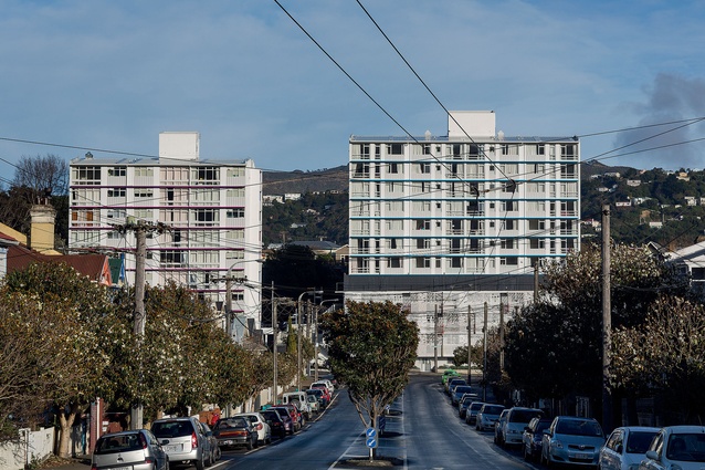
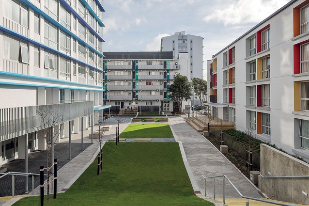
On what is a blunt-ended, triangular site of about 8,700m2, now live three large towers (each containing from 40 to 72 units) and two lower blocks (with 17 and 22 units). Before WCC’s upgrade programme, like its sister sites around the city, Newtown Park was a fairly undesirable place to live. Typical social housing issues became design issues: poor ventilation, front doors that opened directly into public spaces and rabbit-warren layouts. Also, two people had died on the property, which, understandably, resulted in seriously poor public-perception problems.
As well as this, a feasibility study showed that one of the towers would have been very difficult to retrofit; hence it was pulled down. A condition survey was performed on 30 per cent of the units and the architects discovered that one tenant hadn’t used electricity for three years because they couldn’t afford it; some tenants from overseas had never used an electric cooker or a washing machine before, while another had draped the interior of their unit, including the windows, in fabric and built in a gigantic wooden sofa, which filled a room and would have either been craned in or constructed on site. The tenants’ requirements seemed incredibly broad and so it was a challenge for the architects to try and respond to such diverse needs while within a limited budget.
Studio Pacific worked with Isthmus to redevelop the external spaces and reduce the number of carparks around the site, to create playgrounds, allotment gardens, a playing court, outdoor drying facilities, seating, green space and paths, with subtle but clever wayfinding features to link adjacent sites without intruding on tenant privacy. Spatial thinking was key here and the urban landscaping is one of the most successful elements of the scheme as it connects the towers back into their surroundings, in addition to the intended functional benefits.
Studio Pacific director Evzen Novak explained that “when you live somewhere, the sequence of using it doesn’t begin at the front door of a unit; it begins at the street. The problem with the whole of Newtown Park was that, the minute you walked in off the street, you walked into ‘danger city 2001’… and you wanted to get out of it… so, in understanding and addressing the logical sequence of how residents might use the buildings meant that (in our minds it was a holistic approach) we left in some money for the landscaping and [the project] is successful as a result.”
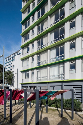
The usual upgrade conditions were applied to meet seismic and Building Code requirements, as well as to improve security, safety and facilities for the residents, and provide double glazing, insulation, better ventilation and a modern upgrade of the units. The architects also opened the corridors out onto outdoor private space/communal laundry-drying terraces on each floor, allowing neighbours spaces in which to converse more easily, too; some lucky residents have million-dollar, north-facing views up the valley.
The buildings’ main entrances are defined with distinctive colours, offering a sense of identity to each one, along with integration into the surrounding site, while new internal community spaces, again, allow for better communication between residents.
This type of budget-driven upgrade meant the design team had to think cleverly about the material palette, utilising recycled materials as much as possible, along with low-cost lighting and hardy plant species. Paving was recycled from the former Manners Mall, for example, and kitchens were retained and upgraded, including solid rimu joinery and stainless-steel benchtops.
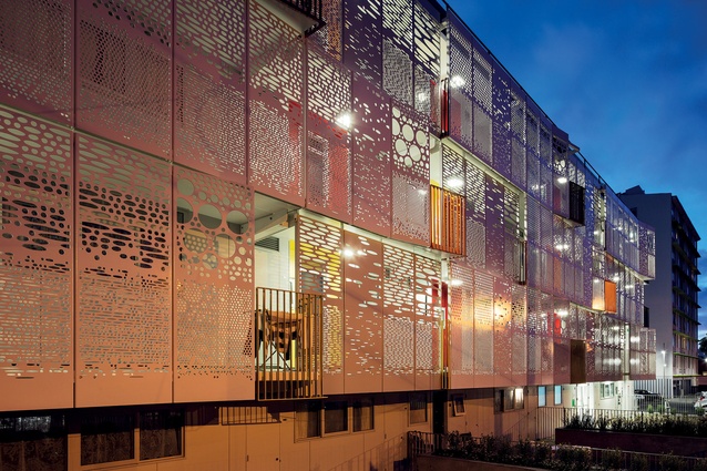
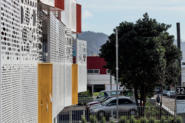
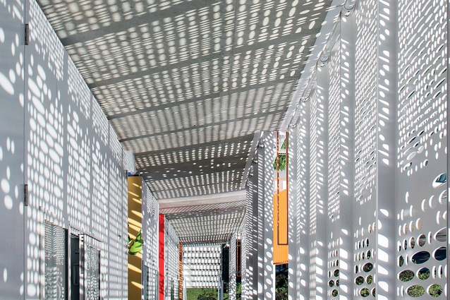
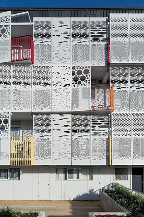
The other highlight of the scheme has to be the new façade to Block C (Mansfield Block), which faces Mansfield Street, transforming what was the backside of the building into the new frontage of the complex: a colourful and exciting, modern face that also has a functional purpose. The clip-on panels hang off a steel tray system, extending the width of the corridor behind the façade. This screen increases privacy, shelter and security for the tenants with its elliptical cut-out shapes that decrease in size and change in shape and proximity the closer you are to the front doors of the units. The screens also push out in front of windows and next to balconies, reflecting the arrangement of the units in behind. It’s a contemporary approach that makes the building stand out, whilst still blending in with the neighbourhood, using colour and light to give the project that important ‘wow’ moment that can so often be forgotten when designing with a
limited budget.
It wouldn’t be too difficult to find fault in a scheme like this and the architects were the first to admit that there was only so much they could achieve on such a budget-driven scheme. But, as they suggest, “That’s the truth of building” and, as it was a refurbishment, they weren’t able to majorly transform the scheme spatially. So, no, this ain’t ever gonna be The Ritz but that’s a big BUT because, as council housing goes, this appears to have the basics right. Yes, WCC could have demolished the lot and rebuilt back onto the site with a swish new Regent Park Apartments-style arrangement; however, consents being what they are, the number of units would have been considerably smaller, thus reducing the number of homes available for those struggling to make ends meet. And, presumably, the environmental costs would have been substantial – all that construction material turned
to dust.
It is also worth comparing New Zealand’s social housing with that of what’s on offer overseas. I’ve visited quite a few council houses in London and, by comparison, Newtown Park Apartments is The Ritz. I didn’t see any graffiti or smell that effervescent whiff of stale urine; there were no heroin needles under the stairs, and no screaming matches from the balconies or cars blazing in the courtyard – and I’m not drawing on stereotypes because I have a personal experience of these scenarios. I recall showing a New York-based friend one of Auckland’s infamous state-housing neighbourhoods many years back, to which he replied, “Wow, you guys are so lucky that this is the worst you’ve got”. He showed me, by comparison, where some people were living in his NYC neighbourhood and it’s certainly a reminder that we are incredibly lucky in New Zealand. Although, I hope, with child poverty growing as it has been, that we don’t forget the people at the bottom of the economic chain who still need plenty of help. I’m sure that this kind of work isn’t exactly bulging the bank balances of the architects designing it but, at least, the appreciation and smiles on the faces of the residents living in Wellington’s new social housing are bound to make its architects sleep easier at night.
Apparently, the client described Studio Pacific’s architectural graduate Andrew Banks, one of the project architects on the scheme, as “the conscience of the project”: he made sure that the design imperatives were not lost through the process of construction. It’s a lovely idea. Perhaps every project team should have a ‘design conscience’ added to its arsenal.

