Nip and tuck: Orama
“Radical and transformative surgery” is performed with precision by Smart Design Studio to transform a grand but tired Victorian house in Sydney into a well-lit family home.
For an architect or designer, the opportunity to work on a great residential project with supportive clients is a dream. If they get this chance twice, they might have to pinch themselves to believe it is true. This is the case with Smart Design Studio and its project for Orama – one of Woollahra’s finest and most historic homes. The clients had previously engaged the practice to refashion their nineteenth-century Mosman house into an example of cutting-edge architecture, so when they decided to downsize and move into Sydney’s eastern suburbs to be closer to their children, they had no hesitation in contacting the firm again.
Even though the site is on the other side of the harbour, the challenge was similar – how to transform a grand but tired Victorian house into a comfortable, well-lit, modern home. With the gauntlet thrown down, Smart Design Studio opted for radical and transformative surgery executed with millimetre-perfect precision.
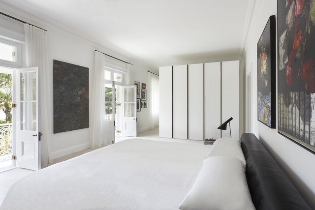
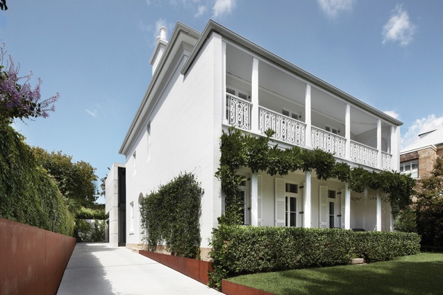
Like many historic homes in Sydney, Orama grew in stages. As more room was needed, new sections were added onto the back of the property. While this left the original cube-like house at the front intact, 120 years of alterations and additions created the typically dark labyrinthine experience familiar to anyone who has lived in a ramshackle terrace. Director William Smart said that the “former house didn’t have scope for change.” To accommodate the changes the clients wanted, William decided to work with the best aspects of the house – the elegant original section – removing all the later additions at the rear.
This strategy allowed for the construction of new, generously sized living spaces and a rationalization of the outdoor areas connected to them. Rooms that were more intimate in nature and scale – such as bedrooms and studies – use the structure of the original house. This provides an effective division spatially and experientially between the private, quiet and restful aspects of the home, and the boisterous, playful and communal ones. The clients now see the completed result as balanced.

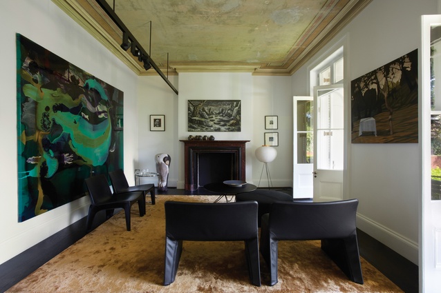
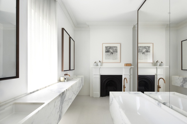
White, black and grey mark the interior and the clients’ strong penchant for these colours. The only time you get a true hint of the historic house’s age is in the drawing room and study, where the architects have showcased the original ceiling paint; this patina provides a beautiful and effective contrast to the crispness of the renovation. Careful choice of door and window hardware acknowledges the heritage significance of the home, as does the palette of materials used, especially in the main bedroom’s ensuite.
Honed marble, waxed brass taps and mirror surrounds are timelessly elegant by nature, an aspect emphasized through the considered detailing of every single element. This conception of detail and form unifies the interior. Of his approach to design, William said that he likes to organize elements into “autonomous units.” Examples of this are the bath and countertops, which are treated like blocks within the space.
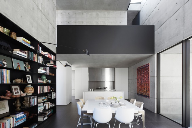
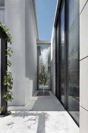
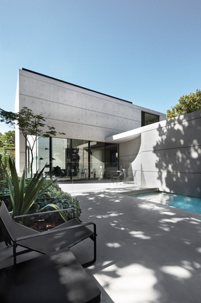
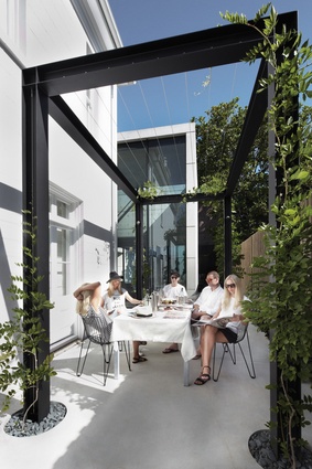
The balancing act between honouring the past and embracing the present with vigour is best expressed at the point where the two sections of the house meet. The beautiful white plaster walls of the old house and the bare concrete of the new pavilion are mediated by a large black-painted steel portal that acts as a threshold. As you pass through the portal you see the first of the six-metre-high windows and capture a glimpse of another and then another. The scale of these giant vertical glass doors, especially in the context of a house, is breathtaking.
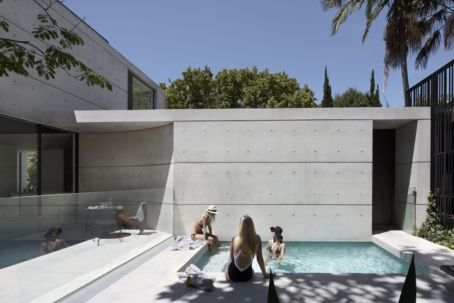
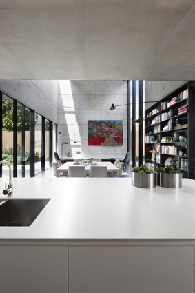
The client said that she “loved watching the cranes assemble her house” and no doubt the sight of these being installed would have been thrilling – if not nerve-racking. William was fortunate that this client loves concrete, and despite the fact that the her husband was at first a bit nervous about having tall grey concrete walls in the living room, the finished result is a crowd-pleaser.
This is in no small part due to the extremely high level of finish on the walls, which William said was “very hard to achieve” but well worth the effort. The velvety-smooth finish on the interior was achieved by hand-sanding the concrete after it had set. The muted grey of the room is offset by a large painting of cacti that explodes with colour. The work, by Lucy Culliton, forms part of the clients’ collection of contemporary Australian art lining every wall of the house.
It is rare that a client and their designer see eye-to-eye and even rarer that this happens twice. At Orama, Smart Design Studio has delivered a project that is both simple in strategy and generous in experience. This project goes to show that the rigour and quality of contemporary design have the potential to enrich our value of past architectural achievements.
Orama by Smart Design Studio received the Hugh and Eva Buhrich Award for Residential Architecture – Houses (Alterations and Additions) in the 2015 NSW Architecture Awards.

