Norris Ward McKinnon
Future-proofing work places can be tricky. The difficulty is, of course, that the future is notoriously difficult to predict. Soren Kierkegaard, musing about the paradox of the future in a time well before the iPad, had this to say on the subject: “Life can only be understood backwards; but it must be lived forwards”.
That said, there are a few givens that we can fall back on: it’s safe to say that the internet is not going away and that cloud computing is just going to expand; because of this, the way we work will inevitably continue to change. There will, most likely, come a time when we’re all freestyling, with all we need available anytime and anywhere. The shackles will be broken.

The dilemma for businesses is how far to go, in the now. The answer? As far as you can afford to. Norris Ward McKinnon (NWM), a longestablished Hamilton law practice, was recently led into a new workspace typology by Wingate + Farquhar. Whereas the law firm’s previous office design was quite cellular, the new design, which clearly delineates client spaces from workspaces, also pulls together a number of other strings – the aforementioned future-proofing, flexible seating arrangements and connectivity – and ties them neatly together.
But, back to the beginning. “One of the toughest things,” says architect David Wingate, “was that the office is in an existing building that’s not exactly the best building in the world.” Visit the building and you’ll see what he means. The foyer is confusing, and the peach-coloured building itself seems to have the dubious honour of being at both the vanguard and the tail end of postmodernism’s arrival in Hamilton. Levels six and seven, where you’ll find NWM, do have the advantage of wonderfully wide views across the whole Waikato.
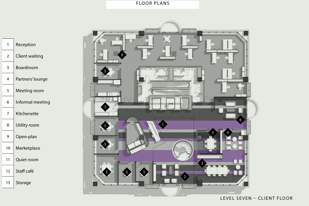
“It’s a square building with a central core and that made it a bit tough to work through,” says Wingate, referring to how a core can compartmentalise a floor. “The first thing we looked at was the floor space. NWM needed more than one floor and the question then became: how do you actually connect the two floors in an elegant way, and how do you make it purposeful? That was the parti; that was the big idea.”
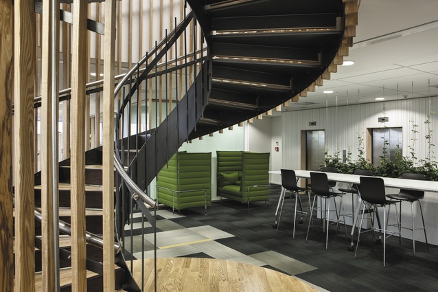
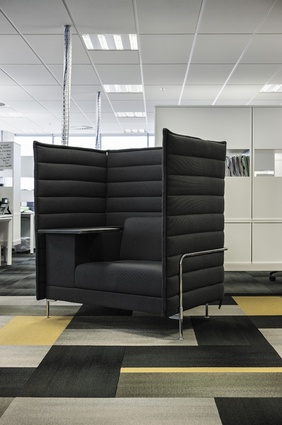
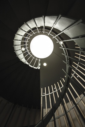
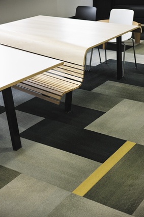
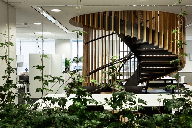
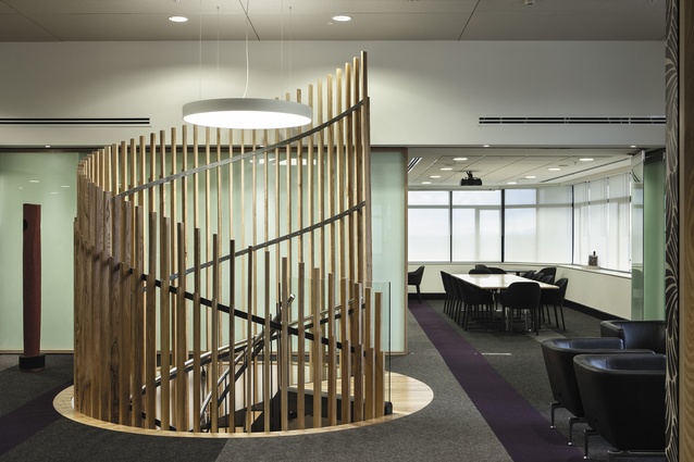
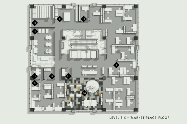
The elegant solution to the problem of connection was a circular staircase, detailed vertically with timber battens, which augers its way down, from level seven, the reception and client floor, to level six. Here, it terminates in a part of the office that has been dubbed a “market place” – “a place for staff to share thoughts and ideas”, which is facilitated by a variety of seating options that also lend themselves to mobile working, on iPads or notebooks, away from the desks.
“What we did was create a ‘market place’ idea where people who are working on that floor can gather together, where the boss and a junior can talk in the same language. And the idea was also the integration of new technology. You have to look at these things. How do you get a generation that’s used to sitting in one style of workplace into this idea that they might not have a desk of their own in the next five to ten years?”
Open-plan spaces have had their detractors, but the style has evolved. The designers say they talked with their client a great deal about other open-plan offices in the Hamilton area – and the experiences other people had had, some of which hadn’t been great. David Wingate explains that the process shouldn’t be one of just taking things away – “you also need to give something back”.
“We spoke about this many times at NWM; about how we can move forward to a predictable jump as technology evolves, and how that will quite easily allow them to embrace the future, whatever that may be, and we think we’ve got a pretty good idea. There is the idea that in 5-10 years’ time you might not actually ‘own’ your desk; so we need you to have some good replacement spaces available that you can move into. The market place became a good anchor for the staircase, and a good anchor for future-proofing space, so the business can grow if and when required. There was also a good discussion around mobilisation. It’s probably limited at the moment, with this company, but we’ve got to think down the track to when it will become more commonplace.”
Back to the big idea: opportunities to design circular stairways are infrequent. There are a number of obstacles: cost to client is one and overcoming a landlord’s reservations about drilling a hole through the floor shouldn’t be underestimated. A spate of earthquakes did little to alleviate the landlord’s reservations, says the architect. “The building owner became a bit nervous about putting holes in floors and compromising structural integrity. However, this stair has actually given more strength to the building.”
Those arguments out of the way, Wingate says they wanted to do more than just connect the floors; they wanted to make the stair a functional piece of art. Art often needs space to breathe and, at NWM, a fortuitous decision to investigate the ceiling cavity on level 7 revealed an extra 1.5m of space which, once removed, adds a loftiness and lightness to the floor while also giving “the reception area a lot more strength”.
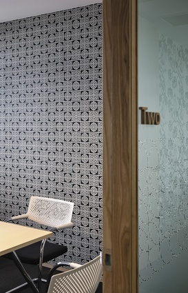
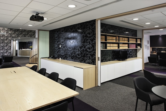
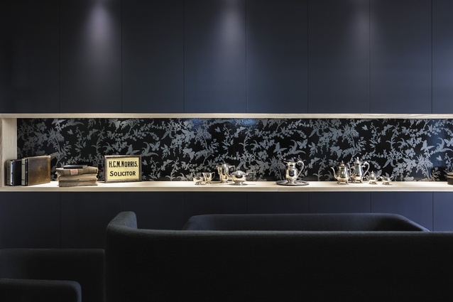
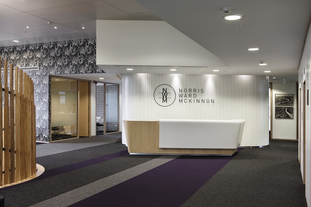
Dotted around the perimeter of this floor is a generous number of meeting rooms, each distinguished with a different flavour of Florence Broadhurst wallpaper. Wooden joinery, perhaps a subtle nod to Mahogany Row, and definitely a nod to handcraftedness, adds additional refinement, as does a burgeoning art collection, and subtle signage details also crafted from timber.

