A neighbourly narrative: North Fitzroy by Milieu
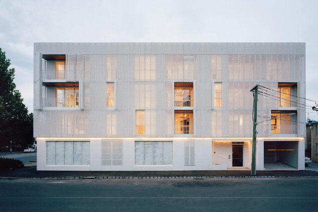
Veiled by white, metallic screening that artfully abstracts views of the city surrounds, this modern take on the classic walk-up apartment – by Fieldwork and Flack Studio – is arranged around a verdant central courtyard, designed to foster community.
The three-storey walk-up apartment building was once the quintessential architectural solution for densifying Australian cities. As the population of capitals down under expanded during the 1960s and ‘70s, red brick flats were steadily constructed along the main roadways and rail corridors that connected the suburbs to city centres. In Melbourne, there is a sense of nostalgia associated with this housing typology, which is now part of the city’s vernacular. But the hard masonry exteriors of these well-worn residences conceal the spatial quality and sense of community that this housing model can provide.
The most successful examples of walk-up apartments are those that are accessed by generous external staircases, with walkways protected from the weather. These shared circulation spaces invite residents to be neighbourly by providing opportunities for chance encounters. A public staircase encourages an entirely different social etiquette to an elevator and is therefore an important communal space, one that is lost in many contemporary residential developments. Recognizing the potential for this simple architectural element to build community, Quino Holland, architect and director at Fieldwork, envisaged North Fitzroy by Milieu as “a modern take on the classic walk-up apartment.”
Located on a bustling corner block in Melbourne’s Fitzroy North, the building responds to the scale and grain of the neighbourhood. The white brick perimeter wall that skirts the site’s boundary is punctured by openings that work in dialogue with the street. Along the small laneway that runs the length of the northern boundary, the brick podium is broken down by a series of patios that form entries to the ground-floor apartments. This habitable edge reduces the apparent scale of the building and stitches it into the rhythm of the adjacent Victorian terrace houses.
On the opposite side of the building, the scale shifts. An oversized door and deep eave break the rhythm of the brickwork to announce the formal arrival point, while large openings that wrap the corner will be lined with seating for people catching up over coffee. The cafe, Lagotto, was designed by Flack Studio and is the latest hospitality offering from developer Milieu Property, which is ensuring the requisite ground-floor commercial spaces offer services that will build community among the residents and the neighbourhood.
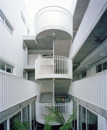
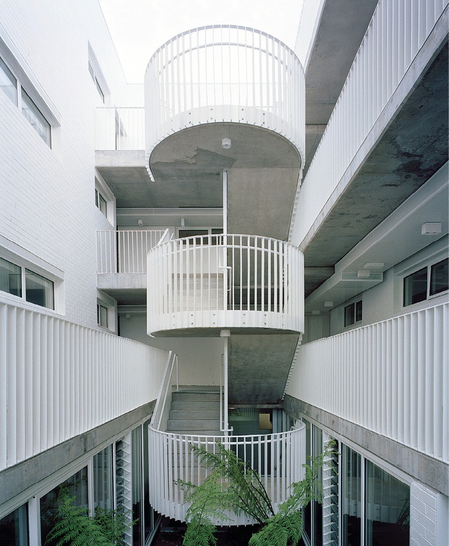
Unlike the spatial arrangement of more typical apartment developments, the planning at North Fitzroy by Milieu facilitates human interaction. Arranged around a central courtyard, the twenty-six apartments are accessible via a monumental staircase that connects all four levels.
Visible from the lift lobby, the staircase and accompanying fern garden entice you away from the elevators and out into the semi-public domain. The stair itself is broad and curvaceous, with a deliberately sturdy tectonic quality thanks to its concrete and steel composition. “The steel balustrade was particularly important,” explains Quino. “It’s got a material quality that evokes the 1960s-era apartment.”
Off the stair, the courtyard is bordered by protected walkways that lead to each apartment. This interstitial space is proportioned so that life can spill over from the homes onto the shared spaces. Potplants, shoe racks, chairs and small tables add a sense of vitality and signify the many domestic experiences that overlap at North Fitzroy by Milieu. On the top floor, where the courtyard frames the sky, the landing is oversized to accommodate informal gatherings.
Gestures like this are significant in conjuring the atmosphere of a bygone era, when more apartments were well built and personal. “When people walk through they often say, ‘Oh, you’ve renovated the building really well,’ assuming it’s an existing building,” says Michael McCormack, a director at Milieu Property. “It’s a great compliment.”
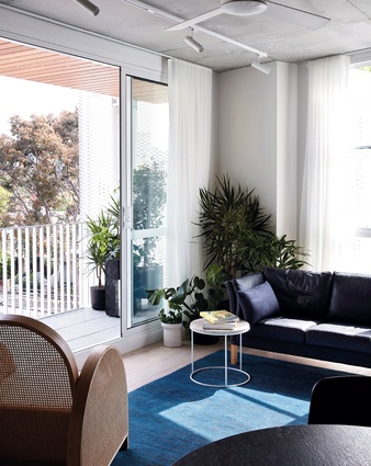
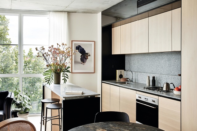
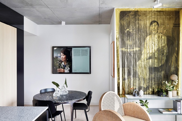
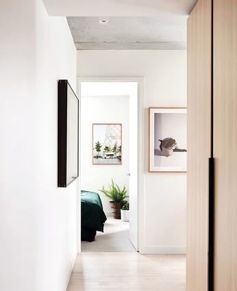
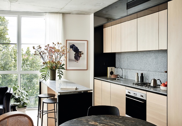
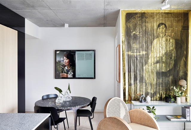
Inside the two-bedroom apartment on the south-west corner of the first floor, the spatial qualities and materials are indicative of the consistent approach Flack Studio has taken to interior design throughout the building. The home is generous and thoughtfully detailed to include elements by local designers, such as light fittings by Melbourne’s Anna Charlesworth. This championing of local design and fabrication extends to the balcony, which offers more private outdoor space in counterpoint to the shared courtyard edge.
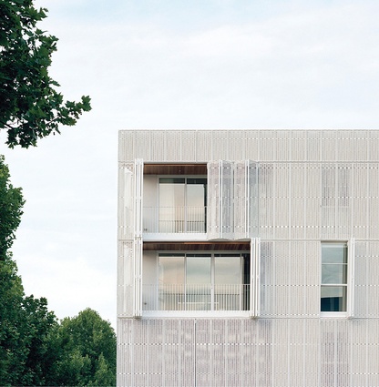
The balcony is veiled by an operable shutter system that was designed and fabricated in Melbourne and mediates the building’s context. The expanded metal screens, which are fixed by repurposed ute straps, abstract slithers of colour from passing cars, neighbouring buildings and the petrol station across the road, making every view from the apartment beautiful.
From the street, the screen appears to hover above the podium, its white, expanded mesh texture reflecting the sunlight as it shades the apartment interiors. During the day, patterns of dwelling are transcribed onto the exterior of the building through the operable screens, whose concertina panels make the varied use of the rooms legible. At night, the building becomes almost immaterial as the abstraction of the screens is reversed and the life of the building becomes a pixelated vision of habitation, projected onto the building’s facade.
North Fitzroy by Milieu invites a physicality that is in no way laborious, but rather, an opportunity to connect with the material qualities of the building, the spaces it shapes, the local climate and the community.
This article first appeared on architectureau.com.

