Gateway to New Zealand
Sam Eichblatt reports on a new hotel presented as a gateway to the country. The design incorporates idiosyncratic New Zealand materials and motifs that represent the journey of the Tainui waka 800 years ago, and its arrival in the Manukau Harbour.
Anna Keen’s introduction to the London architecture world was a classic baptism of fire. Having been hired at Radiate Design, an interiors firm working on large-scale projects throughout the one of her team’s first jobs was an ambitious assignment to completely gut and renovate the Aon Insurance offices in Sydney and Melbourne — prime real estate with a grand total of 21,000 square metres between them.
“Because of the traditional rivalry between the two cities, we needed to put a different spin on the offices. That alone made the project interesting,” says Keen. “We needed to treat them in a different way but the staff still had to feel like they were working in an Aon building.” Her interior design work at Warren and Mahoney’s recently unveiled Novotel was a no less grand undertaking. Keen worked on a complete design programme that integrated interior design and the building shell of the 263-room hotel to create a single, clear statement.
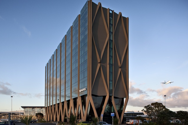
The new hotel is a product of some unique conditions. The three clients were Auckland Airport, the Accor Hotel Group and Tainui Group, the commercial asset-management arm of Waikato-Tainui, which holds 70% of the shares as well as guardianship of the Waikato River: the keystone outside, taken from the Waikato, reads, “A river of a hundred chiefs, at every bend a chief”. Warren and Mahoney’s response was to present the hotel as a gateway to the country, incorporating idiosyncratic New Zealand materials and motifs throughout the hotel that represent the journey of the Tainui waka 800 years ago, and its arrival in the Manukau Harbour.
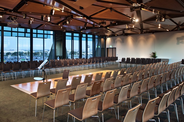
A hotel at an airport is also, obviously, a completely different proposition to one in the city or the country — customers don’t want to feel at one with their environment: they want a nice place to eat, followed in short order by a quiet place to sleep. As a result, says the hotel’s architect, Warren and Mahoney principal Jonathan Hewlett, this is a four-star hotel with five-star public areas. The three lower levels contain the “meet, greet and eat” areas on the ground floor, a mezzanine floor with conference rooms and administrative offices, and a second floor with the main function room and a boardroom.
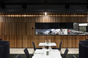
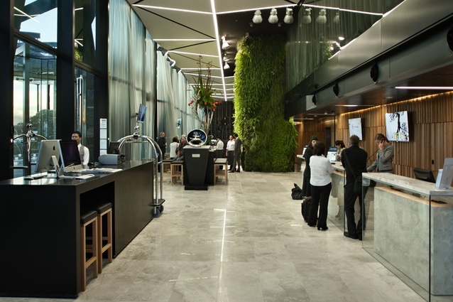
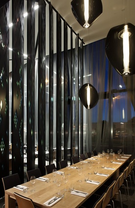
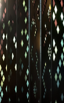
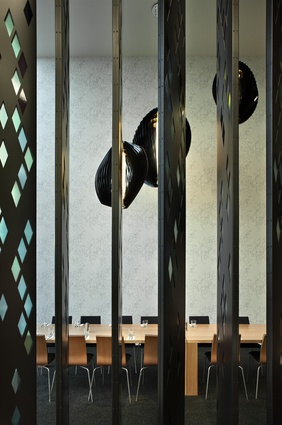
On the ground level the floorplate has been split in half, with one side dedicated to the kitchen, loading, storage and reception back-office area on the east side, and the restaurant, bar, front of house and lobby area on the west, facing the sun. The main feature of this area is its lofty dimensions; it is double-height, and dominated by a central “living wall” from Natural Habitats featuring native plants. The expansive space has been brought down to human scale by designating smaller, more intimate areas with interior furniture. The 150-seat restaurant has different types of tables to suit different types of diners; booth seating for groups, “tables for one” with a neatly concealed television console for the solo business traveller, and at the far end, a dining room that can be sectioned away behind a metal screen made of a series of six metre-high pivoting columns inlaid with translucent acrylic panels in a patiki (flounder) pattern referencing the wealth of seafood in the Manukau Harbour.
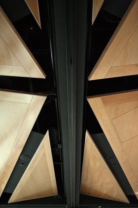
The effect, says Keen, mimics the movement of fish through water. Her team also created the wallpaper, a digital print of a tawa leaf that is repeated throughout the hotel in textiles and as film prints on glass. Another Keen touch was the digital print taken from a photograph of iron sands, abstracted and turned into a bespoke carpet pattern — used to striking effect on the mezzanine level, where it can be seen in full. FSC-certified Southland maple beech was used throughout the hotel, in the joinery, furniture and ceiling panels, as well as the solid wall paneling that, in the public areas, renders the service entrances nearly invisible. The living wall, in turn, conceals the back bar and wine storage area.
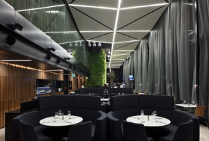
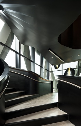
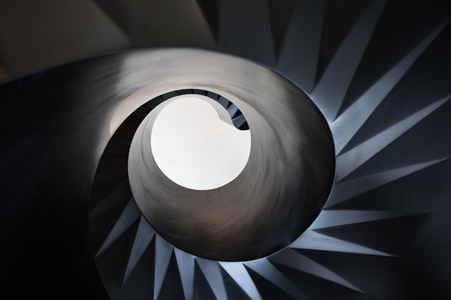
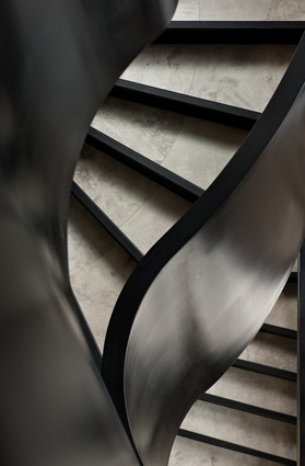
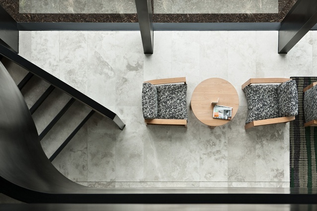
But it’s not all about nature. Furniture from contemporary local designers including Fletcher Vaughan, Simon James and Ed Cruikshank has also been used throughout the public areas, and a dramatic, 7.4-metre, black steel staircase in the shape of a helix balances the patiki screen at the opposite end of the lobby, connecting the three public levels. “We’re finding that guests are spending a lot of time down here,” says Hewlett.
So far, the restaurant has been full every night, report the architects, reflecting the demands of the unique market it now services. The airport’s current programme of renovation and plans for a second runway are bringing it in line with other global hubs offering “destination” shopping and hospitality; passenger numbers, currently at 13 million annually, are set to double in the next decade or so. As well as international and business travellers, there is the 10,000-strong airport staff, visitors seeing off or meeting friends and family and flight crews, who have their own lounge on the 10th floor.
While Keen had freedom to put her stamp on nearly everything, the hotel is part of the Accor chain with corporate brand values defined by the head office in Paris, so the rooms themselves are essentially modular and designed by David Forbes, who works across all of Accor’s 14 brands. “We worked on everything — up to this line,” says Keen, pointing at the place where her team’s bespoke hall carpet ends and the room begins. So, while some elements have been customised to lend a New Zealand flavour — like the material palette and the prints of toi toi used inside Forbes’ trademark framed bedhead — the rooms are, for all intents and purposes, a standardised product calibrated to reflect the four-starness of the Novotel brand; a crucial element when it comes to attracting international travellers, many of whom understandably do not want to take an adventurous punt on an unknown independent hotel when arriving late at night after a long-haul flight.
Each room is designed on a 26 square metre template, or 52 square metres for the six suites, dimensions that dictated the geometry of the rest of the building. For instance, the boardrooms on the mezzanine level have the same measurements as the standard rooms. The airport allowed for a maximum height of 47m, which has resulted in a tall, narrow building with a relatively small footprint of 18 by 70 metres.
What sets the Novotel apart is Warren and Mahoney’s attention to every detail outside the rooms. “It was fantastic to do an integrated fitout,” says Keen. “It was my first complete build and we had input from the word go. That resulted in a consistency in detailing from the building itself down to the carpet and screens, even the teapots. I mean, how often do you get to do that?”

