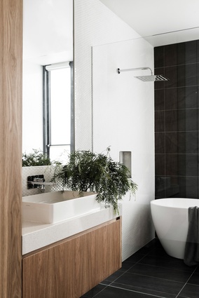
Oasis of greenery: Courtyard House
A subtle arrangement of garden courtyards creates an oasis of greenery all year round for this new suburban house by Figr Architecture.
It was perhaps the first on-site meeting that gave Courtyard House its direction. On a cold, wet Melbourne day, the cleared site in the north-eastern suburb of Templestowe Lower held few secrets about its potential to be affected by the elements. When clients Yolanda and Paul Pacella purchased the site, the two-storey timber house that previously occupied the space had been demolished, with only a pool remaining.
With no structures or vegetation and a gently sloping incline, the site was completely exposed to the beatings of harsh weather. The idea for a centrally located courtyard evolved as a solution that would offer the house a sheltered outdoor space, while internal rooms could make use of natural light and visual amenity.
When the clients approached architects Michael Artemenko and Adi Atic of Figr, they were looking to downsize. Having built two family homes previously and now being empty-nesters, they were conscious of scale and wanted to invest space only where it was needed. Yolanda and Paul invited Michael and Adi to their current house to discuss their brief with the intention of also conveying their ideals of family life and aesthetic predilections.
Deep in conversation and planning at that meeting, the party never made it out of the kitchen. Reflecting on the first sketch that was presented, Yolanda and Paul remark on how closely it resembled what was eventually built, and their immediate feelings of excitement over the initial proposal.

The final product is as much about the journey from the front door to the rear of the house as it is about the connection between spaces. With grown-up children and grandchildren often visiting, observation between spaces was important to the clients, and equally important was the ability to make use of outdoor space all year round.
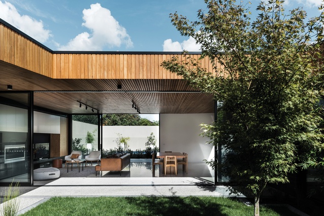
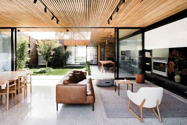
Stepping into the entry alcove, you are immediately immersed in the greenery that lies directly in front. The courtyard presents as an enclosed oasis in the middle of the house and views are created through the courtyard to the living, dining and kitchen, where the line between internal and external spaces is blurred. The plan is formed around the courtyard and almost every room faces directly into the greenery. In the main bedroom located at the front of the house, Yolanda and Paul wake to unobstructed views into their private garden each morning.
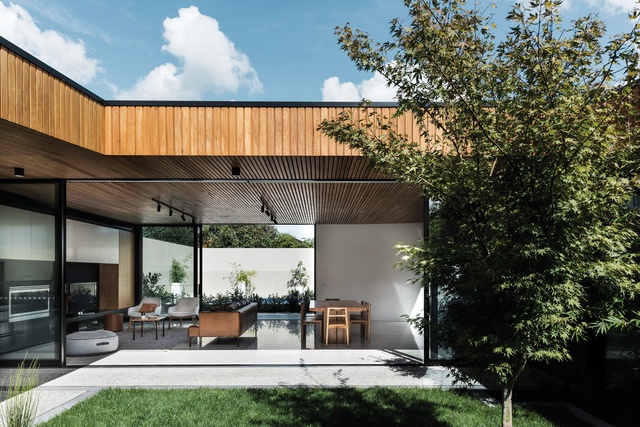
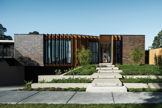
Positioned among a varying array of modest, low-lying houses, Courtyard House dissects the site’s natural incline as it climbs gently upwards from the street. The central courtyard level is raised higher than the entry and the bedrooms and lounge are at the lower level, creating the feeling of being sunken below the natural ground level when you first enter the house. The passage into the living areas runs along the western wall of the courtyard and passes windows punched into the otherwise solid wall of elongated bricks. Through these apertures, morning sun streams into the lounge nook and onto a curved wall on the west boundary of the house.
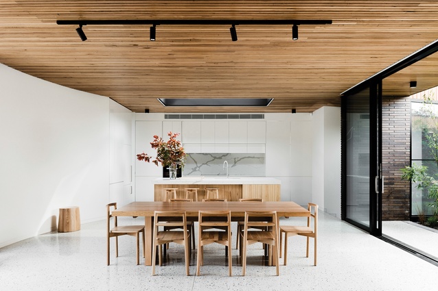
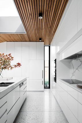
Timber cladding is a recurring element in the form of walls, ceilings and facade, as are the subtle curved walls that appear throughout the journey. From the entry, silvertop ash timber ceiling battens draw your eye to the back of the house. Here, the width of the corridor frames the timber joinery of the kitchen island bench and the skylight window that punctuates the timber ceiling above.
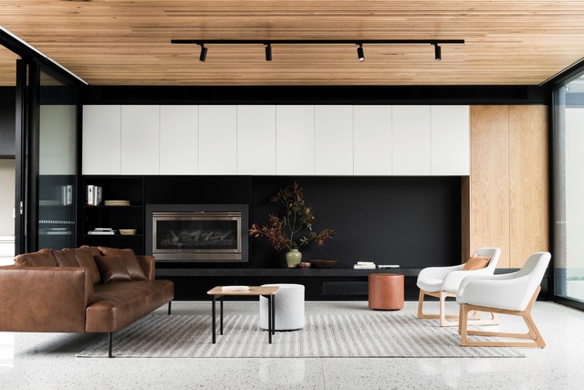
These timber ceiling battens (which might have been discarded from the project by the client if it weren’t for fervent persuasion by the arch) run throughout the house in the communal spaces, and extend into the courtyard to form a canopy over the outdoor dining area. When viewed from the courtyard, looking south towards the living room, the external timber fascia runs down to meet the horizontal ceiling battens to form a bulkhead, and together they appear to float weightlessly over the expanse of glass sliding doors.

The southernmost wall out to the backyard and pool also slides open, increasing the perceived living space between the three zones. In the warmer months the doors are left open for much of the time, creating cross-flow ventilation through the living area from the courtyard to the backyard, and inviting grandchildren to ride their bikes indoors from one yard to the other.
At the street elevation, Courtyard House appears to take subtle cues from the neighbouring properties in form and material references. In the way that all great architecture takes inspiration from its surroundings and context, Courtyard House reinterprets its findings with a striking facade that maintains a level of integration. Yet beyond its architectural merit and contribution to the street, it’s the delight that Courtyard House brings to its owners that Michael says is by far one of his greatest achievements.

