Old school revival
Mark Southcombe explores the architectural legacy of Whanganui Collegiate School, founded in 1854, and the ways in which RTA Studio’s new additions represent a skilful editing of the chaff from the grain.
Architecture at a secondary school campus tells interesting stories. As generations of students pass through, typically, there are also several generations of design work at any campus that is old enough. For state schools, recent fixations with architectural standardisation and lowest capital cost have led, too often, to a spinning turnstile of architects working on any one site, creating discontinuity in a campus design over time.
Private schools have been notable exceptions to this pattern. Institutions such as Christ’s College and Whanganui Collegiate School (WCS) each have a significant architectural heritage, which has been the basis for ongoing architectural care. The architectural history at WCS forms an inherent part of the school’s tradition and identity, its architectural foundations influenced by the English arts and crafts style and architects Alfred Atkins and Roger Bacon.
The picturesque campus plan, with a main entry off Liverpool Street, comprised a gently curving, underlying structure, raised from and overlooking the main sports fields, and a precinct of category-one heritage buildings. That included Big School, the boarding house precincts Selwyn, Grey, Hadfield and Harvey, the Dining Hall and the Headmaster’s House. On this foundation, some of New Zealand’s finest architects have since played cameos: Reginald Ford’s cricket pavilion facing the number one sports grounds, William Gray Young’s chapel and Sir Miles Warren’s Prince Edward Auditorium.
Most of the architecture which pays homage to this architectural history adopts the formal material and colour palette of the original campus buildings. This continuity is even visible in the strict modernist science block designed by Don Wilson and Eddie Belchambers in 1967 and sited at the school entrance. There’s no doubt this and the Cyril Mitchell-designed dayboy and new dining hall buildings must have posed a challenge to the school’s architectural history. Through the period of modernisation, WCS was asserting a contemporary relevance to augment its historic pedigree.
A generation of 1970s’ architecture followed before a return to a focus on the past in the postmodern era. Recently, a major new generation of work was required to upgrade the campus to state integration standards, which began with an upgrade to the science block. In the process, the clarity, power and architectural integrity of the significant modernist architectural heritage at the gateway to the campus was diluted and confused.
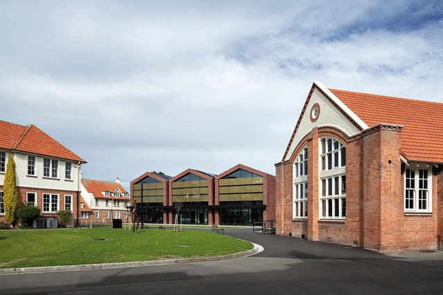
The Board resolved to do better and, in an inspired move managed by architect Charlie Nott, created a new vision via an invited competition for a campus master plan; it was won by RTA Studio and Wraight + Associates. The winning plan edits the existing architectural chaff from the grain with rare clarity and verve.
Through a major new building and a remodelled existing building, RTA Studio has stitched, restored and regenerated the campus urban plan and introduced some architectural dignity for a new generation. The firm has done this in an abstract contextual manner, with both sensitivity to context and a clear new architectural vision for the future.
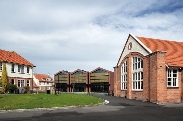
A hotchpotch of insensitive additions to the heritage library and 1960s’ Marris and Porritt dayboy houses was cleared away to create a significant site between the remaining buildings. The new space was structured as a simple landscape quadrangle, linking the old and new buildings spatially. Bidwill Quad, as it is named, also creates a landscape foreground to view Big School, the restored library and the new Administration Building that defines its southern edge.
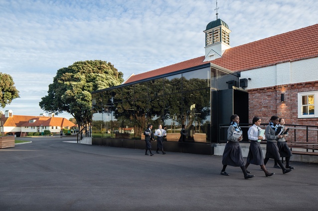
The H G Carver Memorial Library occupies the original Dining Hall, one of the first-generation Atkins and Bacon campus buildings. A series of additions was removed so a stripped-back heritage project could occur, including major strengthening and rebuilding. Some careful heritage restoration strategies were employed: like-for-like material replacement to original exterior fabric, some reconstruction to the edge of the original design and insertion of some new contrasting additions.
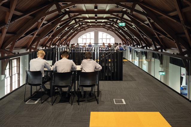
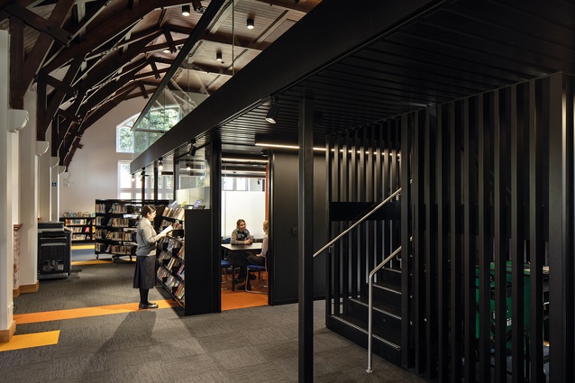
Contrasting and romancing new against old is a well-understood tactic for upgrading heritage fabric. Here, a minimal black design palette is adopted for a new interior mezzanine floor floating within the centre of the existing space and also for a sleek entrance addition. The additions have a quiet aesthetic strength that stands up to and creates a conversation with the existing.
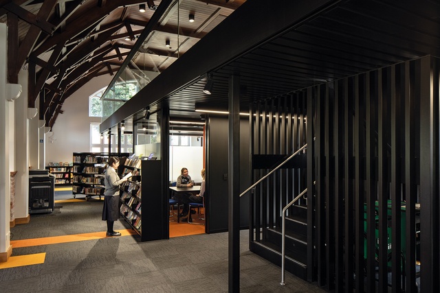
The historic character of the library has been scraped back and recovered. The new mezzanine intervention is of a scale and proportion to enhance the experience of the existing building around its edges and takes you up into the realm of the beautiful sarked timber ceilings above.
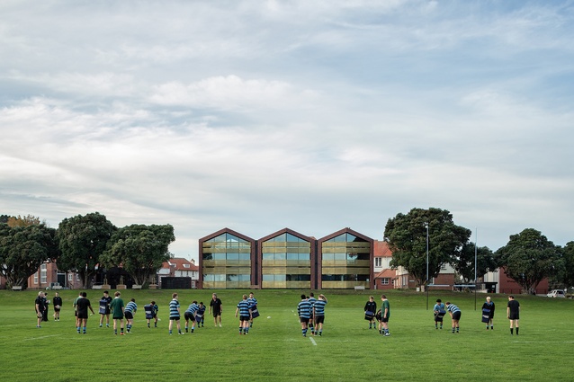
The library revives the school’s original architectural spirit and the Bidwill Quad reinforces it, but the new Administration Building is the main architectural event, literally redefining the campus. Its siting along the brow of the small hillock overlooking the number one sports grounds was nuanced and important. It required the vision and bravery to cut out three mature pōhutukawa from an existing avenue, allowing the building to shift forward to create the quadrangle but, importantly, also to reconnect the school to the fields.
A strong formal presence is created by a triple-gable façade design and a relationship to the larger urban composition that is visible across the landscape spaces it co-creates. Both of the new building’s faces are created from three linked brick portals – glazed and articulated with a series of woven brass shade screens.
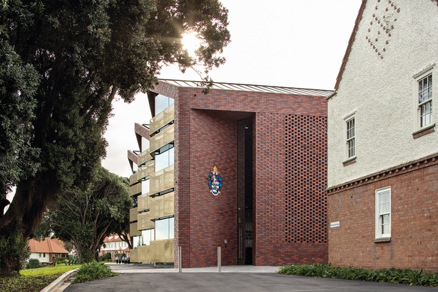
The roof form is reminiscent of the pitch and folded roof of the 1967 Dining Hall building. A super-scaled formal entrance porch is formed by a double-height, angled brick wall that beckons entry. It responds to and expresses the visitor approach and main school entry from Liverpool Street. There is a playful reinterpretation of the brick detailing seen on some of the original building gables, which occurs on both ends of the new building as subtle patterning and ornamentation.
This pattern becomes a perforated brick screen near the entry, giving a sense of the interior beyond and glimpses of the original Headmaster’s House (the school museum) from the interior, visually connecting old and new. A carefully selected mix of three different bricks includes a third of the original red brick colour used throughout the campus, illustrating a subtle game being played here. This is a building aware of and actively working with its architectural heritage: from the same cloth but clearly different.

The building has a simple parti, with dual entrances and two levels separating students and visitors, management and administration. At the library end, a student entrance links student services and an external arcade space along the edge of the Quad.
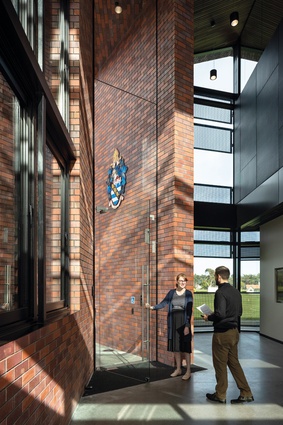
The interior of the building is elegantly planned. A rectangular form with a zigzag front edge contains a series of stacked spaces on the southern side of a folding timber-lined roof, which is linked on the interior by a double-height atrium on the northern side. This sometimes-too-bright atrium space has wonderful views of the original campus buildings, contains a student reception struggling for shade, a student waiting space visible to the whole school, a visitor reception and a central series of offices, meeting rooms and storerooms.
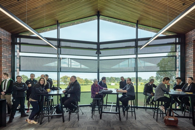
It is all drawn together by two linear stairs connecting to the second-level headmaster’s office, boardroom and staff facilities, overlooking the number one sports grounds. The staffroom, with its magnificent views, is now a favoured location for viewing winter sport and has earned the nickname ‘the corporate box’.
The new buildings at WCS show a leadership and architectural confidence that is a welcome exemplar for New Zealand education architecture. RTA Studio has delivered on a vision for a future campus that involved judicious editing of the layers of history and prioritising architectural judgement and quality. It raises the bar. WCS is once again asserting the relevance of contemporary architecture to its future.
This article first appeared in Architecture New Zealand magazine.
 Subscribe here

