On the Rise: Beth Cameron
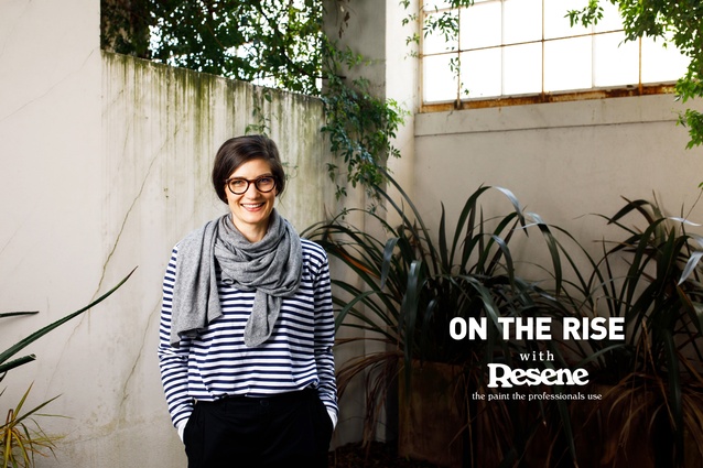
The ArchitectureNow On the Rise series, supported by Resene, focuses on up-and-coming young designers and architects from across New Zealand. For the fifth interview in the series, we talk to designer Beth Cameron, co-director at Makers of Architecture and Makers Fabrication in Wellington.
Amelia Melbourne-Hayward: What were some of your first experiences with architecture?
Beth Cameron: I was lucky enough to grow up in a creative, artistic environment, so the appreciation for design has always been a huge part of my life. Dad was an art teacher and has always had a huge interest in architecture, and Mum – a teacher in language, dance and outdoor education – has a great interest in the environment, plant and animal life. They designed and built our family house and garden from scratch. I’ve had an integral understanding of how space can positively affect people from a young age.
AMH: Did you always know you wanted to study architecture?
BC: I was always drawn to the effect of constructing an environment and the fact that you can share that experience with a lot of people, so I was looking at design very broadly, whether in fashion or product design. I feel that clothing, art and architecture all work closely together in that space.
AMH: What was it about the profession that made it the winning subject in the end?
BC: The fact that you can take the skills that you learn from architecture and apply them very broadly. There are incredible case studies for people who have studied architecture and ended up working in a range of professions. The underpinning of it all is that ability to engage in critical thinking and design problem solving.
AMH: You completed your BAS at Victoria University in 2008, and your MArch in 2012. Can you tell me a bit about your final thesis Embodied Architecture and how it informs and influences your work today?
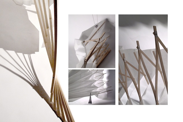
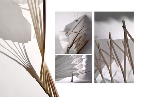
BC: My thesis investigated the relationship between the body, clothing and architecture. It looked at how everything is relative to your experience; from a body centric perspective. How that is filtered and interpreted is greatly affected by clothing you wear, which then interacts with the space beyond. I looked at those points of contact – the difference between a body in structured and fluid space.
As part of the project I built a flexible structure and at that scale I was able to interact with the notion of generating dynamic space. I think it’s been a really valuable design research process that allowed me to research different interdisciplinary areas. It wasn’t a very traditional architecture thesis!
AMH: It sounds unconventional but fascinating. What do you wish you’d been told about the profession before you started studying it?
BC: It’s really important when you’re at university to figure out what subjects and areas you enjoy most, because within the architectural industry there are a huge range of roles, approaches and methods of working.
Something that I have now learnt is that people do everything slightly differently. If you don’t feel like you’re fitting, then look at that critically and find an environment that you are supported within, or a role that you can excel in.
AMH: You have done some work with product design, can you give me a bit of background on that and why it interests you?
BC: I love architecture but I also really like focusing on the finer details and objects, as every furnishing and item affects your experience of the space. I wanted to investigate what it means to design cutlery and how that works.

Under the tutorship of Keiji Takeuchi, I ended up engaging in a rigorous and iterative process of design: drawing, constructing, shaping and producing 3D printed spoons. It’s something I’d like to develop further at some point. It was an incredibly valuable exercise, because it helped me to understand an alternate design approach and method of thinking behind the production of a product versus architecture.
AMH: What were the main drivers that culminated in the creation of Makers of Architecture at the end of 2013?
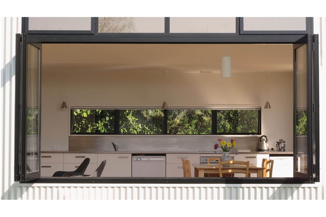
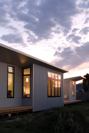
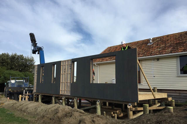
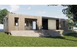
BC: All of the Makers of Architecture directors went to university together – Jae (my partner), Grant and Ben – and after the earthquake, an opportunity arose for the Warrander Studio in Governor’s Bay to be realised. We had to pull together all of the resources we could to make that project happen. During the build, we had a client approach us with some exciting projects and we quickly realised that this could be a big opportunity that we should explore further.
AMH: Did you enjoy the process of working on the Warrander Studio, it was very new to all of you wasn’t it?
BC: It was, we were doing a lot of problem solving. I wasn’t as physically involved with the construction but I worked on the marketing and administration side of things, and on starting to generate our brand. It was an amazing experience and an incredibly successful little prototype!
AMH: What have been some of the hardest parts about starting your own practice at a young age with three others?
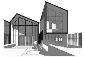
BC: We approached it very optimistically, with a lot of energy, which is a good thing because if we’d known then what we know now, perhaps we wouldn’t have started the company! The challenge is always resourcing – obtaining and developing the skills in the right areas to create smooth systems in terms of work flow production.
We were all self funded, so we were taking a huge risk, but I feel that was a positive thing to do as it means we’ve been able to maintain control of the company’s direction. We’re working to create an environment that develops change in the industry but also creates opportunity for many more people and that definitely keeps us motivated.
AMH: Well, that’s how innovation happens isn’t it, because if some people are not willing to take risks then everything just stagnates. Makers focuses a lot on local, sustainable design, why is that important to you?
BC: The fact that we’re sourcing locally-manufactured products is really important. The New Zealand market has a lot of value to offer and we need to support that industry through creating new opportunities and looking at different building and design systems.

The building industry has a hideous amount of waste associated with it and we need to be very careful and respectful of what it means to be creating buildings. We all need to take a bit more responsibility for what the future looks like and how we can generate a more sustainable model of creating space. The quality of material is equally as important as the quality of space to create a healthy lifestyle.
AMH: What areas of architecture are you currently most passionate about? Which would you like to explore further?
BC: Currently we’re working a lot in the residential space and are slowly working more with medium density developments. At the moment we are working with the Kowtow team, who also have an equally strong sustainable ethos and brand intention. It would be nice to continue to work with these types of clients who have similar outlooks.
The future is constantly changing and is pretty exciting. Technology is going to change the structure of how communities work and how we look at architecture. We also have to think carefully about the notion of real estate – how the space left over is utilised and what that could become communally.
AMH: Who or what inspires you?
BC: I think there are many levels of inspiration. Some have come from my childhood education and environment – architects like Glen Murcutt and painters such as William Scott and Mark Rothko.
I have a particular affinity for Japanese architects and fashion designers – SANAA has always had a huge influence. A lot of the Japanese architects seem to be able to execute their concept in the purest form. It’s very refreshing to see these works and how constraints can be challenged.
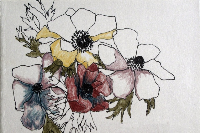
The other inspiration is around florals and the natural environment. Organic architecture is not my style but the structures, geometries and colour palettes within various plants are just incredible.
AMH: How do you find working in the Wellington architecture scene, it’s obviously tight knit, are there any challenges?
BC: We are really enjoying it, from our experience as a company we’ve been very generously supported and encouraged. We are lucky enough to be working collaboratively on projects with some amazing architects. We wouldn’t typically get to interact with some of these people, so it’s very diverse in that respect.
We’re also lucky because the architecture industry is economically quite buoyant at the moment, which helps to generate diverse opportunities. Typically we’re not huge firms here in Wellington, so to be able to share resourcing and knowledge and bring in the right expertise at the right time is crucial. It’s important we continue to support one another!
AMH: What are a couple of projects that Makers of Architecture is currently working on?
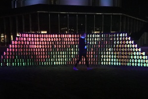
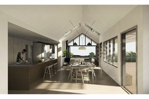
BC: We’re working on some amazing projects at the moment, one is the new Kowtow clothing flagship store, which is a collaboration we were invited to by Rufus Knight. Subsequently we are now also designing the Kowtow workroom fit out. It’s new for us – and great to have some local projects around the corner from the Makers studio.
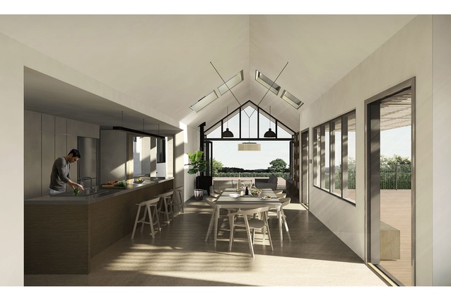
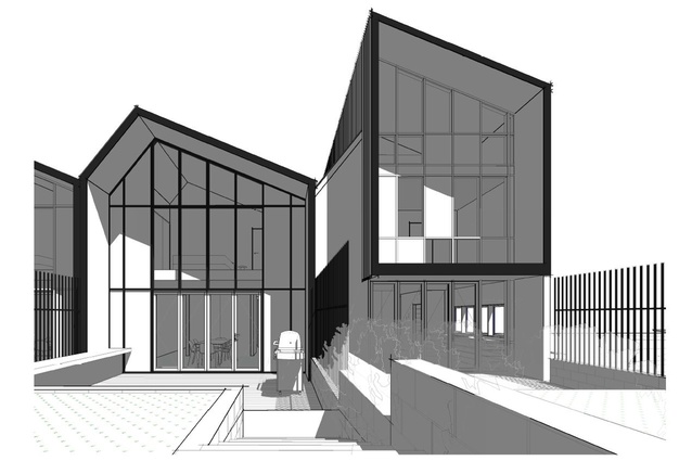
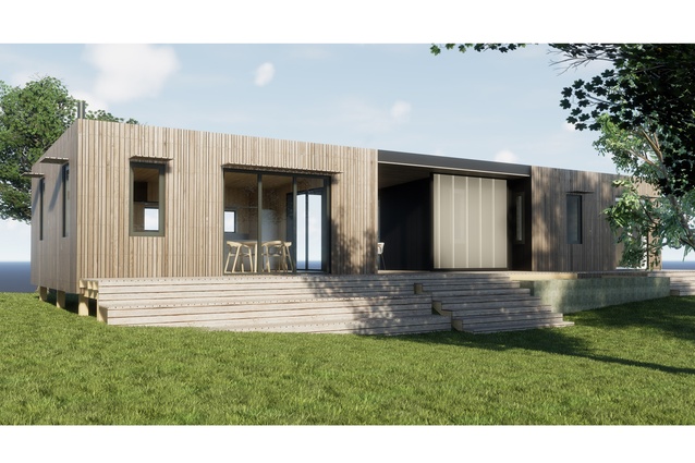
Another one that’s exciting is a personal project. Jae and I are going to build our own house on a great piece of land in Island Bay that currently has an old little prefab house on it. The idea is to subdivide it and develop two houses on the property to make it feasible. It’s also an opportunity to densify and experiment and actually live in a space that we’ve designed!
AMH: It will be incredible to live in a house that you’ve designed and built for yourselves. Even just being able to buy your own house, especially in Auckland, seems very unattainable at present. It’s a really huge issue for our generation.
BC: Absolutely, it’s a hard reality and that’s been one of the drivers for our company – trying to make architecture more accessible and more attainable. Living smarter and smaller makes sense and if you have the opportunity to do that then it’s a total privilege.
AMH: If you could complete an ideal project in New Zealand, residential or commercial, where and what would it be?

BC: It sounds unusual, but I’ve always wanted to design an airport or part of one. I find an airport an incredible space of movement and transition and logistics and experience – there are specific formulas applied that allow the planes to dance and move as they need to. If I were to design an airport for the future, who knows what it would look like in terms of greater infrastructure, because the notion of travel is constantly evolving.
AMH: What parts of working in architecture do you enjoy the most?
BC: I really appreciate working with a positive and supportive team. We all have a lot of energy for what we’re doing and you never feel like you’re disconnected. I also really enjoy working with the clients that we interact with and get to know. For the majority, building a house is the biggest investment of their lives. It’s very personal and an honour to be trusted with transforming and interpreting their vision.
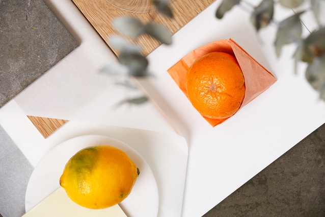
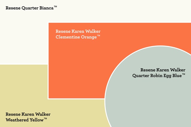
AMH: As part of the series, we asked you to create a mood board to illustrate your influences and inspirations. What ideas are behind this and why did you use these particular Resene colours (KW Weathered Yellow, KW Clementine Orange, KW Quarter Robin Egg Blue and Quarter Bianca)?
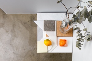
BC: The mood board was composed in response to the current season, with grounded natural tones creating the underlying structure (marble, concrete, American White Oak). The eucalyptus leaves set up the palette and I have woven through butter paper with folded opacity, while the seasonal citrus reflects light and inspired the Resene colour choice.
AMH: Lastly, five essential things that you need to do your job day-to-day?
BC: Observation and listening go hand in hand – they’re both very important. Optimism is a good one, engaging positively but critically in what you’re doing. Our office’s coffee addiction is slightly unhealthy at times but generally a pleasure that we like to share! Lastly, if it’s possible, a glimpse of sunshine – it’s very easy to get stuck inside all day.
Read the first On the Rise interview with Haley Hooper, the second with Geordie Shaw, the third with Maria Chen and the fourth, with Ed Dromgool, here.
The ArchitectureNow On the Rise series is generously supported by Resene.

