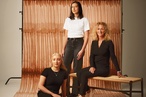
On the Rise: Darrelle McWilliams
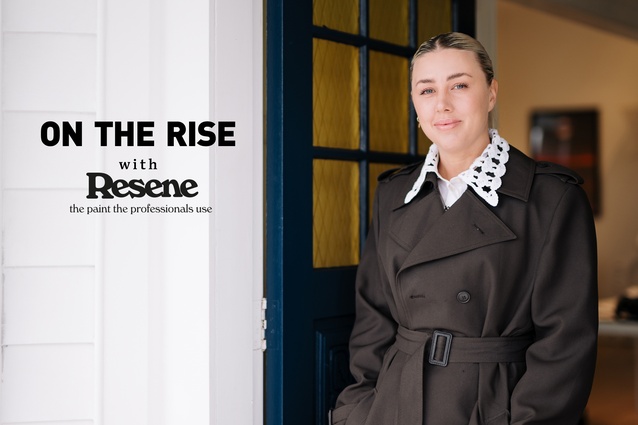
Darrelle McWilliams is a senior interior designer at Izzard Design in Auckland.
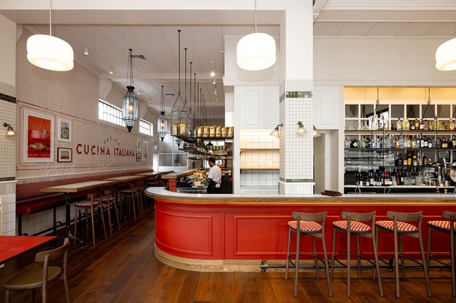
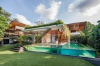
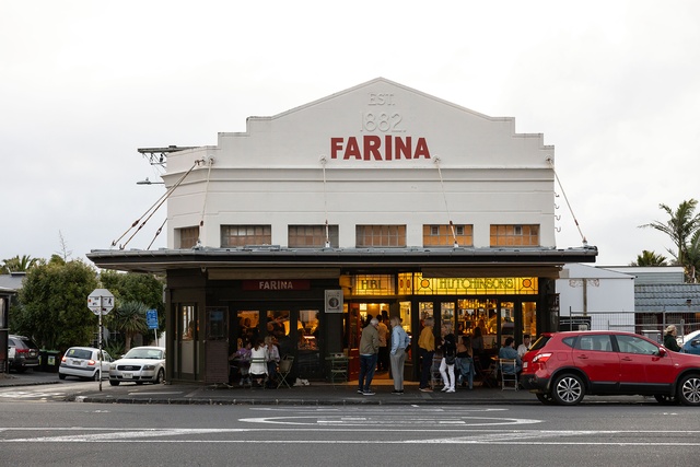
At Farina Ponsonby by Izzard Design, an open kitchen creates a theatrical backdrop to the dining experience while various seating options and zones cater to the differing wants and needs of diners.

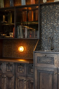
Farina Ponsonby’s painted exposed-brick wall, cast iron fittings and relaxed, albeit traditional, Italian furnishings create a strong historical narrative.
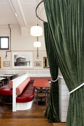
An historical photo of the Farina Ponsonby building (circa 1800s) was framed and hung in the restaurant and further enhanced by custom, hand-painted Italianate wall-art.

The building’s original leadlights were found beneath plywood and reinstated during the renovation process.
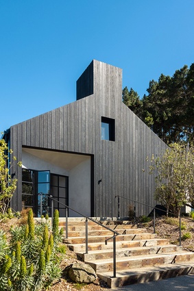
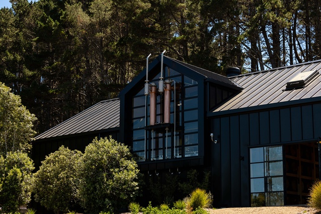
Waiheke Whiskey Distillery & Brewery by Izzard Design — the façade of the building is charred to mimic that of whiskey barrels.
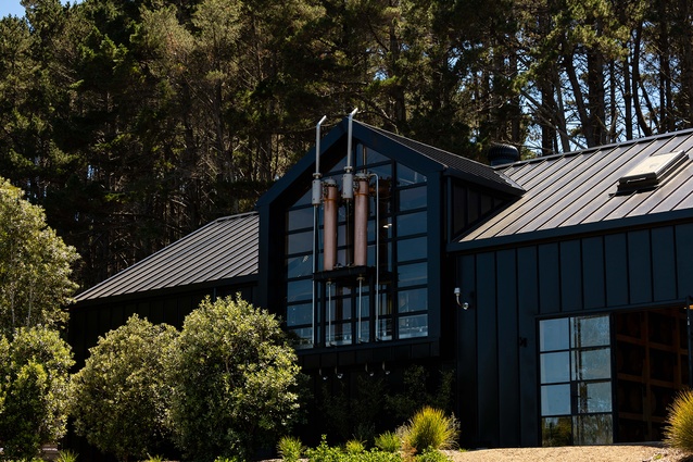
Waiheke Whiskey Distillery & Brewery’s external copper still arms assist in the cooling process.

Waiheke Whiskey Distillery & Brewery cabinetry, with 45-degree angled oak relating to the double ‘W’ logo motif branding.
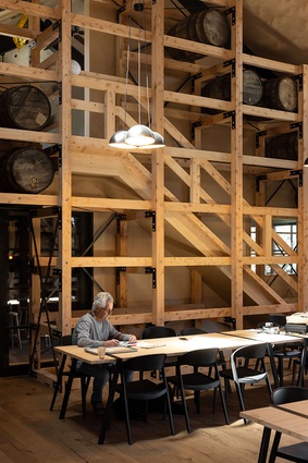
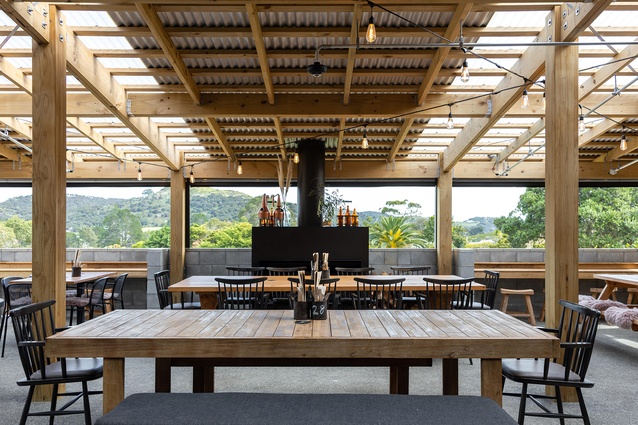
The Waiheke Whiskey Distillery & Brewery barrel room event space with hidden stairs to storage.
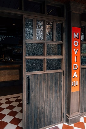
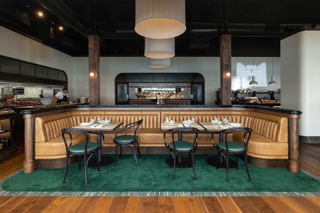
Movida Aqui Melbourne by Izzard Design. The décor stays true to the original with its timeless Spanish essence and origins.
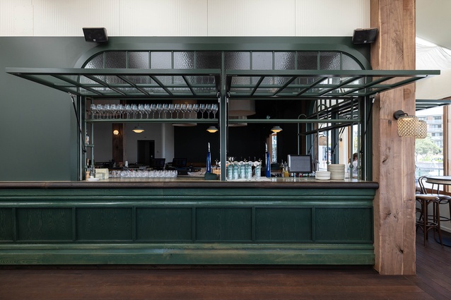
At Movida Aqui gracefully curved banquettes adorned in plush seafoam-green fabric are complemented by bottle-green leather chairs.
Darrelle’s design experience extends to that of branding and logo arrangement, incorporating it into the wider brand story and visual language.
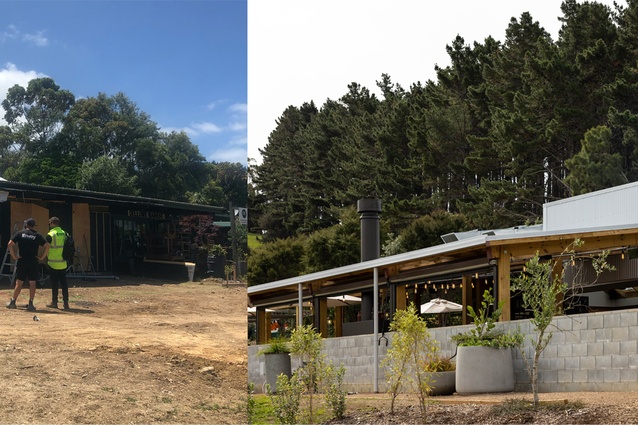
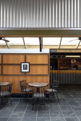
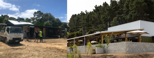
The Heke restaurant on Waiheke, by Izzard Design. The veranda extension before and after.
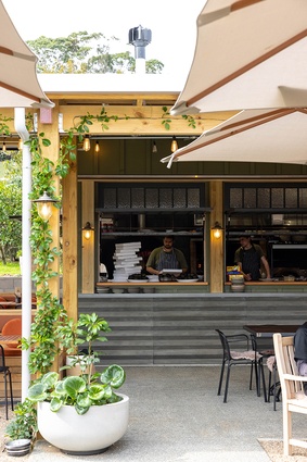
The Heke’s in-situ concrete bar and kitchen fronts continue ‘W’ references of the adjacent Waiheke Distillery.
The Heke’s in-situ concrete bar and kitchen fronts continue ‘W’ references of the adjacent Waiheke Distillery.
The veranda extension at The Heke, from the bar and dining areas.
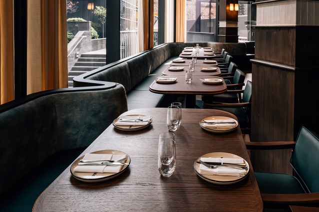
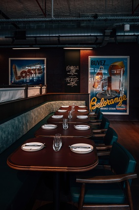
Bivacco restaurant on Auckland’s waterfront by Izzard Design features jewel-green tones, dark timber, travertine and marble in homage to timeless Italian style.
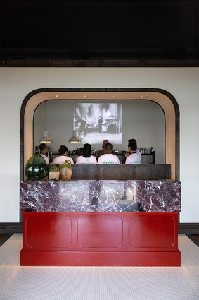
Bivacco’s bespoke maitre-d station with its opulent, red-veined marble counter top.

Sumptuous booth seating at Bivacco surrounding an open kitchen on one side, and a more casual set-up around a bar creates a relaxed ambience for diners.
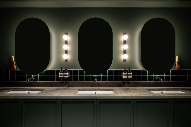
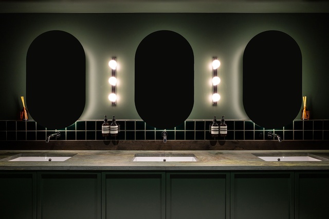
The glamorous bathrooms at Bivacco are an extension of the overall dining experience.

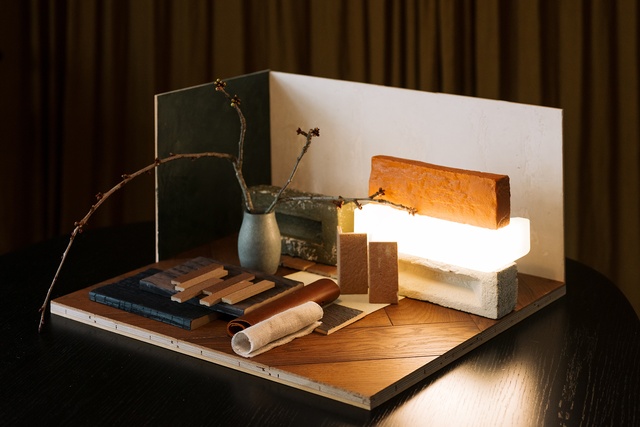
Darrelle’s Resene mood board is inspired by a project Izzard Design is working on for a Japanese restaurant and is given further impetus by a planned trip to Japan during the country’s autumn season.
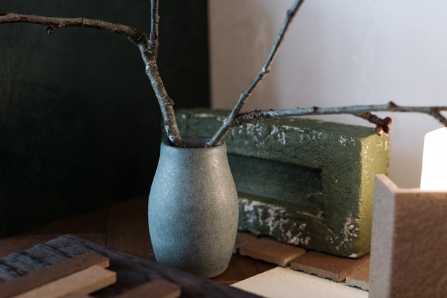
An earthy palette of deep greens, clay browns and neutrals creates a nature-inspired calm that is offset by various textures picked up by the warm glow of accent lighting. Brick painted in Resene Forest Green.
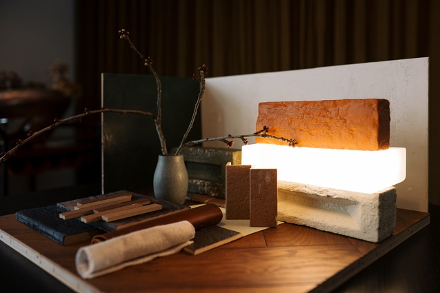
A bright pop of Resene Pendragon in its earthy clay-tone generates a warmth that together with the cool greens of Resene Forest Green, and Resene Gordons Green, evoke an autumn scene in Japan.
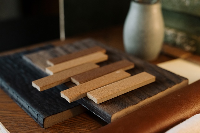
A rich variety of natural textures are accentuated using Resene paint colours in contrasting finishes and complementary colours. Neutrals in Resene Double Fossil and Resene Milk White add light and warmth.
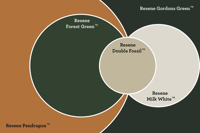
Be inspired by Darrelle’s Japanese-inspired palette using Resene Pendragon, the deep greens of Resene Forest Green and Resene Gordons Green, the warm beige of Resene Double Fossil, and neutral white of Resene Milk White.
ArchitectureNow’s On the Rise series, supported by Resene, profiles young designers from across the country who are shaping the future of the industry. In this instalment, we talk to Darrelle McWilliams, interior designer at Izzard about her hands-on design philosophy and comprehensive approach to the studio’s award-winning designs.
Jacinda Rogers (JR): How did you get your start in the industry?
Darrelle McWilliams (DM): My journey into the design world began with a background in graphic design, which then led me to study interior design. I began my professional career specialising in high-end kitchen design with Spatial Studio and Robyn Labb Kitchens, where I honed my skills in creating bespoke, functional spaces. This foundation paved the way for my role as a senior interior designer at Izzard Design, where I’ve had the opportunity to deliver a wide range of projects, including small tenancies, residential properties, cafes, restaurants and bars.
JR: That’s an impressive progression. Where do you get your creative drive from?
DM: Creativity has always been at the core of my life. Growing up in a creative household, with my father as a painter and my mother as a gardener, I was surrounded by artistry and design. My mother’s passion for developing, renovating and upgrading every home we lived in, as well as her ventures into property development, instilled a hardworking, creative spirit in me. Design and creativity became second nature, shaping my approach to every project I undertake.
JR: How has your background in graphic design fed into your interior design practice?
DM: Graphics and interiors are closely linked, especially in today’s world where branding significantly influences both product appeal and interior design. While studying, I developed a strong interest in layout and organisation, particularly in magazine and print design, with an obsession for perfectly balanced and visually calming compositions. This sense of balance and visual harmony helps inform my spatial designs and has given me an eye for the minute details that give an interior space its ‘soul’ or sense of place.
JR: Izzard works on a range of interiors but most notably specialises in hospitality spaces. What is involved in designing a great hospo space?

DM: When designing a hospo space, I carefully consider the flow for both diners and staff. Every seat is important — no one wants to be stuck in a corner while others enjoy prime views. To address this, I create intimate spaces, private dining rooms, or open kitchen views, ensuring every diner feels valued. This attention to detail helps clients avoid complaints about seating preferences.
I work closely with graphic designers to ensure the space has a cohesive brand identity that flows seamlessly into menus, uniforms and the interior style, enhancing the overall experience. When done right, this level of detail significantly contributes to the project’s success.
An Instagrammable moment is essential — it’s free marketing. Whether it’s a striking front door with a bold logo, a large logo on the building parapet, unique selfie mirrors, interesting tabletop finishes for food photography or creatively designed bathrooms, these elements make the space memorable and shareable.
JR: What are some lesser-known aspects of your work as an interior designer that are crucial to pulling together a successful outcome?
DM: We don’t just fluff pillows; our work is much more comprehensive. At Izzard Design, everything you see in our completed projects is bespoke and designed in-house. From the maitre’d unit to all cabinetry pieces, banquette seating, lighting, furniture and even down to each door and cabinetry handle, nothing is off the shelf — apart from the styling pieces. This makes every project truly unique.
It’s not all about conceptual design — only 10% is conceptual, while 90% involves detailing, consenting, project management and more. While we’re not architects, we collaborate closely with them. Often, we have significant input on the architecture or even the entire building, such as in the design of the Waiheke Whiskey Distillery & Brewery.
We design everything in 3D, allowing clients to virtually walk through the concept and experience the layout and flow first-hand. We also produce rendered images for marketing, concept proposals and more.
JR: Do you have any tips for how to develop your design skills in the hospitality design space?
DM: I’m always exploring new dining spots. It’s all part of the job, isn’t it? I’m naturally critical when experiencing new restaurants, analysing what works and what doesn’t. If I like the tableware, I’ll even lift the plate to check the brand.
I always check out the bathrooms, even if I don’t need to go. Bathrooms are a great place to get creative — it’s where design can shine and offer something unique compared to the rest of the restaurant.
I love to cook, enjoy great food and appreciate a well-paired drink so I’m constantly seeking out new experiences. It’s all research at the end of the day. I’m not taking photos to post; I’m taking photos for inspiration.
JR: What is your approach to a new project, freshly handed to you. Where do you start the design process?
DM: Due to an extensive background working in hospitality, including bars, restaurants and cafes, I’m passionate about both the operational aspects and the customer experience.
My design philosophy involves selecting materials thoughtfully, paying close attention to detail and planning spaces strategically. I research the history and purpose of each project to prioritise rejuvenating or celebrating existing elements, especially given budget constraints.
I consider the entire building, transforming it from exterior to interior to create a fresh story that feels like a completely new space, whether it be extending or changing the architecture of the space completely. I focus on subtle, personal touches that reflect the brand and add depth to the design.
JR: Can you give me some examples of how this approach has manifested itself in your work at Izzard?
DM: At Waiheke Whiskey Distillery & Brewery, which is the brewery component of The Heke restaurant (also designed by Izzard), cabinetry features 45-degree angles that echo the ‘W’ in ‘Waiheke’ and ‘Whiskey’, and the charred timber on the front façade symbolises the traditional process of burning and re-charring whiskey barrels.
For Farina Ponsonby, I created custom hand-painted wall art inspired by old Italian frameworks to highlight curated artwork. During demolition, we discovered old leadlights hidden behind plywood, which we preserved.
Further research into the name ‘Hutchinson’s’ led us to contact Peter Hutchinson’s son, who shared an old image of the building from the 1800s. We had this historical image printed and framed, and it now hangs at Farina, honouring the building’s rich history.
JR: Lastly, tell me about your Resene mood board colours.
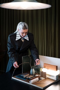
DM: I’m currently designing a Japanese restaurant in Auckland’s Viaduct Harbour and will soon be heading to Japan for a holiday. I always return from these trips feeling refreshed and inspired, which fuels my excitement to dive back into the project.
The Resene mood board I’ve created reflects the autumnal hues and atmospheric conditions I’ll be experiencing while in Japan, combined with the materials I plan to use in the restaurant.
It features an interplay with the Targetti Brick Light and vibrant pops of orange and greens, as seen in Resene Pendragon (ochre orange), Resene Forest Green and Resene Gordons Green, which offer a burst of colour against neutrals Resene Double Fossil and Resene Milk White.
The overall effect is a colour scheme that is warm, grounding and at one with nature. My Japanese-inspired colour palette harmonises and is beautified by the wabi sabi textures of the materials chosen — the plaster finished in Resene Gordons Green and Resene Milk White adding an earthy and tactile quality to the paint finishes.
See more from the On the Rise series here.