On the Rise: Maggie Hubert
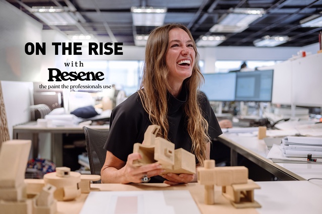
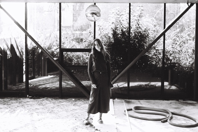
ArchitectureNow’s On the Rise series, supported by Resene, profiles young designers from across the country who are shaping the future of the industry. In this instalment, we talk to architectural graduate Maggie Hubert of Crosson Architects about her start as a sculptor and how it led her to architecture.
Jacinda Rogers (JR): Tell me a bit about your background and your start in architecture?
Maggie Hubert (MH): I grew up in Evansville, Indiana, during the 1990s in America’s Midwest. I studied sculpture and art history at Indiana University (Bloomington) before moving to Aotearoa in 2012. While at Indiana University, I worked at the Indiana University Museum of Art (now Sidney and Lewis Ezkenazi Museum of Art), designed by I.M. Pei. Upon reflection, this was my first real experience of being immersed in an exquisitely considered space. The building allegedly contains no right angles, and the gentle disorientation and heightened awareness created within that space was something I hadn’t experienced before.
I intended to stay in Aotearoa for only a few months but, shortly after arriving, I met Nick Dalton of TOA Architects. He asked to see my sculpture portfolio and then invited me to their office. Over the next five years at TOA, a path was presented to me that I had never considered — architecture. I decided to complete a Master’s of Architecture at the University of Auckland.
I am now happily employed at Crosson working on notably sculptural architecture.
(JR) How did you come to work at Crosson Architects?
(MH): I met Ken Crosson as I began my studies and was offered a casual role at Crosson Architects. This transitioned to a full-time role after completing my thesis project, ‘The Ineffable Life’.
Each project in the studio is a considered and crafted response to each unique client. For me, it is an ideal place to land. I feel lucky to be working alongside the amazing team at Crosson, and Ken has been generous to me in my learning and growth. We share a love of history, art, literature and writing, and he has also helped me with several personal projects ancillary to studio work.
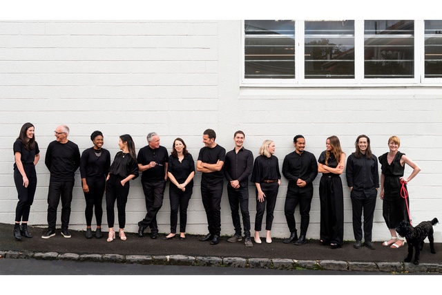
(JR): Can you tell me about some of the projects you’ve been working on at Crosson?
(MH): At the moment, I’m working on the cabinetry for a beautiful addition to a Victorian home and am working alongside the Crosson team to develop initial design responses to some exciting new projects.
I’m interested in the marketing side of the business and like to be involved in considering how we present our work to the wider world. Adjunct to this, I am currently working on a new book that will present images and plans of some of Crosson’s recent works.
The most invigorating project I’m working on, however, is the after-hours planning and design of my first home – small, crafted and playful – in west Tāmaki Makaurau with my partner Sam Caradus, who is also an architect.
(JR): Building your first home must make you question what your personal values are for a dwelling. Can you reveal any special features you are planning for your home?
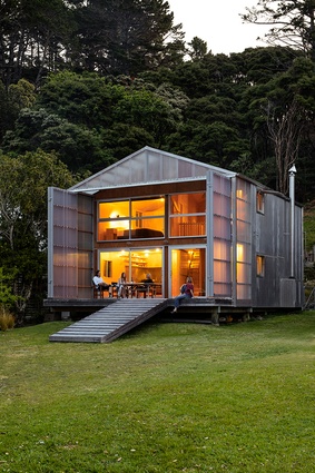
(MH): Both Sam and I are interested in honest and experimental materiality, expressed structure, and colour. We are aiming for a modest footprint, using volume to create a sense of ample space. We are both inspired by the homes designed by Claude Megson (1936–1994), and the architectural devices he used to animate them.
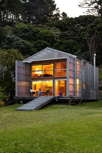
The functions of the spaces within the home will be directed by in situ furniture – spaces for occasions – defining living spaces according to the movements of the sun, to maximise sunshine from our morning coffee to an evening drink.
Recently, we had the immense privilege of spending time with the brilliant architect Peter Stutchbury, and his architect-partner Fernanda Cabral, at his home in NSW, Australia. To me, the greatest success of his home, is that it is not for everyone, but very particularly for himself and Fernanda. Each decision they made in the design was deeply personal and came from their experiences, travels, and connection with First Nations Australians. You couldn’t convince many clients to place an internal sandpit with a fishpond and brassiere adjacent to the main bedroom…
Likewise, we will focus on the unique way we like to live, catering to the necessities, maximising the potential of our site, passive heating and cooling, pulling in sunlight, and planting the site out with native trees and bushes to give back to the street.
(JR): You also write and work with other modes of visual design. Tell us about your involvement in those processes.
(MH): I have had the opportunity to do a few pieces of writing over the last couple of years and find pleasure in that process; research and interviews with interesting people who hold unique insights is very rewarding. The genesis of my thesis arose from the first essay I co-authored with Giles Reid on José Bribiesca’s mirrored-glass house for the April 2020 issue of Home Magazine.
I sometimes feel overwhelmed by the thought of the countless personal stories that contribute to our collective creative history in Aotearoa which might never be recorded. Any opportunity to participate in a variation of record-making myself, feels valuable.
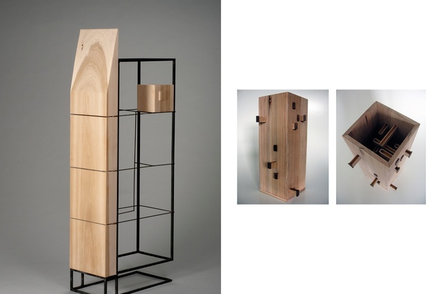
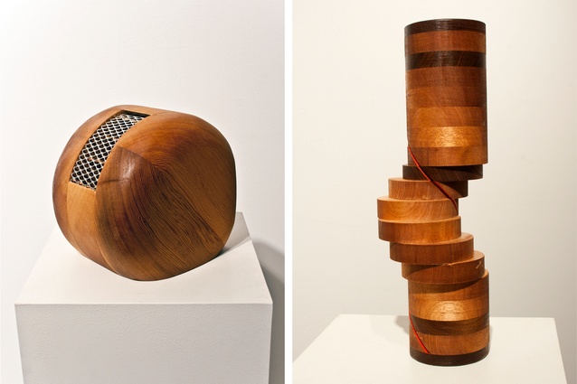
Going back to university as a mature student offered me a new opportunity to invest time in creative media and, while there, I experimented with materiality in a more knowledgeable and intentional way. I loved this, and am intent on making the time to continue a creative practice adjacent to architecture.

(JR): What was it about José Bribiesca’s mirrored glass house in Remuera that interested you?
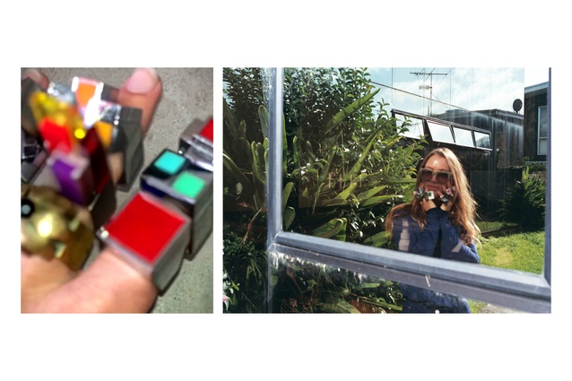
(MH): José was our neighbour. Upon meeting him at his tucked-away, smoky mirrored-glass house surrounded by overgrown bush and reflecting his Remuera neighbours, the joy and chaos with which he filled the space around him was immediately striking.
He was a fabulous storyteller, with an unbelievable collection of life events to share – the kind of person who inadvertently attracts wild situations. His house – a magnification of his life reflected in his dwelling – captured his Mexican heritage and career as an architect and jewellery designer.
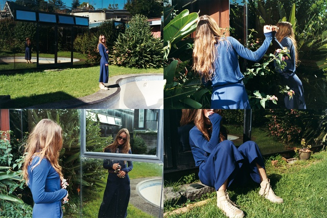
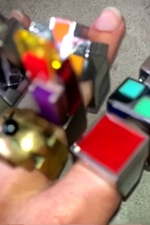
When he passed away in April 2019, the house – once filled with exquisitely designed objects and objects of purely sentimental value – was stripped out: the lawn mowed, the green kidney pool drained, and an ad put up suggesting the best value to prospective buyers would be that of the land. The house had been reduced to a mere commodity – which contrasted so extremely from my experience of it as an extension of José.
Through interviews with friends and family after his passing, I learned much more about the house but mourned the loss of its spokesperson.
I began collecting his rings second-hand soon after I met him, and he would tell me the story behind each successive acquisition. He even gifted a few to me himself and, after his passing, so did his daughter, Sofie Bribiesca. José together with his late wife Lois Ashton (1941–2014) designed the initial ring collection, which is being continued by their daughter Sofie Bribiesca. This collection is precious to me.
(JR): How did this interest in José Bribiesca’s mirrored-glass house manifest in your thesis project?
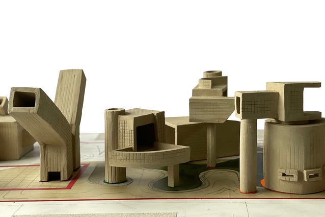
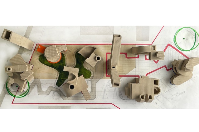
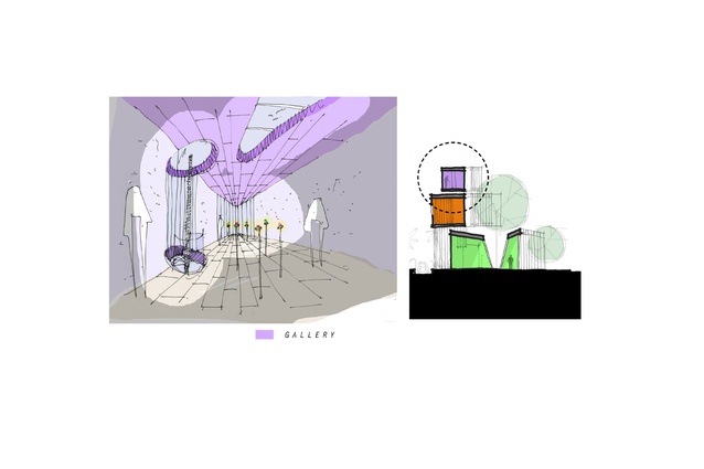
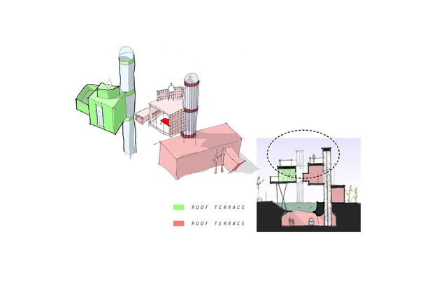
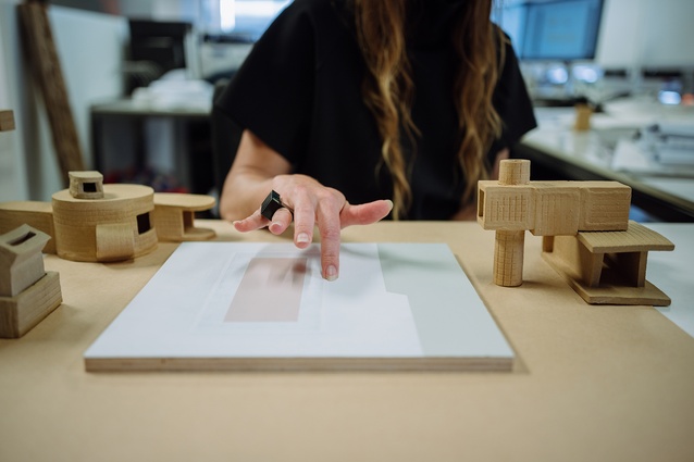
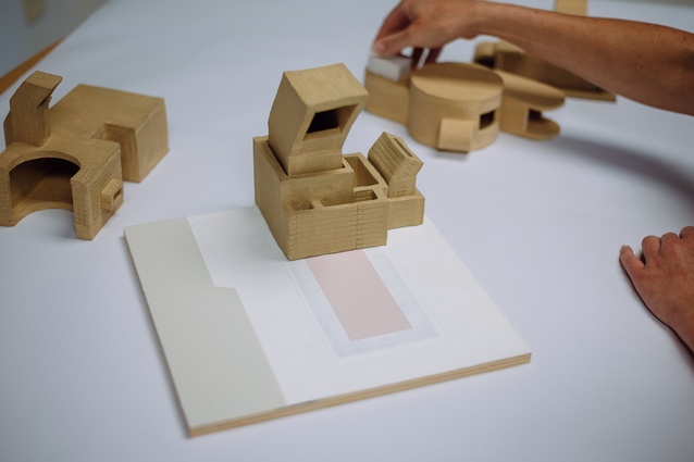
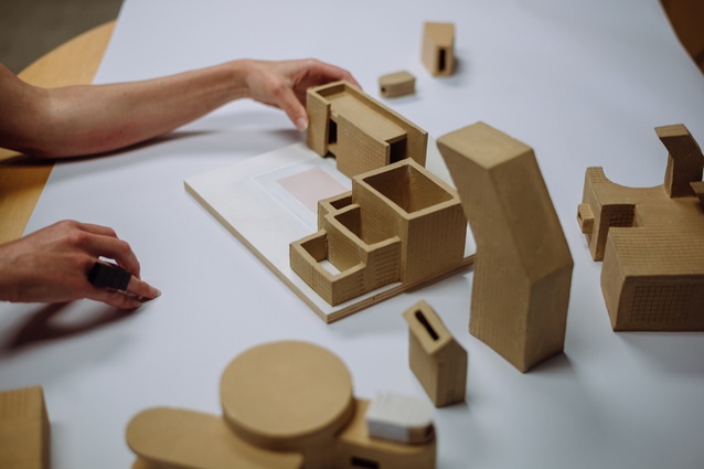
MH: I became interested in ‘the narrative’ as a trace element critical to a designed object in its ability to inform and connect to the physical world. ‘The Ineffable Life’ asked what an architecture capable of cultivating affection – and, indeed, prolonging accord in the face of life’s finitude – might be. The project held to an inherent generosity in architecture – its capacity to build and to prolong memory. In turn, it asked what a crystallisation of the ineffable might look like.
I had found my way to two special people: José Bribiesca and Paul Hartigan – both artists and storytellers who generously shared their unique grasp on the world with me over time. This project sought to make sense of this generosity. It is a tribute to the interstitial place and time of our rapport but, also, a kind of mirror-portraiture addressed to the future.
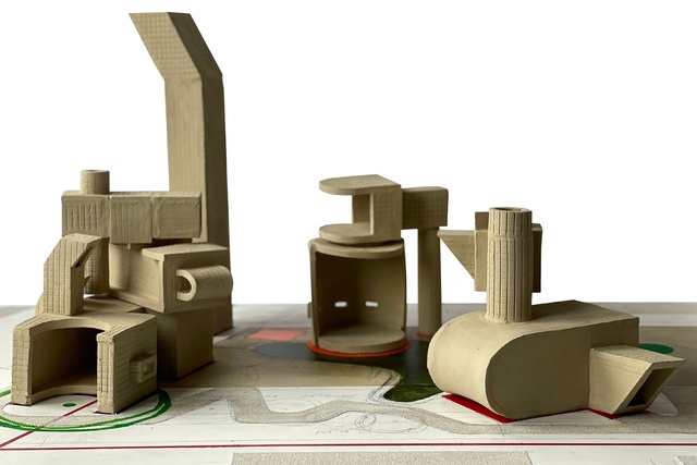
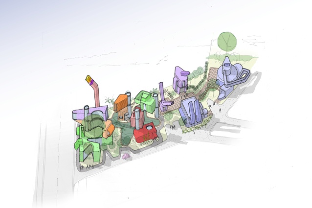
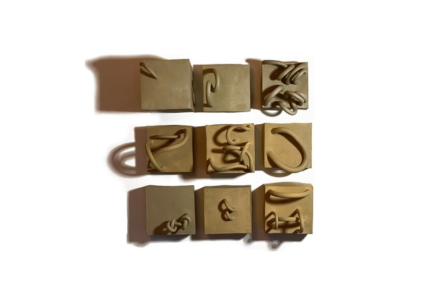
Clay, with its capacity for malleable and impressionable reworking, spoke to me of memory – fragile at first but robust upon firing. My reworking of clay by hand offered a surrogate kind of record-making and suggested a ‘field of memories’ could be carried, allegorically, by architectural vignettes.
I set about composing a speculative architecture addressing ways for sharing and extending affectionate connection. Various built forms were conceived to imaginatively house the personal and creative dimensions of José and Paul’s lives, along with how these might intertwine with those I wished for myself.
(JR): Is there anything that keeps you grounded and recharged in your spare time?
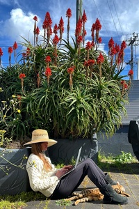
(MH): Architecture is a social practice, both at the office and after hours – it’s one of the things I love about the work, and I’m lucky to be surrounded by some exceptional characters. However, the highly social nature of practice elevates the ‘quiet’ space in between to a luxurious and critical necessity.
I love to be at home, sitting outside in the early morning sun reading, or the setting sun listening to music, always with one of our Bengal cats, Frida and Leto, within arm’s reach. Exercise is also critical to me, and transformative in turning the perception of anxiety-inducing stressors into more approachable challenges.
I value any opportunity to immerse myself in other creative fields and am a proud collector of friends spectacular in their own creative pursuits. I find inspiration in fashion, film and theatre, and delight in opportunities to infiltrate the architectural conversation with these influences.
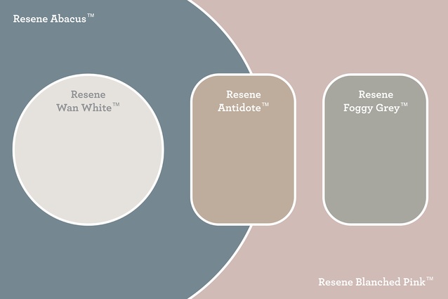
(JR): Lastly, tell me about the colours chosen for your Resene mood board and the inspiration behind it.

Colour and materiality never exist in isolation. They are contingent upon their surrounding colours, materialities, people and events. I created a bas-relief painting for my mood board, to host my ceramic objects and create a complementary relationship of colour, form and texture.
I used the colours Resene Wan White, Resene Blanched Pink and Resene Foggy Grey from the Resene Karen Walker Paints Collection. I chose colours, both flat and with some sheen to create variation within the muted tones, as you might do in an architectural space.
Read an article that Maggie wrote for ArchitectureNow called The Sang House Retracing an Icon here. See more from the On the Rise series here.
Crosson Architects is a design studio based in Auckland that specialises in a diverse range of architecture. To look through their project catalogue, or for more information on the upcoming book on their work, head to their website.

