Open to view
Like most sought-after neighbourhoods in Auckland, Westmere was originally a working-class area, containing some state houses, villas and California-style bungalows originating from housing development in the 1920s. Neatly tucked between Herne Bay and Point Chevalier, its sloping topography and tree-shaded streets ensure that mature greenery and views of the nearby water are an ever-present backdrop.
For the owners of this house, it was the perfect spot for their young family. “We love Westmere and we’ve always wanted to live here.” The pair, and architect John Irving, saw the potential in a sloping site with a brick-and-tile state house and overgrown street frontage. Now, a beach-inspired home – full of natural light and with an ever-present connection to the outdoors – is the setting for family life and informal entertaining.
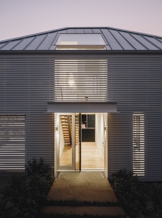
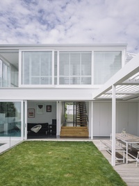
Seen from the street, the form is in keeping with the surrounds but, thanks to overcladding comprised of close-set horizontal slats, gives little away. Inside, however, is a revelation. “I’m mildly obsessed with central courtyards,” admits John Irving, “and this site lent itself so perfectly to that design; plus, the way the ground falls away toward the water offered so many possibilities.”
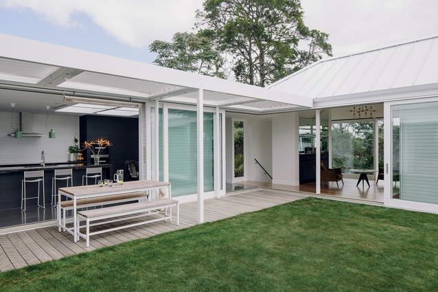
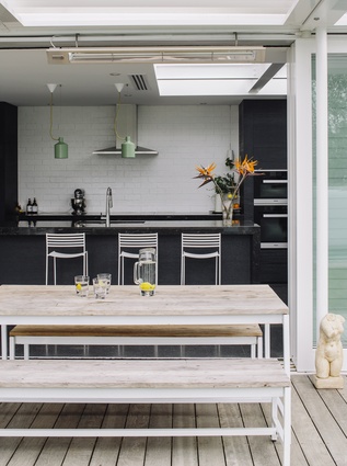
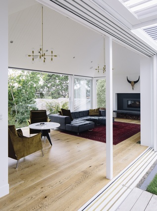
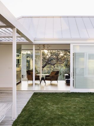
The main public spaces – entryway, den, kitchen and dining areas and lounge – are positioned around three sides of the grassy courtyard. Wooden decking extends from all these rooms and a deep pergola overhang above provides an easy transition. Glass ranch sliders and outdoor overhead heaters ensure that whatever the weather, there’s a constant connection between inside and out.
“It’s great for entertaining,” says the homeowner. “Because all these rooms flow through the courtyard, we can have quite a lot of people over, but it doesn’t feel crowded. The house just seems to soak it up. People can gather in different places, but everyone can still see each other and feel a part of things.”

It’s a quality that’s perfect for family living, too. “The rooms are arranged so that I can be in the kitchen or the lounge and still see the children. They have the freedom to ‘go outside’ when they want because the courtyard is so secure.”
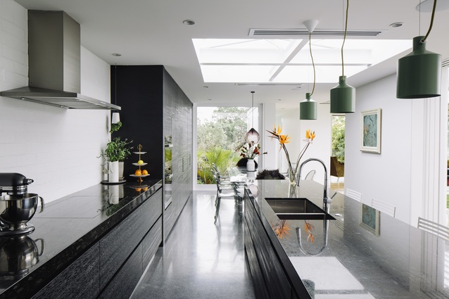
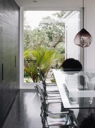
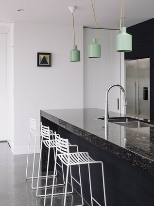
The kitchen and adjacent dining room run along one side of the courtyard. A bank of dark cabinetry surrounds the cooking centre and visually defines and anchors the kitchen space, while a large multi-function island to the front creates an efficient galley-style layout. Skylights and a floor-to-ceiling window at the back of the house bring natural light deep into the kitchen. A glass-topped dining table surrounded by acrylic chairs is positioned just in front of the window, with a Parison pendant light by Nat Cheshire above.
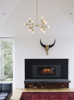
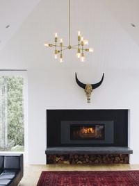
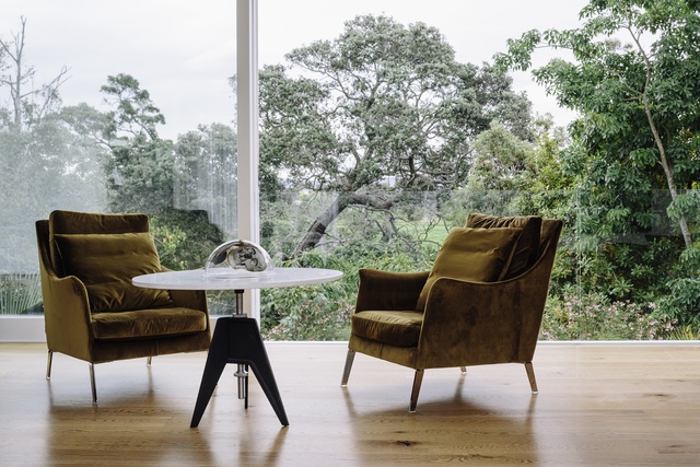
The main lounge extends across the rear of the house and, due to the steep grade of the site, it sits high above the terraced garden. Ranch sliders along the back wall can be pulled completely back; and although glass balustrading provides safety, it seems to recede away creating the impression of being nestled among the branches of the pohutukawa trees.
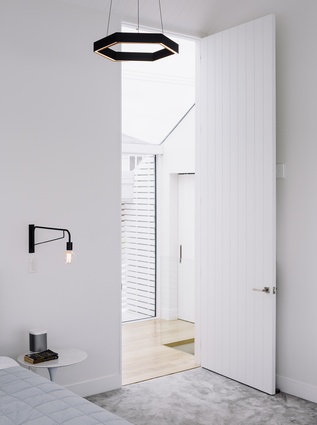
On the opposite side of the courtyard, the master suite occupies the street-facing upper level. It is sheltered from view on the courtyard side by full-height shutters, which the homeowners says gives it a sense of being totally separate.
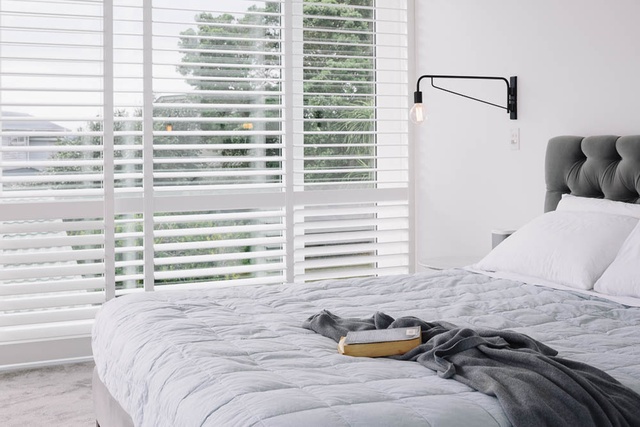
“There’s not much privacy on the main level but upstairs, with the shutters and the high celings and the light… it almost feels like being in a church, it’s so serene.”
The site drops away sharply to the back, and on the lower level, two additional bedrooms and a smaller shared bathroom offer plenty of future possibilities.
“Right now, the children are up on the same floor with us and that’s perfect at this age. But as they get older, we’re all going to want some space for ourselves, and this house will be able to provide that.”
Although they’re set below street level, these lower rooms are equally connected to the surrounding greenery. Just like the main lounge above them, the rear-facing exterior walls are comprised of ranch sliders and full-height windows. Similar to the courtyard, a shallow wooden deck extends from all the rooms out to the very private, terraced garden.
Achieveing such a transparent feel on a tight city lot was the goal from the start, the owner says. “When John first saw the site, he drew a little sketch on a paper napkin. He had the central courtyard on the main level, the lower level to the back side of the house and the upper level to the front… and really, the finished house hasn’t changed much from that sketch.”
It was important that the street presence complement the older homes in the established neighbourhood. As a twist on the weatherboard exteriors of traditional villas, Irving wrapped the front façade and sides in a monolithic shell of horizontal slats.
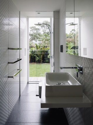
“The overcladding on the façade and the shutters inside enabled us to have maximum light and connection to the outdoors in every sense of the word,” he says. “In fact, we’ve got bathrooms that face the street and they have clear glass walls. It’s not the normal thing, and I have to give my clients full marks for getting on board with that idea, even though I’m sure at first it sounded pretty outrageous.”
Irving says that the house truly comes alive as the sun goes down. “I hate that so many of our city streets have turned into nothing but a series of high walls. You walk along them, and it’s just not pleasant, there’s no sign of life!
“But with this house, you see a glow from within – you get the sense that there’s something warm and welcoming going on. You’re intrigued. But at the same time, from inside the house there’s a real sense of sanctuary.”

