Oratia bathroom
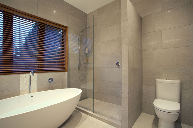
A large yard is key for young children, but as they grow into teenagers, they tend to require space to groom and preen. The owners of this home requested an update of the existing bathroom to accommodate the changing needs of their family – or more specifically, their two teenage daughters. Previously, the shower was over the bath, cramping the space, and the bathroom appeared out of date, says Natalie Du Bois.
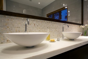
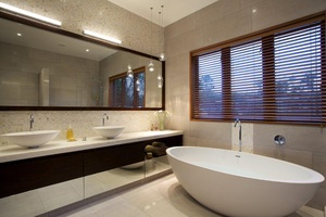
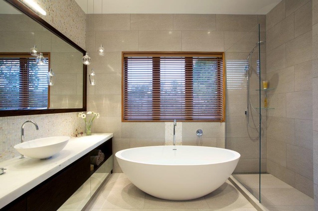
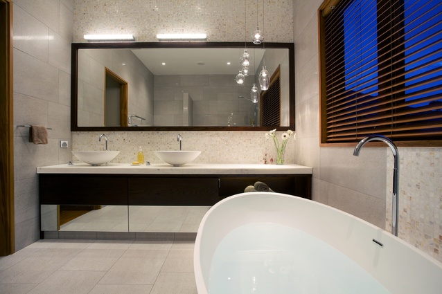
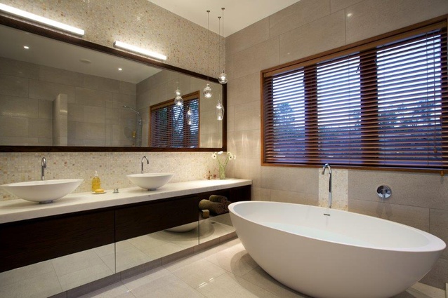
“As you walk in the door, you now see the free-standing bath, which has a sculptural look. The double bowls are the same shape and provide for those busy mornings. There is lots of storage under the basins, so a bolt of mirror glass is used to lighten the look of the cabinetry. The window frame had to stay, as it was the same throughout the house, so I chose a wooden mirror frame and a pearlescent fresh water shell mosaic tile above the cabinetry, with colours in it that picked up on the wood tones,” says Du Bois.
A section of this tile is also featured behind the bath filler, adding a sense of symmetry to the room. As the house has a Tuscan aesthetic, Du Bois chose a porcelain tile for the rest of the bathroom, which appears similar to concrete or travertine but with less upkeep than natural stone would have.
Aside from the task lighting provided above the mirrors, a good deal of thought has gone into creating mood lighting in the space. Three Scandinavian crystal pendants float over the cabinetry to the left of the bath, a shelf at the head of the bath has lighting within it, and behind the tub, up-lights illuminate the shell tile.
“The clients tell me their daughters feels as though their bathroom is like one you would find in a hotel, which is a positive end result to the design,” says Du Bois.

