Outside opinion: Christchurch central library
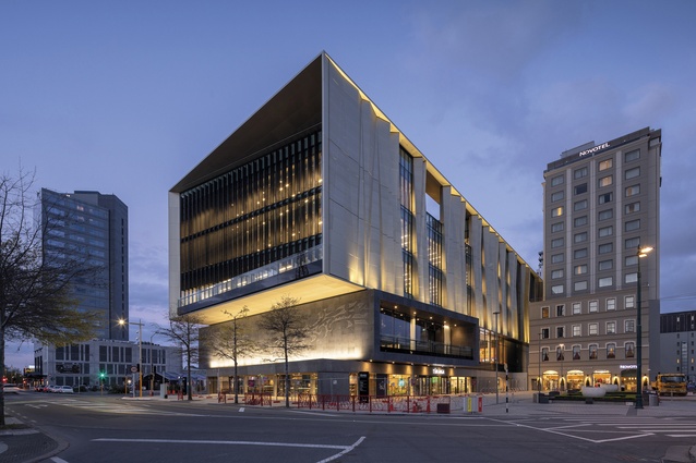
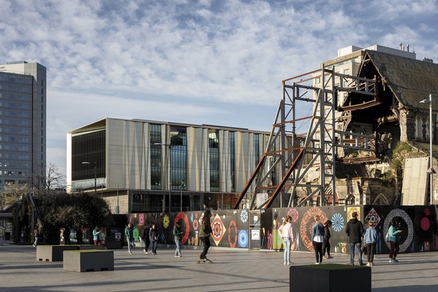
In what is, perhaps, the first truly architecturally and socially significant civic building completed in Christchurch since the earthquakes, Architectus and Danish practice Schmidt Hammer Lassen Architects have created a new form of culturally responsive and place-based architecture.
Since its European establishment in 1850, Christchurch has produced two internationally significant architectural movements: the Gothic Revival of the second half of the 19th century and the post-war modernism of the Christchurch School. Sadly, the enormous opportunity created by the demolition of hundreds of buildings after the earthquakes of 2010 and 2011 has not, so far, led to a third significant architectural movement for the city.
The new central city library called Tūranga is, in our opinion, the first truly architecturally and socially significant civic building completed since the earthquakes and, perhaps, signifies the opportunity for a new Christchurch movement.
The high quality of the building is the consequence of three significant factors: a design process that was meaningfully participatory and involved serious, sustained engagement with librarians as clients and local iwi designers as key stakeholders; a partnership of designers who skilfully and responsively led and executed the design; and, lastly, a public that loves libraries and has swiftly embraced the new building.

It’s clear that the building benefited from not having to adhere to a proposal developed from a tender or design competition. Following a process that was similar to that used in the design of the Len Lye Centre in New Plymouth, the architects were chosen by interview and from consideration of their work histories. This meant the engagement with clients and other key stakeholder groups could be meaningful.
For Tūranga, the architects developed a genuine, high-functioning relationship with the library team. They held joint workshops over six months to refine the brief. The architects also consulted and discussed the project with around 35 or 40 external stakeholders, including adjacent businesses in Cathedral Square, the education sector, social services, residents’ associations and national library bodies. In 2014, Christchurch City Libraries led a public consultation campaign called ‘Your Library, Your Voice’, gathering ideas about the kind of library people wanted and the services it should provide.
Of all the post-quake buildings, this is the one that most successfully integrates the important stories and narratives of Ngāi Tahu and Ngāi Tūāhuririri. This is accomplished by the designers working closely with Matapopore, the mandated voice for mana whenua in the rebuild of Christchurch.
Tūranga is unlike other buildings that have emerged post-quake in which the narratives are added as an extra layer, or a decorative film onto the architecture. In this instance, because Matapopore was engaged at the beginning of the process, the values and cultural narratives of mana whenua inform the spatial and formal design of Tūranga, and the six artworks led and informed by Matapopore are parts of the building and the experience of using it.
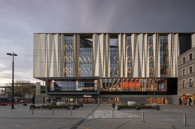
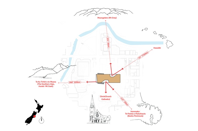
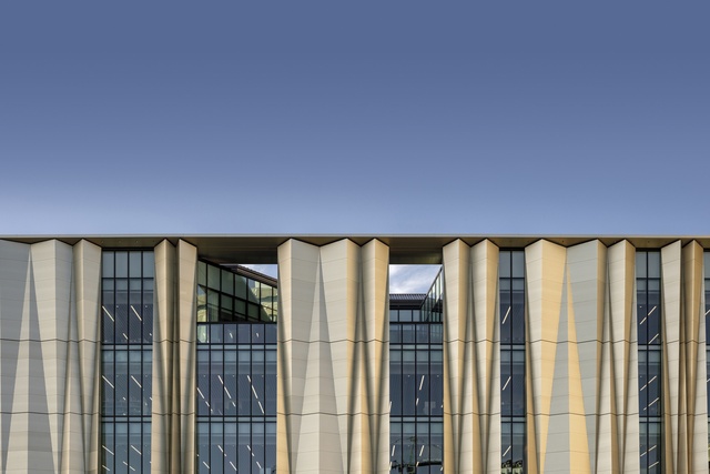
The golden screen that wraps the building references both the folded landscape of Waitaha (Canterbury) and blades of harakeke, without the cardinal sin of being treated literally. The roof terraces – wedges cut into the fourth floor of the building – provide important views south to the Port Hills and north to Maukatere (Mount Grey), and the glazed west wall faces Kā Tiritiri o te Moana, the Southern Alps.
Morgan Mathews-Hale’s Mātauranga – The Ascent of Tāwhaki is a two-dimensional work that wraps around the lifts on all levels and welcomes people at the principal entrance. The artist expands on the architects’ colour scheme for each floor, weaving in visual imagery and bold colour gradation to tell the story of Tāwhaki’s journey through the heavens to obtain knowledge.
This building is a joint project between Architectus and Danish firm Schmidt Hammer Lassen Architects, which brings extensive international experience in library design. It shows. The acoustic treatment enables lots of activity while still creating numerous quiet, reflective spaces.
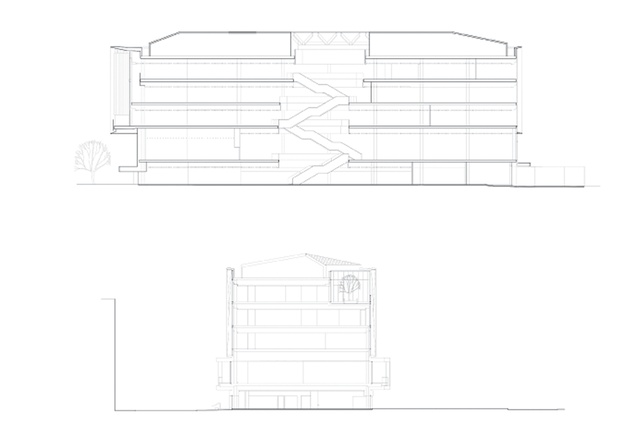
The programming of the library moves from active lower floors to the slower, less-active and more-reflective upper spaces in the middle, with the drawcard of fiction on the top floor. The external clarity of the building is enhanced by the notable lack of steel cross-bracing: an all too dominant feature in post-quake buildings.
The lateral forces are resisted by two concrete service towers that protect fire stairs. The towers are designed to move during earthquakes with large hydraulic pistons in both vertical and horizontal directions returning them to centre. It’s notable that this solution was developed by the design-build entity (that included the design architects) for its tender, illustrating the benefits of close working relationships between architects, engineers (Lewis Bradford) and contractors (Southbase Construction).
The new library offers a range of amenities, including public meeting spaces, a giant Lego collection and slide, 3D printers, an interactive wall, sewing machines and more. These ‘new’ additions are consistent with international trends in library design and Tūranga embraces these without ever losing sight of its role as a collector and provider of books and archives.
Criticisms of the building can be made and yet, when investigated closely, these too become features of the design. The arrival point, the threshold between public realm and interior, feels weak when compared to the strength of the exteriors and interiors themselves. Also, can a glazed rectangular box with a screen façade really offer anything new to architecture and the city?
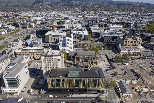
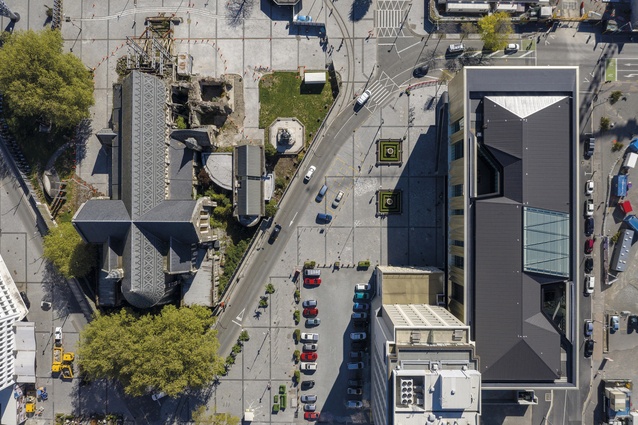
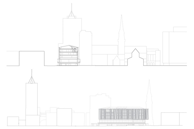
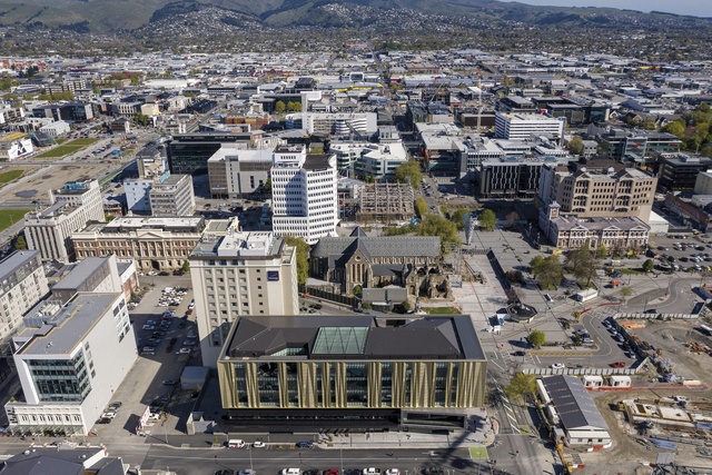
Sitting on the northern edge of Cathedral Square and alongside the Cathedral itself, the visual presence of the building is strong. It’s rare for a building to have such a strong historical position in a city while also having to anticipate significant new design features on its south (redesign of the square), west (the massive convention centre being built over the road and the possible closure of that road) and north (a long-debated and under-funded arts precinct).
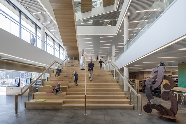
The relatively weak point of arrival is perhaps a consequence of this contextual complexity but this problem is turned into a feature by giving full prominence to the revelation of the interior stair and atrium when it is encountered.
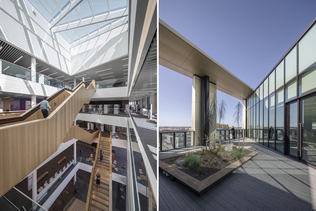
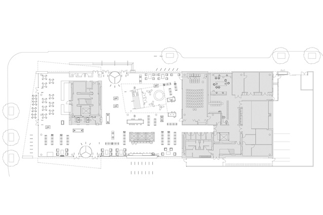
The building has great views of Cathedral Square and important historical and prominent landscape elements; however, it is predominantly a building that looks in. The designers chose to lower the ground floor and add the extra height to the first floor, effectively turning the second storey into the larger and more significant public space, including a meeting and seminar room, readable as an angled black box from the outside, with remarkable views and a balcony to the square.
This reduces some of the impact of the public space on the ground plane but produces a powerful opening-up of the building when moving up the timber stairs that zigzag their way through the atrium. The stairway and atrium create a singular interior space, which makes the building seem smaller and more simple than it actually is.
Is this a great work of architecture? One argument against this is the relative uniformity of the building. It can be read as a kind of decorated shed with a few elements that add variety: playfulness in the depth of the floor plates; the skewed dark box of the community space on the first floor; negative cuts on the higher floors; and the stunning folded aluminium material that cloaks the glass curtain wall. Its beauty and elegance are largely gained through the aluminium folded screen, which changes tone as the strong southern light shifts through the sky.
However, the building has the strength of clear and legible planning that characterises the almost austere Scandinavian aesthetic with the contextual and playful narrative elements provided by the clients and Matapopore. By doing this successfully, the building does raise the prospect of a second wave of great modern (or perhaps it’s actually a more highly developed form of postmodern architecture) buildings in Christchurch.
Christchurch is said to have the highest library usage rate in the country and a history of valuing and using its public and civic buildings, such as the town hall, municipal buildings, local pools and libraries. From discussions with locals, the buzz around town, social media comments and media, it is clear that the city has already fallen in love with its new library and this is, perhaps, the most important critique for a public building.

Architectus also designed the bus interchange, which opened in 2015. They are typologically and spatially very different buildings but do share similar sensibilities in creating calm and well-structured civic spaces. These two stand out from the crowd of new buildings constructed over the past six or so years. The bus interchange is an important building but, by its nature, it is a transitory and ephemeral space that works by moving people efficiently and carefully.
Tūranga is, in contrast, a destination, which works by creating an array of different kinds of experience: quiet seating, meeting with friends, reading magazines, accessing public services online, playing games. It is already well loved; it is a great civic building and may well define a new form of culturally responsive and place-based architecture in New Zealand. After everything the people of Christchurch have been through and everything that was lost, this is a building that they deserve.
Read more about the library’s interior here.
This article first appeared in Architecture New Zealand magazine.


