Party out the back: Auckland villa
This Ponsonby home was renovated with the hope of maximising the social and entertainment potential of its garden area.
The expression ‘business in the front, party out the back’ could not be more apt in describing this Ponsonby villa because, for the owners – who work and play in the music and publishing industries – business dictates that socialising be a regular occurrence.
The turn-of-the-century Victorian villa was purchased with this in mind but, other than its fantastic central Auckland location, the ‘business’ frontage didn’t really have a lot more going on for it than does the frontage of a mullet haircut. The house was rundown, the verandah was filled in – it was outdated and beaten up, thanks to its years as a tenanted flat.
But the owners wanted more than a refresh, says architect Evelyn McNamara, who worked with designer Chris Tate on the project – the house was to serve equally as a function space and as a home.
“The brief was for a mega contemporary party house, an entertainer’s house,” says McNamara. The clients weren’t afraid to polarise, either; this meant the scope to create a strong statement was unlimited.

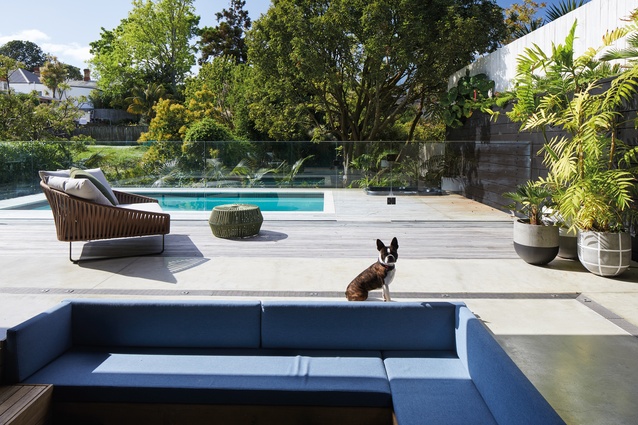
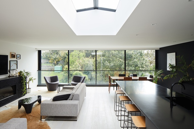
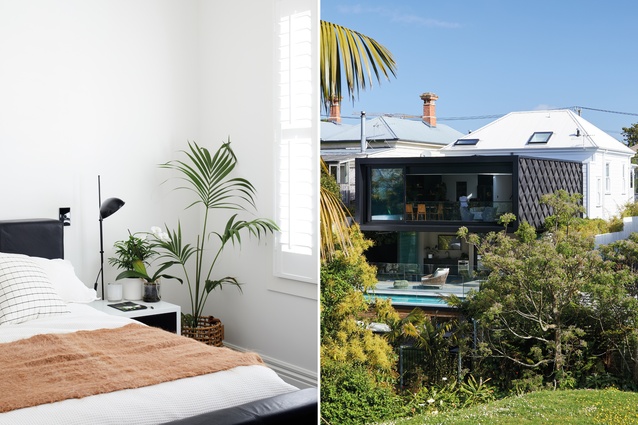
The site slopes down the hill from the road frontage, lending itself perfectly to a filled-in basement entertainment area that connects with a backyard pool space, underneath the extension to the original home. This was where McNamara and Tate decided to push the boat right out; they designed the living space of the house to cantilever 4.7 metres over the entertainment space underneath.
It’s not an easy feat of engineering and it’s virtually never seen in a residential project, particularly in a heritage zone where the area is heavily protected from any variance from tradition – but the result is jaw-dropping.
The home was jacked up several 100mm to create a taller downstairs space and extensive retaining was put in place along each fence line, in order to comply with resource consents.
The glass sliders, which enclose the cantilever for entertaining in winter, stack together to dissolve the threshold between indoors and outdoors completely and enhance the cantilevered design – “it’s kind of un-nerving” laughs McNamara. A sunken conversation pit, complete with central gas fire, is designed so that party-goers can escape the wind after having a dip in the pool.
The downstairs space is considered to be a complete entertainment area in itself; it contains a mini-kitchen/bar and wine cellar as well as a bathroom/changing room. The backyard is accessed through a side gate at the street frontage, specifically for party-goers; it means the home remains private with a central front entrance.
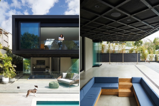
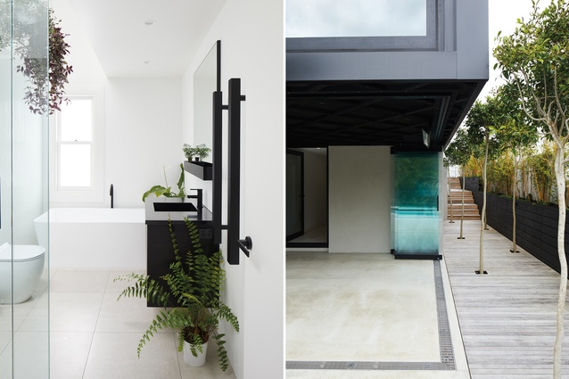
The journey down the side of the house allows visitors to ‘decelerate Chi’ as they travel down to the pool area and, as such, the attention to detail is immense. Slender uplit trees dot the journey and the detailing on the side of the cantilevered extension mimics the traditional latticework detailing of the villa, while complementing the adjacent original weatherboards.
The extensive retaining walls that hold back the neighbours’ properties made the extensive excavation for the downstairs space possible and ensure complete privacy – a very difficult objective to achieve in a villa-lined street.
For that reason, the neighbours were happy to sign off on the project, as the retaining walls mean that neither neighbour has a view of the outdoor living space.
“Privacy is always really high on the list, especially when you’re so close to people,” says Tate. “The treatment of the retaining walls became important, too, because they’re quite a feature when the doors are all back.” This meant even the detailing of the bolts on the retaining walls was carefully considered and staggered in a pattern.
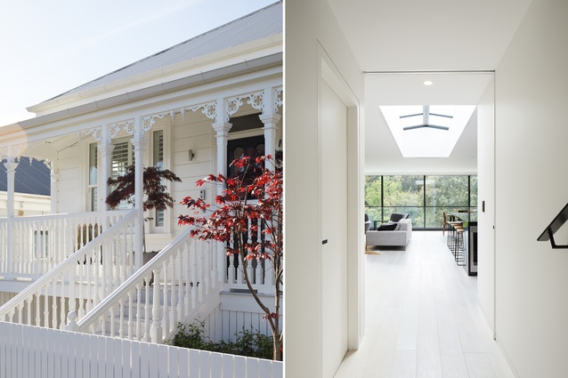
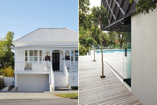
Creating a strong statement in the back is all very well but, when in villa-land, one must adhere to the strict protocol of the street frontage. Therefore, the street view was completely restored and the look is all business.

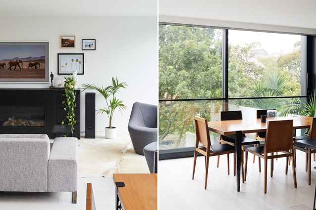
However, as soon as you step inside, the aesthetic becomes much more ‘rock star’ than traditional cottage. The central hallway has been restored, with rooms off each side, but the palette of the white oak floor and black steel accents immediately creates an edgy juxtaposition that speaks to the owners’ influences.
But the most dramatic statement of all, and the biggest clue to the possibility of a party out the back, is the staggering view from the front door right through the house; when the glass wall of doors at the back of the living space is pushed back, all that can be seen and heard is an uninterrupted canopy of trees and the buzz of the party below.
This article first appeared in Urbis magazine.


