Pattersons
At Patterson Associates, life is a bit like a sitcom – full of drama, critical decisions and personalities every day. Here, 10 architectural actors at the practice talk about their work and the themes that draw them together.
Do you find a void at the centre of architecture? And the necessary covering over of this void, to create stable ground on which something can be built, the motivating force to explain and support architectural practice? It is in the spirit of these questions that we have made a collective decision to resist the re-presentation of the ground on which our work, our service and our business as architects stand. Like architecture, our individual and collective identities are sustained by voids. Necessarily empty containers, filled with potential, through which we reach out for, and into, the future, in an act of creative discovery. We put it to you that the void between us is the space on which our present and future vitality depends. And so, we present ourselves to you as we are, a manifold of voices, with the hope that, in doing so, we might begin to see the shape of it.

Free radicals
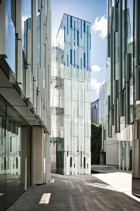
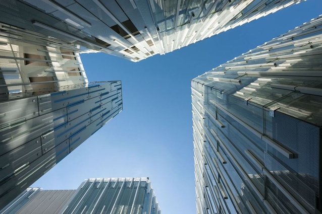
How we use pattern at Patterson has been a constant and conscious evolution. Early examples – Cumulus 2003, Stratis 2005 and Mai Mai 2007 – used repeating 3D motifs within otherwise flat façades to express a connection to place through pattern. It is fair to say, by 2010, we had become experts in use of glass reinforced concrete (GRC). Maybe because of this, we jointly felt the need to further develop our technique in this area. As is often the case, this experimentation began in our public work.
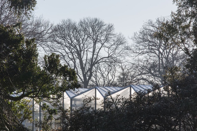
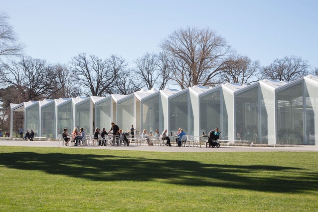
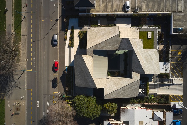
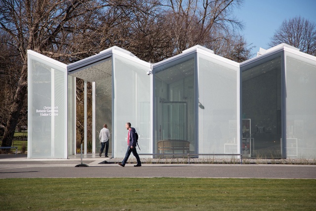
Our concept for Christchurch Botanical Gardens Visitors Centre, 2014, is underpinned by an ecology of references unique to its purpose and place: cellulose plant cell structures, snow-covered mountain tops, low-lying fog and Gothic rooflines.
Plant cell structures were of particular importance to us as we looked for ways to utilise exposed structure in a way that minimised its often decorative and moralising effects. Impressed by the simple elegance of modular, component-based rural glass houses – their spatial qualities and highly optimised exposed structure – we understood that the purity of this machine for living could be infected with our own holistic approach to place and pattern.
We developed our own rhythmic structural pattern and conjoined the roof and wall as an inverted wrap, realising a simple but surprising geometric motif. This geometry informed internal space planning, the overall building structure and form. Private spaces are contained in cell-like pods that also act as bracing elements within the wider open public spaces. The resulting concept emerges from the intersection of structure, form and parti.
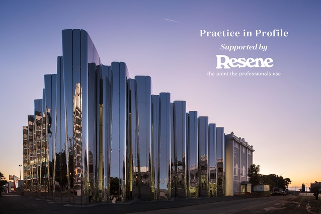
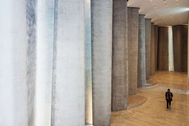
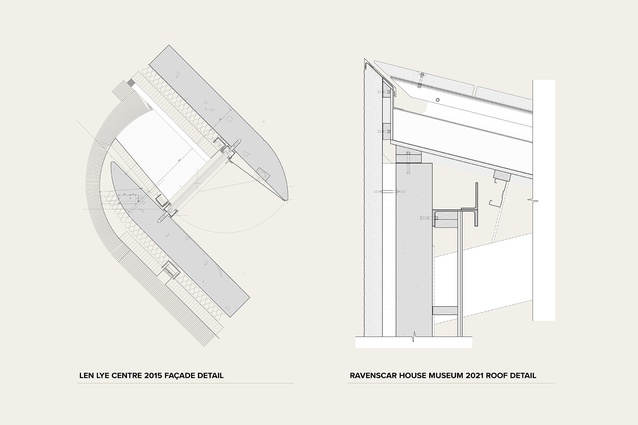
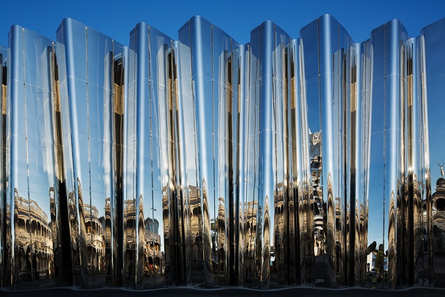
Our pattern thinking evolved again at the Len Lye Centre, 2015, where fluid structural concrete walls support, contrast and map the metallic façade; an architectural effect that links Len and his work to the building.
The external walls of the building are an example of form following function but in a Patterson way, where function is understood as literal, experiential and symbolic. The interlocking rhythmic array of three-dimensional wall volumes clad in mirror-finished stainless steel reflect sunlight in sculptural patterns on the street below and re-present the surrounding streetscape as a jittering, distorted mirror image; recognisable and strange.
Yet for me, the rhythmic, curving structural concrete interior is more magical: in stark contrast to the exterior, these serene, almost cathedral-like forms disrupt the otherwise conventional white cube galleries within. Art as place and space emerging from the interplay of technique, rhythm and rigour.1
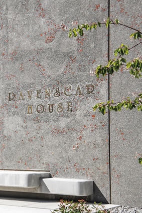
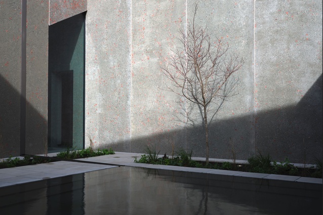
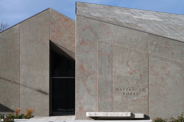
Lately, our pattern thinking has returned to the surface but in a way that opens up a portal between the structure of materials and memory. At Ravenscar House Museum, 2022, we used rubble donated by the neighbouring Arts Centre from buildings lost in the 2011 quake in the mix for the precast concrete cladding panels. The colour and texture of the resulting surfaces connect this new building with lost heritage in an immediate, powerful and affective way. AM
Into the clouds
I disappeared into Cumulus in 2008. A person pretending to be an artist, pretending to be an engineer, dressed up like a bicycle messenger, already thinking about the intersection of te ao Māori, modernism and modern life: the metaphysics of these Shaky Isles; the collision and collapse of worlds on the one hand, reciprocally ordinary and exotic, and the undertow of future belonging on the other, of foreground becoming background becoming foreground again.2 And so, I committed myself to a 5-year course of group therapy. Aka Architecture school; a special form Talking Cure where you put the room on the couch instead of the couch in the room.
Such was my whakapapa, the landscape that understood me, when in 2015 I read Paradise Lost and Found,3 Mark Wigley’s love letter and lament to New Zealand architecture, penned shortly before he disappeared forever down the yellow brick road, and rediscovered the Patterson portfolio in earnest. The recursive and resonant truth of Wigley’s essay – that the history of New Zealand architecture was rather the history of its absence produced by the search for it – was as clarifying as it was challenging. Against this, 25 years of architectural labour at Patterson rose before me like the teeth of Te Ika-a-Māui: the first signs of a future world just over the horizon yet, somehow, always already here and now; a sequence of deeply optimistic civic, commercial and residential projects that illuminate the space around the black hole Wigley placed at the centre of New Zealand architecture without being drawn into it; a way out of and beyond the critical constellations that had both enabled and constrained my own voyage into future belonging, all the way to the Restaurant at The End of The (Universe) World4 and my own unknown known possibility of nowhere else to go – so there I went, back into the clouds. Towards a New Zealand architecture. SG
Reporting from the front
Patterson is mission-driven: to produce architecture that is uniquely Pacific through a robust, interrogative and creative process. We operate as a single entity and, while we don’t have the restrictions of a prescribed style, we benefit from the clarity of a prescribed process.
Our design culture is set up to encourage open debate, extracting the best ideas quickly but thoroughly. We are highly critical and are able to respond fast, particularly because of our direct styles of communication. This allows us to achieve a lot with very little. We may make a bit of noise, create a bit of friction and add a bit of pressure but it’s as required to produce something unexpected and beautiful. In our shared pursuits, we’re encouraged to place our individuality at the service of each other, the work and, ultimately, the building. We believe this part of our culture is how we attract like-minded people from around the country.
Our tools may vary but our process remains consistent. We work in an environment which is, in many ways, reminiscent of a university crit space, where hierarchy is simultaneously respected and irrelevant. We benefit from a leadership team which prioritises guidance over instructions; anyone, from director to graduate, can participate and ideas are collectively scrutinised to ensure only the best survive.
Every project is presented with a site, a brief and some hints of what the direction might be. Regardless of title or role, we are invited to interrogate the concept and connect the dots to complete the big picture. Our communication tools for these processes are traditional, particularly in the early stages: scaled plans, sections and perspectives. However, with emerging technology offering so much potential, we’re constantly testing for ways to harness its power in our search for the unexpected.
Concept and design development tends to benefit from being relentless. In finding and refining the best outcomes, we are encouraged to iterate, test, iterate, and test again, tirelessly. Patterson demands a great deal of originality from every person for every project. This requires a high level of enthusiasm balanced with naïvety from the collective whole. For this to be sustainable and to maintain the balance of quality, milestones and delivery, the team must rely on their sense of clarity, confidence and competence.
Young, new, or old: as an employee, each team member is aware of the big picture, the wider conversation and the work that supports it. Past and present projects are re-evaluated in search of the unseen. Collectively, we are given broad responsibility to resolve complex ideas. While sometimes terrifying, this opportunity and challenge is always transformative. It is not for everyone and it isn’t always easy but for those who stay, the results are rewarding.
The practice supports us each to invent our own methods and develop a sense of who we are as designers, operating within a wider framework. It allows us to practice our values and beliefs, should we choose to be vulnerable. And, through this environment, both challenging and nurturing, our team turns up every day, to contribute towards something they believe in. SR and BF
Courtyard in our island nation
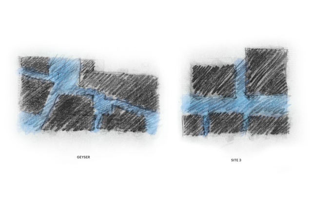
In today’s singular world where maximum leasable/saleable area is king, the holistic value and values of the courtyard rarely stand a chance. Its layering of spatial sequences, from public to private, light to dark, indoor to outdoor, has been around for millennia. It’s also present in architectural traditions, however old or contemporary, the world over. Often broadly categorised as a romantic notion – like a secret garden, domesticated wilderness or picturesque ruin – a courtyard is both a habitat and the simulation of a habitat, offering a curated version of nature, framed by an atmosphere of intimacy, beauty and shelter.In a densely urban environment, it allows much desired privacy, security and the ability to hold and with-hold natural elements. In climatic terms, it offers an escape from the elements and the ability to cross ventilate spaces effectively. Closer to home, the idea of a courtyard as a positive space between multiple buildings is common across Pacific cultures, which, similarly, understand the ocean as a full space, connecting rather than separating many islands.
The technique of creating courtyards through the composition and curated separation of different building forms is one we use a lot. Mike Austin discusses this Pacific idea of spatial separation as a positive space in his essay ‘Oceanic Architecture’.
“Differentiation and separation are achieved not by walls and partitions, but by space, much as islands are separated by the sea. This term for the spacing is va, an Oceanic word, that, with numerous complex variations and translations, is applied to both the social and physical worlds. […] The hope for the future is for the production of an architecture resulting from the grinding together of land and people in the context of ever-present ocean.”
This ever-present mighty ocean, and the simultaneous connection, separation, isolation and reflection it offers to our island nation, enables creative opportunities that are uniquely local yet increasingly relevant globally. Courtyards in this context should be viewed not as having a negative impact on the bottom-line but like a trade wind or ocean current, strengthening the cultural identity of our built environment and offering better architectural and urban design outcomes. DP
Crossing over
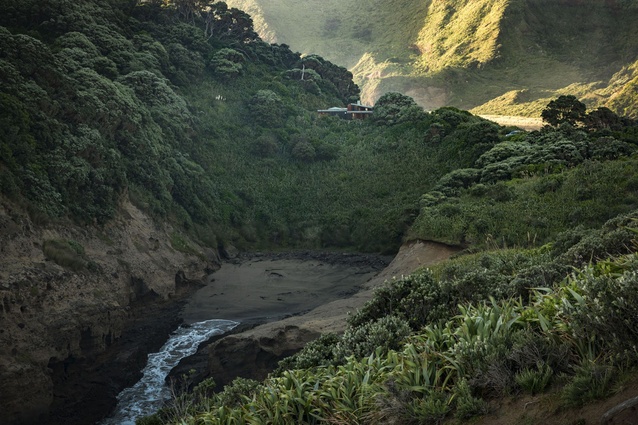
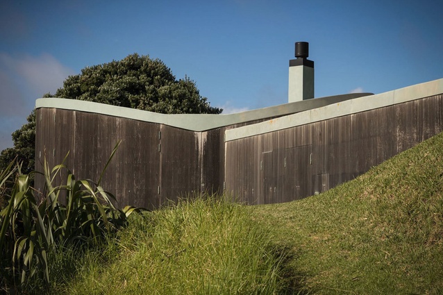
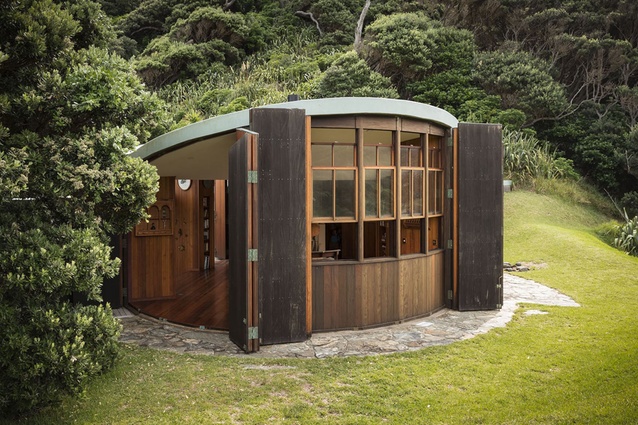
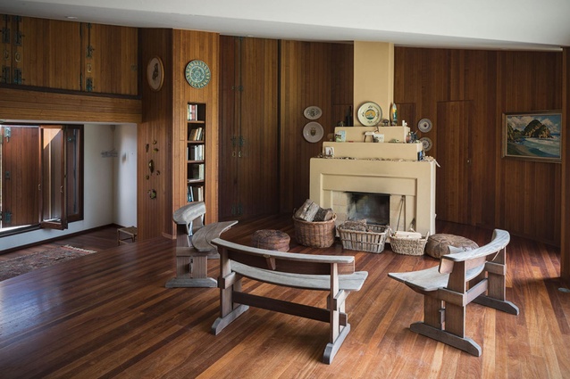
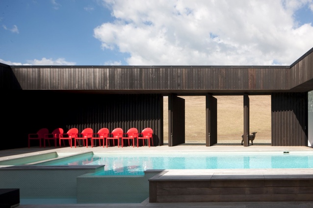
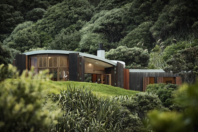
Like most, I’ve only ever scouted out the Bethells House when it was closed up and unoccupied. Its timber shuttered form, wedged into a headland between three beaches, only fleetingly visible from a few points along the coastline. Photographs properly documenting its transformation from closed to open, from inside and out, have only been recently taken. The house was completed before I joined Patterson (consented and built within a year). Its concept, to me a least, is all about taking the ideas of enclosure and protection to the limit. A house made ‘solid’. Impermeable. A pure but playful geometric form hiding a precious kernel inside – like a nut.
Its timber shutters are a practical response against the elements (and vandalism, I suppose). But, as in many of our most compelling projects, the use of a solid perimeter wall, shuttering, screen or veil transcends the practicalities of privacy, security, weather protection and sun control. As we cross these thresholds, they reveal to us a new sense of place – putting us at the centre of a new world.
To achieve this, Patterson designs often go out of their way to modulate the transition between a building and its context, such that crossing the threshold becomes about creating a new POV, an instantaneous change in perspective, a transformational quality. In many Patterson projects, thresholds and courtyards are used together to create inside-outsides – central courtyards – that are powerfully re-orientating, like the Parihoa Farm House further up the coast in Muriwai (the first project I worked on). But the Bethells House creates this re-centring effect without one. Instead, the skin of the house opens up, making the living space the intersection and centre point of the extraordinary landforms that surround it. The oval heart at the centre of the plan is its own central courtyard.
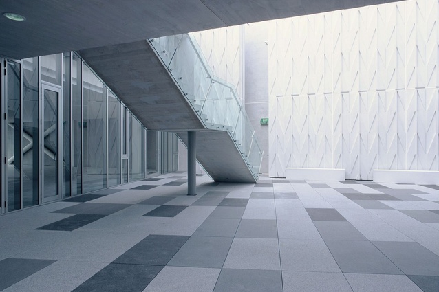
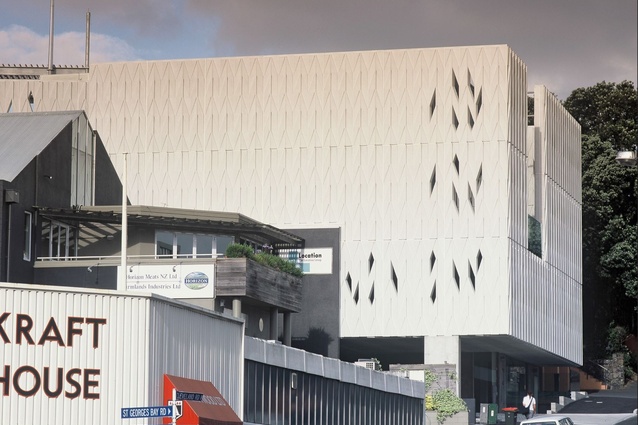
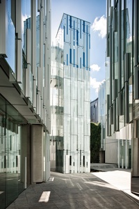
A very different building that also takes the threshold to its limit is Cumulus in Parnell. A solid, patterned white cloud hovers above the street, with access to the office spaces by way of a central elevator that transports its passengers to another world in a theatrical way – doors opening to reveal a cloudy-white GRC-clad courtyard open only to the sky. The architecture engages with the urban streetscape and the public but in a counterintuitive way: not in the standard approach of breaking up building forms to make it more ‘relatable’ but by bringing the public across the threshold and into a new and different world. LD
To infinity and beyond
Creativity comes in many forms. As a draftsman, I contribute to the practice in a different way from the designers. Once a design reaches us, the documenters, the basic concept of look, materiality and spatial aesthetic has been decided. However, that is only part of achieving the outcome. Transforming the design into an actual building is an exercise in creativity itself.
Given the bespoke nature of our projects, coming up with practical and buildable detail solutions is challenging and complex. As our projects rarely look the same, each tends to have its own set of issues. Resolving these while staying true to and further developing the concept is a continual source of satisfaction. Creating buildings that naturally belong to their geological and cultural contexts is the cornerstone of our philosophy.
We are known for our use of solid building materials, such as concrete, stone and steel, and for nestling these into the landscape to produce buildings that are beautiful and that feel solid and enduring. The ever-increasing number of building parameters introduced by regulatory bodies can make achieving this effect a challenging and sometimes delicate task. Conceiving innovative solutions that retain our design intent, while complying with a constantly evolving and sometimes over-regulated compliance path, is a real source of pride.
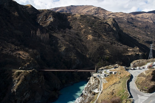
Having spent more than 16 years at Patterson, I have been involved in documenting many very challenging designs: Local Rock House, The Hills Golfclub Clubhouse, Cumulus, AJ Hackett Bungy and Paoneone – all very different buildings, each requiring its own unique design and detailing solutions.
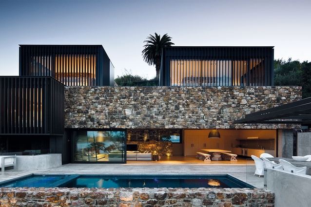
At Local Rock, for example, holding up the 1200mm-deep rock facia that spans the 14m threshold between the main indoor and outdoor living areas, acting as a natural transition between the beach below and the private bedrooms above, required an ingenious mix of creative engineering and architectural detailing. The result now speaks for itself (or to me at least).
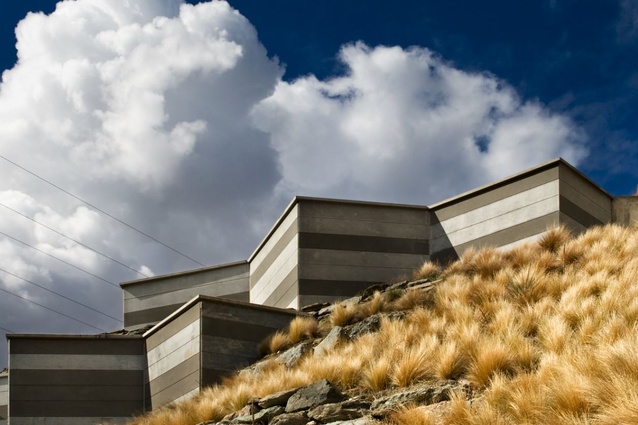
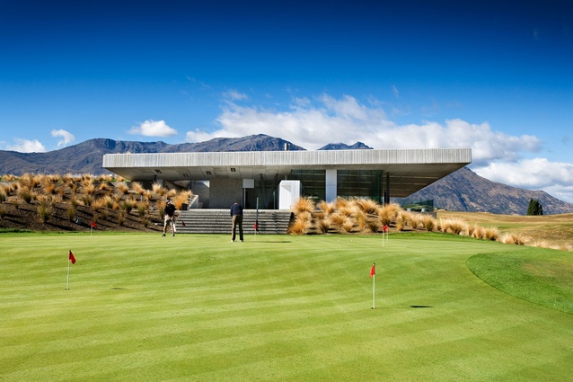
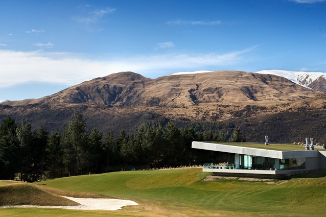
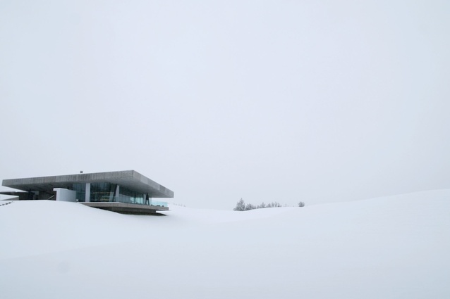
Similarly, The Hills Clubhouse had some very strict parameters set by the resource consent: mostly that it should be ‘invisible’ from the main road. Our solution was to build it into the hillside and ‘hide’ the building with a densely planted earth roof. Using GRC to produce the façade and wraparound ceiling to the main clubroom, while hiding the support structure for the landscaped roof above, was a highlight.
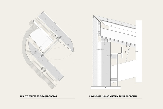
When I started out, we drew projects with pen and paper on drawing boards and I was called a draftsman. Now, they call me an LBP (Licensed Building Practitioner – Design and 3D modelling) and complex BIM software is the norm. The evolution in how our projects are documented has been tremendous, and the consequent improvement in detail resolution a constant source of amazement and satisfaction.
Working at Patterson is demanding but the pleasure we take in doing what we do, the way we do it, makes working here very rewarding. I took a brief ‘sabbatical’ in the late 2000s to work at other firms. I realised that I missed the opportunity and challenge to push the limits of detail design presented at Patterson and contribute to buildings that align with my personal design philosophy. Luckily, I received an invitation to return. I am proud to be part of a great team; I hope to remain and continue to produce buildings that will stand the test of time. ST
Touching space
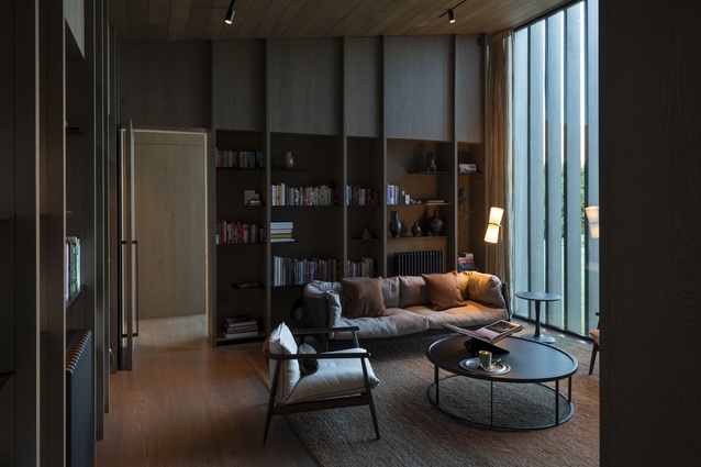
The longer I practice, the more I move towards a sensory appreciation of architecture. My interest and energies are now mostly directed towards the material effects and fabrication of architectural spaces, particularly through the careful, considered interplay of light, look and touch.
Strange as it may seem, the act of touching an unfamiliar surface is not required to know what it feels like; a manifold of analogies is summoned by the gap in our experience as an automatic response. The possibility of an uncanny dissonance between perception and reality tickles the fingers, even in the absence of feeling. As an architect, my appreciation of the working processes and craft required to achieve these experiences heightens them further.
At concept stage, the architect’s description of the materials in words combined with artist renders is our clients’ first experience of the materiality of their project. It is not until the second stage, developed design, sometimes months after the initial commission, that our clients and design team find themselves assembled around a selection of material samples – strips, squares and rectangles of the stuff buildings are made of – and a dialogue grounded in reality rather than renders can begin.
This is also often the moment in which a project shifts mode from concept to delivery and a very different kind of reality; detail design. However, with some luck and a little optimism, this abstract representation of the building in miniature will provide the team with sufficient intrigue, joy and delight to weather the ensuing storm of decisions, deadlines, stress and exhaustion between this point and project completion.
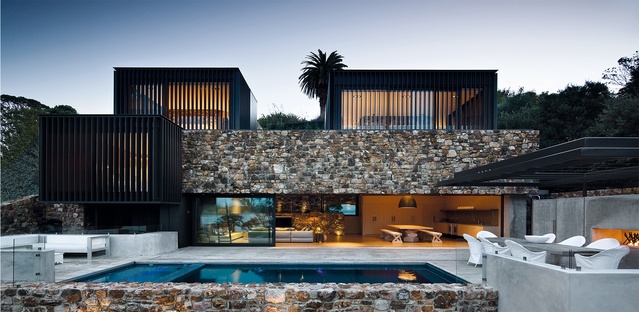
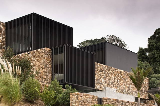
Locally quarried rough-hewn rock plays a leading role in many Patterson projects. Used to retain the site so that buildings appear to emerge naturally from the landscape, as at Seascape Retreat, or thrust up, suspended against gravity, as at Local Rock House. In each case, the materiality of the surface draws the architecture into its place, while the apparent simplicity of its detailing disguises the depth of expertise required to put it there.
At the other end of the scale is our use of GRC as an applique. A lightweight, monolithic skin stretched over mostly hidden structure becomes a stage for the play of light and shadow through our use of pattern as ornamental relief. Materiality meets psycho-geography. Cumulus, one of Patterson’s cloud building series, displays a lightness that is true to its concept and a moulded form that solicits tactile explorations of its surface – even in the absence of the possibility of touch.
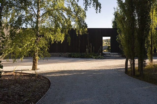
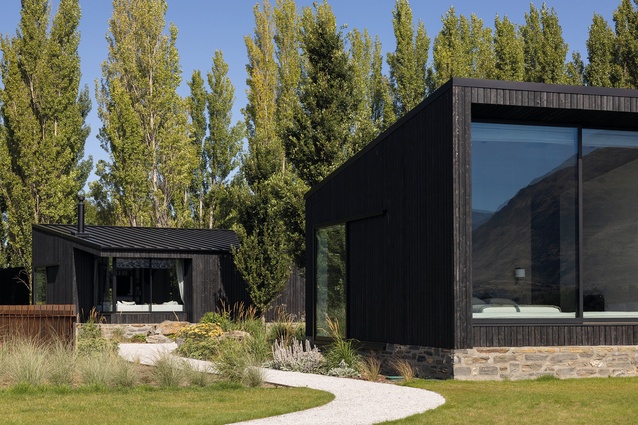
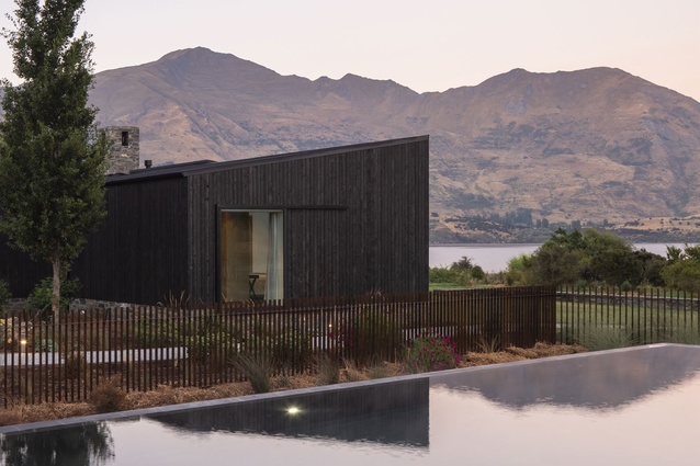
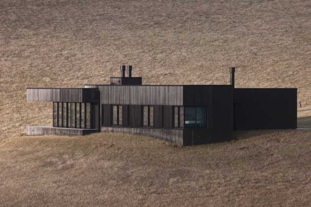
The hiss, crackle and smell of timber boards being charred on the shore of Lake Wanaka will be a strong memory of a recent project for me: the process now also remembered in the surface and experience of the finished building. Left to weather and age gracefully, it is the antithesis of black-stained timber that must be revisited every two years in a battle against the elements.
The use of materials that weather and patina naturally in accordance with their place is a consistent and satisfying theme in our work. SF
The strange time of the render
In 1997, Mark Wigley gave a lecture at AA School of Architecture he titled ‘The Strange Time of the Sketch’. In it, he argued that architects have understood the hand sketch as encapsulating the life force of the final building – its complete distillation before the fact, such that the architect is just a medium conducting that force from their hand into the physical form. The computer-generated render is very different from a hand sketch but the way we use it at Patterson has many parallels with this understanding – ideas and feelings about the hand sketch we perhaps hold even more tightly now in its absence.
My current station on the moving assembly line could be called detailed developed design, or detailed design development, or developed design in detail. Jobs, or at least fees, are broken down into stages but, in reality, the delivery process is a continuum and stations and titles necessarily blurry. In any case, by the time a job gets to me, a lot has been done. Nevertheless, even a well-developed concept design is messy, inconsistent and unresolved by any measure. Above and beneath this confusion, its cause and resolution, is the render.
My working title for this piece was ‘The Tyranny of the Render’ because it is to these images we will refer back to, again and again, to discipline and punish the design as it proceeds from concept to construction site. A recent site visit revealed we had missed the mark, “thankfully these clients are so trusting of us, because this isn’t at all like the renders”, while other projects are revered because, when the render is placed alongside a photograph, the two are said to be similar.

These two-dimensional illusions appear real but are entirely fictional. I often wonder what it is about them that clients like: do renders speak a language they [think they] understand? Does the complex simulation of material textures, light-rays and space produce shadows and highlights that remind them of that time when…? Is it that the sky is always blue? Do they know that the position of the lens is a point in space that their eye will never be?
The tyranny of the sketch was totally eradicated for me when I moved into CAD, and from there into detail design. The blank page is no longer my problem and the ability to copy, delete or undo at will and without consequence, that characterises the CAD modelling space that renders cover over, is a constant relief because, let’s be real, the instantaneous effect of a fully formed idea does not come from a two-minute sketch. The best ideas are never entirely equal to themselves, either at the beginning or the end. They need time to grow, to be nurtured, often in secret, before they can even know themselves what they are. For me, this quality of nurturing is synonymous with detail design.
Assembling a construction set requires the simultaneous coordination of 1+n constantly moving, interdependent parts – a web of prefabricated elements, standards, consent conditions, personalities and opinions. The pieces of architecture are in constant flux. And, while a construction set really is the Final_Actual Final_Final Final_SAMS ONE.pln set of drawings, we all know it really isn’t. The drawings will continue to change, as amendment follows variation follows revision. And, even then, after all that, construction drawings are, at best, a set of incomplete instructions that will be imperfectly executed in the service of an outcome, the completed building, that will continue to change.
And so, with some irony, we begin to see that it is the render, rather than construction drawing, that provides architecture with its line in the sand. A doubly-sacred index of the beginning and end of an architectural project, whose influence also organises everything in between. The render really does have a life force of its own, which would make us its stewards. Guardians perhaps? I guess that sounds better than ‘Tyranny’. Architects – Guardians of the Render. NA
The never-ending pilot
It amazes me that architecture has never had a sitcom genre; I find it riveting, full of drama, critical decisions and personalities every day. I am lucky enough to work with wonderful, bright people, often in relationships that are decades long, in a free and easy studio environment. We all (sometimes painfully so) speak our minds.
The programme can be all consuming and I find it is crucial to have time out. A change is as good as a holiday, so we’ve never specialised by building type, constantly working on a disparate range of types, from single residential to apartments, lodges to sports facilities, tourism, institutional and commercial, in the country and in the city.
Somehow, between deadlines and firefighting, we have passed the point of needing to constantly pitch or socialise for jobs. Clients generally come to us because they have experienced our buildings. This is incredibly satisfying – and sustainable. I love it when people enjoy projects like Axis, a building that has now been standing 100 years. The unique characteristic of architecture is that it’s around for a long, long time so, if we have tried to specialise in anything, it has been in permanent, quality buildings.
Architects are futurists. Lately, we’ve been reconciling permanent buildings and their carbon impact through research with Tricia Love Consultants using life cycle analysis on our recent Ravenscar House Museum. Built almost entirely in concrete, all going well, this base isolated institutional building could still be standing in 500 years. But when calculated using the specified 60-year commercial or 90-year residential building life cycles, its embodied and operational emissions far exceed those of reference buildings. However, when projected out 150 years, it easily outperforms them. Interestingly, the total carbon impact over 150 years is less than that of a single 777 flying Auckland to Hong Kong return.
It is also sobering to note that, according to Trish, we could have built Ravenscar twice in LVL and still had a smaller carbon footprint. In fact, the calculations reveal we should be building and re-building raupo-style ‘fabric‘ buildings in timber every five years. Life cycle analysis implies that we could build/grow our way out of the industry’s embodied emission problems.
There is obviously a lot more work to be done; the climate implications of demolishing perfectly good buildings in response to seven-year planning changes, and our building code ending at a 50-year building life, are unresolved and who is to know what will be recyclable in 100, or even 40 years? Isn’t it obvious that cars and planes will be shared and autonomous, rendering many current transport and planning decisions obsolete?
We have been building virtual models of our buildings for a few years now and what is very exciting for me is the effect of a whole new digital world; digital twinning, virtual environments, visualisation methods and augmented reality enabling virtual 3D details to be coordinated with the exact spot on the construction site.
Forward thinking on how we approach questions of sustainability, heritage, transport and evolving technology are at the forefront of architecture but it seems our core value about belonging will survive; the linking of landscapes, cityscapes and people to create practical and beautiful environments that will inspire Aotearoans to live, work, debate and play will endure across generations. Architecture is an exciting world and, usually, I can’t wait to get to work every single day. AP
References:
1 Len Lye, Free Radicals, 1958. youtube.com/watch?v=LpAOHBHxaSM
2 Simon Glaister (2009), ‘Against Gravity’, [Concrete, Steel, Newsprint, Absence], ST Pauls St Gallery, Auckland. stpaulst.aut.ac.nz/allexhibitions/pastexhibitions/2009/simon-glaisterpush-over.
3 Mark Wigley, (1986), ‘Paradise Lost and Found: The insinuation of architecture in New Zealand’, in Douglas Lloyd Jenkins (ed.) (2005) New Dreamland: Writing New Zealand Architecture, Godwit.
4 Simon Glaister (2016), ‘The Restaurant at the end of the Universe World’, [Kauri, Rimu, Paua, Pounamu, Steel, Plastic, Glass, Electricity], in Future Islands, New Zealand Pavilion, Venice Biennale 2016.

