Pavilion living: Annandale Residence
This alteration and addition to an inner-city terrace house by Jackson Teece is a second attempt by the owners to create their dream home. This time around, they have succeeded.
Both clients and designers learn from their experiences. While designers get the chance to reflect on what went well and not so well after each project, a client typically gets this opportunity just once in their life. However, for a couple in Sydney’s Annandale, a previous experience renovating their terrace prompted them to take a different approach when the time came again to rework their home.
When the clients first bought their nineteenth-century terrace house in the inner-west of Sydney, they engaged an architect to renovate and extend the existing structure. While the architect delivered what the client had asked for, the couple felt that the new house still wasn’t what they were after. Reflecting on the process, they saw that there was a lack of communication between themselves and the architect.
Twelve years later, the clients felt like having another go at achieving a place that really embodied the way they wanted to live. Fortunately the couple had made the acquaintance of a director of a prominent Sydney architectural practice who gladly took on the project. Paul Brace, who at the time was director of interiors at Jackson Teece, was assigned as project designer.
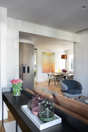
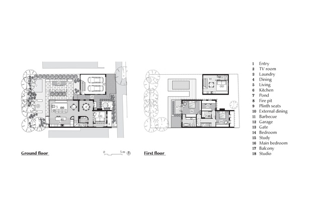
The first priority for Paul was to make sense of the circulation within the house. Where once there had been two staircases connecting the lower floor to the upper floor, Paul consolidated the vertical circulations into one central drum. Located at the front of the house, the drum incorporates a realigned staircase, store and powder room. Clad in limed timber verticals, the drum’s generous curve provides a smooth flow into the living spaces to the rear.
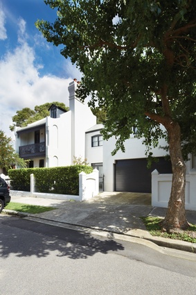
The extant masonry terrace house acts as a grounding device to the project, with its solid walls, oak flooring and vertically proportioned windows. In dialogue with the curved hub is a large round table by Daniel Barbera. Its dark timber top and bronze legs work with the subdued hues found in the rest of this section of the house.
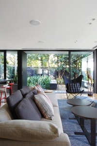
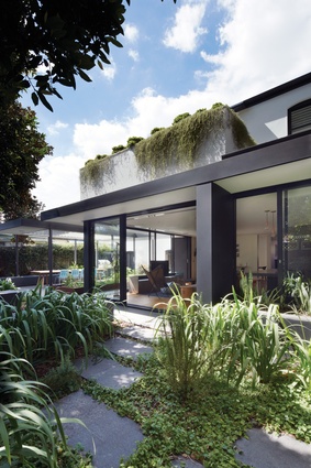
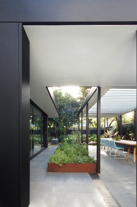
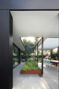
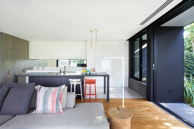
The rear of the house has been conceived as two pavilion structures, one housing the main internal living space and the other providing shelter for the exterior dining area. Both are defined by black steel framing and have an emphasis on low horizontality, reminiscent of a mid-century modern Palm Springs home. The timber verticals from the drum reappear in the kitchen joinery, as do the oversized door pulls. The two work well together as a compositional element.
The charcoal grey kitchen island has been designed as a “big table” that sits over a central solid unit. This effectively breaks up the bulkiness so often found in islands. It also allows the island to straddle the material change that takes place between the oak floors of the living area and the terrazzo used in the kitchen. The entertainment unit is finished in a glossy, metallic-grey car paint. This forms part of a suite of joinery that Paul designed for the house, all of which has the same automotive glisten.
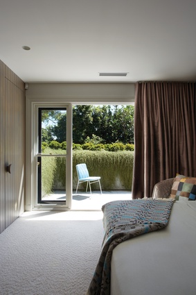
The solid oak stairs lead up to the sleeping quarters. The theme of light tones for the floor is repeated, this time with a plush wool carpet. The metallic glints of the car-paint joinery are picked up by the grey-green silk curtains. The main suite opens out above the pavilion roofs, and privacy is provided by a solid balustrade and raised planter bed. This allows for a large outlook to the sky from the bed, with complete privacy from adjoining properties.

The clients say that in contrast to the last incarnation of the house, they now use every single room in the “new house,” and they are happy with the clean lines of Jackson Teece’s reworking. Paul says that the success of the project was in part due to the “open process” between the clients and his team.
The clients were glad to have Paul advise on all aspects of the project, from furniture selection to procurement of artworks, and they comment that in the twelve years since the first renovation of the house, there has been “huge architectural progress” in terms of the quality of residential design in Australia.
This improvement has come not just from the design end of the process, but also from the general public – and in particular clients – who have become better informed about good design. Paul notes this as “a rapid growth in architectural awareness.” Whether this has come as a result of media exposure or through first-hand experience, this can only be a good thing for residential design.

