Peninsular pavilions: Three Piece House
This comfortable and unpretentious home by Trias is remarkably of its place and creates a compelling dialogue with the fabric of the neighbourhood.
Stockton, bounded by the Hunter River on the northern edge of Newcastle, has a suburban character reflective of life on the peninsula. Despite it’s proximity to the city, this place is innately peripheral, a suburb edged by a complex topographic boundary that shifts between mangrove embankment, riverfront promenade and vast stretches of open coastline.
This definitive margin between land and water is skirted by a perimeter of sprawling parkland that creates a public border to the suburb. The shared terrain forms a democratic edge that is peppered with neighbourhood landmarks.
These monuments to recreation signify an additional boundary condition that is tenuous and blurred and is repeated throughout the suburb. Offering a counter balance to the unnavigable shoreline, the cricket pitch is subtly delineated in the expansive turfed lawn and the oval is loosely distinguished by a colonnade of ubiquitous Norfolk Island pines.
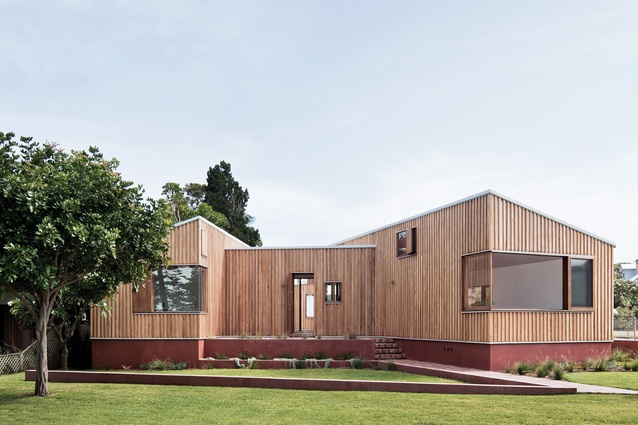
Located on a corner block adjacent to the oval, Three Piece House sits at the threshold between the shared communal edge of Stockton and the more private neighbourhood streetscape.
Trias directors Jennifer McMaster and Jonathon Donnelly designed the house for a retired couple from Sydney, and the dwelling has helped to stitch the lives of its owners into the fabric of the neighbourhood. Through an architectural response that is remarkably of its place, the architects have finessed the suburban vernacular into an architecture that is comfortable and unpretentious.
Adopting the vestigial form of its neighbours, the house is outwardly elemental. The brick plinth, pitched roofs, corner windows and chimney are derived from the pattern language of the suburb. These elements have been foregrounded in the elevation hierarchy and appropriated in a manner that initiates patterns of habitation.
Presenting a response to context that goes beyond being a collection of references, the architectural manoeuvres throughout Three Piece House make legible the idiosyncratic patterns of dwelling that have shaped the character of this coastal suburb. With the house as a reference point, the layered patterns of its surrounds are given clarity as a series of habitable edges, thresholds and shifting boundaries.
Operating as a diagram for the general habitation of Stockton, the house is distilled to a public edge with a semi-private middle that is set within bounded land. The site itself is sunken, an anomaly that is acknowledged by a series of low rendered brick walls. Positioned to formalize the street corner, the walls are interrupted by two brick entry paths and edged with native groundcover that will partially obscure the walls over time.
This pattern is repeated along the streetscape, where sandy front gardens are allowed to creep into the median strip. In a gesture that extends the public domain and allows the owners of the house to participate in customary front yard barbecues, the house is pulled generously off the site boundaries. An exercise in modesty, the house exemplifies the Trias rhetoric that advocates for “less but better.” As a result, the experience of dwelling in this house occurs at its edges, allowing a pattern of occupation befitting its site.
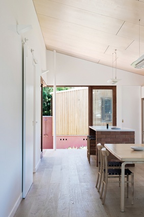
The home is comprised of three pavilions – a living wing, sleeping wing and guest studio – and each space encourages activity at its periphery. Arranged around a courtyard, the living pavilion is shaped by a series of generous openings. The kitchen window to the east invites early morning sunlight and encourages engagement with the street, while on the opposite side of the kitchen bench, large timber doors blur the kitchen with the courtyard.
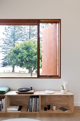
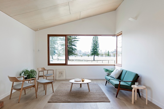
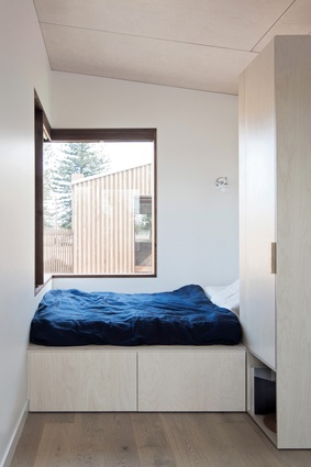
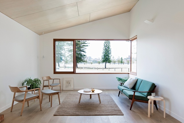
In the guest studio the bed and day bed are pushed to the extremities of the building, where windows have been placed to extend the space into the garden. Throughout the house openings are made habitable by extended ledges sized for sitting and admiring views to the city.
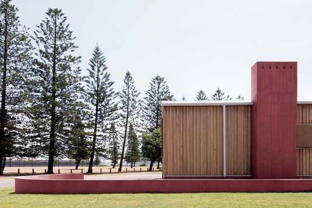
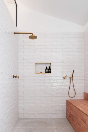
The southern view over the river is fragmented to focus on landmarks of the city. These are the permanent fixtures of a harbour view that is made ephemeral by enormous passing coal ships. In their absence, the latent significance of these vessels is directly expressed in the rust-toned render that references the hulls of the ships. This colour forms part of a limited material palette that is consistent throughout the house and applied in a manner that exhibits a considered approach to detailing.
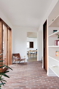
Externally, the profile of the rough-sawn timber cladding is rescaled and separated to establish the fence line, while the masonry plinth, made of bricks salvaged from the existing bungalow, is carefully eroded to form steps, seats and raised garden beds. Inside, the matched grain of plywood joinery and raked ceilings echoes the topographic nature of the place and demonstrates an affinity with the implicit quality of the surrounds.
With subtlety and a sense of reverence, Trias has created contemporary suburban architecture that forms a compelling dialogue with the fabric of the neighbourhood.
This article first appeared on architectureau.com.

