Point Resolution Bridge
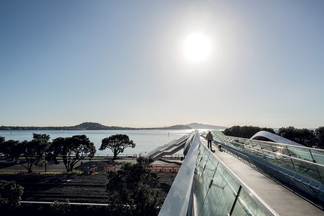
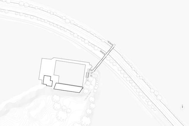
When an over-railway pedestrian bridge crossing Tamaki Drive became dilapidated, Warren and Mahoney was brought on board to design a new structure to connect Point Resolution’s headland and the Parnell Baths to the waterfront. The new sinuous all-white bridge cantilevers out over the rocky water’s edge in direct view of Rangitoto Island. Justine Harvey walked the bridge with the design architect Dean Mackenzie.
How did this project begin?
We were approached by Auckland City Council at the beginning of 2012 to look at replacing the existing pedestrian bridge that was built in 1927 and then extended in the 1970s.
I can’t remember what it looked like.
It was blue and like one of those engineered railway bridges in Otago, with lots of metal struts which were corroding. So, in conjunction with the electrification of the railway lines, they had to raise the bridge to allow the cables through. Council looked at three options and we presented this new design which they decided to go with.
It’s a prime site here so they’d have been foolish not to do so.
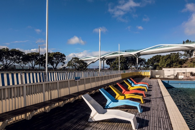
Yes, the view to Rangitoto is iconic and this is a gateway moment into the city or to the bays. It’s also related to the Parnell Baths, which is a popular historic building (designed by Hungarian émigré architect Tibor Donner in the early 1950s). The location is fantastic.
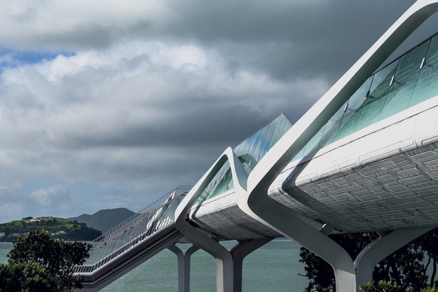
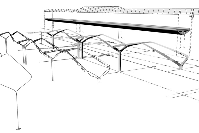
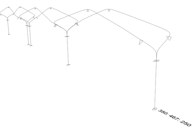
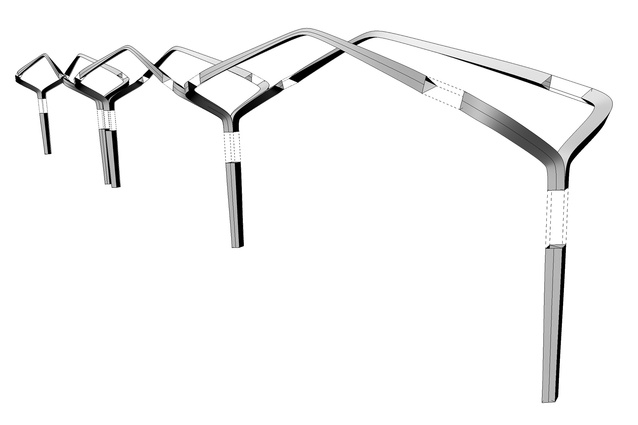
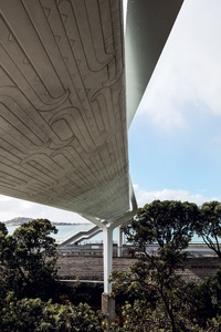
The bridge’s sculptural side is actually best seen from the road, looking up. It has three parts to it. The first element is the 80m-long concrete deck (which is in three parts on site); it’s highly sculptural, particularly the underside because most bridges are sculptural from the side or underneath, rather than the surface on top. So it’s almost like a cross between a superyacht hull and a waka hull, although we thought of it more as a sculptural concrete element. Then, in turn, that element is cradled by this steel exoskeleton so you can see the three arches. There’s this highly complex geometry going on.
It almost looks like the deck is floating within it.
Yes. That was definitely the idea: there’s this pivoting action you can see here, so the deck appears to float above the steel skeleton because the connections holding the concrete deck are discretely placed and only 100mm by 100mm steel pins. The skeleton tries to wrap around it so the arches actually come back in board slightly – it grabs the concrete element and holds it. At the same time, it’s a highly expressive arch form and those are all structural; they’re not decorative. The third element is the glass balustrade that sits on top.
The glass is very subtle, it blends in.
Yes, but I’d rather not have the stainless-steel cap we had to put along the top of the glass.

Was that a health and safety issue?
Yes, because there’re going to be electric power cables underneath here, you need to have an earthing strip, so if someone throws a metal cable over (and I don’t know why you would) and it touches the line down there, they’re not killed; the earthing strip takes the voltage and earths it. Plus, it protects the edge of the glass from vandals. We’ve been lucky so far that no one’s attacked the bridge.
The language we’ve used here is the language we’ve used on one or two projects; we’re developing a vocabulary. Every bridge is unique and of its place in terms of design but there’s certainly a continuity of style we can’t avoid; it’s just what we do. So, with the bridge we designed for Christchurch and, to a lesser extent, the one in Waterview, you’ll see some common threads; I see that as a good thing, a certain authorship.
We held a competition (to develop the pattern on the base and the balustrade) and a Kiwi artist called Henriata Nicholas won it.
It’s a lovely pattern – are they waves?
A pungarungaru or water ripple. The important thing was that it had to be contemporary and part of the language of the bridge; it didn’t want to be a token thing stuck on the side.
Henriata came up with the pattern and we came up with the idea of embossing the pattern into the underside of the hull. Actually, if you look, it’s deepest at the bottom and, as it comes around, it gets shallower and shallower. It’s quite subtle and is quite like an engraving or an etching of the skin. Then it carries up and onto the glass as a white frit – a subtle thing.
What about the ribboned steel?
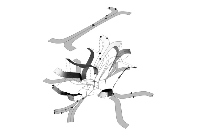
We have a diamond shape in plan which is then morphed into a triangle; it’s very deliberate because what it gives you is sharp edges. If you had a cylindrical shape, regardless of what side you view it on, it would always look the same: uniform. Whereas, if you have an object which has facets to it, you achieve light and dark and the sharp edge gives the eye a projectory to read; so you see the form more clearly than if it were a tube. During the process, we had to strongly argue that this aspect was important, and a better option than just using a tube and bending it into shape.
It looks much more contemporary too.
It was only fairly recently that we could make these forms, and one of the powers we have in the office now is modelling in three-dimensions and parametrically, so we can just change a number and the bridge updates automatically. This bridge is modelled in Rhinoceros (you can read Dean’s article about parametric and algorithmic design on page 71).
Standing on the deck here, looking at Rangitoto and the Hauraki Gulf, we have a fantastic view; I just can’t imagine Auckland extending the port right out into the harbour?
It’s crazy.This is one of the best views of the harbour – not of the CBD but of the harbour.
I assume they can have the port anywhere they want. Surely the cost of moving the port would be recouped fairly quickly in the grand scheme of things, with a larger modern port elsewhere enabling growth over the next hundred years or so. The proposal to extend the port 150m into the harbour was unreal and, even reduced to half that, is still significant.
I imagine that if they develop the (Wynyard Quarter) tank farm into parks and apartments looking back into the city, Auckland would be a world-class waterfront. Right now we still have the legacy of a corporate and industrial past.
Part of the problem is that the port shuts off the central city from the water’s edge. The public doesn’t have access to it; it’s not an interactive ‘working’ port like in the olden days: a part of the community and engaging for people – and children, in particular. And never mind that the motorway cuts right through the city to feed cargo in and out of the port, which isn’t exactly sustainable in the long term, particularly if it needs to grow. I’m getting sidelined. Don’t you think a little café or space on the end here would have been incredible.
Actually I designed it to extend out another four metres, cantilevered out over the foreshore. The idea was that you create a promontory, so you can come and stand here and it’s not just a view. This is not a typical bridge that directly connects two valleys together but, instead, a headland with a road – it’s a destination. It’s asymmetrical too. I wanted it out another four metres. People would have had their wedding photos taken here!
So why not?
The planner thought that it was a bigger risk because if you go out over the high water line you can trigger a coastal resource consent which might have proven very hard to get… And, it had to happen fast because it was being built over a live railway.
Well, they could even have made money out of the place with a little kiosk. It would be an asset.
Well, now, if you jump off the edge you’ll just die, rather than hitting the water! I did fight hard. This bridge will be here for a hundred years so we should really get things like that right. We don’t want to regret these opportunities.
It’s frustrating to see potential scuppered because of the system but, even so, your design is still a really great asset for the city.

