Poured pleats
On a west-facing ridge in the middle of Auckland’s Ponsonby, Jack McKinney Architects has transformed the streetscape with a dramatic gesture that is equal parts theatre and sculpture.
To a mid-century modernist enthusiast, architect Jack McKinney’s latest creation might seem to reference the halcyon days of Donald Wexler’s Palm Springs cool and Horace Gifford’s Fire Island vogue.
These pioneering greats transformed American domestic architecture in the ’50s and ’60s with their butterfly roofs, floor-to-ceiling windows and sculpted concrete details.
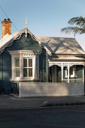
But look a little closer and McKinney’s inspiration appears to come from much nearer to home and harks back even further in time to the ubiquitous Victorian villa that is so much a part of New Zealand’s architectural landscape.
“The existing house was pretty charming; it had a nice scale and an almost-original footprint,” says McKinney, “but what was unusual about it were the double gables on the side. Often you have two gables that run front to back but this had these interesting ones on the western side. These were the genesis for all the extra ones that we started creating in concrete.”
Serendipity is sweet. Auckland’s strict conservation controls call for architects to maintain the integrity of the existing heritage building and, in areas such as this inner-city suburb of Ponsonby, maintain elements of the original villa form, including pitched roof lines, in any additions to the house.
“So, instead of fighting the rules, we used those conditions to create something very site-specific and very specific to the villa that was there,” McKinney explains. “We’ve been quite positive about applying the rules while still achieving something quite radical and architectural.”
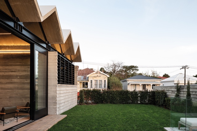
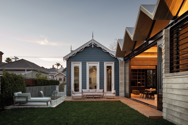
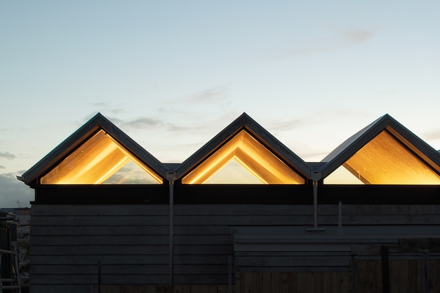
The rare twin-gable feature informed five new concrete gables of the same pitch and at the same elevation, which sit atop the 13-metre-long x 5.5-metre-wide extension to the house. Why five? “Odd numbers are nice,” says McKinney. “And then the internal walls have to start striking those ridges or valleys so that then sets up a module within which all that spatial planning has to work. So, it’s sort of a sculptural conceit but, then, to make it work, you have to be quite rigorous about the placement of everything.”
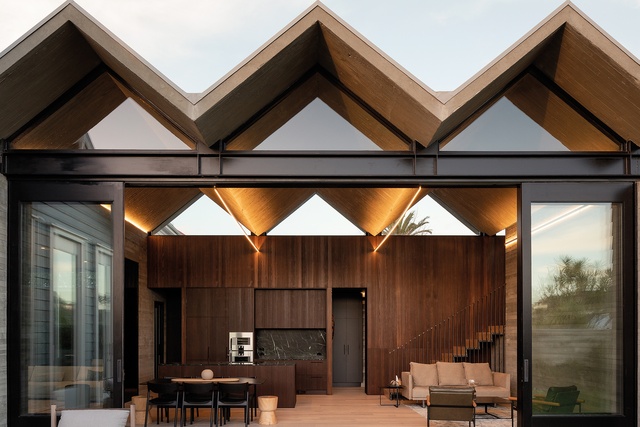
Somehow, the concrete roof appears almost weightless, as if effortlessly floating above the living space. The critical detail here, explains McKinney, is the way in which the roof meets the metal beam below it. “The metal beam is expressed and the little vertices of all these valleys just touch it but they don’t overlap it. So, sculpturally, that’s nice, because you feel like it’s just been placed and it’s just resting there quite gently.”
McKinney has a predilection for working with concrete – he created the award-winning Diagrid House in Auckland’s Grey Lynn, with its 56-tonne roof line effectively sailing out above the dwelling with no obvious support. When asked how this Ponsonby project compared in terms of difficulty, he says that, while the former called for extreme engineering, this latest one was characterised by “one afternoon of pouring and panicking”.
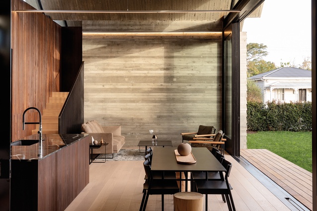
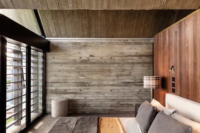
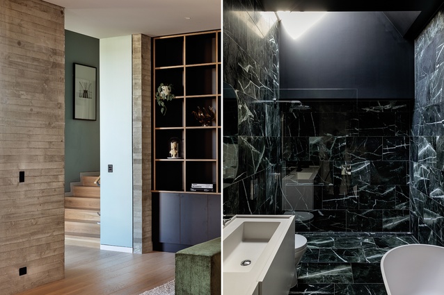
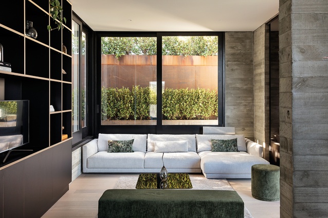
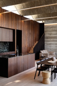
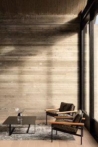
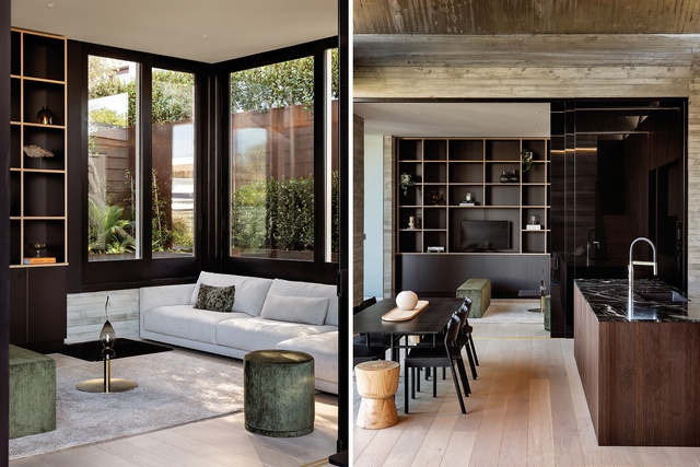
There is a fineness and elegance to the shuttered finish of the concrete, which is continued through the walls, and the larch timber joinery and oak flooring together provide a softening foil. For McKinney, the warm tobacco tones evoke a seventies’ feel: “It makes me think of Burt Reynolds”. Continuing on the theme, black-tinted glass doors slide back off the kitchen and dining space to reveal a snug, den-like retreat. When closed, the tint in the glass provides an unintended moment of inclusion in what is otherwise a very private house; the neighbourhood is reflected across the panes.
Perhaps not surprisingly, the home-owners spend most of their time in the west-facing addition to the original villa. “In terms of planning strategy, which is quite normal really, the old villa becomes the bedrooms, the dormitory to some extent, but that’s really because that’s what the scale of the rooms is suited to,” says McKinney. “You have those nice proportions and the windows are in the right places so it’s entirely suitable.”
Where old meets new, the architect cleverly lowered the floor of the third original bedroom which opens out to the deck and pool; the stairway down eases the transition between the two forms on the sloping site and allows the roof to be kept at the same height.
Unusually but, in this case, fittingly, the house is sited on a street where the sections run right through from one road to another, offering two distinct frontages. The original heritage structure faces north onto one character-filled street while the modern intervention with its dramatic roof transforms the somewhat ad hoc nature of the parallel streetscape on which it sits.
McKinney is happy with the result: “The backs of these sites are open to future interpretation. There’s often a shed or a garage on this side but we believe we’ve created something that’s quite entertaining, particularly as you walk down the street and look under the roof and it frames a lovely view of what’s out west.”
Indeed, this house has undoubtedly interpreted the future for its current owner and those to come, but the magic here is that it has done so by interpreting the distant past at the same time.

Material Palette
We talk with architect Jack McKinney about his passion for concrete and the ways in which he dealt with lighting the expansive gabled ceiling.
Concrete often forms a key sculptural element in your designs. Where does your fascination for it come from?
Jack McKinney (JM): For me, it’s all about expressiveness of form, and concrete offers so much freedom and opportunity in that respect. When you’re working with concrete, you can be a bit more dramatic. The Brazilian architect Oscar Niemeyer and Norwegian Sverre Fehn both created some incredible structures with concrete and Eladio Dieste produced some wonderfully elegant, ground-breaking forms in Uruguay: not with concrete but with brickwork. I guess all three have influenced me in some way.
Tell us how you lit the concrete – it seems like a clever device.
JM: We didn’t want any downlights built into the ceiling because it’s too pretty to have lights in it but you still need to light it. So, we just used very simple LED extrusions that we designed for the project to give both up and down light. We asked the electrician to produce them. There was a risk that they might detract from the ceiling but I think the scale of them is delicate enough that they don’t and they’ve been set up on the lines of the beams so they just line up with all the valleys.

